

We help people and organizations create graphs that make sense and weave them into compelling, action-inspiring stories
With a focus on simple lessons and practical application, we equip and inspire individuals to take data storytelling to the next level
understand the context

choose an effective visual
eliminate clutter

focus attention
tell a story
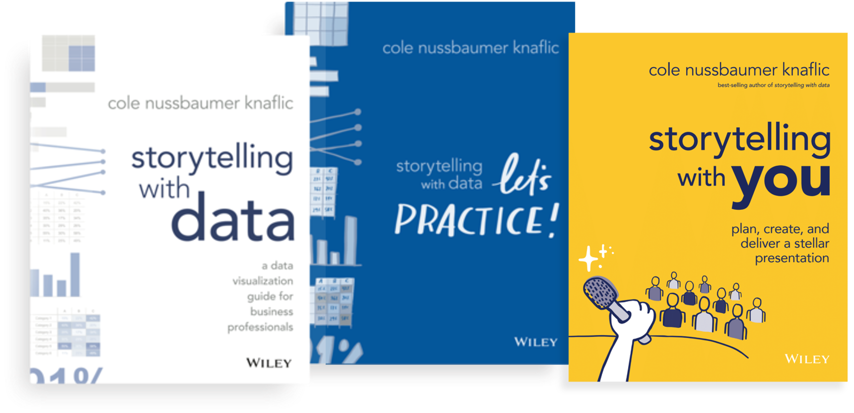
Three best-selling books cover the fundamentals of visualizing data and presenting powerfully, plus guide readers through hands-on practice
Our workshops and presentations have benefited more than 25,000 people around the world
Experience SWD lessons firsthand in inspiring sessions geared to help people understand the value of effective data storytelling and impart skills to build individual and team confidence and credibility. Transition your work from acceptable to exceptional!

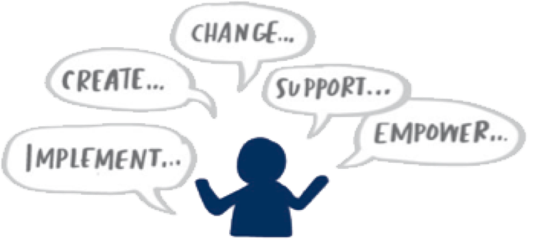
Change the way your organization communicates with data
We offer a range of virtual and on-site sessions—from short presentations and webinars that enlighten and excite to engaging workshops that facilitate skill development in a hands-on setting—customized to meet your team’s specific data storytelling needs.

Invest in your development and attend a workshop
In our public workshops, individuals from a wide range of roles, organizations, and industries come together to learn effective data storytelling through an interactive and hands-on day of learning.
Join the SWD community to practice and be supported in your journey to better data storytelling
Are you interested in improving your personal data visualization and communication skills? Join our community to connect with others, share your work, practice, and give and receive feedback. Building good habits is the key to success, and the SWD community is here to encourage you!

We have experience working
with clients across many industries


Our customers love us!
Here’s what some of our workshop participants have said…
You challenged my way of thinking for preparing and producing a quality presentation. Thank you SWD, you have changed my professional life!”
The SWD workshop was excellent. The presenters were professional and knowledgeable. It was packed with practical tips that we can immediately incorporate in our work.
I loved seeing the examples of how you took our data and turned it into something so much more powerful and compelling!
It was the perfect combination of instruction and hands-on practice.
The SWD workshop was one of the best sessions I have attended in a long time. Not a dull moment—it was interactive and kept my mind engaged. It has changed the way I share data.”
Engaging, informative, and superbly delivered with practical advice that’s easy to implement. Well done!”
Great facilitators! I loved the breakout room group activities and discussions.
The session was fantastic. My team is buzzing with ideas and inspiration!”
Check out the latest…
BLOG
using emojis to draw your audience’s attention
Discover how the unconventional approach of using emojis can highlight key points while balancing professionalism. Whether you prefer traditional methods or a touch of whimsy, learn how to captivate your audience and effectively convey your message.
PODCAST
ep 78: visualize this with Nathan Yau
Join Cole as she chats with Nathan Yau, founder of Flowing Data and author of Visualize This and Data Points. Nathan shares his journey from grad school at UCLA to becoming a renowned figure in data visualization. They discuss the evolution of his work, the inception of Flowing Data, and the impact of his books on the field. Dive deep into the creative process behind visualizing data, the importance of asking questions, and the iterative nature of both data analysis and visualization.
VIDEOS
stacked area chart makeover
This video looks at a stacked bar graph that is failing to articulate its call to action clearly. Data storyteller, Simon, iterates through different chart options, ultimately deciding the stacked area chart—a less common choice—is ideal.