visualize this

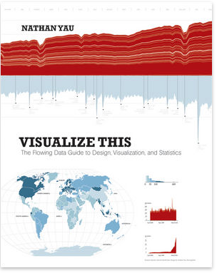
Nathan Yau writes one of my favorite data visualization blogs, FlowingData. His recently published book has been sitting on my shelf untouched for much too long. Earlier this week, I decided to remedy that.
His book is Visualize This. Subtitle: The FlowingData Guide to Design, Visualization, and Statistics. It's written in the first person and is super accessible, full of examples and anecdotes to make the lessons real. The book includes references to a lot of publicly available data and also has links to each dataset used, so the reader can follow along through the steps that are explained.
After starting with an introduction on telling stories with data (obviously near and dear to my heart), the book jumps into the practical question of how. There are step by step instructions for scraping data from websites, using Python to reformat it, and the strengths and weaknesses of various out of the box applications and programming languages for analyzing and visualizing data.
By his own words, Nathan's book is "example-driven and written to give you the skills to take a graphic from start to finish." It accomplishes this goal. The middle chapters each focus on a different kind of visualization problem: visualizing patterns over time, visualizing proportions, visualizing relationships, spotting differences, and visualizing spatial relationships. Yau follows a thorough, hands on approach. For example, in the chapter focused on time series, he goes through what to look for, the best types of graphs to use in different scenarios, how to load the data into and plot in R, and how to fine tune the visual using Illustrator. Relevant statistical methods are incorporated as makes sense, for example, smoothing and estimation.
While there is some very solid foundational material, the majority of the book is focused on the practical question of how to actually analyze and visualize the data. It seemed to me most tailored to the person who is looking to move beyond Excel and the like and get started using R and Illustrator (with some time devoted to interactive graphics as well).
Throughout, Nathan's graphics are beautiful and accessible - great examples of effective data visualization. He follows the rules he sets forth in every one:
- explain encodings,
- label axes,
- keep your geometry in check,
- include your sources, and
- consider your audience.
The final chapter focuses on designing with a purpose. He says he always assumes that people are showing up to his graphics blindly and puts the onus on himself as the designer to prepare the audience with the relevant context and insights. "After you learn what your data is about, explain those details in your data graphic. Highlight the interesting parts so your readers know where to look. A plain graph can be cool for you, but without context, the graph is boring for everyone else."
Well said, Nathan!