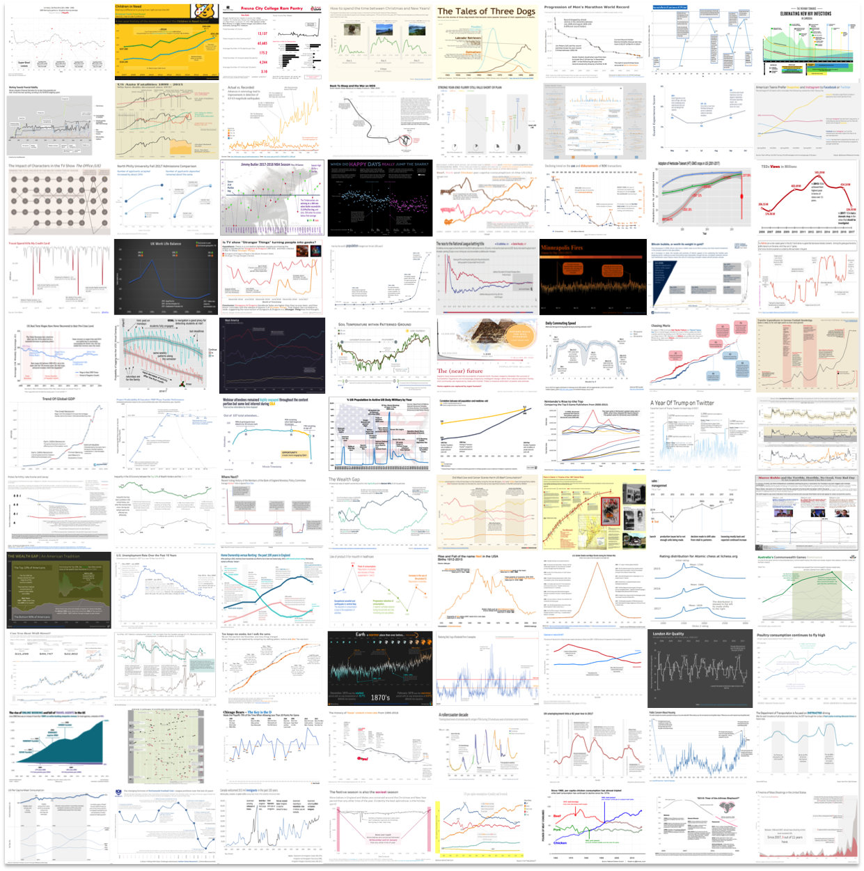
88 annotated line graphs
At the beginning of the month, I challenged you to create an annotated line graph on a topic of your choice. Nearly 90 people took me up on it! This is the summary post where I'll share back with you all of the awesome work that was shared with me as part of this initial installment of the #SWDchallenge.
I'll start with some musings on what I saw when combing through submissions. People used a variety of tools—many in Tableau, but a number also used R and Excel (sidenote: I hope to continue to see a wide variety of tools used here). People visualized data from a super wide range of topics: sports (football, baseball, soccer, basketball, mixed martial arts, Australia's commonwealth games), meat (due to a number of crossover entries with a recent #MakeoverMonday), economic indicators (from the US, UK, Canada, and around the world), financial data (the rise of bitcoin, gold vs. oil, playing the stock market, the wealth gap), and more. A handful of people used real work scenarios and least one entry (Jeremy's) was done as a team effort (I'd love to see more of this!). It's fascinating to see all of the different ways to format annotations (from placement to typeface to the use of lines)—there's no right or wrong—when scrolling through the visuals, observe where things are done in a way you like that you may emulate in your own designs.
Some of my personal favorites were those who shared personal data, giving us insights into their lives: Pere shows us how his walking patterns changed after the birth of his child, we feel Kelly's pain as we follow her average commute time to work (watch out for mile 12!), Amy gives us insight into her take home pay vs. spending by category and how it stacks up to her 50/30/20 budgeting goal, we can follow along on Alexander's hike on the Queen Charlotte Trail, and don't miss Sara's visual that depicts blood values through a decade of cancer treatments for a member of her family.
A number of people chose dark or colored backgrounds for their visualizations, or otherwise had a bit of fun by making the data somehow reminiscent of what it represents. Mike M. chose a green background to match his monetary topic, Ravi's smoggy background for London air quality means you're not expecting good news before you even get to the data, Pooja uses Earths to encode data and colors emulating hot and cold when depicting data on our warming planet, Fiona's credit card spend is bleeding, Jeff's data on Minneapolis fire alarms appears to actually be on fire (due to both color and shape), and David's Happy Days visual follows in style though color and typeface and yes, even includes sharks.
While I definitely suggest scrolling through them all, I'll call out a few others that stood out to me. In addition to their thoughtful design and attention to detail, these take me through an experience as I read through the text and look at the data: Allistair's progression of men's marathon world record, Bill's connected scatterplot on the war on SIDS, Hayley depicts how the world's population has changed in the last 1,000 years, Kat takes this further and shows through a scrolling story how the world's population has changed over the past 200,00 years, Klaus cleverly embeds a big picture view in his nicely designed transfer expenditures in German football, Mark B. annotates in the gap between the top 10% and bottom 90% of wealth holders, Matt C. created a nice pic of some similar data—top 0.1% vs. bottom 90%, Neil has crisp, clean design and nice annotation formatting on the rise and fall of his name over time, and Sarah B.'s UK unemployment graph packs in a lot of text and info without feeling overwhelming through thoughtful emphasis, deemphasis, and overall design. There are a ton of amazing examples—too many to call out individually. Speaking of which...
There's been a friendly debate at my house regarding this challenge. Rewind to last night, and I'm scrolling through the finally-completed draft post of all the entries to show my husband, saying, "how cool is this?!?" To which he responds, "Do you think anyone is actually going to go through all of that?" My initial response was, "Of course!" But when I step back and think about it, it's a fair question, I suppose. This is a lot of content to scroll through. So I'd love any feedback you'd like to share: is the volume here helpful or overwhelming? Send a quick note to swdchallenge@storytellingwithdata.com to let me know your view. Also, for those of you who make it to the bottom of the post, if you could take a second to click the ❤, that would help give me a sense as well. BTW, I do hope you make it to the bottom, because Zak's timeline of mass shootings is beautifully done!
In the near term, unless I hear loudly otherwise, I'll plan to continue to report back with all of the entries I receive for the challenge each month. If the number of entries grow much from here or I hear consistent feedback that it's too much, I may start curating the summary post.
A couple notes to those who submitted examples: first off, THANK YOU for taking the time and sharing your work. In my copying/pasting, if I've misrepresented anything or failed to include a social media profile you'd like to have linked, please send a note with specifics to swdchallenge@storytellingwithdata.com and I'll take care of it. The makeovers are posted below in alphabetical order by first name (+ last initial when needed; I omitted full last names in respect of those who would rather remain anonymous). If you thought you submitted a graph but don't see it here, please send a note with your visual to the address above and I'll add it (I think I got them all, but you never know).
For those of you planning ahead, a quick note also that the February #SWDchallenge may start in the second week of the month rather than the first. I'm working on a potential partnership for this one and still working through the details. More on that soon!
So without further ado, here are your 88 annotated line graphs. (Well, actually 89: Elizabeth on my team snuck in with a last-minute entry to help advertise the couple spots still open in our Charlotte public workshop this week!)
#SWDchallenge SUBMISSIONS: ANNOTATED LINE GRAPH
Adam C.
For January's challenge of the annotated line chart, I decided to look at Jim Kelly's Quarterback rating. This chart depicts his QBR by game vs. the 16 game (16 games = one season) moving average of the rating. Each dot is a game. I highlighted playoff appearances in red. For the annotations, I chose to highlight the four Super Bowl losses and show how his performance in those games was subpar to his average. I grew up in Buffalo so these losses still hit home!
Blog: thedataduo.com
Twitter: twitter.com/acrahen
LinkedIn: www.linkedin.com/in/adamcrahen
Adam G.
Short #Coffeetableviz blog post showing an annotated line chart using the Children in Need data sourced from Wikipedia. Twitter: @greenynorfolk
Alex
This is an example of a dashboard built to present the impact of a college food pantry. The annotated line graph is just one component, but I wanted to share as a real world example of a dashboard that included a line graph.
Alexander
Pictures in annotations is a feature that only seldom makes sense. In this particular example I think it works quite well, as every mark is represented by a picture at that particular point on the track. I tried to keep all other information (breaks between days and the high level stats) as unintrusive as possible, by having them faded in the background or below the graph. I am happy to receive any kind of feedback via www.curvediscussion.com or https://twitter.com/genetis. Tableau Public version.
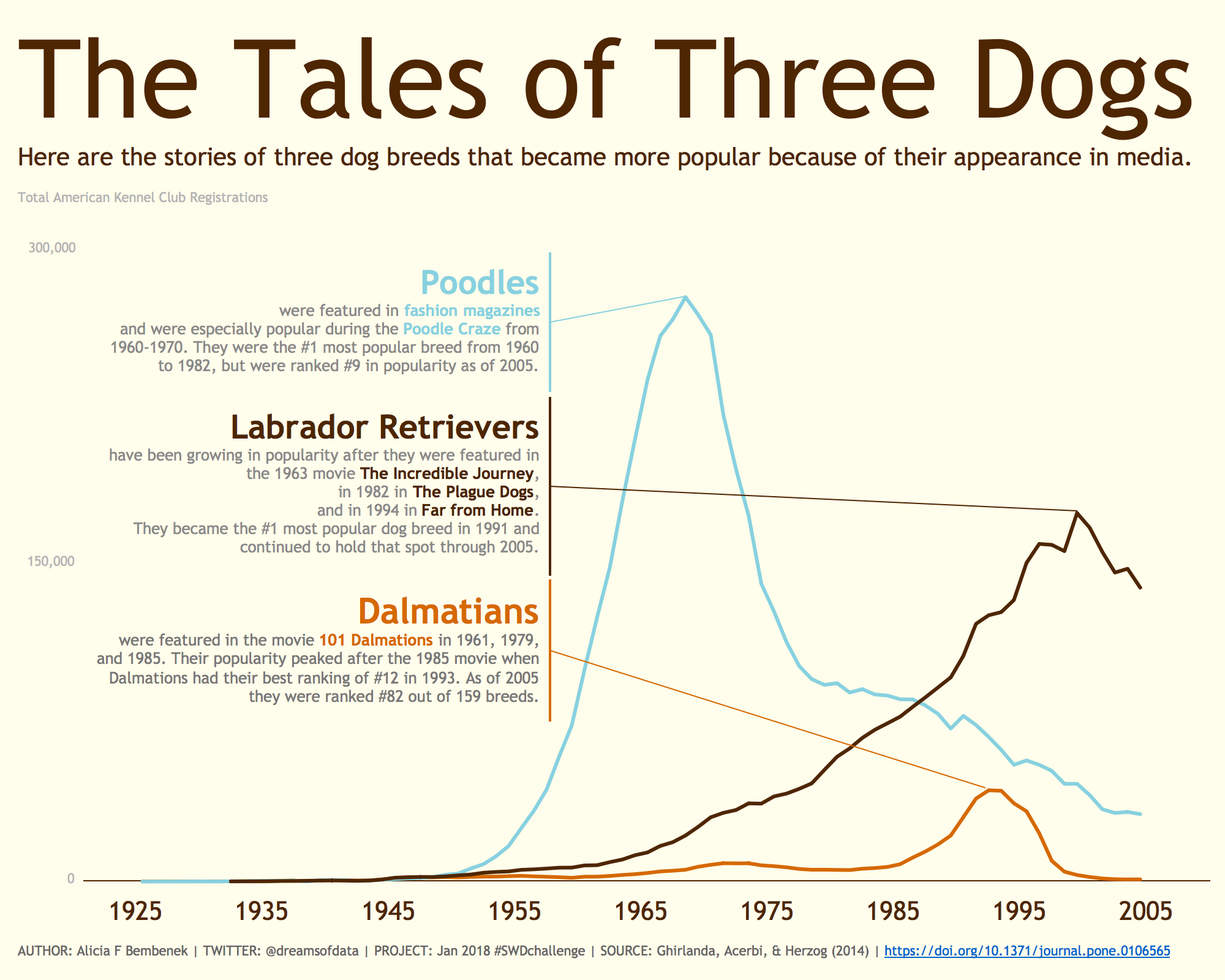
Alicia
This annotated line chart was created by Alicia F Bembenek. You can follow her on Twitter at @dreamsofdata, and see more examples of her work on Tableau Public and her data visualization blog dreamsofdatablog.wordpress.com.
Alistair
My submission depicts the Men's Marathon World Record over time. I like the fact that it shows the progression over time with interesting periods such as 1909-10 and 1952-54 where the record dropped significantly. Along with the last 50 years where the record has only reduced by less than 7mins. There's lots of discussion in the running community as to when the 2:00 barrier will be broken. This viz suggests that it could be quite a while until we see that. Twitter: @alimotion
Allen
I used data from the following sources and did the cleaning, sorting, visualization, etc in Excel.
Sources:
http://mmapayout.com/blue-book/pay-per-view/
https://en.wikipedia.org/wiki/List_of_UFC_events
This visualization is targeted towards an MMA fan. Things to know:
Significant fighters / UFC stars known for their pay-per-view drawing power due to their promotional efforts, style of fighting, involvement in entertaining fights, and/or championship status: Conor McGregor, Ronda Rousey, Brock Lesnar, GSP, Anderson Silva, Chael Sonnen, Chuck Liddell, Randy Couture, Tito Ortiz, Forrest Griffin, Stephan Bonnar, Cain Velasquez, Junior Dos Santos, and Matt Hughes.
Allison
Each year the USAID and CDC teams in Cambodia have to create a country operating plan detailing our strategic vision for the HIV response in Cambodia. This operating plan is used to justify to congress the proposed PEPFAR budget, so communicating our vision intuitively and in a powerful way is of extreme importance. The HIV response in Cambodia is quite different than the rest of the world, as they are one of the only countries within reach of virtual elimination of new HIV infections (<300 new infections per year, at which point the epidemic will slowly die out). Reaching virtual elimination would allow Cambodia to show the rest of the world a viable programmatic strategy that they could follow to elimination as well. Knowing this, we wanted to make a succinct, one page visualization that showed both the epidemiology of the epidemic and the corresponding programmatic strategies & funding levels that have led to the dramatic decrease of HIV infections and deaths in Cambodia. The graphic was a wild success: it was eventually shown at the International AIDs Society as a best practice of how countries could visually communicate their strategy to others, and it was a large reason our country operating plan was successfully approved by congress (leading to 11 million dollars of funding for Cambodia).
There is a few things to note in terms of the graphic itself. I think the first thing an individual trained data visualization will notice is that there is absolutely no data values on this visualization. This was done very purposefully. Since the purpose of the visualization was to invite conversation about the big picture of the strategy and how that impacts the epidemiological data, we didn’t want people to get hung up on individual numbers, but rather look at the visual as a whole. The milestone flags are color coded to align with the major areas of the PEPFAR strategy. These flags correspond to our strategy visualization which I also have attached to this email. Learning more about data visualization the past year, I think there are definitely some things I could have done to make more effective color choices. For example, making the funding levels different shades of grey instead of colors may bring out the milestone flags more. I think it also would have been nice to put HIV Related Deaths line in a shade of grey as well, and only keep new HIV infections in a red color (as that is the major goal of the country – reaching elimination of new infections). It would allow that epidemiological data piece to pop out, and the grey of the others would be in the background for context (which is needed for the conversations), but not compete for attention with the more important new HIV infection line and milestone flags.
Amy
I'm continually interested in visualizing and talking about finances as a way to break the taboo around the topic. Financial data can be really raw & personal when annotated. I ended up looking at my calendar more than the actual numbers to see what was happening in my life when lines took a jump.
This is a look at almost a decade of financial information for my basic living essentials & what I should have been spending, according to 50/30/20 budgeting. For more viz and an explanation of 50/30/20 budgeting, see my other project www.fiftythirtytwenty.com
Ben G.
This shows the history of auto fatalities and tries to explain why it has been falling in recent years. You can view it live at http://plotdevice.bengarvey.com/auto.
Ben J.
Bill
It’s not a traditional line chart. It’s a connected scatter plot. But it does tell a chronological story along a sweeping and tangled line.
Brad
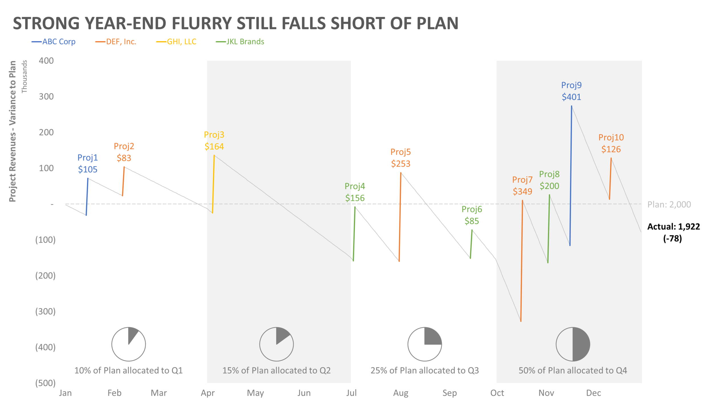
This is an annotated line graph from a real work scenario that I'm planning to report for 2017 year end. It's been thoroughly randomized. In the presentation that I put together, the data was layered in piece by piece—first by quarter (including the pie chart annotations), and then one customer at a time by color.
I like the budget-to-plan construction because it uses one descriptive line instead of two and it also allows me to show the major vertical jumps in a visually similar context (not to mention it compresses the axis—y-axis range in this example is 900k, versus a minimum of 2000k if I were to plot actual and plan individually—which makes comparisons easier).
The major points of emphasis are the quarterly seasonality skewing towards Q4 and the effect of infrequent but large sales timing on our quarterly reporting (specifically, the end of Q2). In the spirit of trying something different, I present my case for using pie charts when comparing across charts within the annotations.
Chris
This is one of a set of annotated line charts that depict every play from scrimmage in the last ten Superbowls. It was created by Chris DeMartini and the interactive version can be found on Tableau Public. The goal behind the visualization effort was to evaluate if field position throughout the game corresponds to resulting score.
Ciaran
Colin
My goals:
- Match the category colours to those recognisable with the brands.
- Show change over time, appropriately using a line chart.
- Directly label the lines, but remove the y-axis for a cleaner, less cluttered design.
- Add some annotation to include a narrative of the functionality of the different social media networks.
- Use colour in the titles and annotation to identify the brands, removing the need for a colour legend. This creates a cleaner, less cluttered visualisation.
The visualisation is available on Tableau Public. I wrote a blog on my design process, which is available on Datawoj.co.uk
Corey
I am submitting an entry from my previously posted "The Office" Tableau Public dashboard. The chart is a bump chart ranking the total dialogue of five major characters by season.
In the heart of the series, you can see a flip-flop of importance between Dwight and Jim -- trying to identify who is going to be Michael's "Number 2". When Michael leaves the show (season 8) Andy gets promoted from to top dog. After a down season (based on IMDB ratings), Andy's prominence is lessened, and Dwight and Jim take center stage.
Data set was built from dialogue scripts found on officequotes.net. Link to dashboard.
Dan
This is a first stab at showing milestones/measures of students applying to a higher ed institution. It shows progress against last Fall term. I want to build on this by adding more milestones in the admissions pipeline:
1. How many students applied
2. Then students accepted
3. Students denied
4. Students deposited
5. And finally students who registered for classes.
Besides the trend leading up to entering as a registered student, I want to prompt the user for a day in the admissions cycle for the current term that will be used as the starting point for comparison with the previous year. I want the dashboard to act as a scorecard by using a simple text charts with up and down arrows showing how the school is doing compared to the measures for the previous year. Viz on Tableau public.
David B.
If we use Jimmy Butler’s background image as a trendline, we see that in his first season with the Timberwolves as his scoring increases so do the Timberwolves chances of winning. @dj11barton
David H.
This visualisation examines that most crucial of pop culture questions: When Did Happy Days Really Jump the Shark? I would normally hesitate to use such as bold colour scheme but I wanted to try and reproduce the look and feel of the programme's opening credits. The interactive version includes further annotation when you hover over the dots and shark icons, and can be found at https://t.co/KSGQzaH0Mh. Twitter: @data_ink
David M.
- I made sure to include summary text at top, so viewers have something to take away even if they don't fully engage with the viz.
- I kept the colours simple and sprinkled in a liberal use of shapes to help make data points more intuitive for viewers.
- I got out of my comfort zone to add more annotations. My original viz only had one annotation, to cut down on clutter - it . (But as you say with you #SWDChallenge, sometimes we won't be there to explain our key insights so it is needed from time to time).
A full list of my design choices and the interactive viz can be found on my website.
Eduardo
Elizabeth
My annotated line chart doubles as a packing guide if you're traveling to Charlotte for our public workshop on 1/25/18. Join @storywithdata & me for hands-on practice of data visualization and storytelling. Not registered yet? Seats are filling up: storytellingwithdata.com/public-workshops
Esther
This visualization is to highlight the growth of Herbicide-Tolerant crops—corn, soyabean and cotton and special focus on how HT_corn has grown in US from 2001-2017. Herbicide-tolerant (HT) crops, which tolerate potent herbicides (such as glyphosate or glufosinate), provide farmers with a broad variety of options for effective weed control). I used R to come up with this visual. Data source: www.ers.usda.gov
Faisal
Fiona
I took a look at my credit card and it's pretty horrific. Here's the Tableau version. To stop people from really understanding how much I spend, I decided against a running sum, and felt inspired by the "Iraq's bloody war" viz, with the sharp daggers of travel spend making my credit card bleed.
Garry
Each Christmas we have a local charity put on a show in the streets where Santa on his sleigh visits the children to spread Christmas cheer and a few chocolates. This year someone said “where are all the kids?”
This chart depicts how we priorities work over family in the UK. Government rightly encourage equal opportunities for work but fail to encourage equal opportunities for family leading to the case in 2017. There is a rise of women in work and bearing children at a much later age. The choice is work over family. If men had equal rights to maternity perhaps this would change.
Data source: www.ons.gov.uk
Geoff
Data is sourced from: GoogleTrends https://trends.google.com/trends/explore?date=today%205-y&q=Stranger%20Things & Amazon Sales Data https://www.novelrank.com/asin/0786965606
Twitter @GeoffPidcock
Hayley
I looked into global population over 1000 years, using information from Our World in Data. I annotated a few points to explain the population increase or lack thereof. The dashed line represents the projection.
Source: https://ourworldindata.org/future-population-growth/
Jacob
My entry is a Tableau Public viz that I made, telling the story of the 2016 National League batting title race. One extra feature that I really like is the ability to 'zoom in' on the end of the line to see the details of the end of the year when the race really got hot.
Jeff
The reason I chose a data set on Minneapolis Fire Alarms is that my best friend, who's a Fire Captain in Fargo, ND, has an interest in utilizing data visualization to help the department become more efficient in several areas. This prompted me to find some data around fires and play around with it. With the project on the back-burner at the moment, I thought the #SWDchallenge was a good opportunity to share one piece of the data I had gathered, especially considering the large spikes in fire alarms, due to the 2013 and 2015 summer storms.
Jeremy (and team)
I’m very excited about the year of data vis challenges you’re organising—they’re a great way to bring people in my organisation together and get them to focus on what we could do to achieve better practice. Here is y team’s entry for the January challenge—an annotated line graph comparing the relative values of gold and bitcoin over the last ten years.
Jim
Batter by batter win expectancy for the Houston Astros in World Series game 5, 2017.
Joe
Julià
Justin
I wanted to go with a dark background mainly for fun—I create business reports and dashboards for my day job and white is default (for good reason). But in isolation I find dark backgrounds appealing when viewed on devices.
Karen
These data were collected in 2016 near the top of Medicine Bow Peak in the Medicine Bow-Routt National Forest in SE Wyoming. The study was funded by @WyomingEPSCoR and conducted by Zoe Ash-Kropf, Karen Vaughan (@vaughan_soil), and Linda van Diepen.
Kat
I got slightly carried away with the freedom of data choice this month… inspired by Xmas holiday reading material (Sapiens by Yuval Harari) I started on an annotated timeline of human population growth - from 200,000 years ago.
Note from Cole: I've included just a small portion of it here, check out Kat's original post for the full picture.
Kelly
This chart shows the typical driving speeds along my commute to work in 2017, based on 195 trips. It was interesting to see the difference in variation at different points along the route!
What I learned this month: how to shade between two lines in Tableau (using this blog post: http://bit.ly/2CYRPiW). Link to dashboard on Tableau Public: .
Klaus
My submission focuses on Transfer Expenditures in German Football Bundesliga.
Tableau: interactive version | Twitter: @ProfDrKSchulte | Blog: www.vizjockey.com
Kim
Revisiting the home run race of 1998, nearly 20 years ago when Mark McGwire and Sammy Sosa pushed each other past Roger Maris' previous record of 61 home runs in a single season.
http://tabsoft.co/2Fdo3W2 | @WizardOfViz | www.wizardofviz.com
Kush
Affect of the major financial crisis on Global GDP. See more here.
Kyle
There are two annotated line graphs from the work I do as a project portfolio manager (the data are actual, but no confidential information is revealed). The “base” version (below) is what I’ve sent to our Global Leadership Team; I also keep a “detailed” version (not shown here) in the background in case any of them want to dive deeper.
Lea
When analyzing engagement for a 60-minute sales webinar, I plotted out attendance at the minute level. While the shape itself was intriguing, the story came alive when I overlaid key milestones throughout the session. Note that attendees came and went, hence why peak attendance only comprised of around 90%.
Blog: LeaPica.com | Twitter: @LeaPica | LinkedIn: LinkedIn.com/in/LeaPica
Lee
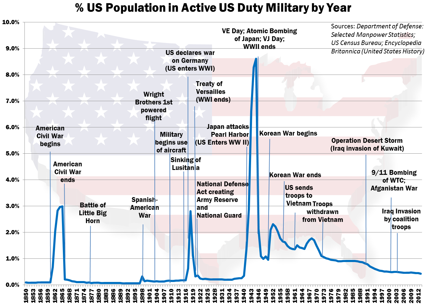
This graph shows the % of US population in the active military (Army, Navy, Marines, Air Force) by year with noted US military events. It was interesting to see that 8.5% of the US population was in active military roles during WWII and today the % is <1% perhaps showing the advancement of technology and equipment.
Ligia
On this graphic, I'm representing correlation between population and monthly aging demand of medicines, in Brazil. According to the Brazilian government, published in 'Dados sobre o envelhecimento no Brasil,' "Most important cultural achievements of a nation in your process of humanization is the aging population, reflecting an improvement of living conditions."
It's a correlation very closed. As you take care of your health, more extended is your life expectancy. And how bigger your age, more care is needed with your health.
Ludovic
Mahfooj
Please find my contribution for this month's SWDchallenge from archive of #MakeoverMonday Gold vs. Oil Price. Public link.
Marcela
Mark B.
Blog: www.sonsofhierarchies.com | Interactive version on Tableau Public.
Mark E.
This line graph follows two versions of a single metric - the UK Base Rate, the benchmark for interest set by the Bank of England. One version of the metric shows the average rate that members of the Monetary Policy Committee voted for, and the other represents that which they collectively settled upon. By using colour alongside the annotations I was able to indicate which version I was commenting upon, even though the lines are often very close together. To ensure that both lines were visible, I made the red line slightly transparent.
Matt F.
Michael
I also blogged about your challenge and provided my thoughts that went into my creating this chart: https://datavizblog.com/2018/01/06/panic-in-detroit-introducing-the-2018-swdchallenge/
Michelle
Here is my annotated timeline of aircraft incidents. Since this year has been labeled as one of the safest for commercial flying, I thought I would look at the history of air incidents. Originally my chart was just going to include the line graph, and show how technology and safety regulations have decreased the total number of incidents. However, I also plotted the number of fatalities out of curiosity, and noticed the number of fatalities is reduced dramatically due to a reduce in “parachute jumping” incidents. I tried researching what would have caused the shifts, but haven’t had much luck. I talk about this discovery on my blog Data Dimples as well – I still haven’t found an explanation!
Miguel
Mike C.
This is a cleaned-up version of something I put together a couple of years ago, early on in the Presidential campaign. A few of my colleagues and I were tracking, over the course of years, how the UK bookmakers were handicapping the Presidential race, and we aggregated available odds into an "implied odds of winning" metric.
There was one week in which there was a tremendous swing for one candidate: Marco Rubio. In the course of 9 days, he went from one-of-the-pack of Republican candidates, to the unquestioned front runner, back down to also-ran; within a month, he was completely out of the race.
This annotated chart shows the abrupt rise and fall of Rubio's 2016 Presidential aspirations over a two-week period.
Mike M.
This was a dataset we looked at last year for Makeover Monday. I realize that the non-white background is unorthodox, but if memory serves, I wanted to incorporate a "money green" into the viz as a way to let this viz stand out from some of the other entries. And I felt that the shades of grey worked as a nice compliment to the green throughout.
While the main narrative is the wealth gap between the top 10% and bottom 90% (specifically how the top 10% has always owned the majority of the wealth), I also wanted to highlight the even greater concentration of wealth at the very top, and so chose to include an inset alongside the main viz.
Mohamed
Munazzah
Britain's housing market is said to be "broken". This timeline shows how housing tenures in England have shifted from renting to home ownership over the past century, and how the trend has reversed once again. More details here.
Natale
It represents the trend of consumption of a specific "X" product in a healthcare environment. I will not go into detail for obvious reasons of confidentiality. The data were processed using QlikSense (which I also use for processing at work). The data processed during the "exploratory analysis" phase (done with QLik) is then graphically processed in Excel. Linkedin profile
Neil
Neil Richards | @theneilrichards | questionsindataviz.com | related blog post
Nicolás
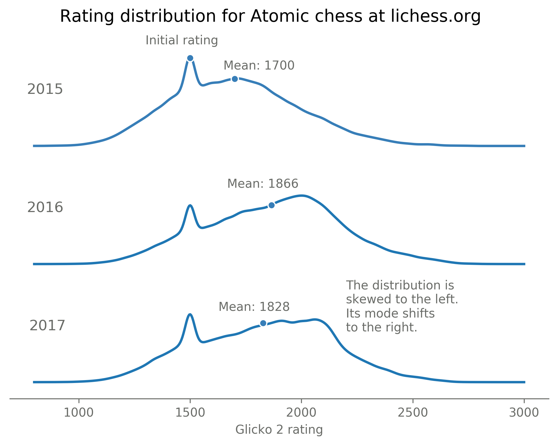
Distribution of rating evolution for Atomic chess at lichess.org. Note how the distribution is skewed to the left from 2015 to 2017.
Nishant
A visual that looks back at the last 10 Commonwealth Games dataset and illustrates Australia's games dominance—a new insight! Tableau Public | Twitter
Oleg
1) This is a dynamic visualization - so I couldn't use static annotation lines on the main visualization area. See interactive Tableau Public version.
2) The visualization is complex - requires a viewer to understand the logic behind the trades.
3) Instead of making the main visualization even busier with additional details, I decided to put the annotations in "How to Read the Chart" section.
Paula
Pere
Last 5th of november, our first son Teo was born. I wanted to visualize something related to him. I thought of comparing my walking patterns before he was born, and after he was born. I used the step data count from my phone. Twitter: @pere_rovira
Pooja
I used color to indicate warm and cool temperatures per intuitive senses. Blue for cold and orange for warm. For the peak temperatures per decade, I annotated those with events that could have resulted in the eventual decrease or increase in temperatures. The text at the bottom left and right dynamically change based on decade when you hover over the globes up top to show which month was the warmest and the coolest in the selected decade. View on Tableau Public.
More info about me:
Blog: https://thedataduo.com
Twitter: https://twitter.com/DrexelPooja
LinkedIn: https://www.linkedin.com/in/pooja-gandhi-tableau-zen-master-988584140/
Pratik
Here’s something I did with my personal power consumption data.
Raphael
I used Tableau for the first time, after several years as an R-only user. The data was gathered using the Data Science Applied to Health Platform, a project from Fiocruz (http://bit.ly/2AEV7Tr). Social media: @rfsaldanhario | Blog: https://rfsaldanha.github.io
Ravi
Title: London Air Quality
Commentary: While the level of nitrogen dioxide was over 70 ug/m3, the overall trend since 2012 seems to be one of decline.
Datasource: https://data.london.gov.uk/dataset/london-average-air-quality-levels
My Twitter: @Scribblr_42
Rodrigo
Available on Tableau Public
Ryan B.
A line graph of the Chicago Bears points allowed per game from 1985-2017.
Ryan G.
Sara
Over the past decade, a very close family member has diligently tracked his blood values during his fight with prostate cancer. For this entry, I digitized his manual notes into an annotated line graph.
Tools used: d3.js and the d3-annotation library of Susie Lu.
Sarah B.
For this month’s challenge I decided to look at UK unemployment trends. I included reference bands to show each recession as it’s interesting to see the effects of an economic downturn on the labour market. You can interact with this chart on Tableau Public.
Sarah N.
It shows the Ipsos More Issues Index data, which demonstrates that public concern about housing has been dramatically rising since 2010. I wrote an article about the story too, which is on my blog.
Sean
I chose to look at the number fatal traffic accidents that involved a distracted driver. It was fascinating to see that these incidents are at all time lows. It appears that it took some time for the DOT to catch up to the rapid innovation of technology but since 2010, they have increased distracted driving enforcement, released an entire website dedicated to public advocacy.
One, of course, cannot ignore the innovations in hands-free calling and in-car WiFi, among many other things that may also by contributing factors. But make no mistake, the DOT is focused on distracted driving. Tableau Public version | related blog post
Sharon
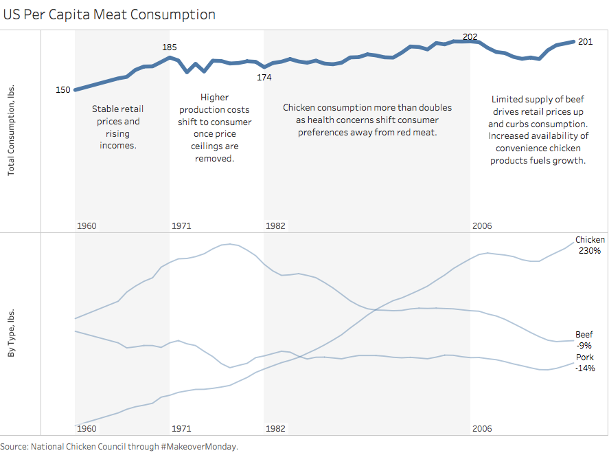
My annotated line chart looks at changes in US per capita meat consumption over the past 55 years (credit to #MakeoverMonday for posting the data set). Did you know that Americans consume more chicken than anyone else in the world – more than 90 pounds per capita in 2015! My chart shows how chicken consumption grew +230% over this time period and where's the beef...
Simon
Tableau Public | Twitter: @SimonBeaumont04 | Blog
I wanted to share something that was personal to me so I focused on the highs and lows of the Football Club I support in England. Whilst the viz is a basic line chart I wanted to highlight on the line where the narrative related to, I did this through including numbered dots on the line chart but only for those seasons where narrative was included. The number in the centre of the dot can be used to link to the numbered narrative.
Slavik
Presented by Slavik Glazyrin. More on Immigration and Refugee history of Canada.
Sophie
Had great fun making this chart and thinking about the impact of annotations and titles on a viz.
Srikanth
Thomas
Here is my submission for the SWD January challenge. I have also uploaded the raw code (including how to scrape the data directly into R) on my github | Twitter: @thomas_mock
Wendy
Inspired by Ellen Degeneres’ #BeKindToElephants social media campaign and the work by The Great Elephant Census #GreatElephantCensus to collect and provide irrefutable data on herd populations, my #SWDChallenge entry is entitled “2018: Year of the African Elephant?” We have learned over the past 50 years that when there is public awareness to the plight of the elephant — conservation efforts succeed, and population levels increase.
Zak
My visualization shows a trend of Mass Shooting victims over time in the United States. As you can see in the chart, there is a severe upward trend in recent time resulting in record-breaking years back-to-back. You can find more of my work on Tableau Public and by following me on Twitter @zaksviz.
I'll end by expressing my huge thanks once more to everyone who participated who took the time to create and share their work. Thanks also to those reading (if you've come this far, please click the ❤ below) and stay tuned for more #SWDchallenges to come!
