education visualized
Last week, I challenged you to visualize education and practice thoughtful use of color and words to create a visual story. This is part of a month-long celebration of Black History to #VisualizeDiversity in collaboration with data.world, Tableau Public, #MakeoverMonday, Viz for Social Good, and Data for Democracy. This is the recap post where I'll share back with you all of the great work that was shared with me as part of the February 2018 installment of the #SWDchallenge.
First, I'll highlight some observations:
- A number of people focused on the gap, often filling it in as a means to quickly draw attention, which worked well (see submissions from Zak, Tamara, Neil, Jeff P, and also Lindsay's, which draws attention to the gap via vertical lines in a way that looks quite slick).
- While there were some positive stories highlighted—degree growth for women (Sateesh), decreasing high school drop out rate for males (Lindsay), division I African American students closing the graduation gap (Jeff P), unemployment falling as education increases (Divya)—a common theme across many of the visualizations was the need for more progress. I thought Sarah's empty outline of opportunity in her bar graph depicting teachers from diverse backgrounds worked quite well.
- A number of people used maps, some quite creatively to encode data in different ways (see Sara's tile grid map depicting states still under federal court order to desegregate, Rob's 32,000 areas of educational attainment in the UK, and Alistair's small multiples of the graduation gap by state).
- On the opportunity side, I would have liked to see more takeaway titles. There were definitely cases where this was done well (to name a few: Sharon, Sean, Emily, Elizabeth, and Brittne), but I think there is opportunity for more of this. As a related note, I had a short Twitter chat where the question was posed of whether titling interactive visuals with a question would make people more likely to dig into the data. I'm not sure that's the case, but I'd be curious in others' views here. I do think there is room for a takeaway title even when you do allow people to explore the data, as you've likely looked at it more than they will and so are in a unique position to be able to teach your audience something new, or help them get started when it comes to what to look for in the data.
- In all, I am impressed by the breadth of topics, varied approaches (lines, bars, scatterplots, small multiples, slopegraphs, dot plots, unit graphs, waffles, and more), and tools that people used (Tableau, Excel, PowerBI, Python, d3.js, Illustrator) to visualize education-related data and teach us all something new.
A couple notes to those who submitted examples: first off, THANK YOU for taking the time to create and share your work. In my copying/pasting, if I've misrepresented anything or failed to include a social media profile you'd like to have linked, please send a note with specifics to swdchallenge@storytellingwithdata.com and I'll take care of it. The makeovers are posted below in reverse alphabetical order (the A's can't always go first, right? Sorry Adam!). If you thought you submitted a graph but don't see it here, please send a note with your visual to the address above and I'll add it (I think I got them all, but you never know).
If you like to plan ahead, the next #SWDchallenge will be announced on March 1st. In the meantime, be sure to check out week #3 of the month-long #VisualizeDiversity collaboration celebrating Black History Month with data.world and Tableau Public, with Chloe Tseng's viz for social good—with project specific info available on the site and Slack channel.
Without further ado, below you'll find all of your awesome entries in the February installment of the #SWDchallenge.
FEB 2018 #SWDchallenge SUBMISSIONS:
Education, Color & Words
Zak
This visualization shows the education gap between black and white students and how certain challenges may have contributed. You can find more of my work on Tableau Public and by following me on Twitter.
Tamara
I felt that the challenge wanted to see the positives of black education in America. After reading a lot of pieces on the subject, I could understand why in a month like Black History month it would be good to show the positives instead. However it doesn’t do anyone a service to not highlight the gap between white and black graduates in America. So I aimed to show very shortly: What’s the gap? Is black education on the rise? Will the gap get smaller? When will it close? Link to thoughts and process | LinkedIn
Stela
For February challenge I decided to look at women in the military. I used Excel as well as ideas I learnt from the book Storytelling With Data to visualize the data. Blog | LinkedIn
Sharon
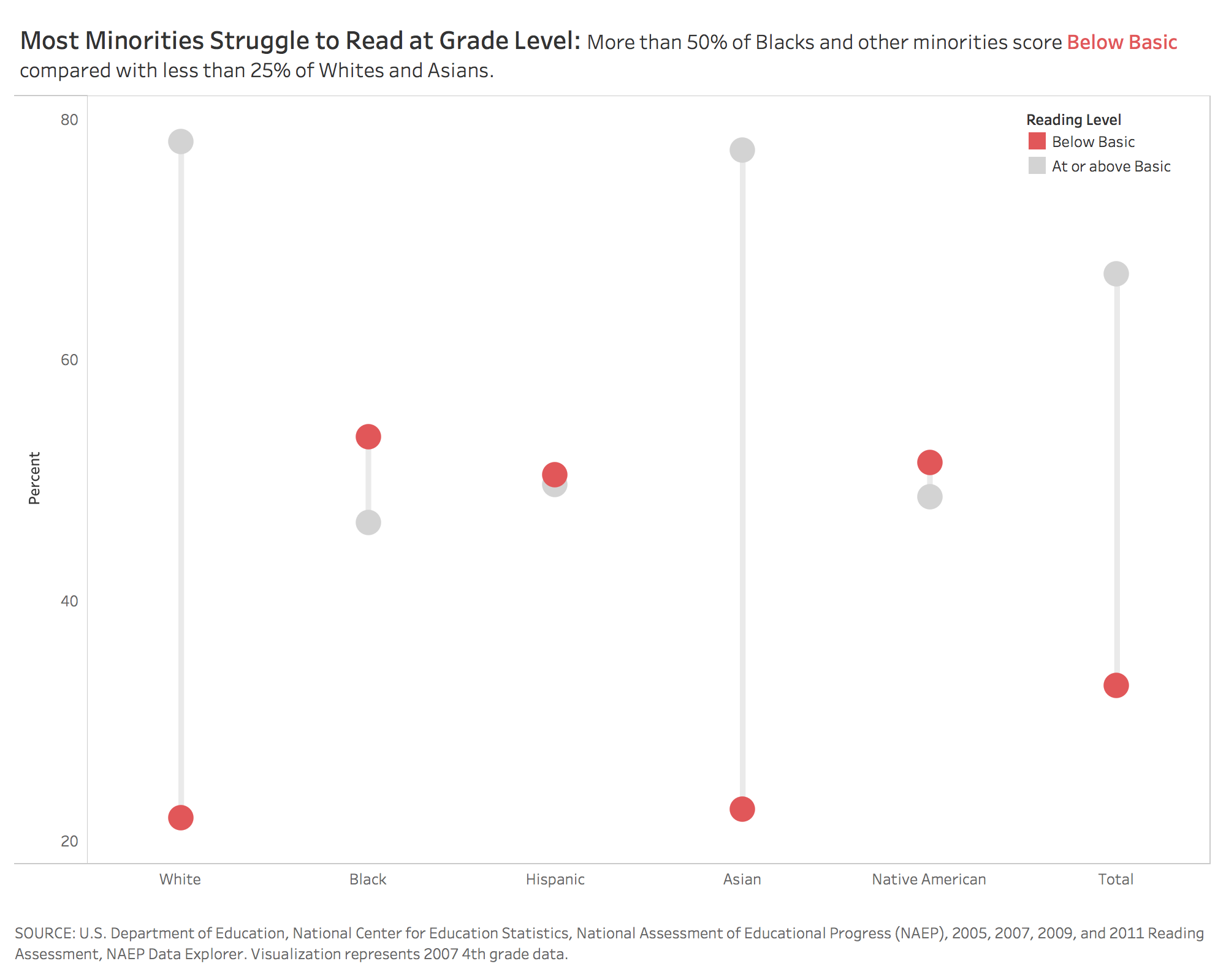
Data from the Department of Education is striking and concerning: already in 4th grade Black, Hispanic, and Native American populations struggle to meet Basic reading criteria compared with White and Asian students. Twitter
Sean
Sateesh
For February's Black History month challenge, I looked at HBCU data to find if there is a growth in HBCU - Degrees Conferred from 1976 - 2001 among Women. From the chart, we can see from 1976 to 2001, Doctor's- Women degree conferred rate increased by 729% followed by First-professional Women (394%) and Doctor's Men (293%). Overall Women's rate seems to improve and Men's rate on the decline. Blog: https://Vizard.co | LinkedIn: Sateeshkumar
Sarah
For this challenge I decided to look at the under-representation of teachers from black and minority ethnic (BME) backgrounds in schools in England. While England is a relatively ethnic-diverse country, the vast majority of teachers still come from white backgrounds. As a result, students from BME backgrounds are more likely (than white students) to struggle to find role models they can relate to in their school teachers. Taken at face value it is easy to assume that teachers from BME-backgrounds are less drawn to careers in teaching. However, this is not necessarily the case. According to the findings of a recent study there is evidence of everyday racism in schools and colleges including discrimination, harassment, ostracism, lack of pay progression, and BME teachers being held back from promotion. Taking these factors taken into account may go some way in explaining why the under-representation still exists. You can interact with my full visualisation on Tableau Public.
Sara
Reading this month's theme Black History Month and Education, I thought of Ruby Bridges, and how her young age of 63 makes you realize even more how recent school desegregation is. While looking into this, I came across a dataset at ProPublica listing all school districts that are currently (as of 2014) still bound by desegregation court orders. Recent, and very current. Tools used: d3.js Twitter
Sagar
I have used very basic calculations.Twitter | Tableau Public Version
Rob
This didn’t turn out as well as I hoped. The map maybe a bit over the top for this challenge, but maps seemed to be a little ignored in your work, and getting 32,000 areas on a map in semi-coherent way is a challenge.
Paula M.
My submission to #SWDchallenge celebrating #BlackHistoryMonth2018 shows the Undergraduate Enrollment by Ethnic Category at Harvard University. Inspired by my relative @CopeteAntonio and his latest article. Tableau Public | Twitter
Pamela
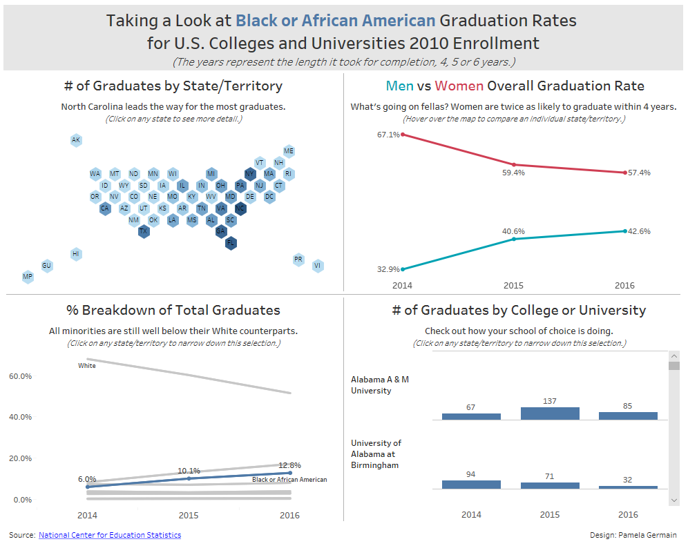
I created my visualization with Tableau 10.5 using the 2016 file for the 2010 cohort from the National Center for Education Statistics website. There was so much data that I narrowed it down to just 3 group types of completion in 4 years or less, 5 years and 6 years. From there I wanted to show a state breakdown and used a hex map so I could fit it in one of the quadrants. For color I stuck with black, white and gray as the background elements and blue to represent African American. However I needed to also show different colors on the gender chart, so I picked a teal and red. The splash of color is minimal and doesn't take away from the overall effect. My audience as I was creating this, was for it to be a tool for families with teenagers looking for a school with a good graduation rate for Black/African Americans. Tableau Public | Twitter
Pablo
I found this dataset fascinating as there is clearly a big gap in scholarships between White/Caucasian Students and Black or Hispanic or other minorities. Tableau Public | Blog | Twitter
Olga
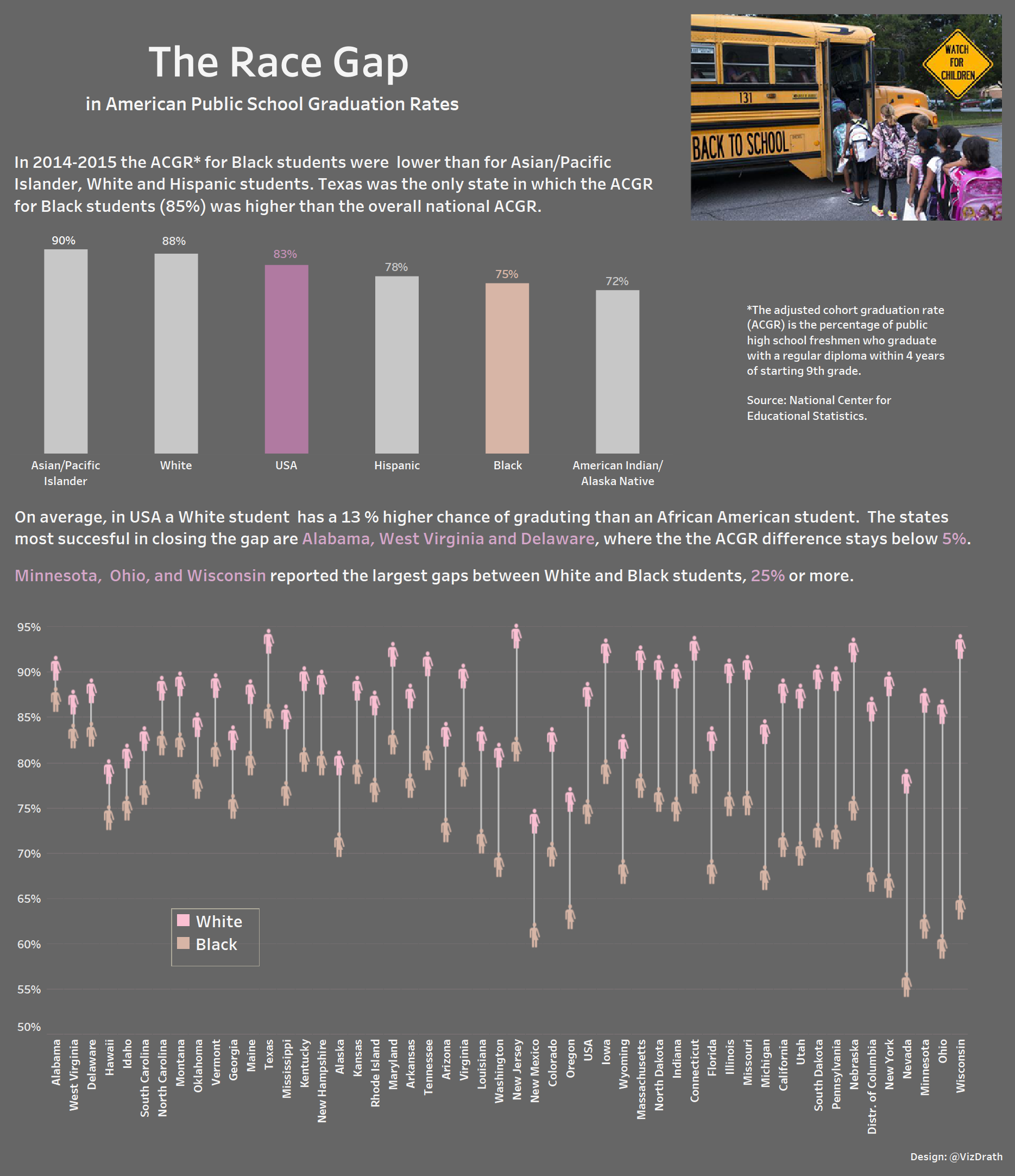
The Graduation Race Gap in American public schools. Interactive Viz. Design by @VizDrath.
Nick
Here is my #SWDchallenge dashboard on Ida B. Wells. I wanted to find someone I didn't know about and share some of the high points that I learned about them. She was a pretty remarkable person. Hopefully it works for what you asked for in the instructions even though it's not directly measuring anything in education, but rather providing some educational material for others that may not know about her.
Neil
My competition entry centres around Oxford University. There was a bit of press recently about the fact that some Oxford and Cambridge colleges don’t have a single black student. In such a multi-cultural and multi-ethnic country as the UK that staggered me! So I’ve found data from the Oxford University website (and also some national demographics from ONS, the Office of National Statistics) to produce a simple line/area chart. I’d love your feedback—one of my concerns is that I’ve inadvertently split the chart into what feels like two separate charts and they are not in intuitive order. @theneilrichards
Munazzah
I looked at the ethnic divide in educational attainment at the school level in England. I compared the performance at GCSE level in English and Maths of students from ethnic minority backgrounds to White British pupils who made up 93% of pupils who took these exams in 2017. More details here.
Mike
Two of the most highly regarded HCBUs are Spelman College and Howard University. In the U.S. News College rankings for 2018, they are they highest-ranked HCBUs in their respective categories (national liberal arts college and national university). Interestingly to me, they are also relatively affordable--as are almost all HBCUs--for the educational value they provide. While no college could really be said to be truly "affordable," these two institutions are among the best in terms of quality-per-tuition-dollar available. Tableau Public | Twitter
Mark
Immediately when I saw this challenge I recalled discussion in the UK news around the inequality reported in the process of admitting students to Oxford University. Fortunately, someone had already placed a Freedom of Information Request, so I don't have to go far to get the data. I build this slope graph using Tableau, and tried to keep as much text away from the lines as possible, whilst also ensuring that the labels were close enough. I was sparing with colour, but decided to encode one of the types of school in blue to denote that which shows the greatest difference in acceptance rates, which I deemed to be the most significant thing I wanted my reader to take away. Twitter
Lorna
Where does your UK university stand with Ethnicity markers. Tableau Public | Twitter
Lindsay
My entry looks at the declining drop-out rates for males and some of the protective factors that may help our young Black boys complete high school and go on to college. Tableau Public | Twitter
Kent
I used Python and matplotlib to create this visualization. A more thorough write up can be found on my ipython notebook.
Kat
Growing up in New Zealand I wasn’t given an education in Black history. For me, this month’s data storytelling topic was an amazing (very small) insight into American history.
My biggest challenge was attempting to understand an audience (diversely opinionated and with a possible strong inherent bias) and present data in a hopefully non offensive way—without losing the story. This was built using Adobe Illustrator (link).
Julià
We analyzed weekly connection patterns of new students and found 6 clusters, four of them (in light blue) representing a different pace (6-7 days per week, 5 days per week, etc.), and the other two showing disengagement (in red), one from the very beginning (like "I don't know what I'm doing here") and the other after a few weeks ("I tried, I failed, I quit"). The dropout rate for these two groups is clearly different, providing us with some hints about when and how to detect students at risk.
Jeremy & Sarah
For the topic of education we decided to look at education rates in Africa: specifically, how many children are enrolled in primary schools in each country. As “colour” was one of the key aspects of the challenge this month, we opted for a choropleth heatmap: not only is this an inherently colour-based approach, we felt that a map would best show how low scores tend to have geographical grouping. (We tend to find calling this graphic a “choropleth heatmap” gives laypeople more of an idea of what we’re doing).
Having used the data set of all children for the main map, we wanted to drill down and see what the gender differences were like. Here we focussed on the biggest differences in enrollment rates between boys and girls – but retained the colours from the first graphic in the country name labelling, to give an at-a-glance idea of whether there was a correlation between big gender gaps and low enrollment rates (and there is some crossover between poor performers in each area). The second chart highlights the gender difference – but also allows viewers to tell if a big gender gap sits in the context of overall high enrollment. We deliberately opted for white for this section, rather than ‘usual’ boy/girl colours because a) that always feels like a speed bump, as readers ask themselves if stereotypes are at play b) we wanted to make sure colours referred only to the main map.
Jennifer
I selected the number of degrees conferred by race/ethnicity groups. When I was playing around with the data it just struck me that hispanic and black students were earning the majority of awards within their group in the lower degree levels (Certificates and Associate degree) which would translate to lower earning power, while white student proportions continued to rise at the higher degree levels. Tableau Public
Jeff S.
Here is one for the #SWDchallenge using color and language on educational data. It's a viz from a few years back on Ohio Schools data. The use of color was pretty simple throughout, but done in chalk colors to match the theme of the viz. The colors of the classroom and chalk board stood out, so I was especially careful to pull back the use of color throughout the viz. Related blog post | Tableau Public
Jeff P.
Himanshu
Showing distribution of donations/gifts done by prospects for US universities and how it's spread across major field (field where donation was allocated). Size of circle shows magnitude of gift amount. Data Source | Tableau Public
Gina
Note: this is a cropped version, the full interactive visual can be seen in related blog post and Tableau Public.
Emily
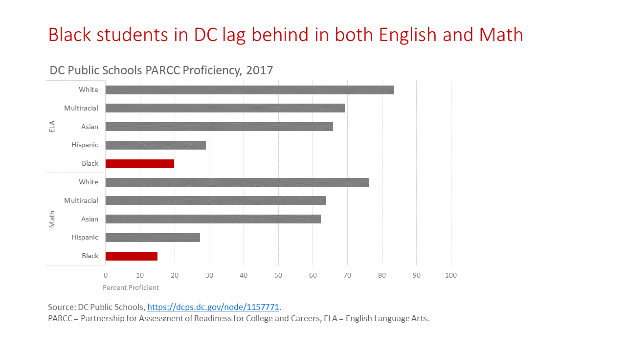
I used Excel and data from DC Public Schools to highlight how the performance of black students on the PARCC lags behind that of other groups.
Elizabeth
I'm a huge fan of our local media company Charlotte Agenda and although my child is years from attending kindergarten, I like to stay informed about the many educational choices available. I appreciated this recent article on the cost of private tuition but I didn't see this takeaway until I visualized the data. The power of data visualization! Connect with Elizabeth on LinkedIn | Twitter.
Elena
My submission was developed in Tableau with a focus on the representation of black people in UK academia. I initially wanted to use only data on academic staff but after I realised how underrepresented this ethnic group of people is, I expanded my scope and looked and the trend in newly recruited postgraduate research students, as I think that this is often the time when one starts to seriously consider the possibility of pursuing career in academia. I used several charts and combined them in an infographic-style dashboard with no built in interactivity - in this way I had to ensure that I maximised the use of text and colour to highlight the areas of importance. I took inspiration from last year's week 48 #MakeoverMonday submissions of 'The world as a 100 people'. I also decided that to deviate from your tips and go with a 'curious' rather than 'takeaway' style title. The data is obtained from the public data releases by the Higher Education Statistics Agency (HESA). The dashboard can be viewed (and downloaded) from my Tableau public profile but you can also follow me on Twitter. The visualisation was developed as part of the #VisualisingHE project.
Eduardo
Divya
Dilyana
I wanted to see if there are any correlation between students, who graduated within 4, 5 and 6 years. I thought, the scatter plot is the best choice. I can see there is a positive correlation, so the more students graduated within 4 years after starting in one university/college, the more students graduated within 5 & 6 years after starting at the same university/college
I created this vis with Tableau and published it here. I tried out a lot of color combinations and at the end, I decided to use dark red & dark blue. Twitter
Dave
My visualisation uses the excellent open data provided by the UK higher education statistics agency. I looked at the diversity of students and which subjects are more diverse. I used waffle charts which are a bit of fun but I think worked well in this instance. Related Blog Post | Tableau Public | Twitter
Dan
This is a newer version of a data visualization that I did in Josh Tapley's Data Viz class at Temple University. I butchered the color and the call to action in the earlier version. I hope I did a better job this time. Working off a red and black logo is tough! I debated not using color (only shades of gray) in the heat map, but in the end decided to add color to that, too.
I used Tableau. My thinking was to shed some light on how Freshmen do in their first term of College. Grade Point Average is a good indicator of how they are doing, and whether they will hang in there for the duration. Do some students do better than others? Who are they and what are their challenges? Student retention is a big data analytics subject in higher education. This is a very high level look at a very detailed and complicated subject that is dependent on many variables. Twitter
Conrad
Colin
My entry this month looks at matriculation rates at the University of Washington amongst different ethnicity groups from 2006 to 2014. The slopegraph highlights the increase in matriculation rates amongst African American students despite decreases from all other ethnicity groups. The visualization was built in Tableau using data from the University of Washington's Office of Minority Affairs & Diversity. Interactive version.
Charles
This was made with Tableau. Although it is fairly simple, I found that it really showcased how much the gap was widening between men and women over college degrees (for the period covered by the data). I also looked at the numbers by degree level, which showed that more women graduate at all levels, but it was a little bit more distracting for the reader than this “plain” timeline. LinkedIn
Chantilly
This week I decided to focus on the HBCU experience via a survey that I found from Gallup- Princeton University. I attended an HBCU, Howard University, and found it interesting that the results aligned with my engagement and well-being post grad life. Through use of a simple chart and color highlighting I was able to visualize the positive results of African American HBCU graduates that were surveyed. Twitter
Brittne
I used Tableau. I played with different views but I really got interested in the sharp decline in Education PhDs and the shock at disproving my false narrative about Psychology PhDs (overall ranking position- 7th. I thought it would higher). Tableau Public | Twitter
Alistair
After finding a suitable dataset (High School graduation rates), I wanted to understand how attainment changes not just by ethnicity but also across the country. Yes the national trend is showing improved graduation rates yet within this high level approach there are a number of stories.
Small multiples by states:
- A number of states consistently show attainment rates below that of the national trend, these include D.C, the South East as well as the Pacific Coast.
- I’ve used a modification of the Hex Map concept to show the variation against the national rate. I toyed with using a multiple map in grid format, however thought that this approach helped to bring out the effects at the regional level – quite useful for a Scotsman who isn’t particularly well versed in American Geography.
- Colours – I’ve used a warm maroon as being positive and a cool green as being negative. No particular reason for this other than to avoid using Green / Red (Colour blind) and Red / Blue (Political Parties).
Hex Map:
- I’ve used colour in the Hex map at the bottom to highlight the differences between White and Black students. I found this interesting as the large differences between ethnicities don’t necessarily relate to poor performing states.
- For example in the state of Wisconsin the overall performance is much higher than the national average, however black students are far less likely to graduate with a rate of 64.1% compared with their white colleagues 92.9%.
Adam
February's challenge centred on education, raising awareness for Black History Month, for this I have focused on undergraduate UK UCAS acceptances to UK higher education. This chart depicts the percentage change in acceptances to UK HE between 2006-2017 by gender and ethnic group. I annotate a few key points in time to add some context to the changes over time, add a takeaway to add to the descriptive title. Blog | Twitter | LinkedIn | Tableau Public
I'll wrap up by expressing my huge thanks once more to everyone who participated who took the time to create and share their work. Thanks also to those reading (if you've come this far, please click the ❤ below—it's a good stat to help reinforce that the work to post all of these is worthwhile) and stay tuned for more #SWDchallenges to come!


