bring on the bar charts
This month's #SWDchallenge was a straightforward one: create a basic bar chart. We sometimes avoid bar charts because they seem common or boring. Our view is that's the wrong approach. We should use them and use them frequently because they are common. The beauty of a bar chart is that our audience already knows how to read them and they can instead focus on what the data actually says. So we challenged you to teach us something new with a basic bar chart with bonus points for thoughtful use of color and annotations to call action to the main takeaway.
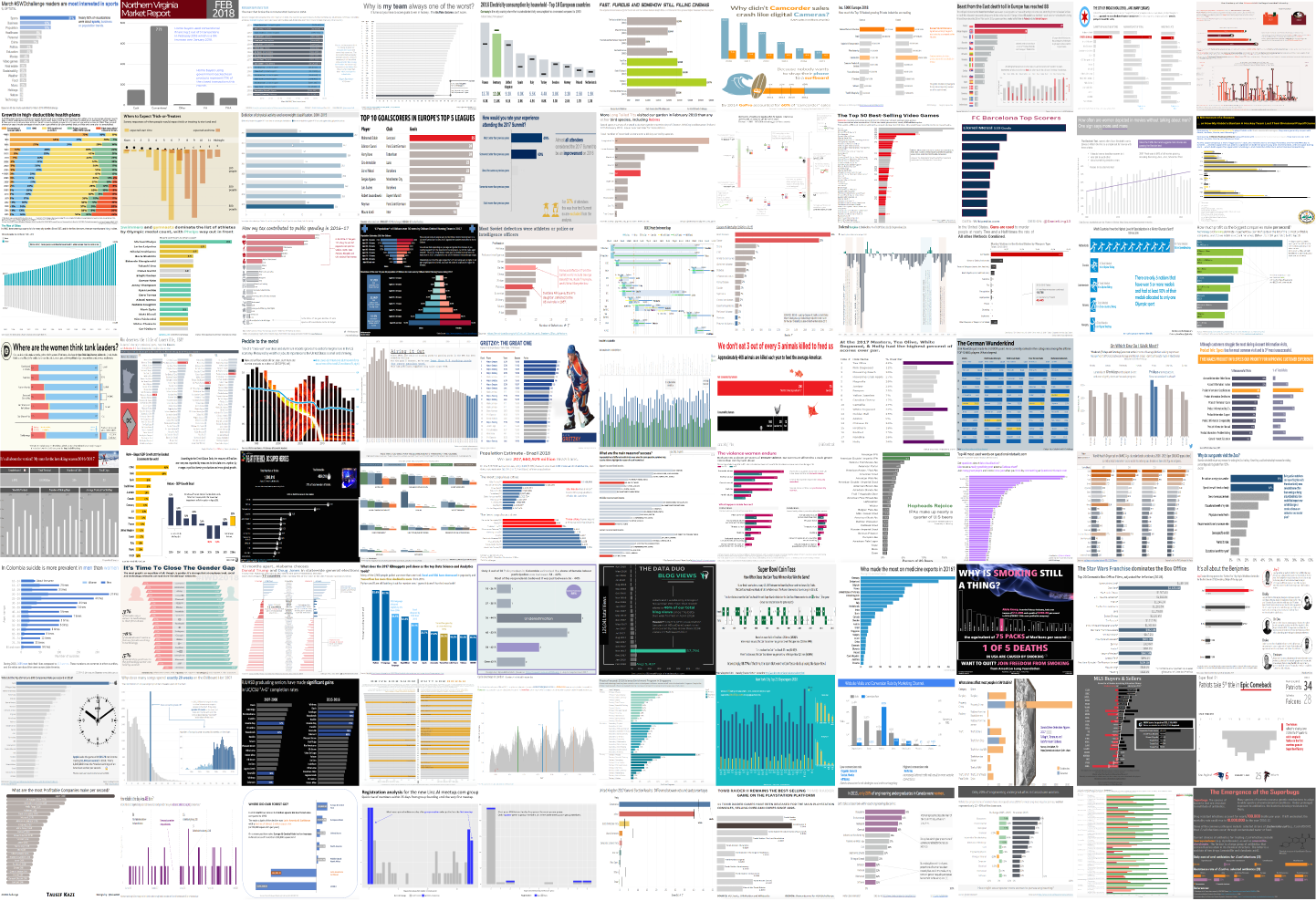
85 of you delivered, with bar charts ranging from single series vertical & horizontal to stacked to diverging. In keeping with the theme, we visualized your chosen topics to see what's trending on #SWDchallenge readers' minds.
Within the business category, profitability of top companies was top of mind as three readers—Josh S., Sateesh and Tausif—chose the same dataset! (Possibly a #MakeoverMonday repurposing?)
A couple notes to those who submitted examples: THANK YOU for taking the time and sharing your work. The makeovers are posted below in alphabetical order by first name (+ last initial when needed; we omitted full last names in respect of those who would rather remain anonymous). If you tweeted or thought you submitted one but but don't see it here, email your submission (including your graph attached as .png) to swdchallenge@storytellingwithdata.com and we'll work to include any late entries this week.
Without further ado, here is a recap of March 2018's #SWDchallenge submissions. As you scroll though these, notice how easy it is to actually see the data! We can't overemphasize the beauty of the basic bar chart.
Abraham
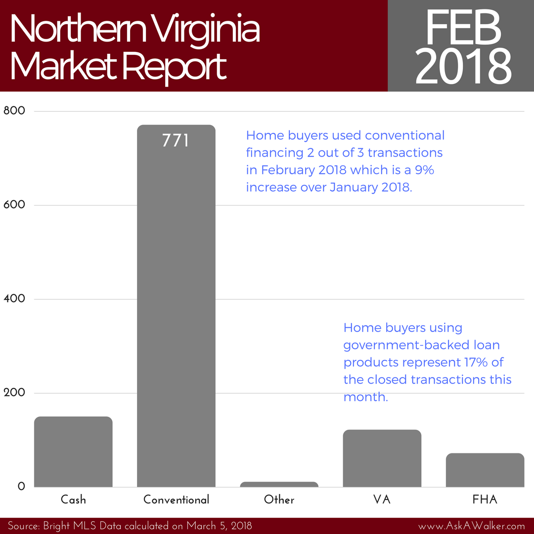
Conventional financing represented two-thirds of the Northern Virginia real estate transactions in February 2018. Home buyers using government-backed financing will have challenges competing against individuals using conventional loans in the upcoming spring selling season. This chart was designed in Canva. Visit www.AskAWalker.com for the latest real estate sales trends in the Northern Virginia area.
Adam C.
I created a basic bar chart showing why my hockey team is in second to last place in the NHL. It turns out you need to actually score to win in hockey. I stuck to minimal monochrome colors used only to call out my team's performance in this area. I scraped hockey-reference.com with Google Sheets and visualized the data in Tableau. Link | Blog | Twitter | LinkedIn
Adam G.
March's challenge centered on the humble bar chart, the data subject, a homage to the recent passing of Sir Roger Bannister (3rd March 2018), the first man to go under 4 minutes to run a MILE. This viz focuses on the world record holders below this magic 4 minute barrier, set in 1954.
Blog | Twitter | LinkedIn
Adolfo
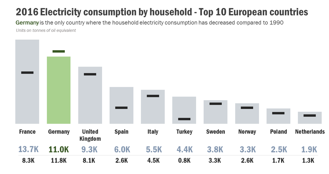
Just a simple bar chart comparing the Electricity Consumption by Household in 1990 vs. 2016, just 1 country is consuming less electricity compared to 1990, Germany. For the 2016 values I used the bar charts and for the 1990 values I used a dash, I cannot add the value labels on the bars due to lack of space and the graph would look crowded so I decided to put the values at the bottom of the chart, just below the name of the countries, the 2016 values are bigger and the color is the same as the bars; the 1990 values are smaller and they are in black. The issue with Excel is that sometimes, if you want to add details, you practically have to handmade your chart, in other BI tools just a few clicks and done however I still love the detailed process that involves vizzing in Excel! Twitter | LinkedIn
Alistair
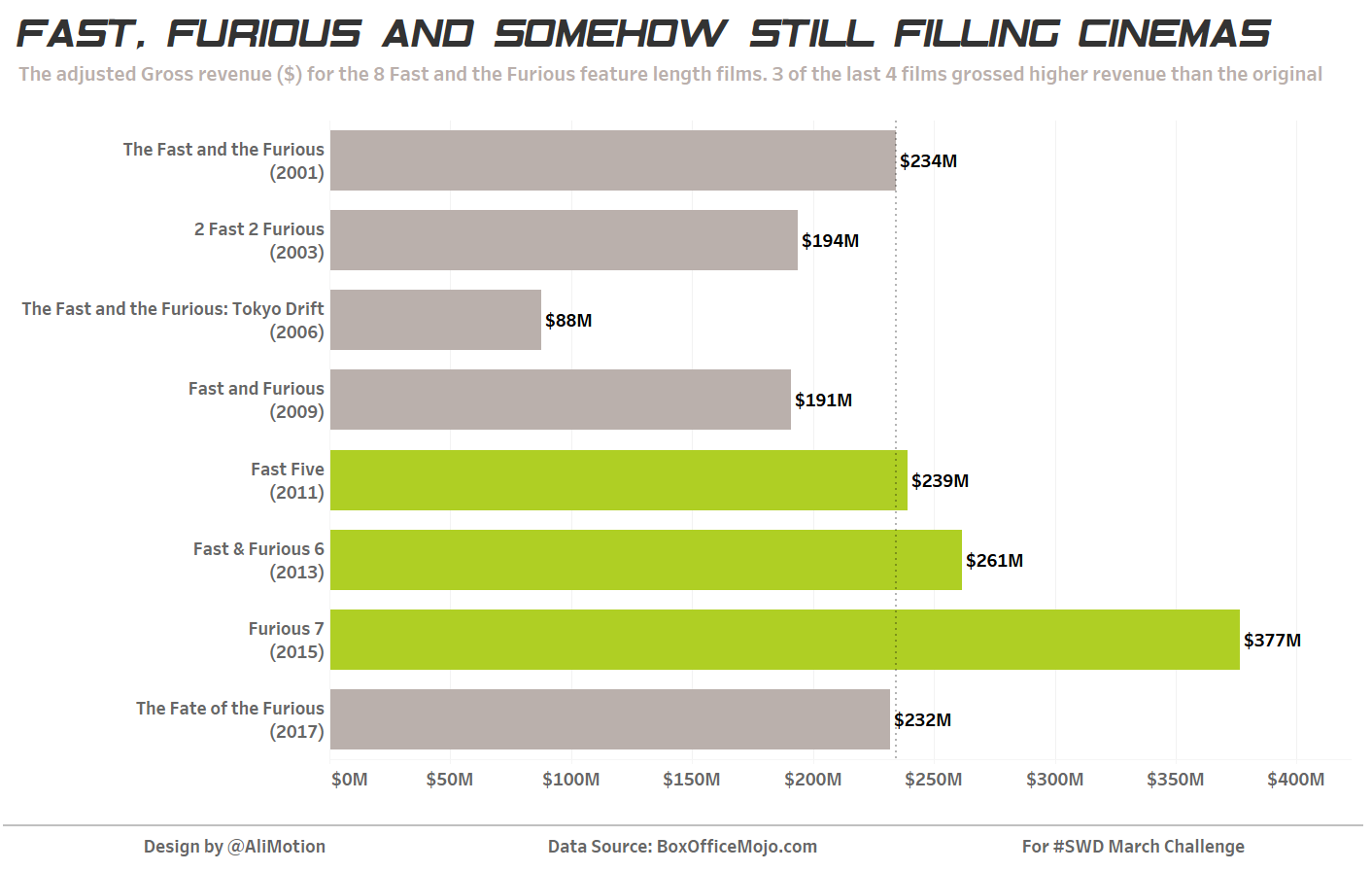
For this month's challenge I was rather shocked to hear that there were as many as 8 Fast and the Furious films. If I'm being honest I think they should have stopped at 2 maybe 3 but 8 (with plans for more) seems excessive. I've made a pretty simple bar chart showing Adjusted gross revenue in chronological order of film release date. I've used colour to highlight those films that have exceeded the revenue of the original film and have used a reference line to help with the encoding. As I said nothing very fancy but I did download a similar font to the one used on the film posters and chosen the colour of the original car in the film. I did consider sorting by descending revenue but thought the film order possibly helped with the story as people would ask what order they were released.
Amulya
I enjoy watching football but not that much if my team is struggling so bad. It is fascinating to me how bar charts are so simple and yet convey so much information when it comes to population size comparisons. I know goals scored are not the only determining factor for ranking in sports, especially in a football league as competitive as the English Premier League. But a team has go to outscore their strongest competitors at the minimum if they want to stand a chance.
Amy C.
Bar charts don't have to be boring! They can be playful and maybe even spooky. These use Halloween data and bring in other elements to make them more visually interesting, while keeping data integrity. Twitter
Andy S.
In BYU’s management communication program we teach students to write, design, and speak. We emphasize the techniques of storytelling with data when it comes to visualizations. This visualization, built primarily in Microsoft PowerPoint, explains a pattern I discovered in some market research while preparing a presentation on disruptive innovations.
Apara
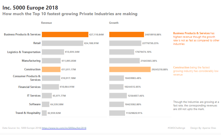
I have created a simple bar chart depicting the fastest growing private industries and the revenue made by them. Tool used by me is Tableau.
Athan
For this challenge I decided to visualise the fatal effect of the recent “Beast from the East” cold wave in different European countries, focusing on Poland and the UK where almost half of its victims were based. You can view an interactive version on Tableau Public and reach out to me on Twitter for comments or feedback.
Brad
Brent
This infographic chronicles the history of college football games between the University of Miami and Florida State University. Three interrelated bar charts tell the story of this rivalry. I built the visual in Tableau, and the interactive version is on Tableau Public.
Cassandra
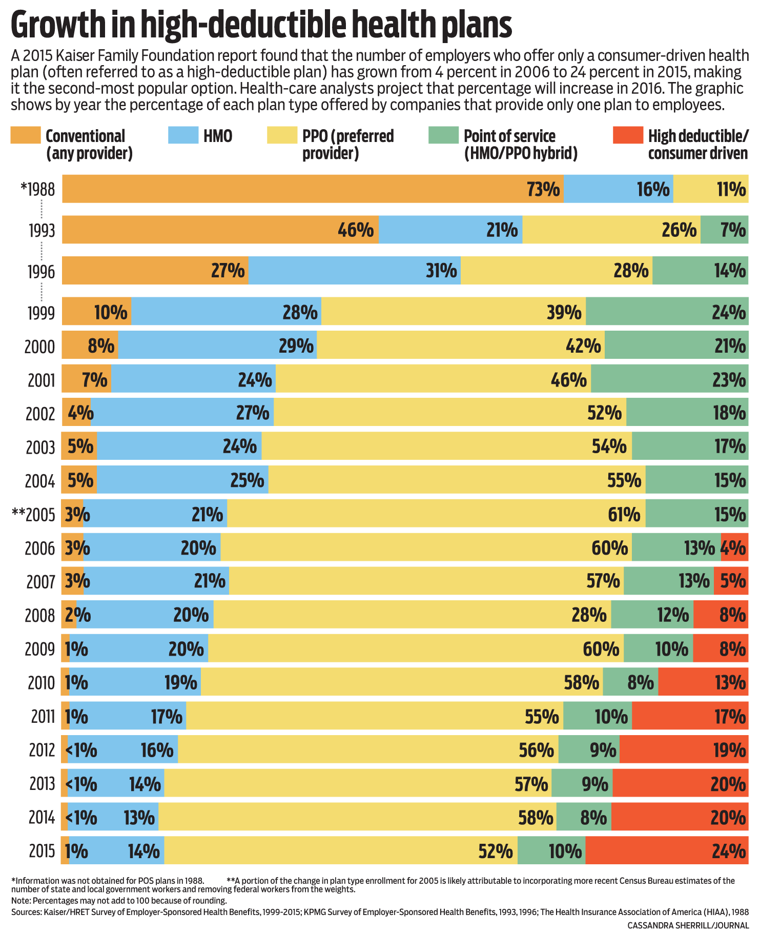
Here’s a big bar chart I did several years ago for the Winston-Salem Journal about health-care plans. It’s a bit of a different presentation from a “typical” bar chart, since the bars are stacked and their totals are the same. I felt that was the best way to show the shift in plan usage over time—since there are so many bars, it would’ve been unwieldy and much less clear if all the plans for each year hadn’t been stacked. (I never like graphing when there are years of data missing, because it can create false impressions, but in this case we felt the data was valuable. I spaced those bars out more than the others and added the dotted lines between years to indicate the separation. Still not sure that was sufficient or the best thing to do.)
Charles S.
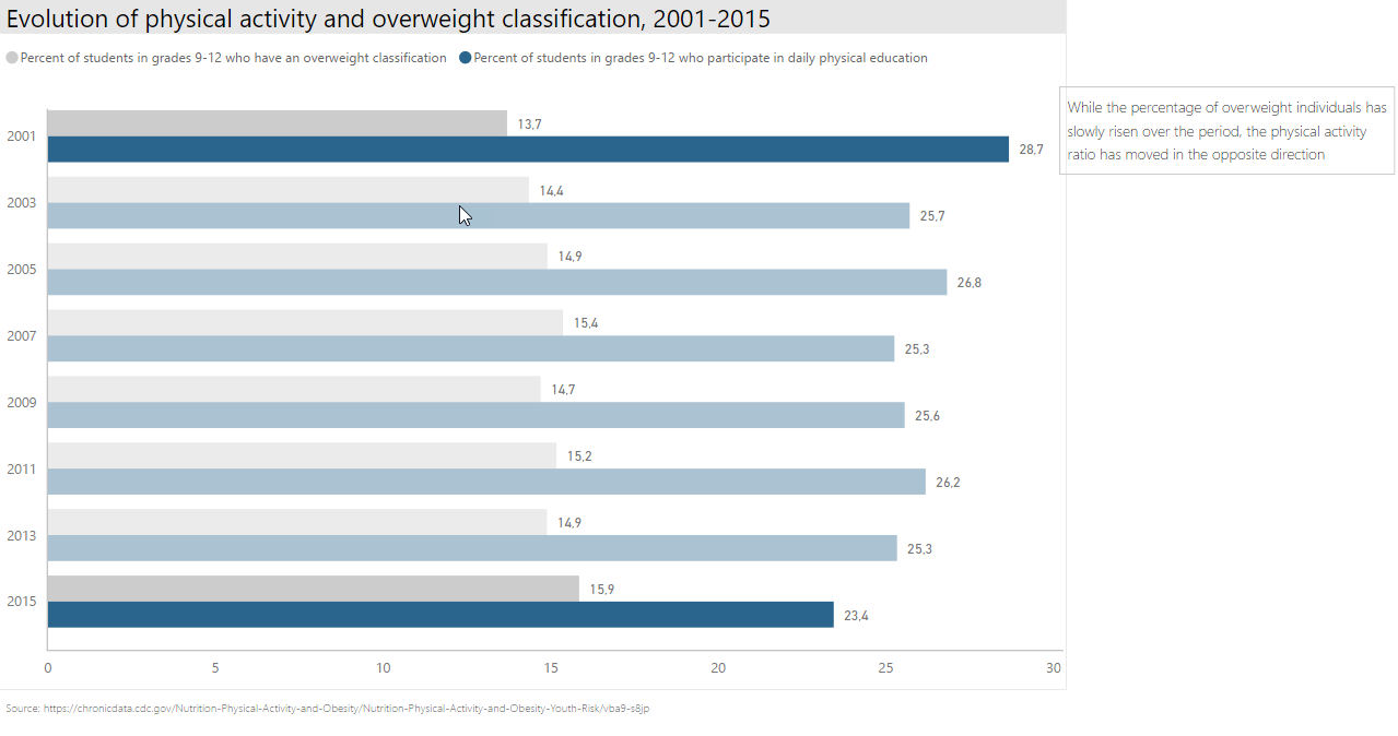
For this month's entry, I have produced the following bar chart from CDC data. This was made with Power BI, and underlines how physical activity and the proportion of students classified as overweight are going in opposite directions for grades 9 to 12 students over the period covered. Although we cannot speak of (negative) correlation, I find that the bars make it easy to underline the trends for the dataset used.
Charlie H.
I was watching some Premier League football in the UK here, saw a guy score and knew he was one of the top scorers in Europe and decided to research and chart it. The colour is a reference to Salah’s team (whose team wear red), with all other teams pushed into the background with grey.
Ciaran
Colin W.
Here's a pilot viz for part of a collaborative project with my wife Ann, who is a keen small garden blogger. Her blog ‘Green City Gardens’ focuses on gardening in an urban setting, and particularly the role domestic gardeners can play in collectively improving the urban environment both for themselves and the wildlife with which we share our planet. We recorded how many birds visited our garden over a 10-day period in February 2018 including which species. The data visualisation aims to add insight to the title, use colour effectively as well as practice in bar labeling for a less cluttered look. I also practised the storyboard approach, which will inform the final version of the viz for the blog post. The Interactive version is available on Tableau Public.
Daan
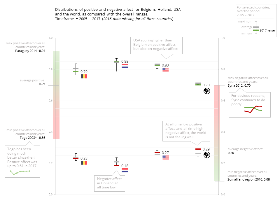
My analysis is the positive and negative effect data for three countries of personal interest (Belgium, Holland, and USA). All data from recently published world happiness report.
Daniel C.
I looked at the top 50 best-selling video games and how Nintendo console exclusives dominate the top 50. I added indicators to show where games have been bundled with consoles which can boost their sales. I also added a highlight action to show multi-platform games that were playable on Nintendo consoles. Data is sourced from Wikipedia. Viz on Tableau Public | Twitter
Daniel L.
I used Tableau Public to create the top ten FC Barcelona goal scorers.
Dave A.
With the Academy Awards and Times Up this past weekend, I was thinking about women in film, and wondering what data was out there. Luckily I found on data.world this great set on Bechdel test, which really asks "Is a female character a character in her own right, or just an extension of a male character?"
Dave N.
This bar chart was a quick and fun visual narrative of my kiddo's (unfortunately) one-and-done playoff hockey round. It shows how the playoff game very closely mirrored their overall seasonal results—essentially matching how they and their opponents played in all but the penalty categories (which ended up being the reason they lost the game). For creating the full dataviz, I gave myself a time limit, from pulling the data from our league's website to the final image creation, of no longer than the actual game time (which was 1:15 - an hour and 15 minutes). I did it in 1:14. : ) Twitter
David O.
Back in 2007, more folks lived in cities than in the countryside, so I tried to tell that story with some diverging bar charts. Made with Tableau, data from the World Bank. Tableau public link.
David S.
For my basic bars I decided to look at Olympic medal count, using colour to highlight gymnasts and swimmers, who dominate the list. I created this in Tableau and used the viz in tooltips functionality to add an additional level of detail.
Elena
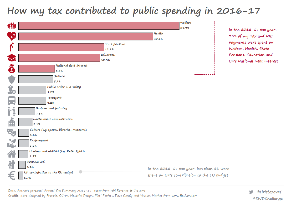
This is my second version of visualizing my annual tax summary showing how my tax and national insurance contribution payments were spent in the public sector. Here I see that 75% of my Tax % NICs were spent in the top 5 public sector areas: welfare; health, state pensions, education and UK's national debt interest. Read more about how I was inspired to create this visualization in Tableau in my recent blog post.
Ella
I thought I would share my latest viz that I have done for the UK health TUG around diversity as I really enjoyed creating a slightly different type of bar chart (diverging). This viz looks at some of our health care data comparing population figures to those seen by our local District Nursing teams in one of our boroughs in the UK. The district nurses provide an essential home based service to patients that aren’t able to leave their homes to attend clinics. The district nurses are amazing, and will go out in all weathers to ensure they see their patients!
Elsa
Emily
Last year I read the fascinating book Stalin's Daughter: The Extraordinary and Tumultuous Life of Svetlana Alliluyeva by Rosemary Sullivan. After Stalin's death, his daughter defected to the US. It got me wondering about other Soviet defectors during the cold war. Being a huge fan of ballet, I felt like most of the defectors I had heard of were ballet dancers. I was curious about the breakdown by profession. This chart is more exploratory in nature and was made with Tableau.
Gordon
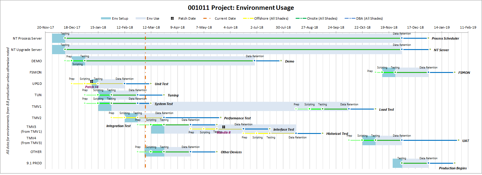
This isn’t “simple” but I couldn’t resist. I built this a few years ago in Excel 2010 for a project and the concept has proven useful. I updated the dates so the “today” vertical line shows up. Briefly, this displays the server environments and what happens in each of them during an ERP upgrade. Some environments were used for multiple phases (e.g. TMV 1 and TMV 3). We didn’t have enough hardware to keep all environments available all the time so we had to take them up and down and schedule the teams’ work accordingly.
Hemal
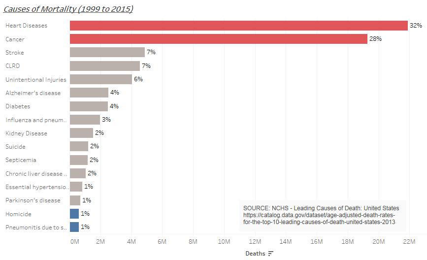
I pulled in causes for mortality, from 1999 thru 2015, on data.gov. I used Tableau to create this bar chart with a purpose to bring forth the comparison between the various causes of death and a hope that it educates people and helps align resources in fighting the most critical causes.
Twitter: @hemalsanghvi
Jambesh
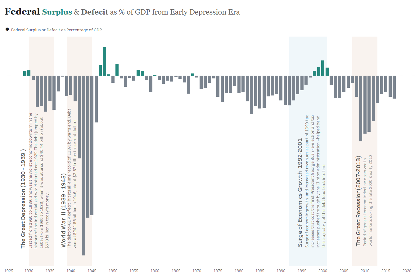
Here's a historical look at federal surplus and deficit trends over time.
Jamie B.
Tried to make it as simple and self-explanatory as possible.
Jason P.
Here is my submission for the #SWDchallenge in March. The timing couldn’t have been better since I was already inspired by the Winter Olympics and I was analyzing historical medal count data. I thought I would focus on some outlier nations that are extremely specialized in only one sport. The stacked bar chart is based on volume (medals in specialized sport and medals in other sports). Percentage is also a key factor in the story, but I chose not to visualize that information because by definition, these are the only nations with at least 90% of their medals in one sport. Visualizing percentage could be useful information, but the trade-off might be that I have too much information. These 5 nations are anomalies in terms of their extreme allocation of medals in only one sport. Hopefully, I have done these unique and talented nations justice by visualizing just how specialized they are. You can find me on twitter at @jaydpauley and on Medium.
Jeff
As the deadline for this challenge is midnight just before the beginning of International Women’s Day, I wanted to take a look at some gender-related data. I turned to the just-launched Open Think Tank Directory for a dataset on think tanks. The chart shows the share of think tanks in each region that are led by women, men and, in a few small cases, when they’re led by more than one person with a mix of genders. At one level, it makes sense to give the breakdown as a percentage of the total — but I also wanted to give a bit of context to these numbers, as our dataset is substantial but not complete. The chart on the right shows the number of think tanks included in each region and how many we have information about the gender of their leader. Who ever said you can’t visualize missing data?
Jeff P.
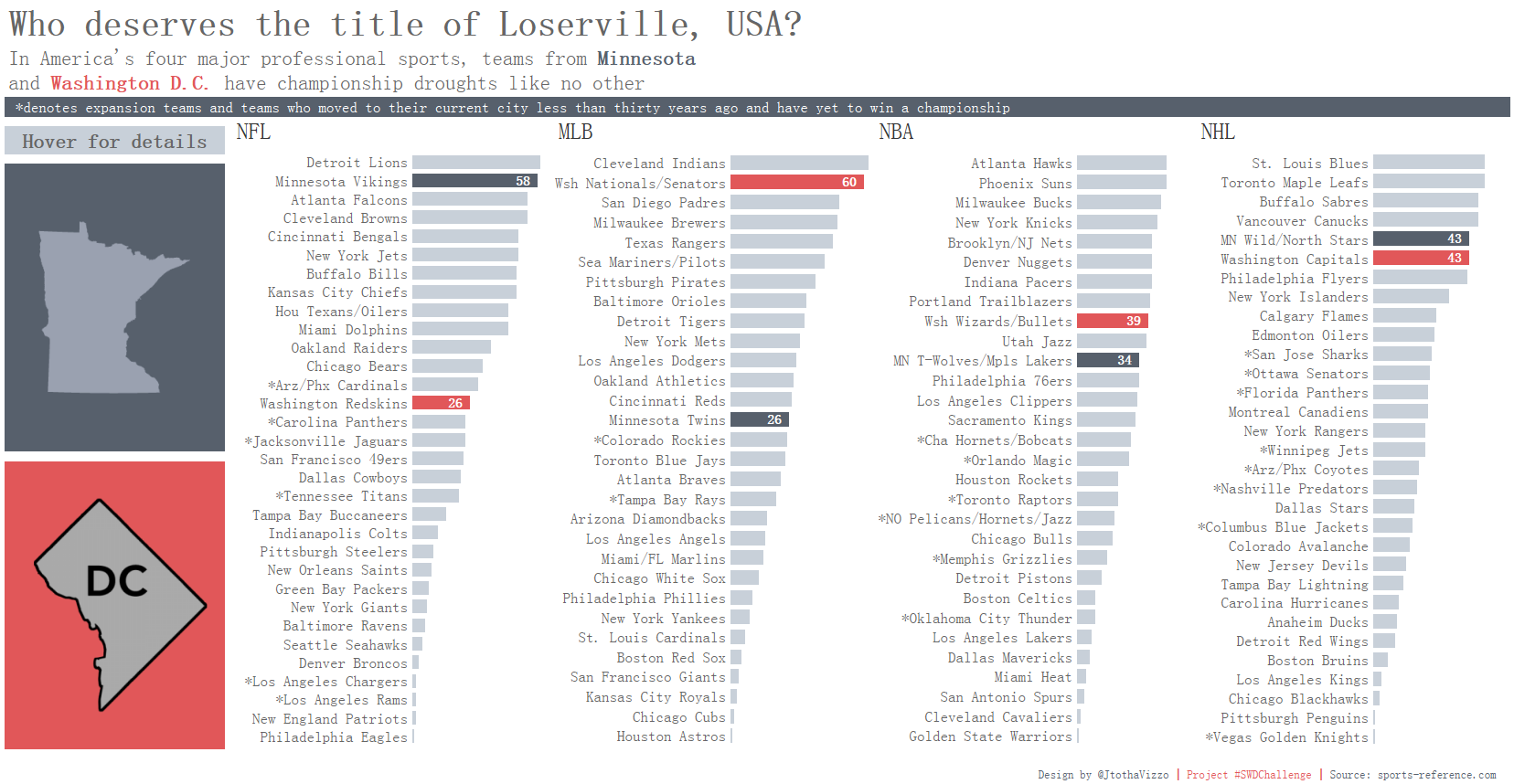
As a huge sports fan from Minnesota, I've been wanting to tackle this viz for quite some time to see just how bad our men's professional sports teams have been. My goal was to look at the four major professional sports in the U.S. and for each sport, sort the teams from most to least number of seasons played without a championship. I was certain the Minnesota teams would be near the top in all sports and had a hunch Washington D.C. teams would be up there too. However, I didn't realize just how close their droughts would be in total. I used color to call out just the teams belonging to these two fan bases and included maps that can be hovered on for more detail.
Blog | Twitter: @JtothaVizzo
Jeremy and Sarah
To pick a topical subject, we’ve looked at steel in the United States. US President Donald Trump is justifying the proposed 25% and 10% tariffs on US steel and aluminium imports on national security grounds, avoiding World Trade Organisation scrutiny as the multilateral trade body does not have the powers to rule against measures imposed on ‘national security’ grounds. However, our graphic shows that the steel and aluminium sectors are not as nationally important as Trump believes. We’ve tackled this as a bar (well, column) chart looking at the steel industry’s decreasing share of total US GDP and jobs since 1993. As this is a fairly simple time series, we’ve gone for eye-candy to engage the reader, creating the bars from a photo of a steelworks. We’ve shown the workforce share as a line on a second Y axis; we tend to tackle this by making sure the line, Y axis labels and legend use the same colour, with legends for left and right axes to the appropriate sides of the charts. The chart was first constructed in Excel, and then taken into Illustrator so we could do most of the finessing.
Jim S.
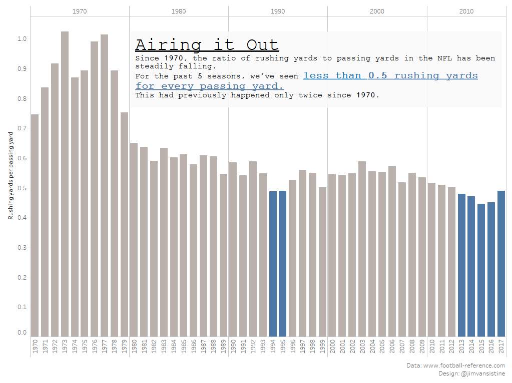
For this month's challenge, I looked at the ratio of rushing to passing yards in the NFL since 1970. Even with the trend falling steadily, the last 5 seasons have been historically low, built using Tableau. Workbook and data can be found here.
Josh S.
I love this data set because it makes big numbers easier to think about. As always, I started by discovering the story: figuring out who my audience is (the heroes), the big takeaway (the theme), how all the evidence supported the takeaway (the plot), and how the audience would consume the information (the setting). Then I worked on the narrative that would tell the story: how do I place my audience, as heroes, into the data story? How do I make the analysis relevant to them and invite them to learn? What visualization best illustrates the plot (spoiler alert: bar chart!)? And, of course, how do I flesh out the plot with the things that make the story worth experiencing: color, annotations, and other design elements. Once I had a general wireframe drawn, I built the visualization in Tableau.
Author: Joshua Dean Smith (find me on LinkedIn or on Tableau Public!)
Justin D.
When I was a kid, I loved watching Wayne Gretzky at the tail end of his career. Recently, I’ve been getting back into the NHL, so I decided to visualize the Gretzky's dominance in his prime for the #SWDchallenge | Tableau Public Link
Kat
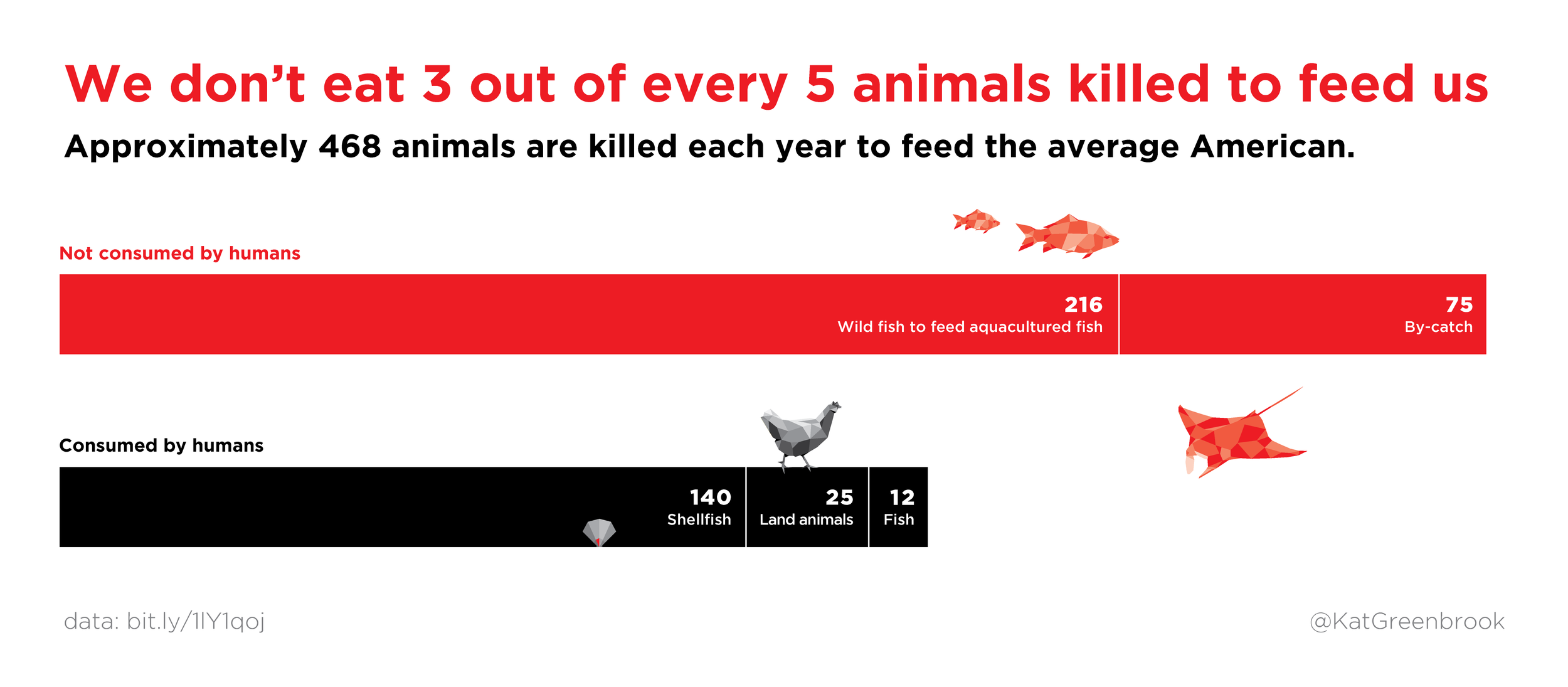
The bars may be basic but this chart went through a few iterations as my story kept changing! Data viz created using Adobe Illustrator.
Kate B.
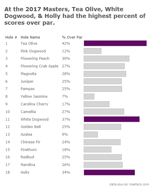
I used Tableau public to show the 3 hardest holes at the 2017 Masters golf tournament. I defined the hardest as the holes that had the highest percent of scores over par. I sorted the data by hole number instead of by the highest percent because as a golfer it seemed more logical to me to see them in order of the holes.
Kaivalya
I have made a bar chart to show the acceptance and the enrollment rates for universities in the US. The tool used to build the chart was Tableau. The data was only county wise. To get the state information, I used the zip code and mapped a code to the state. Also, the acceptance and enrollment rates were calculated as follows: Acceptance rate = total admits/total applicants and enrollment rate = total enrolled/total admits
Klaus
Created with Tableau | Tableau Public | Twitter
Kush
For March's #SWDChallenge, I have explored my 16 months of daily walking data collected from Moves App. The bar graphs visualize average and median number of steps I have taken for each day of the week. It is clearly highlighted that my weekends are comparatively more active than weekdays. Also since I am not much into outdoor activities, there are not many outliers in the data, because the average and the median are fairly close to each other.
Blog: vizoftheweek.com
Twitter: twitter.com/kushkul07
LinkedIn: www.linkedin.com/in/kushkul/Tableau Public: https://public.tableau.com/profile/kush.kulshrestha#!
Lea
I'm as big a fan of getting down to basics with bar charts, so I welcomed this challenge. But in data storytelling, I sometimes find that a single-measure bar chart is an incomplete story unless it is a precursor to additional context. So, I used one of my favorite visualization techniques which I learned in Stephen Few's "Now You See It" which is called a table lens, or side-by-side bar chart. It allowed me to compare categories across two measures. In this example, I created a build that started with a possibly premature conclusion with only viewing one measure, and completed it with more context around where the needle may be better moved. I also used a standout orange hue to call out an area of attention. Twitter | LinkedIn
Liyang W.
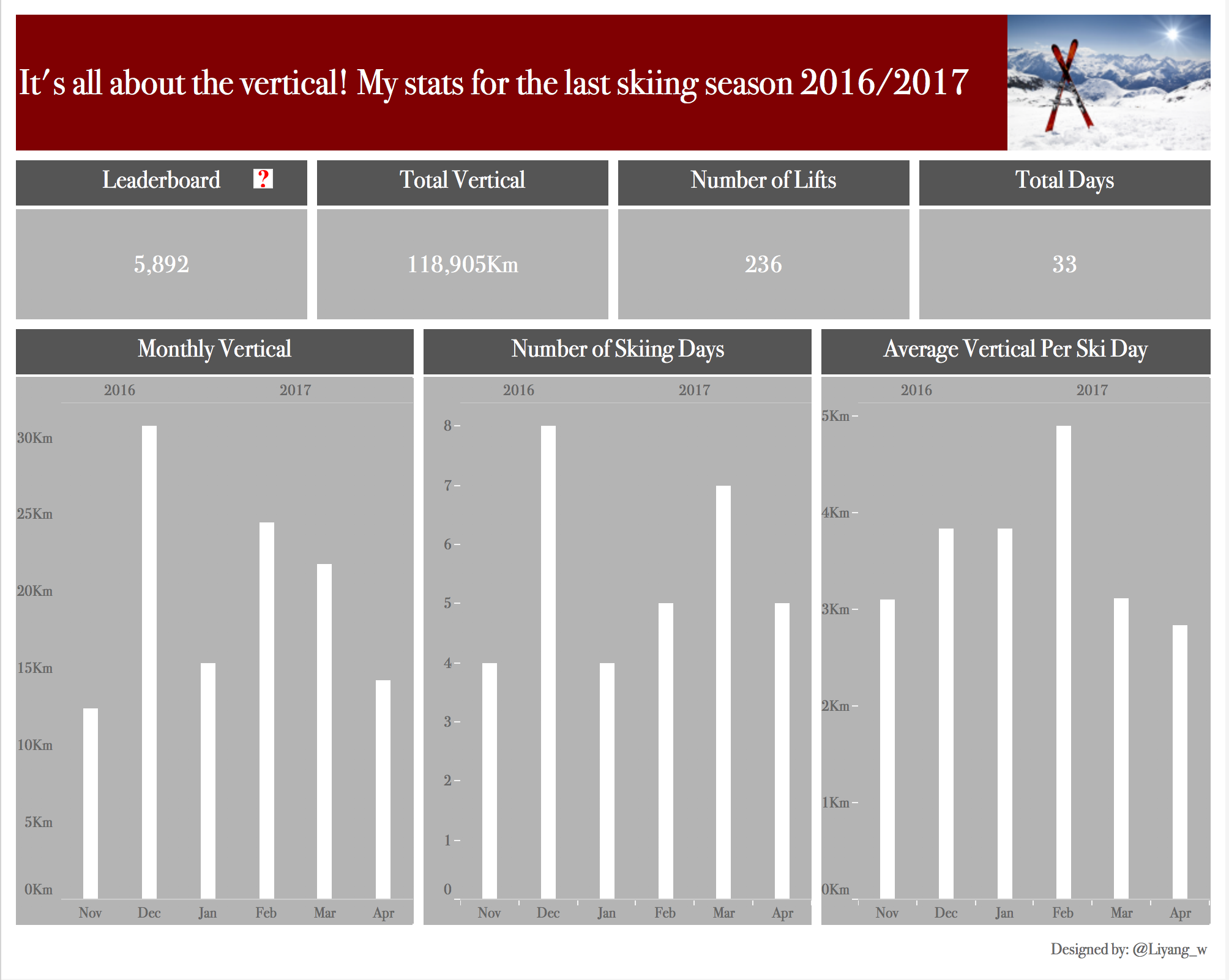
I ended up using my personal data for the chart, very simple.
Lorna
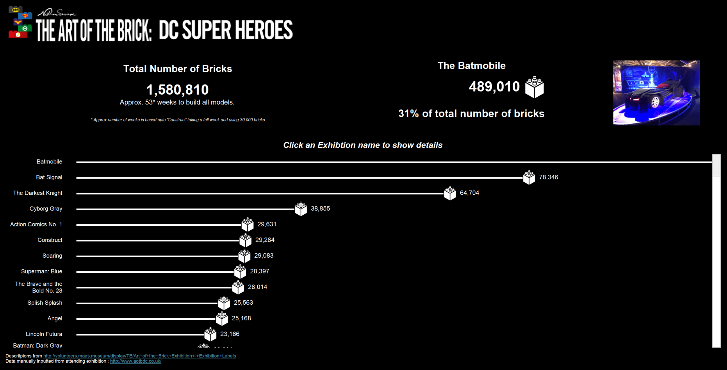
I went to an exhibition and wanted to show how many Lego bricks were in each model. By using the bar chart it allows the user to see the difference in number of bricks. You can then click onto the exhibit and see the description of it. Interactive viz
Mahfooj
Marcos
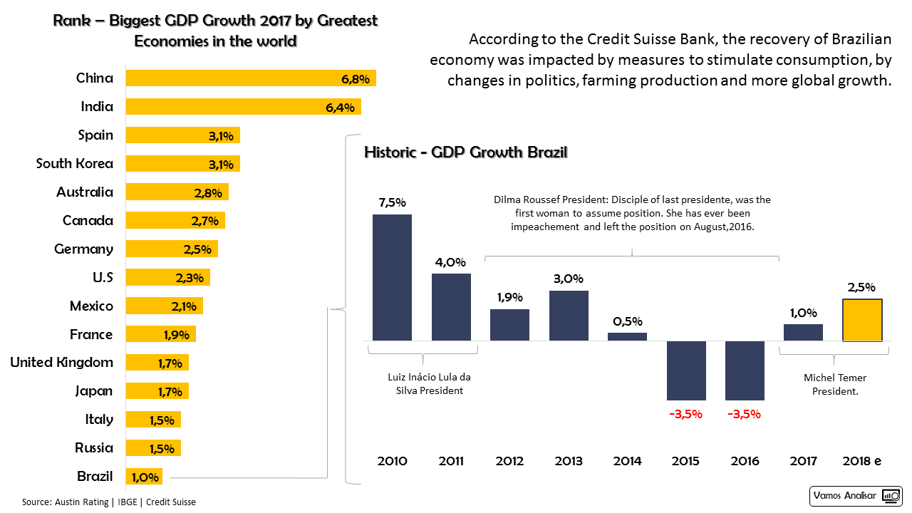
My submission is a look at Brazil's Population Estimate for 2017-2018. I only looked at most and less population cities, trying to emphasis the biggest and lowest ones. The data came from IBGE - Brazilian Statistical Office and I use Tableau for DataViz, because I'm trying to learn more about this tool. Interactive Viz
Mark B.
Michael
When Roger Deakins won an Oscar last night for Best Cinematography, the announcer mentioned that that was his first win after 14 nominations. So I got curious about who else has been nominated a lot w/o ever winning.
Interactive viz
Munazzah
While Women’s Day is all about celebrating women’s achievements, it is also important to reflect on what holds them back. Gender violence and domestic abuse predominantly affects women. I look at some stats on it from the UK. More in the post here.
Nathan H.
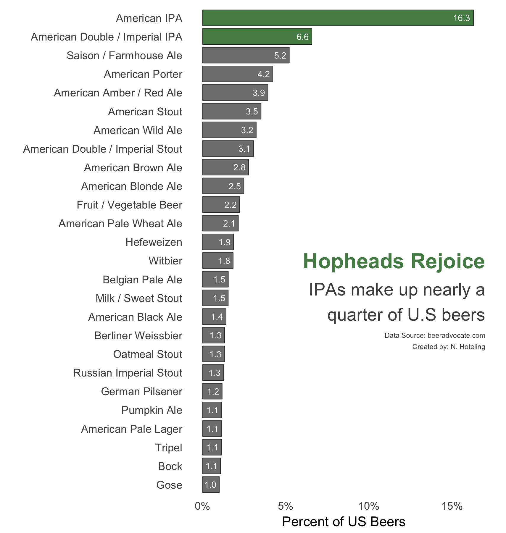
I scraped beer data from beeradvocate.com, filtered on U.S. breweries, aggregated by style, and calculated the percent of beers that fell into each style. To my delight IPAs and double IPAs came out in the top two spots. I used R to make the chart.
Neil
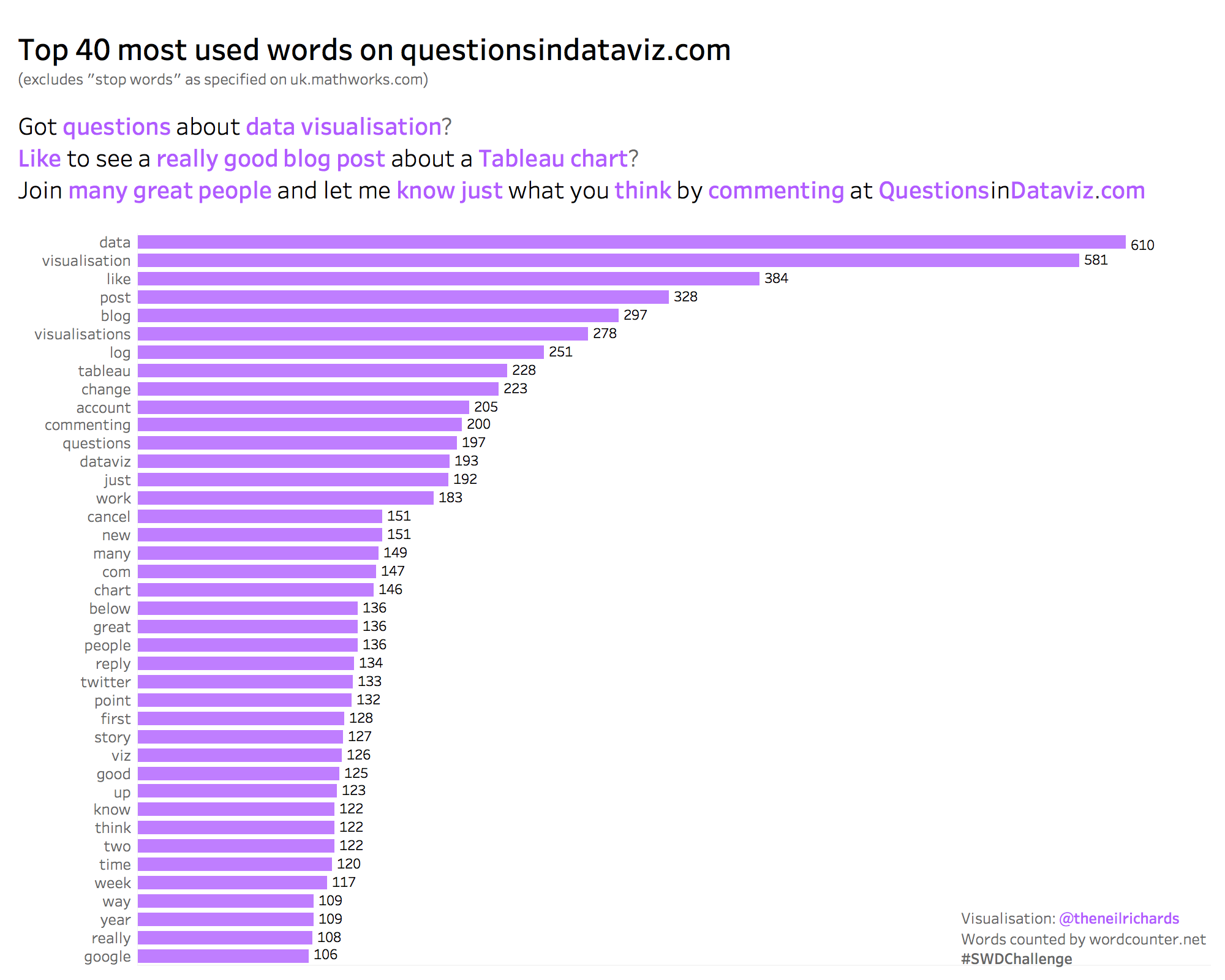
A simple bar chart visualizing the most commonly used words (excepting stop-words) in my blog: “Data" and “visualization" feature most heavily! Twitter: @theneilrichards
Nicolas
My submission is about the ratio of men to women who committed suicide in 2015. This ratio has been the same in during the last decade and is about the same across Latin America. I did it using Python's Matplotlib and Seaborn. Twitter
Nick K.
I wanted to find some data that was interesting that could show how using some color would revel changes. I was surprised at Iran's data so when I saw that outlier along with Morocco's so I thought it would something that other people would pick up on easier like I did with the color.
Nick Z.
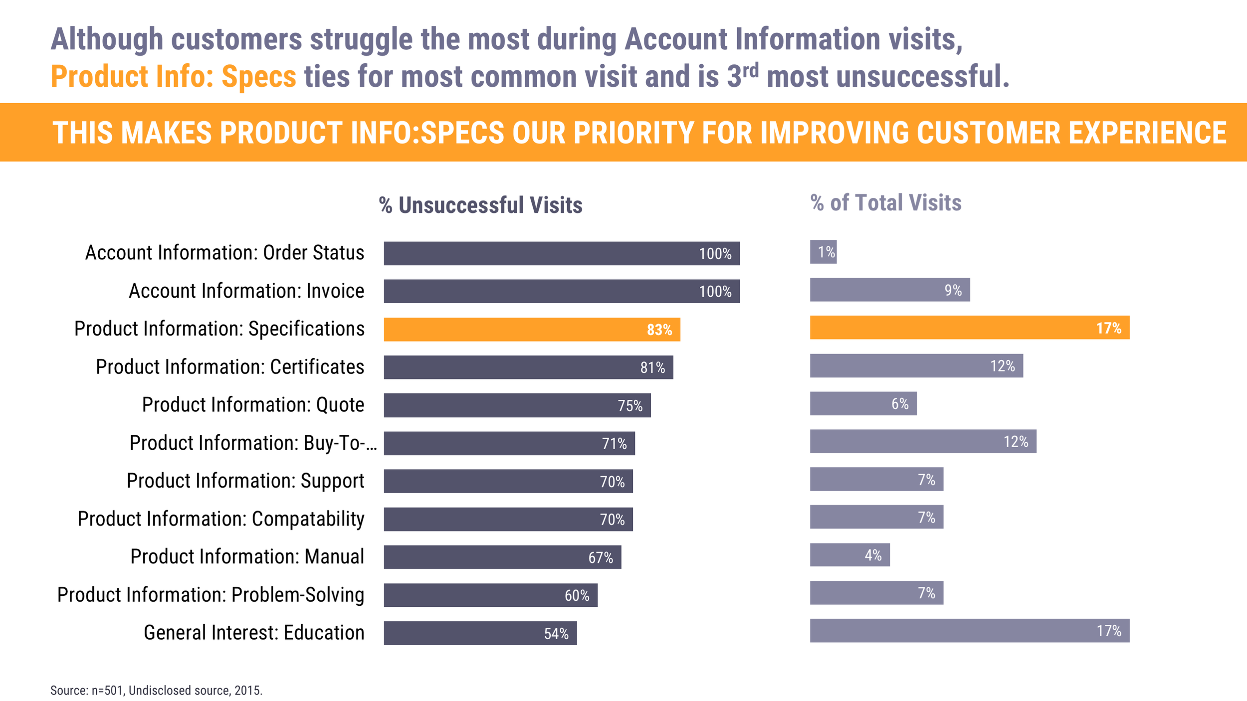
My “readers” are often internal stakeholders so when I annotate charts to call attention to specific data I often take that opportunity to pose questions to them. I find this helps guide discussions and keeps them more interested in reading (and responding to) what I give them. I made this chart in Excel, sorted my data in descending order for more clarity, formatted the x axis to 100% (it defaulted to 70%), and added two text boxes, one for the title and one for the annotation.
Pablo
I focused on the gender gap in tech companies and how it is time for a big change. It works well in conjunction with Women International Day tomorrow. Last year marked the first year since 2006 that the percentage of women working in the technology field declined, a troubling reversal for an industry that had been making progress in closing the gender gap and industry leaders should work urgently to revive progress toward parity. Link | Twitter | Interactive Viz
Paul M.
In the 2016 Alabama Senate special election, Doug Jones flipped 12 countries won by Donald Trump in the 2016 Presidential election from red to blue. Bars were not my instinct when I first looked at this data. However, this seemed the perfect opportunity to challenge myself to keep my chart choices simple. For me, the story is in the drastic change over a relatively short period of time. For that reason, I focused on the counties that flipped from Republican to Democrat.
@RelatableData | Paul's Tableau Public Profile
Paul W.
I reviewed the data on Super Bowl Coin Flips to see how often the winner of the coin flip goes on to win the game. While I created a simple bar chart using Tableau, I didn't use the bars to aggregate the data, as is the typical use case for a bar chart. I looked at doing it that way first, but it only resulted in two bars—one for heads and one for tails, which wasn't too exciting or interesting. Instead, I used the bars as a binary indicator, either heads or tails for each Super Bowl, and then color coded the bar to indicate whether the Coin Toss Winner won or lost the game. So I ended up putting a twist on the regular old bar chart but still kept it simple.
Interactive Viz | Twitter: @PaulWachtlerPMP
Paula
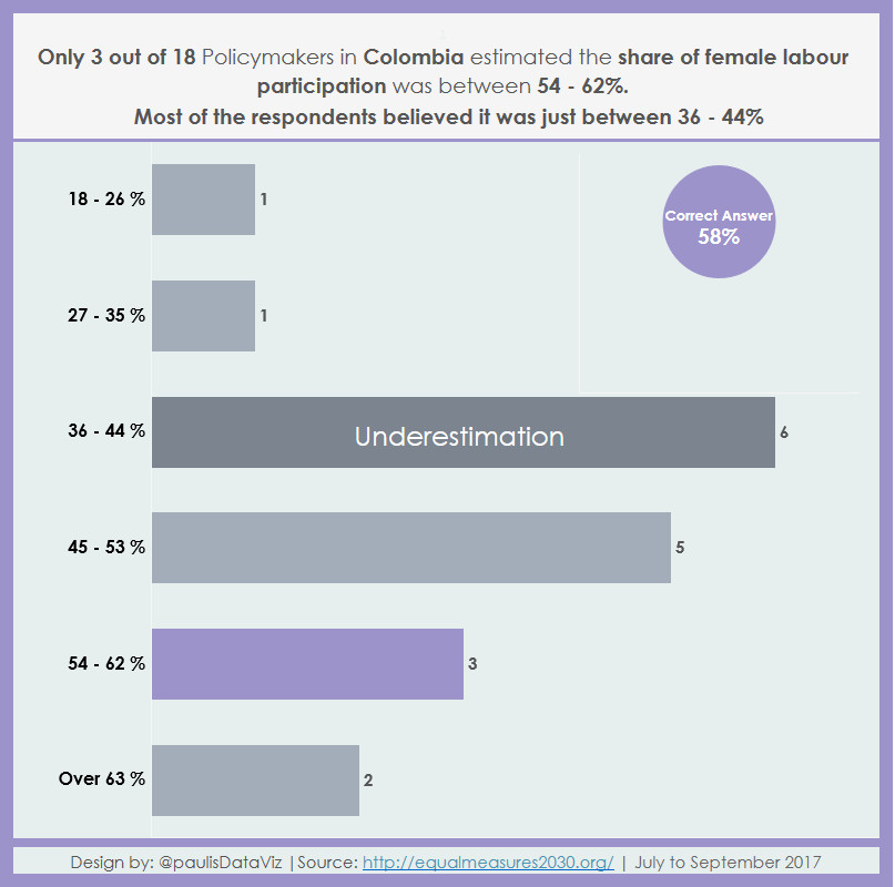
I'm visualizing how policymakers estimated the share of female labour participation in my home country Colombia. Interactive Viz
Paula J.
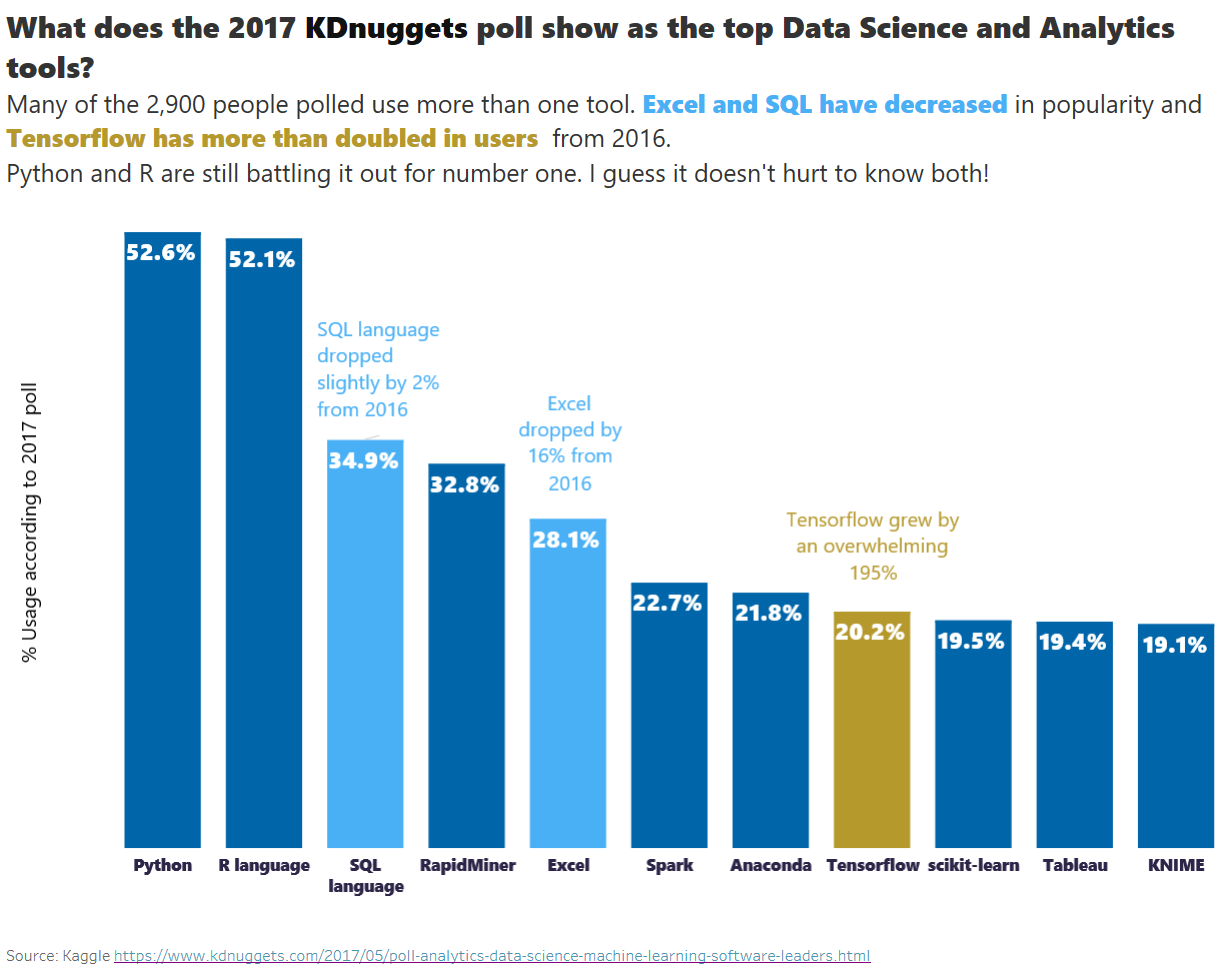
KDnuggets conducts yearly polls on what tools data scientists use and this is how the tools rank. I am glad you were curious about the previous year results because when I looked for that data I decided to use 2016 poll numbers which seemed to be different from the summary columns in the 2017 table indicated. Lesson learned—always check your data!
Pooja
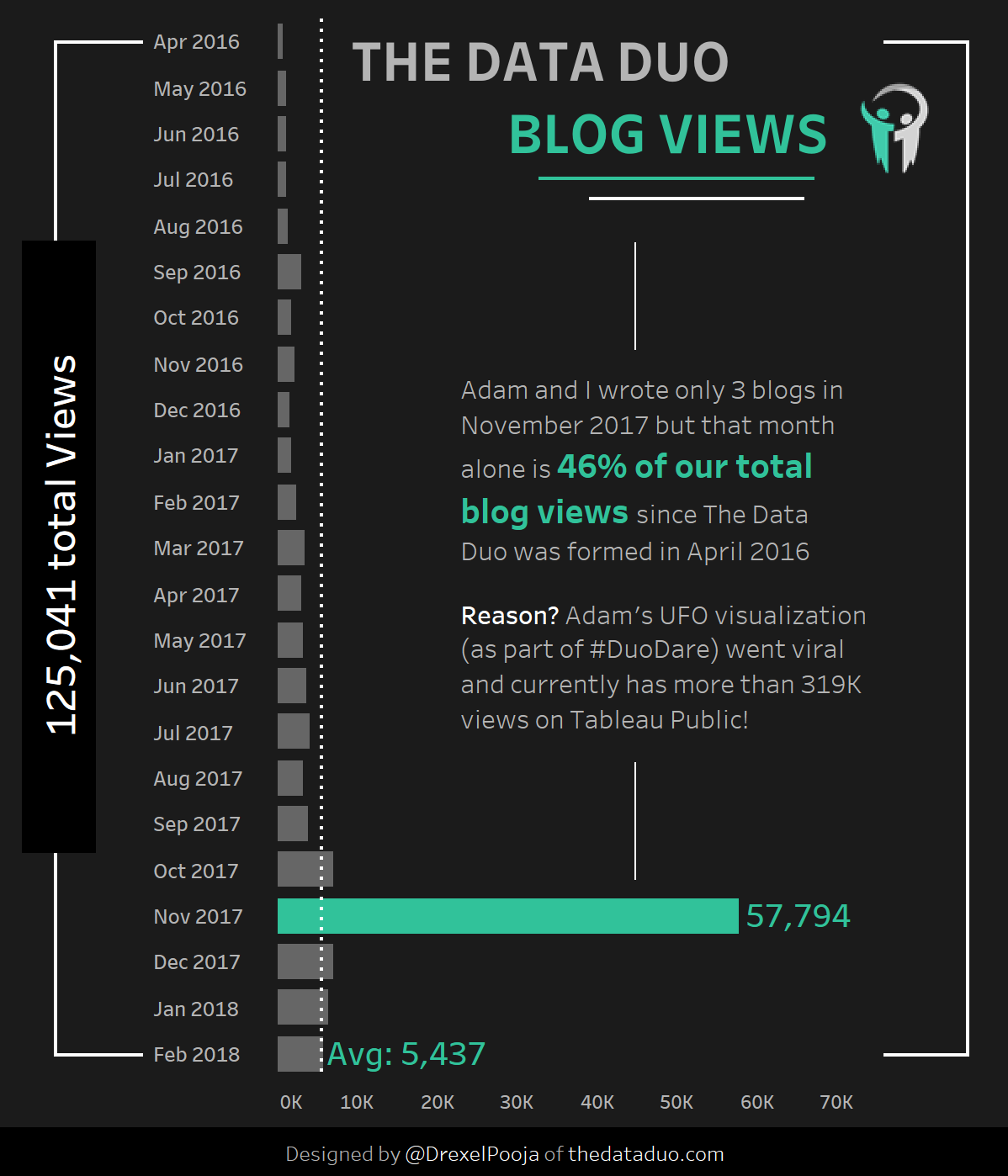
For this month’s challenge I decided to take a look at our blog stats. We were founded in April 2016 and are coming up on our 2 year anniversary so thought it might be awesome to analyze our stats via your challenge. Our new project #DuoDare has received great attention and Adam (my co-blogger) blew up our November stats by creating a stunning visualization on UFO sightings. My entry goes to show that color, annotation and bars when used effectively can help deliver your message at a single glance! Hope you enjoyed my entry. Blog | Twitter | LinkedIn
Rodrigo
Rody
Following your guidelines, I went with a Bar Chart on the Top 20 Highest Grossing Domestic Box Office Movies (adjusted for inflation), and highlighted the Star Wars Franchise dominance. Interactive viz
Sara
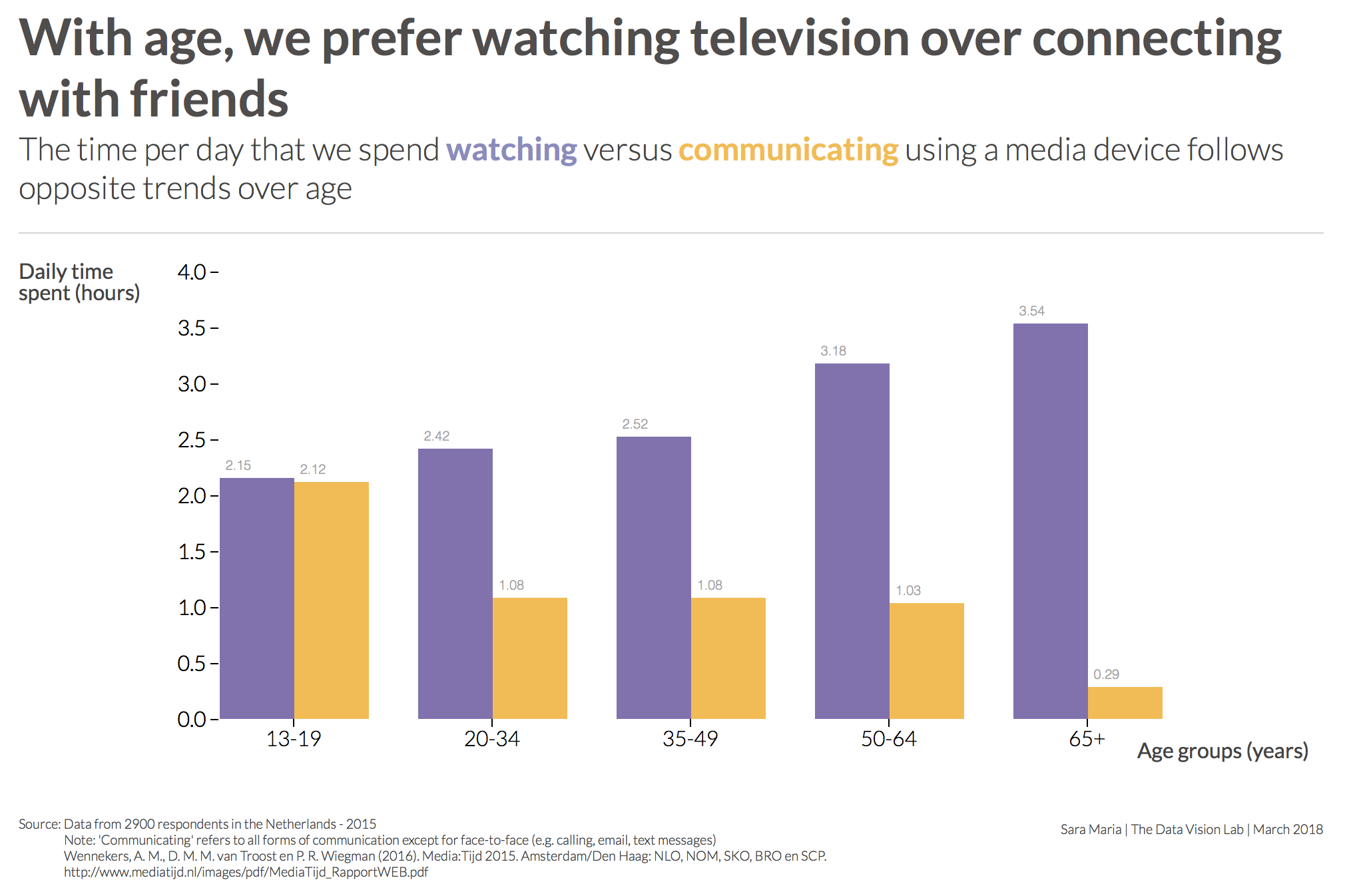
This month I created a grouped bar chart showing the time we spend looking at and communicating with our media devices. The data comes from a population sample in The Netherlands, collected in 2015. I like incorporating legend information in subtitles, and this chart was a good candidate for that. This chart was created in d3.js.
Sarah B.
Given that the brief was to use a simple bar chart, I opted for a simple dataset. I recently read an article by Forbes which listed the top 5 wealthiest hip-hop artists and their overall net worth. I thought this would be ideal for the challenge as it’s not a subject-matter that’s commonly visualized. I included the net worth of each artist listed for both 2018 and 2017, opting to use bar-in-bar charts to show the growth in net worth over the last 12 months. Interestingly, this is the first year in the history of the annual list that Diddy hasn’t placed first. I included some text to the right of my visualization to help explain how each artist had made their millions too. Ironically none of the artists listed have become super rich from their music alone. They have all branched out into other areas such as alcoholic beverages, music streaming services or clothing. I wanted to draw attention to Jay-Z since he topped the list so I included his bar and the headers of any associated text relating to him in red to make it stand out, keeping everything else in black and grey. You can interact with my visualization on Tableau Public.
Sateesh
For March Basic bar chart challenge, I looked at what the top 25 profitable companies made in 2016. From the chart, we can see Apple leads the game with $45.7B net income making $1,444 per second in 2016. That’s 1,0 17,219 times the *median earnings of an American worker per second.
*Median weekly earnings of an American worker $859
Blog, Linkedin
Sean M.
I’m a semi-professional appreciator of music and when you pair that with my knack for data analysis and visualization, you end up scraping every single Billboard Hot 100 chart going back to 1958 to look for trends. Well, in my initial exploration, I was curious what the distribution was for amount of weeks spent on the chart. So I built a histogram depicting just that. And the result intrigued me! The MAJORITY of songs to ever chart on the Hot 100 have spent exactly 20 weeks. As a data analyst, I knew this was the point of entry into further analysis. By breaking it down further by number songs each year to spend exactly 20 weeks on the chart, I again saw a massive jump in 1991. This led me to do some research and come to find out there is a little known rule in the Hot 100 criteria. “Any song to spend 20 weeks on the chart AND not rise above the 50th spot will be designated as “recurrent” and removed from the list.” Billboard implemented this rule as a way to keep having fresh new songs added to the list.
Simon
My viz attempts to test the assumption ‘drive for show,putt for dough’ which suggests the more successful US PGA golfers are also the ones with better putting statistics. I approached this by creating 2 diverging bars,one depicting the top 50 driving performance golfers in 2017 and the other the top 50 putters. I then visually coloured the bars relating to players in the top 50 prize money list of 2017 using the same colour as the word ‘dough’ in the title (to achieve an association). In addition I only provided the names relating to the bars of a top 50 earner as these were the golfers pertinent to the analysis. This allowed me to visually demonstrate more of the top 50 earners were in the top 50 putters,this crudely confirming the assumption. Blog | Interactive Viz
Simon R.
Inspired by my recent attendance at the storytelling with data workshop in London, I decided to set up a Tableau Public profile and give the next challenge a go. My visualization shows day by day breakdown of cycle hires in London but I wanted to focus on the reasons for some of the larger entries using colour to do so.
Siriwimon
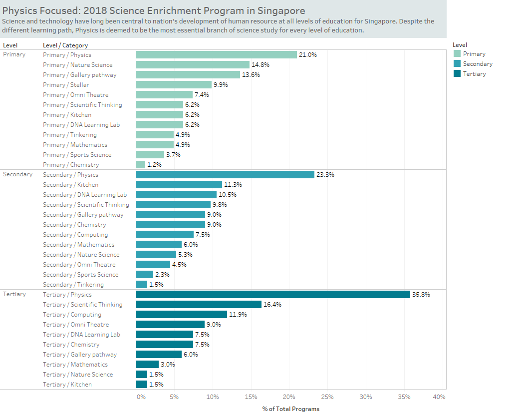
According to the Singapore’s Prime Minister speech on National Rally Day** in August 2017, Lee Hsien Loong highlighted 3 main focus areas for the nation long-term development. They are (1) pre-schooling, (2) diabetes fighting and (3) smart living. Obviously, education comes the first in priority. Unsurprisingly, with the vision in bringing Singapore towards smart nation, science is the foundation driving the aforementioned long-term vision. Despite the already strong human capability of Singaporean, science and technology are being focused at all levels of education. In particular, Physics is apparently the one given the highest emphasis, in term of number of programs generated comparing to other topics in science. Although the data shown represents science learning labs and classrooms beyond school classes, this guides how science is being focused in Singapore. Singapore is recognized about its success in national development. I thought that every country can learn from Singapore from any particular aspect. Although I am interested in education as it is a foundation for sustainable development at all levels. So I would like to present a piece of aspect that might inspire my own (and maybe others al well) life-long learning. Data from data.gov.sg by the Government of Singapore and created with Tableau Public. LinkedIn
Sohom
Here is my very simple attempt to use bar graphs for showing the tallest 25 buildings in the NYC with their purpose and building material used. I have kept it as simple as possible focusing on bars as a medium to show the height. I have purposely not sorted the bars so as to give it a look of a skyline.
Shane W.
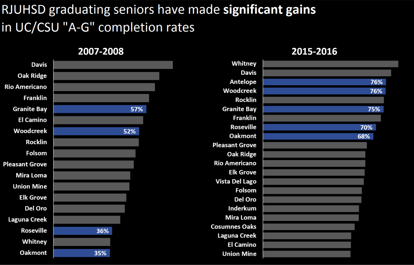
At our beginning of the year professional development day for staff, our superintendent wanted to communicate the gains we have made over the last decade in UC/CSU “A-G” completion rate (it’s a measure in California of how many high school graduates complete a set of classes from different curricular areas). We used to have a table of values for each year, with yellow highlights for our schools. I wanted to create something more visually striking, illustrating that our schools have moved from down here, to up there.
I originally used the school colors of our schools. But there were two issues with this. First, the point wasn’t individual schools but the district as a whole. Different colors separated them rather than unified them as our schools. Second, the different colors for each school were distracting, too many colors going on. So we simplified it to the district’s particular shade of blue. Also, why the black background? Change this viz to a white background and the brightest part of the viz is now the gaps between the bars. The gaps become more prominent than the bars. With fewer bars this isn’t as much of an issue, but in this case, with this number of bars, the black background is a better choice. (Why so many bars? That’s what my boss wanted, so that’s what we do and it’s my job to figure out how to do it.)
Data came from California’s school data system, DataQuest (this is a good website for a lot of school data in California). The viz was created in Excel. @shanewaggoner, #RJUHSD
Stela
I used Google Data Studio to create this bar chart. The bar chart visualizes website traffic and conversions by marketing channel. Blog
Stephen R.
The chart depicts the detected and undetected crimes in South West Dublin as reported by the Gardaí (Irish police). The graphic is used for emphasis.
Source: John Lahart, TD (Member of the Irish Parliament), Created in: Tableau + Paint.NET
Steve F.
Tarun
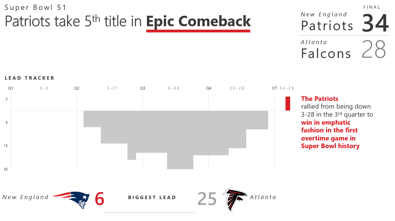
I've picked the topic of Super Bowl 51 and using a column chart have depicted how the New England Patriots overcame a huge deficit to stun the Atlanta Falcons in overtime. This is a column chart with zero gap width between each data point, hence at first glance it provides an illusion of an area chart. The chart tells the story of how Atlanta held a lead for the major portion of the first 3 quarters only to slowly lose out in the 4th quarter, eventually losing in overtime 34-28.
Tausif
For this month challenge on Basic bars, I used the MakeoverMonday archives data. Twitter: @takazi88
Teresa B.
The data consists of a sparse time series of number of incidents/delays, which makes it a great candidate for a bar graph. In the visualization I wanted to highlight the fact that over the course of four months there has been many incidents and delays that have affected many bay area commuters. LinkedIn | Tableau Public
Thijis
Multiple charts on climate change and you can see the remainder of them on Twitter.
Tiago
My goal was to show that in a first past the post election (like the one in the United Kingdom), the percentage of votes a party receives does not reflect on the number the seats a party wins. The bars were colored according to the traditional color scheme for the political parties.
Thomas O.
On January 30th, we founded the Linz.AI data science meetup.com group. The bar charts shows the growth of group members until the first meetup 35 days later. I used R (ggplot2) for the visualization. The data consists of all attending guests and does not show the 25 members who registered for the group but didn't visit the first meetup. Twitter | Link
Umar
Valerie
In light of International Women's Day on March 8th, I decided to pick a topic close to me - the proportion of female engineering students in Canada. As an industrial engineering graduate myself, with several female relatives graduating in the 80's and 90's, we always spoke about the low representation of women in this field, and how ratios haven't seemed to change over time. I wanted to explore the proportions across the various disciplines, and if/where there has been any improvement.
Interactive Viz | LinkedIn | Twitter: @valeriemais027
Yash
I have taken the statistics of the top 20 happy countries. I wanted to check what all contribute to the overall happiness of a country. One important observation - not all countries on the list are generous.
Young
This is my very first submission for the SWDchallenge, created with Tableau. It shows the cost assessment of antibiotics used to treat bacterial infection, and the rate of resistance against the selected antibiotics, sampled globally between 2012 to 2017.
Thanks again to everyone who took the time to create and share their work! Stay tuned for the next #SWDchallenge, which will run the first week in April.
