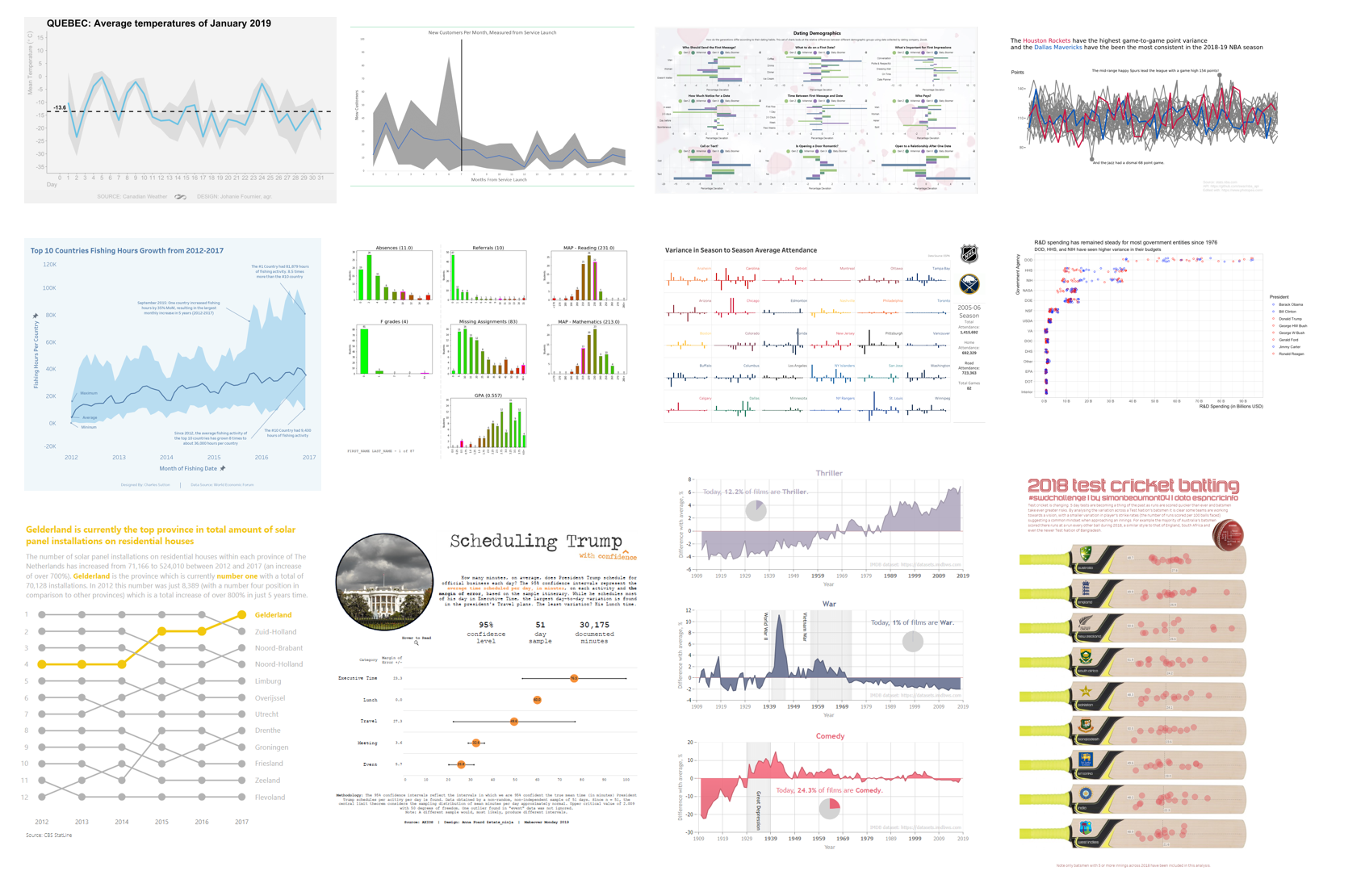
various views of variability
This month’s challenge was to visualize variability in data and nearly four dozen delivered! It’s neat to see the variation across submissions, with people making use of numerous chart types, topics, and tools. When it comes to chart types, Adina used histograms to show the differing graduation rates between school sizes. Alex gave insight on how certain movie genre’s popularity has varied over time with an area chart to visualize deviation from average. Haley utilized boxplots to visualize the variability of The Simpsons ratings (both within a season and over time) and Meagan chose violin plots to show the variability of Denver’s daily temperature. Ben J showed examples of numerous ways to visually encode the range of MLB strikeouts—including reference bands and circle histograms.
Tools employed included Tableau, Excel, R, JMP, Python and more. Dennis carried over last month’s challenge by trying out a new feature (bump chart) in his tool (PowerBI). RJ also tested a new tool: sharing an image of variability in data from his recently released book! (Stay tuned for the next SWD podcast, where he and Cole discuss.)
From a topics perspective, February means love is in the air… or is it? Several readers showed that, well, it varies… by generation (Declan’s dating preferences and Lisa’s Valentine’s Day celebrations) and across states (Kate’s martial rates). Ben X had the recent NBA All-Star game on his mind with his visualization of each NBA team’s scoring data (and thoughtful use of color within a spaghetti graph). Weather was another hot topic (pun intended). Like Cole, many people are over cold temperatures! Johannie showed variance in January’s daily average temperature in Quebec, Joshua displayed the average rainfall across time in Portland and Lora visualized the spread between min & max in fall & winter with dots.
To everyone who submitted examples: THANK YOU for taking the time to create and share your work! The makeovers are posted below in alphabetical order. If you tweeted or thought you submitted one but but don't see it here, email your submission (including your graph attached as .png) to SWDchallenge@storytellingwithdata.com and we'll work to include any late entries this week (just a reminder that tweeting on its own isn't enough—we don't have time to scrape Twitter for entries, so emailing is the sure way to get your creations included).
The next monthly challenge will be announced on March 1st. Until then, check out the #SWDchallenge page for the archives of previous months' challenges and submissions.
We hope you enjoy the various views of variability in data that follow!
Adam G
Gone BIG for SWDChallenge Feb 2019: Relative size of the sun
Adam L
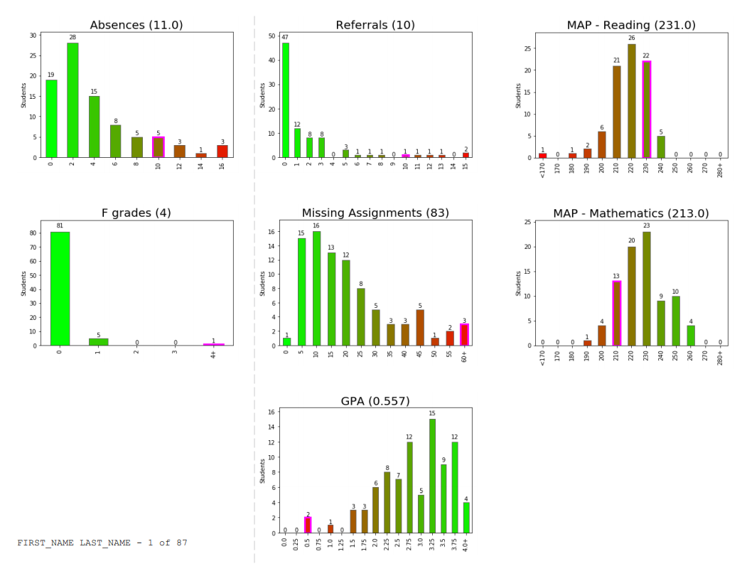
I work in a K-12 school in Illinois (about 90 mins from Milwaukee...your cold January viz resonated in my bones!), and this is a revised project we are about to deploy in the coming weeks. About four years ago, @SrtaRad came to me with a problem. Every year, we have freshmen who have a less-than-stellar first semester. We wanted to have a meeting with these students to help them understand that their first round of classes has put them off-track for graduation. We wanted to sit down with students and parents, show them their levels on a variety of metrics, and convey two things: 1) how discrepant their performance was from peers, and 2) that they often have the academic skills to do better (making this a perf deficit, not skill). The goal is to help these students kick it into gear in semester two and get back on track to graduate in four years.
Our metrics included attendance, failed courses, discipline, missing assignments, GPA, and academic test scores. We experimented with different visuals but struggled to convey the continuum of performance combined with individual student scores because the ranges across metrics vary so widely, and some are even flipped in direction (e.g., high GPA is good, high absences bad). After several iterations, we arrived at a tri-fold brochure produced through a SQL query, some vlookup() in Excel, frequency distributions with red-green gradients, a Mail Merge, and manually highlighted bars for individual students. While the product was pretty neat, it was fairly clumsy to produce and extremely difficult to maintain. The frequency distributions changed with every run, which meant re-copying and pasting images into Word multiple times as we came closer to holding the meetings.
Enter Python, Jupyter Labs, and these libraries: cx_Oracle, pandas, matplotlib, and PyFPDF. The Jupyter notebook now queries the data straight from Oracle, reads it into a pandas dataframe, produces frequency distributions for each metric, sorts the students by combined risk, and produces a customized graph for each student for each metric. This allows us to go from triggering the script to finished PDF in about 10 minutes without any additional manual work. On first run, matplotlib provides good attempts at histograms to help conceptualize the shape of the data distribution and guess at what the bins should be. I can still fine-tune the binning of the data through a configuration file. This is necessary because with only about 100 students in a cohort, automatic binning can produce some weird graphs that are not helpful in guiding discussion. Here is the final result: a brochure that can be shared easily with the student and parent to get the conversation going.
Adina
I used this data from the Chronicle of Higher Education regarding college graduation rates. I decided to visualize the variance by showing area charts of the graduation rate distribution by school size. It's basically a series of histograms, but I felt the shapes created by the area charts were easier to compare than bars.
Alex
This visualization shows the contribution of film genres to the history of cinema. Information is presented as a deviation from the mean at each time point. The mean is calculated for each genre separately and corresponds to the arithmetic average for the last century. As you can see, the popularity of each genre changes dramatically over time. Since the filmmakers are incentivized to meet the needs of their audience, we can track the mood in society using this data. Often, presented values are associated with some world events. For example, the development of science and technology led to the popularity of science fiction, while military conflicts dramatically increased the number of war films. The charts give examples of such dependencies and viewers can also find these relationships themselves. More charts are available here.
Ana
That was a big challenge for me, as I am not used to work with this sort of data, and therefore, I have difficulties to imagine which way is better to represent the story. I am a sailor. I used to race. For us, temperature is not important...it is quite nice in Spain. Also, we do not care about rain. But we are always looking at wind forecast and sea waves. Therefore, and just for fun, I wanted to bring the February challenge to my hobby. I downloaded the average daily wind speed of Barcelona for the last month of January from Meteo.Cat. But that was not saying anything about how good was January for racing purposes. So, I also downloaded the average wind speed for every 1/2 hour. That means, 48 averages for each of the days. The table of data was not saying anything to me. I played with different visualizations until I decided a dispersion graph in Excel. There, I could see when the wind was concentrated most in comparison with the maximum wind gust of the day. But I could not see the real story until I changed the series’ color. Blue for daylight averages and grey for night averages. Then I added the daily average line in orange. That confirmed me what I already knew, that during the night we use to have calms. But also, the distribution of the blue and grey dots, helped me to identify which days were much better for sailing.
Anna
Confidence intervals help statisticians/researchers estimate a population parameter (such as the true mean or percent) and by visualizing a confidence interval, I find students can digest the concept a bit easier. Visualizing confidence intervals also help students compare the variation between groups as well. Confidence intervals have two parts—the sample statistic (to estimate the population) and the margin of error. Visually, the margin of error shows the variation in the statistic. Mathematically, the margin of error is calculated using the sample's standard deviation/standard error. The confidence level (95%, 99%, etc.) determines the number of standard deviations used to determine the final margin of error. When you compare confidence intervals, look to see if they overlap. Since we are confident the true mean is captured within the interval, it can be located anywhere in the interval. Therefore, overlapping intervals tell the viewer there may be no difference between the groups, despite a higher sample mean in one. And it's all based on variation. Confidence intervals that do not overlap give good evidence of a difference between groups. Finally, confidence intervals should be used with caution—my methodology mentioned at footer of visualization.
Blog | Interactive viz
Ben J
I took a few different looks at team-by-team variation over 100 seasons of baseball strikeouts per 9 innings. There's a version of this one in my book Communicating Data With Tableau in chapter 9, Variation and Uncertainty.
Ben X
This spaghetti plot shows the point scores of every team in the 2018-19 NBA season up until February 5th, 2019. The data exploration was done in Pandas, and the plot is built in Plotly with little annotations added in Photopea, an online image editor. Each line is one of 30 total teams, and I highlighted the two teams with the least and most variance among their point totals. I also highlighted the highest scoring and lowest scoring games of the season annotated by their point totals. I wasn't sure what to do with the y-axis ticks because I thought it would be helpful to have some number reference. I was a little unsure how to label each axes too.
Link | Code
Charles M
I made this graph using Excel, using a line chart for the average, and two area charts showing the variance. The client tasked me with comparing the launches of their various service offerings, so they could generate KPIs around new customer acquisitions for future service launches. I greeked the data from the original data set, to highlight the methodology, while protecting the client's internal data.
Charles Sa.
I downloaded a Kaggle dataset detailing US Census information from 2016, and connected to the file with Tableau. It provided a detailed picture of many features of the population, both demographic and economic. A lot of different analyses and conclusions could have been taken from this dataset; I chose to focus on some economic information on rents, mortgages and second mortgages.
At the top of the dashboard, I wanted to compare mean and median rents/mortgages, and decided to use ECDFs to make it easy to pinpoint how many data points were under or above a threshold, 80% in my case.
At the bottom, I used boxplots to see if there was disparity in the proportion of households trailing a second mortgage depending on location (each circle represents a Zip Code). Grouping results by Division made sense with the space I chose to work with. Outliers in this case are really insightful in my opinion, because even though the general proportion is well under 10%, you can see that there are areas where the situation is much more dire and would provide material for a much deeper analysis.
Twitter
LinkedIn
Charles Su.
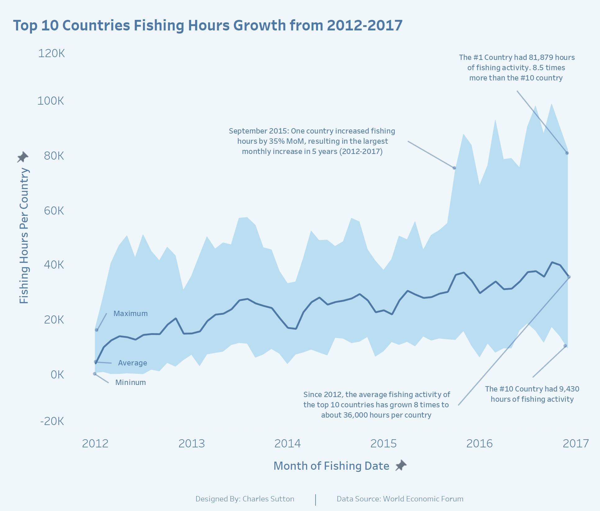
The chosen data source is fishing activity data provided by the World Economic Forum. I used it to tell a story about the growth in fishing activity by the top 10 countries from 2012 to 2017. It is the starting graph of a more comprehensive infographic about the fishing practices of larger developed nations and their impact on the fishing resources of smaller developing countries. This was a great challenge to help me stretch my skills by working more with LOD Calcs, Annotations, and Band Charts. Tableau is my tool of choice and I use these challenges to develop my data storytelling abilities.
Declan
This month’s SWDChallenge visualizes the variance in demographic responses to a series of question by first daters as collected by Zoosk. The infographic was built using Dashboards for Kx.
Twitter
Dennis
For this months #SWDChallenge I decided to combine two components. The first component is of course the #SWDChallenge of this month. I also wanted to build a bump chart for a couple of weeks now after I saw a couple of them appear during a Makeover Monday. As I never build one of those in any of the tools I used it seemed like a good exercise to learn something new. I build a bump chart (using Power BI) in which I wanted to highlight a single province within the Netherlands to show it's change over time. To highlight this province I made the line yellow (as I "see" energy as something that's yellow) and bit bolder (for both the line and the marker). I did the same with the label of the province. As an extra component I added a title and an explanation to the chart to make it complete. The result of these two components combined look like this:
Doug
My wife teaches high school physics, and she was having difficulty convincing her administration and guidance counselors that math pre-requisites are important in order to be successful in physics. I was working on the data evaluation of her current students’ grades when I took Cole’s workshop. This figure, which compares grades for students in the College Prep level, and several other figures made a good story to present a statistical analysis to folks with English and History backgrounds. I used Excel to make the figures and Jmp for the statistical tests.
Haley
I used Tableau to create a boxplot of IMDB episode ratings for seasons 1-28 of The Simpsons, with a line showing the average for each season. I've seen this data visualized in several different ways (heatmap table, scatterplot), but I think this method does a good job at showing the variance within seasons and the overall trend over the years. It's also easy to see which seasons were the most uneven, like Season 9 which included one of the highest rated and one of the lowest rated episodes of the whole series. I included the green-yellow-red color scale to emphasize the decline in IMDB ratings over the years.
Ingo
With this dataset, I focused on showing the variance of the patients that were treated within the first 4 hour period with the goal being 95% according to NHS. The top left shows the % attendance by region. Then the individual hospital and then the different categories of injuries with the complete timeline and the variance for each period shown below to also allow for quick trend / pattern recognition.
Johanie
For this month’s challenge I was inspired by Cole's analysis of her cold weather. It was a very cold January here too and I wanted to know how cold it was. So I found weather data on the web site of Canadian Weather and plot the average January's temperature with the min and max for every day. This tell me that January 2019 was cold but not as cold as I thought it was because the average temperature of -13.6°C was not so far of the climate normal of -12.2°C. To go further, I made my first violin plot to put side by side the January's temperatures from 2010 to 2019. With the median, I discovered that half of the days of January 2019 were below -14°C. Which has not occur in Québec since 2015. So yes January 2019 was the coldest January of the last 4 years.
Joost
Last year me and my coworkers from the IT Department went Go-Kart racing for our annual getaway. We got 2 heats of racing, in which the second heat got more participating coworkers. At the end of both heats we received a printout with the statistics of the heat, such as fastest lap time, lap time per coworker per lap, etc. This resulted in some funny data visualizations that show the variation of lap time per heat / per coworker. I plotted the variation of all laps driven per heat:
Joshua
Kate
I recently got engaged and it’s been funny to see and hear people’s reactions. One co-worker actually said, “I didn’t know people were still getting married.” While there have been numerous claims that “marriage is dead,” I don’t think that’s true everywhere. This led me to take a look at U.S. marriage rates and explore the marriage rate variance and look at these rates over time. For this SWD Challenge, I found my data here and brought it into Excel and played around with it exploring the different graph types to see what popped out at me. This was my first time really using the histogram graph and bubble chart option to plot all 50 states. I then recreated the bubble chart in Illustrator and brought my histogram over from excel. I used color consistently to highlight a few states and talk about their rankings and trends over the 9 years. Read more about it at my blog.
Kevin
With this challenge I wanted to use Scotland's open data portals. I found data set showing attendance volumes to A&E across Scotland health boards. I decide to show the variance of the volumes from the monthly average of each health board from 2008 to 11/2018.
Tableau Public | Twitter
Lisa
This month’s Storytelling with Data February Challenge is to visualize the variance. Since Valentine’s Day is almost here, I chose to visualize a simple Valentine’s Day data set with a boxplot to show variance over time with age groups and whether or not they had changed their minds about celebrating Valentine’s Day. I first visualized each category as a small multiple line chart and then layered the corresponding boxplot over each chart. Using Tableau’s Analytics pane made it simple to add the boxplots. For added effect, I included a photo of a celebrity couple from each of the age groups above the charts to make the dashboard memorable. I also added the heart as a washed out background image in the charts to help give perspective on where the line and boxplot were plotted when comparing the charts.
Blog
Liz
I used data from Michael Tauberg on data.world to visualize the 10 publishers with the most books on the New York Times bestseller list. I found that some publishers have a lot of books on the list for a short amount of time, while other publishers hit it big with one extremely popular book. This visualization was made in Tableau.
Lora
The months of November, December and January contain a good amount of variance in the minimum temperatures, but not much in the maximum temperatures. So while year-to-year these months will be fairly cold, just how cold they get will vary. The months of February and March differ—variation is seen in the minimum and maximum temperatures. These two months, year-to-year, could be either a continuation of winter or the beginning of spring.
Mark
For this challenge I took a look at the variance in attendance from team to team in the NHL.
Marshall
I used ggplot2 here and really love the flexibility of R and how it allowed me to create some descriptive statistics inside the violin.
Meagan
For this month's SWD Challenge on visualizing variance, I made a Power BI report with Denver daily weather data that used two chart types I have not used meaningfully in the past. The first page contains a violin plot with a bar code plot overlaid. It is good at showing both distinct values and the frequency of those values, clearly displaying the variation in values on the y-axis. Next, I used a scatter plot to visualize daily temperature changes where the dot size varies based upon the frequency of the value observed.
Link
Michiel & Sanne
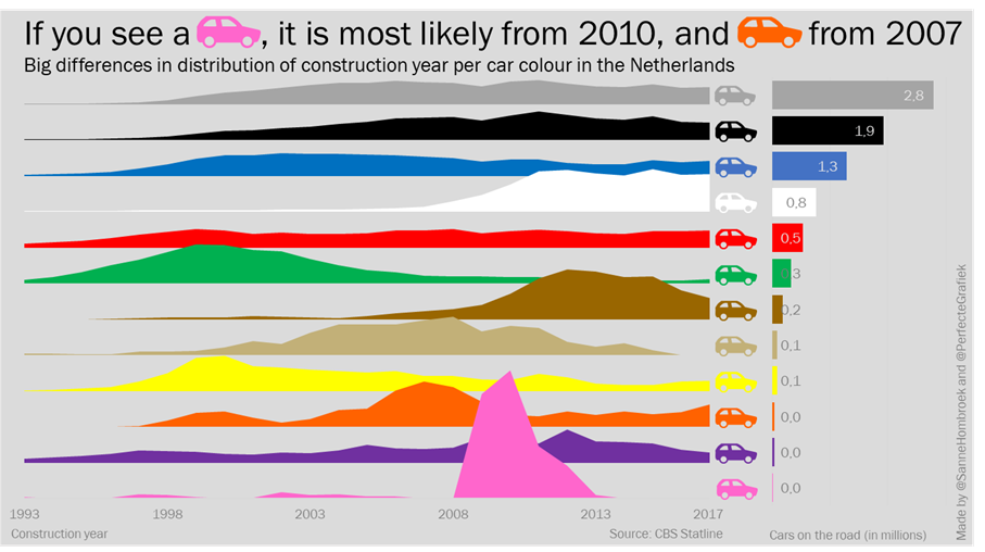
The challenge to visualize distribution came at the same time, we saw this tweet about the colors of cars in the Netherlands. We twisted the original data to find another story and came up with the idea to make a joyplot to show the distribution of a single color over the years. With the help of a tutorial we made this in Excel. To add some context, we added a bar chart to show how many cars of each color are on the road. After we made both charts, we made the car icons in Powerpoint and combined everything into this visual. From start to end, we spend two hours.
Patricia
It is showing the variance, by state, in percentage of adults who report driving after drinking too much (in the past 30 days). The data had the percentages by state, and I used it in the normal distribution function to plot the corresponding values on the y-axis (formulas are in the Excel sheet). We can see on the graph which states are within 1, 2, or 3 standard deviations from the mean. I added a special touch to my state...FL.
Patrick
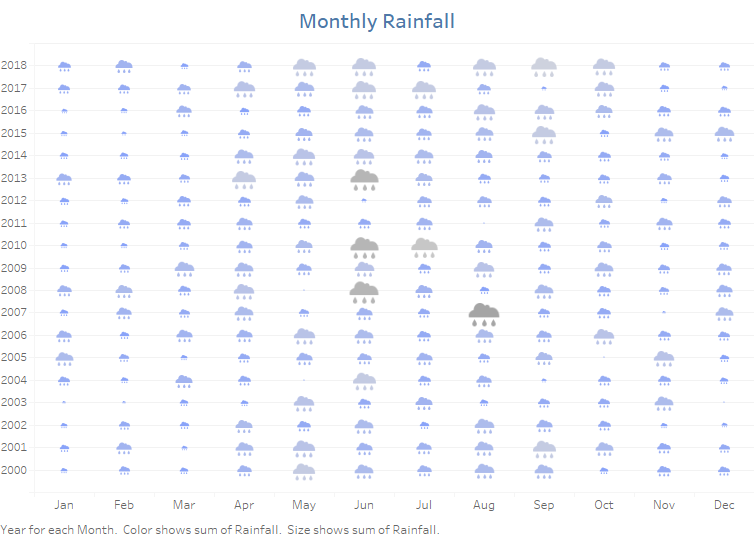
I used a similar data set—monthly precipitation somewhere in Milwaukee. The most outstanding thing I noticed is that Milwaukee gets more rain than Ireland in July! Has to be data quality issues there. Amazing. For something as physical as weather and rainfall that we all (certainly in Ireland) talk about every day, I think visualizing the icons always helps grab the attention. In particular, giving the clouds a larger size and darker colour the higher the rainfall gets, conveys the sense of heavier fuller clouds and hence the variation across the months. At a glance, I think we can see variation within a month over time—August 2007 had 12 times more rain than August 2000, across the calendar year Jun-Aug are the wettest months—diverging gradually to the driest Dec-Jan and over time—this visual isn’t great for this—but a simple removal of the month from the dimensions gives a yearly average.
Regis
The story for February comes from data prepared by Simon Beaumont for the January 2019 SportsVizSunday challenge. I selected a jump chart because I had never made one before. Many thanks to Chris Di Martinini and Ken Flerlage for their incredible work and tutorials. It was much trickier than I expected. It required at least 20 calculations and lots of tinkering with the format. The effort was worth it because I love the way it clearly displays the time variation between each team's bid for the trophy.
RJ
My entry for this month’s challenge could also be an entry for the previous “new tool” challenge: my first time using a book to tell data stories!
Ryan
For this month's challenge, I re-made a previous viz of mine on pace in the NBA. I liked this data because it is easy to see the variance in pace between teams and how it has varied over time. In earlier seasons, teams were playing faster (higher pace) with a higher range but then the game slowed down towards the 2000's. Over the last 10 seasons, the pace has picked up largely due to the advancement of the 3-point shot.
Blog | Twitter | Tableau Public
Sara
I used Excel to look at variance in maximum and minimum number of regular wins by NFL teams over the last 10 years. Then I plotted the two Super Bowl teams to see how many wins they have had each season in the last 10 years. To see more of my work, visit my blog!
Shaistha
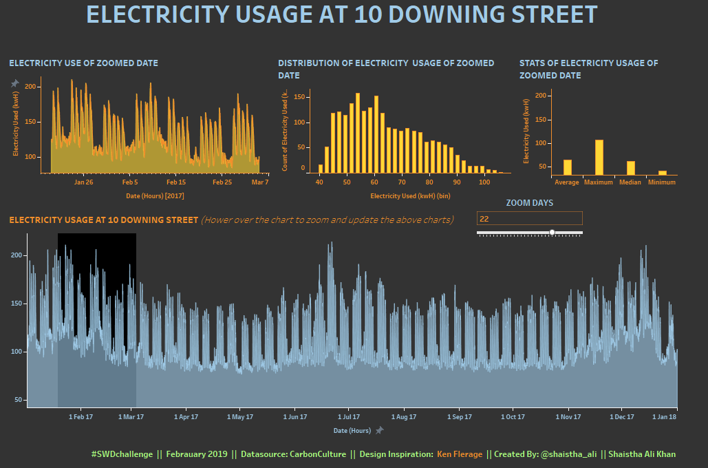
I tried to analyse the electricity usage in 10 Downing Street in 2017. Used Tableau for visualizing and Thank you Ken Flerage for the wonderful article on Zoomable charts.
Article | Interactive viz
Shine
I used small multiple horizon charts to visualize variances in crime rates from 1965 - 2012 across the 50 states in the United States. The deeper the shade of color, the higher the crime rate. I built it using Tableau. On the interactive version, you can sort by crime type and hover to see the trend comparison vs the overall average for the country.
Twitter | Interactive viz
Simon B
When exploring the concept of variation I wanted to visualize player variance across teams to understand if Test playing cricket teams had a particular style. The two metrics, how quickly a player scores their runs and how many runs they score, allowed me to use visually identify those countries with a tighter cluster of player and as such less variation in batting styles across players; suggesting a common approach taken across the whole team.
Stephon
I made this graph in R and refer talk briefly about it here at my blog.
Wai
I examined the number of recreational visitors to the nine California National Parks in 2017. I used a combination of charts to examine the attendance variation between parks, months, and even temperatures.
Interactive viz
Vidya
For this challenge, I took the monthly rainfall data for India from the open government platform website. I decided the analyze the 10 year period from 2006-2015. The monsoon or rainy season in India is between July to September. Knowing this we would expect to see peaks in the average rainfall between these months and the plot of average rainfall shows exactly that. But this does not tell the whole story. India receives its rainfall from southwest monsoons and northeast monsoons from July-March. Which means for most time of the year, some part of India receives heavy rainfall. Plotting the average, min and max rainfall, it is clear that though the average rainfall peaks between 300-400mm in July-Aug, the maximum rainfall is much higher and it spreads from April to December in most cases. To put these numbers into context, I paired this chart with a boxplot to understand what exactly is heavy rainfall in India?
BLOG
Zolt
Usually, I am showing the median and the inter-quartile range in a similar fashion to the average & min-max range chart which was shown in the challenge description (sometimes the quartiles are replaced by task specific percentiles figures). From here I started to investigate different approaches; at the end I created a heatmap type presentation of monthly temperature histograms. I used R/tidyverse + ggplot for data wrangling and chart creation. There are two alternatives, the difference is the bin width: for human perception the 5 C degrees bin width makes perfectly sense, but the 2.5 C degrees bin width provides some extra details. The data was collected from meteoblue.com (the only reason for choosing Basel was that the historical dataset only for this city is for free/evaluation).
Wow, tons of variation in the ways people chose to display variability! We hope you enjoyed perusing this collection as much as we did and perhaps were inspired by some new approaches, too. Please leave a comment if you have ideas for future challenges that you’d like to see here.
Click "like" if you've made it to the bottom—this helps us know that the time it takes to pull this together is worthwhile. Thanks for reading!
