visualizing artisanal data
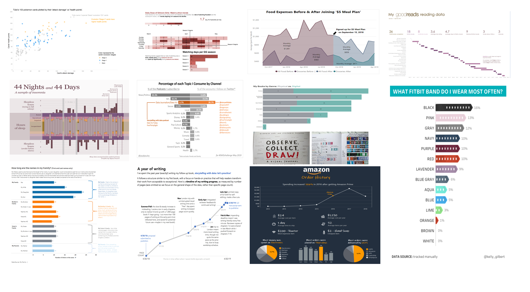
A sampling of the submissions received this month
This month, we explored the concept of artisanal data: a dataset collected entirely on your own—electronically, manually, via surveys, or by observation. Guest author Mike Cisneros challenged us to analyze and find the conclusions that we can have full confidence in because we are the true stewards of the data.
Fifty-three readers submitted their bespoke visualizations. Accountability was a recurring theme: many commented that their intent was to hold themselves responsible to achieving a goal—or that this exercise enlightened them to begin doing so. Not surprisingly, as a result of this hot topics included exercise, weight loss, and spending. It was neat to see the range—both in approaches and tools—that readers applied when creating their visualizations and we encourage you to scroll through the entire post to be inspired by how your peers collected, analyzed and were influenced by their unique datasets.
When reflecting on the submissions, Mike observed the thoughtful considerations participants applied:
“There are many lessons to be gleaned here; not only from the data you chose to collect and the way in which you presented it, but also from the issues and considerations raised in the process. In setting out the challenge to collect your own data this month, I had worried that it might be too burdensome for people; thankfully, dozens of you proved me wrong, and I thank all of you for your efforts.”
Scroll through the entire post to see further commentary from Mike with examples of these underlying themes: data can be humanizing (Andre and Alyssa), visual metaphors can be evocative (Hilje, Kate and Tiffany) and individual experiences can be universal (Julia and Penola).
Other standout entries include Colin and Lotte, who applied an effective takeaway title to their exercise trends while Liz selected clean, uncluttered charts to highlight trends in her personal hobby, reading. Jared took a trip down memory lane with a cool visual timeline of his evolving professional development and soft skills while Lance employed annotations with categorization to visualize the length of names in his family. Several readers discovered something perhaps previously unknown: Haley realized the effect of Amazon Prime on her spending habits, Rebekah validated how she’s been occupying her time post-grad school, Tania discovered the impact of clicking on Gmail ads, and Pris evaluated consistency in implementing her New Year’s resolution.
As an added bonus, Cole highlighted the benefit of having guest author this month: she was able to participate! Her submission provided a peek into the labor-intensive process of writing her second book— storytelling with data: let’s practice!—which will be published soon.
To everyone who submitted examples: THANK YOU for taking the time to create and share your work! The submissions are posted below in alphabetical order. If you tweeted or thought you submitted one but don't see it here, upload your submission as a .png here and we'll work to include any late entries this week (just a reminder that tweeting on its own isn't enough—we don't have time to scrape Twitter for entries.)
The next monthly challenge will launch on June 1st. Until then, check out the archives of previous month’s challenges on our #SWDchallenge page. Happy reading!
Adam
For this months #SWDChallenge I have pulled together my Work Train travel for 2019 up to the end of April. I travel quite a bit for my role as Snr Data & Viz officer and we generally are required to travel for product development meetings, team planning meetings, current project face to face meetings and team working days. Our core team is disparately located around the UK, meaning meet ups are not always quick commutes.
Interactive viz | Blog
Alexander
Interactive visualization of organic home garden productivity over time, including soil amendment and environmental effects. Total production by growing season & vegetable category is on top. Selected by filter, the lower graph displays individual vegetable yields with environmental input data. Future year iterations with sufficient historical data may include a yield forecast.
Interactive viz
Alyssa’s submission exemplifies how data can be humanizing. Mike notes “Alyssa’s submission hit on several key topics in data visualization: trust, both between collector and visualizer and trust in the accuracy of the observations; careful handling of personally-identifiable information (PII); the importance of not depicting subjective categories as having absolute values; and in being transparent about what data is not shown, as well as what is shown.”
Alyssa
I created this dataset from the narrative sleep log of an anonymous patient at the Counseling Center. They kept incredible detailed notes, and any uncertainty is reflected in the design (missing data, not putting precise labels on hours slept, etc). I feel incredibly lucky to have been trusted with this dataset and hope that the final product reflects one part of the way PTSD impacted the patient's life. A note on the design: the amounts of sleep designated as incapacitated/impaired/operational/rested are intentionally not labelled for three reasons. First, everyone's sleep needs are different, so the number of hours of sleep isn't as informative as the impact that sleep has on a person's life. Second, I want to avoid pissing contests over sleep deprivation ("wow, you consider THAT impaired? I haven't slept more than that in fifteen years," etc). Third, the number of hours of sleep in the log were rounded to the half hour, and according to the patient may have been off by 15-20 minutes since it's difficult to know the precise moment they fell asleep. Therefore, I would prefer to give a vaguer impression (low end of operational, high end of impaired, etc) rather than facilitate falsely precise estimates of the number of hours the patient slept.
The humanizing factor carries over to Andre’s submission. Mike notes, “Andre turned the challenge into an opportunity to combine his interests with his young son’s interests, allowing them to work together on a visualization they could both enjoy. While we hope, at times, to make human connections through the outputs of our data visualization process, Andre showed us that we can also strengthen human connections through its creation.”
Andre
My 5 year old son, Túlio, absolutely loves pokemon cards. He doesn't know yet all the rules but is fascinated by the cards' types, numbers, colors and powers. Since he spends A LOT OF TIME looking and analyzing each one of them, I thought it would be interesting to build a visualization showing all of his cards. After cataloging all 153 of them, we made a histogram and a bar plot with pencil and paper. Then I thought it would be a good idea to show the correlation between the cards's "attack damage" and "health points". I also used color to distinguish the card's "evolution stages". Túlio is really getting into data visualization and I am really getting into pokemon cards!
Anthony
This entry has the most personal data: my own blood pressure and heart rate. The motivation was to obtain a view over time of these data so that I could track trends and also to share it with my physician. The data was collected from the OMRON BP786N blood pressure monitor, and then recorded in a simple CSV file containing date, systolic pressure, diastolic pressure and heart rate. A script called "bpadd" records the data and then calls a decksh script to visualize and show the data.
Arthur
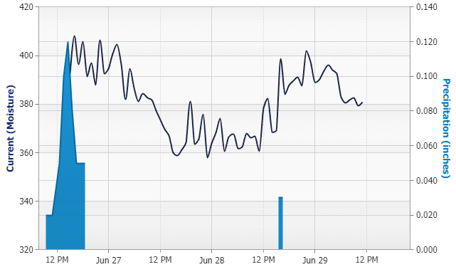
In my kitchen ceiling there is a slow onset water damage that seems to happen over time. The upstairs neighbor has no water near the floor that could be responsible for this. A contractor suggested it must be condensation build-up running down onto the celling, slowly causing this damage. I wanted to investigate this further and confirm that rain was not running down inside the walls to cause this damage. To this end, I built a crude moisture sensor using a couple transistors, resistors and two needles I could stick into the drywall. To this I attached an Arduino with a timer flash drive logger in order to measure the moisture over time. I then plotted precipitation on top of this moisture data using a JavaScript chart library to see if rain has anything to do with this. This data was collected from the Midwest in June, so it was hot outside. I believe the spikes visible in the chart correlate with the air conditioner removing moisture from the air and the sensor is measuring the moisture over the surface of the wall rather than internally. This was a fun project where data visualization helped me see that rain does lead to an overall increase in moisture within the drywall!
Ash
Starting in March 2019, I really got into data visualization (viz) and starting practicing with data viz community projects, like the #SWDchallenge. Practice fosters improvement and learning! This month’s #SWDchallenge involved collecting our own data, and I have been keeping my track of my weight. Here, we look at my 2019 weight with a focus on the time (before and) after I really got into data viz. It looks like some of my weight loss is correlated with my new found data viz enthusiasm!
LinkedIn
Bill
My family participates in an annual Thanksgiving Day 5K run, the Trinity Turkey Trot in Princeton NJ. I have an informal approach to getting in shape for this and other 5Ks, with mixed results. Peter Drucker says that “you can't manage what you can't measure.” With this adage in mind, I started tracking my workouts in late 2015. The free MapMyRun web site, sponsored by Under Armour, provides the tools I need. I draw each course I run on a road map of the area and store the course for future reference and comparison. By course and date, I record information on individual workouts: length, time, and number of steps. I also track time spent doing other types of exercise. MapMyRun calculates Average Pace per Mile. I was able to download my MapMyRun workout records to a .csv file. I then imported it into Excel, when my first assumption, “the data is clean”, was dashed. Date of workout was either in DD-MMM-YY format or a string “MMM. DD, YYYY”. Rather than exercising Excel functions or manually correcting rows, I imported the dataset to Tableau Public, which decoded the formatting, and set me up to use Tableau Public to build the chart. I kept Workout Types that were relevant to the analysis of my running, and discarded others. Average Pace per Mile values were generally reasonable. I discarded rows with zero or extremely large numbers. I anticipated that my running pace leading up to a race would impact my 5K race time. After looking at the data, I think that the number of workouts weeks before a race are also important. The chart itself took several iterations to get to where it adequately showed what I envisioned. Not perfect, but close enough.
Brent
This submission tracked all the expenses that I had for my cars from when I purchased my first car in July 2012 up to April 2019. This was the 3rd of 4 visualizations; starting with total overall expenses, then stripping out major expenses before getting to minor expense breakdown. It was eye opening to see how much I used to spend on gasoline and on maintenance!
Bryan
If you are often tired and then track your sleep but don't change any of your sleep habits, then mostly what you'll learn is that you aren't getting enough sleep (which you already knew because you are tired). I did find out that I tend to get a little more sleep on Thursday and Friday evenings, when I would have expected to get the most on the weekends. The missing days are when I went to bed but didn't put my fitness tracker on. (I only wear it at night to track my sleep.) I used the FitBit API and an R script to get the raw data. Tableau was what I used to create the visualization. You can hover over each day and see the waterfall of that night's sleep.
Interactive viz
Catherine
I wanted to evaluate my grocery expenses before and after signing up for the $5 Meal Plan service. It also occurred to me that other food expenses such as restaurants, fast food, coffee shops, etc. should be included since groceries could be substituted for eating out and vice versa. I pulled my dataset from Mint.com, after re-categorizing many transactions, and used Power BI to create the visualization.
Cole
One benefit of a guest #SWDchallenge is that I get to participate! My submission plots my progress over the past year writing my second book, storytelling with data: let's practice! General learnings: I write best when I travel and have a harder time concentrating at home (home days are better spent planning content or editing). I also write well from cafes: the background buzz puts me in my head in a way that works well for getting words out. Also: next time, I should collect better data if I want to make a graph—it would have been great to have other metrics, like word count, and also I found myself wishing for more frequent and consistent data points over time. This is only part of the picture: the book includes over 100 hands-on exercises and more than 250 visuals. I'm looking forward to sharing it with you and it should be available this fall!
Colin
I started wanting to know how many days I had walked 10,000 steps or more. So I downloaded my fitbit data for the last 30 days. As I work some days and provide childcare on others as well as family days out, I spliced the data by weekday to see if there were any trends. I created a bar chart of average steps to show which days I was less likely to hit my 10k steps target. The line chart breaks this up to show that on two days I hit my target less often. But it also highlighted that on the other days there was a large variance between the number of steps counted. Analysing the data as aggregate bar charts and individual points on a line made me think about different ways I could improve my average step count. Looking back over my activity for April made me realize how varied my walking patterns were for each day of the month.
Blog
Crystal
This month's #SWDchallenge gave me the push to create something I've been wanting to visualize for a while now, a timeline of my dog's life. Next week he will be 15 years old!
Interactive | Twitter
Dennis
After reading the book Dear Data I started collecting some of my personal data with the purpose of visualising it later this year. With this months #SWDChallenge I had a great opportunity to start visualising one of these datasets. I decided to visualise the data about the cups of coffee I drink during the day.
Dmitrijs
Doug
I've tracked our home utility use for years as a means to monitor the efficiency of the heating system. Several years ago we replaced an old furnace, and I used this challenge to estimate the annual savings. While I knew the new furnace was saving us money, the annual savings was less than expected.
Elżbieta
I wanted to visualize my grocery shopping from last couple of months. Did I spend more every month? Did I place more orders? Simple curiosity!
Tableau
Frans
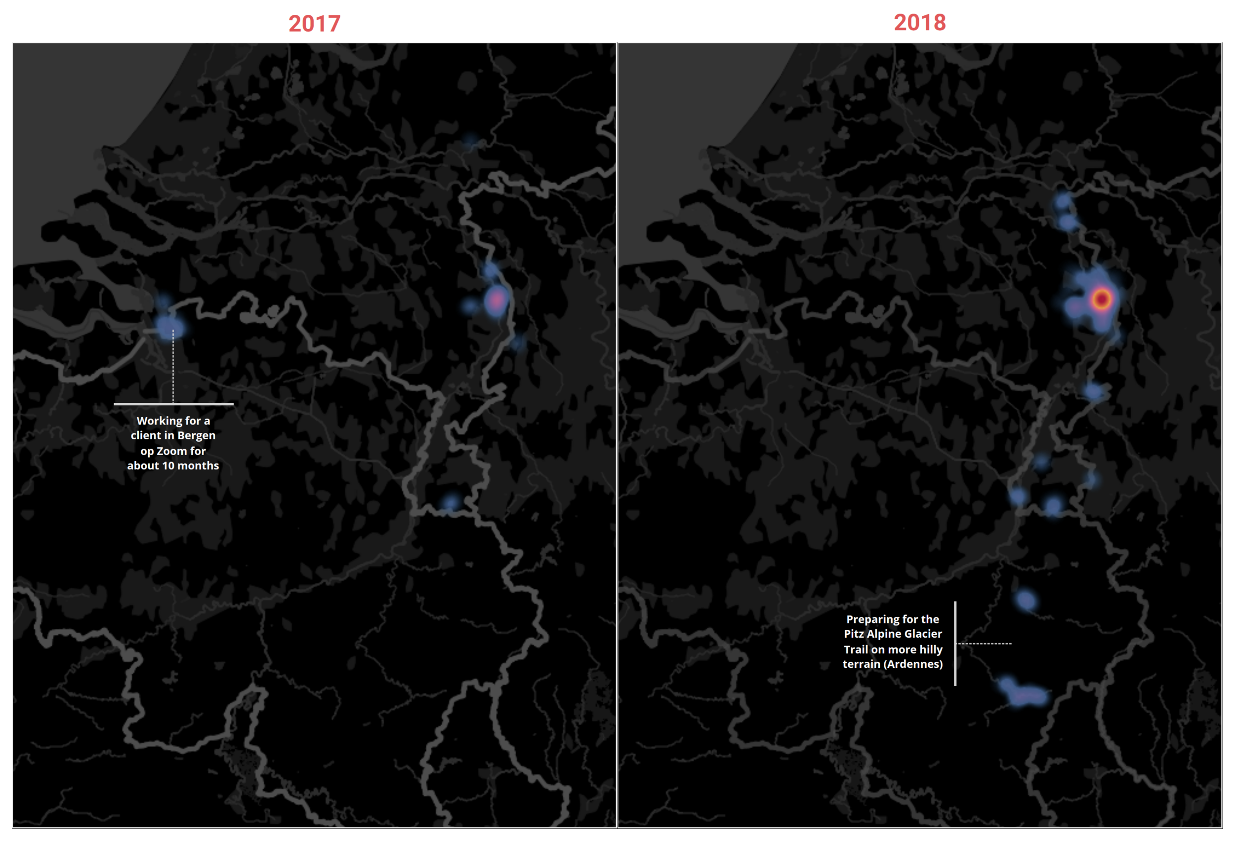
Earlier this year I used the Strava web connector to import my running data into Tableau. I was aiming to make a visual exploration on my running activities. Although I knew them quite well, I was wondering if a lot of difference would appear, for instance in intensity, location and length of the activities between 2017 and 2018. I think it did. I not just started more running in 2018, I also enlarged my running area. Especially by preparing for a big ultra run in Austria.
Gianni
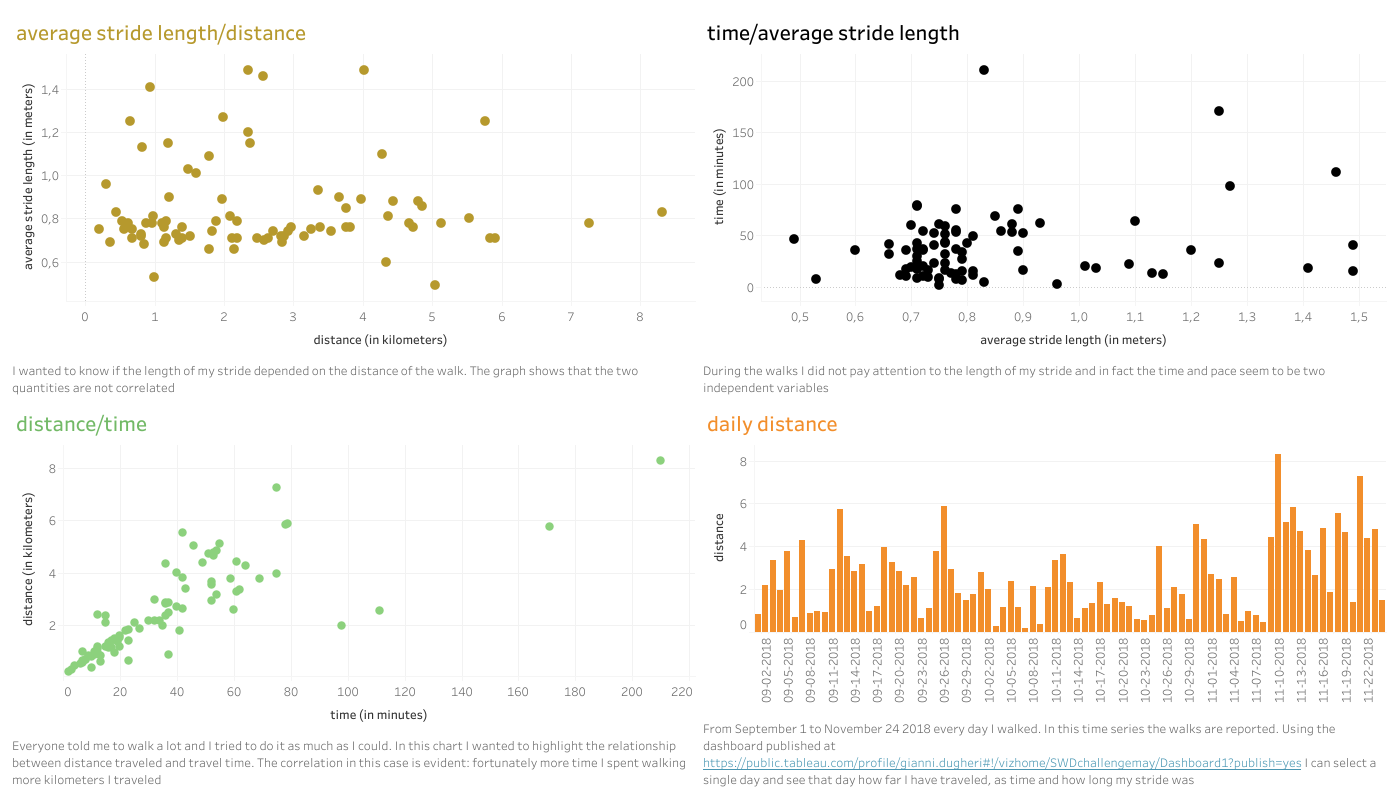
Because of a health problem, for some months the only physical activity I can do is walk. To stimulate myself a little I use a heart rate monitor and these are the data from September to November 2018. I can select a date and see how much I walked that day, how long and the length of my stride.
Interactive viz | Blog
Haley
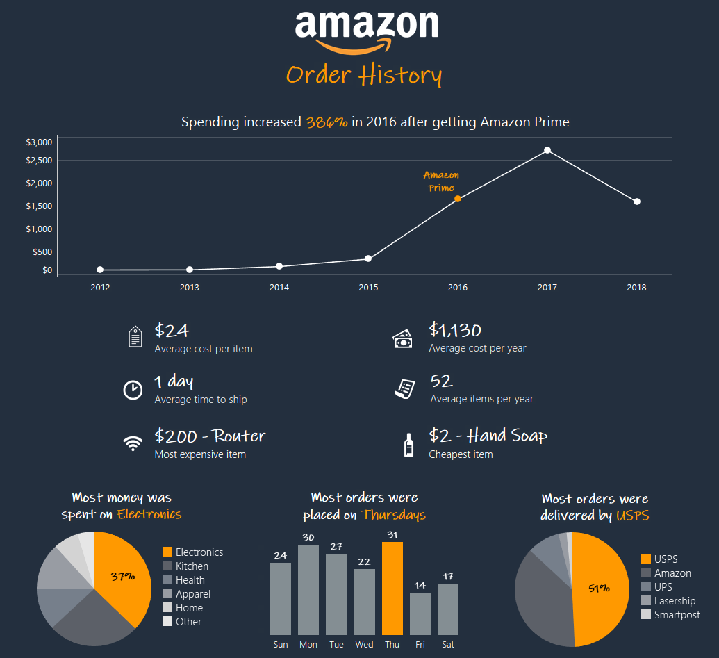
I downloaded my order history from Amazon and saw that I started ordering a lot more in 2016, the year I signed up for Amazon Prime. That caught my attention, so I pulled out some other data points that I found interesting too. This was created in Tableau.
Hanna
I use the library a lot and wanted to explore how many items I had on loan each day during 2018. The number of items went from 7 to 24 and I always had something on loan. Unfortunately I didn't have time to add annotation, but some things I can direct you to. Like March with the sun out and people enjoying the snowy and sunny season after the long dark polar night or the road trip we took in July.
Hilje’s submission demonstrates that visual metaphor can be evocative. Mike writes, “The design replicates the look and feel of a festival map. As she explains in her blog, the stories themselves are, in many cases, as interesting as (or more interesting than) the aggregated data. Her choices in what she chose to emphasize, and how, truly honor that consideration.”
Hilje
I collected data on the ultimate festival experience. You can read the entire story on my blog.
Jared
I initially wanted to created a timeline of well, something. After a bit of a brainstorm it hit me. I've recently been reflecting on past roles, and the skills I've been learning along the way, so why not visualize that?
Blog
Jason
For the May 2019 #SWDChallenge, we were challenged to work with a dataset that we have collected or created ourselves and use that data to create any type of chart we would like. I decided to create a visual profile of the content that I consume via Twitter and Podcasts. I would love to see a content profile on friends, family and the people I engage with online. Digital Marketers are already building this type of stuff into their algorithms, I'm sure. For my visualization, I decided to create a chart that is often used for population comparisons...a Population Pyramid. Although this isn't the type of data normally used in a Population Pyramid, I thought it was an effective way to represent the data. Hopefully you agree, but please reach out if you have feedback or suggestions.
Website
Joost
As a BI Consultant in the Netherlands, I travel a lot to my clients across the country. Ever since I started working as a consultant in 2014, I have been saving all the locations I visit in Google Maps. For this months #SWDChallenge I downloaded all these locations from Google Takeout and loaded them into Power BI. I visualized the result with a heatmap.
Julia’s submission shows us how individual experiences can be universal. Mike comments, “Julia used a technique that I always appreciate, which is to use real-life, universal comparisons that help audiences grasp the magnitude of certain things; in this case, comparing the length of yarn she has used for her knitting projects over the last six years to the distance between two cities in Europe.”
Julia
I was curious how my history of knitting projects summaries. I took my data from Ravelry and plotted it using R and gimp.
Link
Kate also shows us the power of a visual metaphor. Mike commented, “Kate’s animated coffee drinking viz also made use of an interesting visual metaphor, in the sense that she designed a spider chart that was reminiscent, in motion, of a coffee stain slowly spreading across a table. Sometimes these small touches make our work memorable in a way that a less-considered visual approach might not.”
Kate
I’d like to share an updated animated viz of all the coffee I drank in Italy while on vacation in February. I had fun trying to visualize this using a clock and learned some new animation tricks. You can watch my animation and read all about the “rules” of Italian coffee drinking and whether or not I followed these “rules” at my blog.
Kelly
In January 2019, I bought a pack of 14 colored bands for my Fitbit. I tracked the color I wore each day, wondering which would end up being the most-used. I actively tried to avoid wearing black or gray, but still wore those neutrals one out of every three days. The biggest surprise was pink at number two, because I rarely wear pink clothing or accessories! I realized that this particular pink is fairly close to my skin tone, so I was treating it as a neutral.
Lance
While it took me some time to settle on what data to use for this challenge when I settled on this topic I had a lot of fun putting it together (in Tableau). While the topic might be a little different I have complete confidence in the quality of the data and the conclusions it produced!
Lisa
This month’s #SWDChallenge by guest author, Mike Cisneros, inspired me to put to use a data sample I tracked in Observe, Collect, Draw: A Visual Journal. I visualized the data using a bar chart and added annotations and images to bring life to the chart.
Link
Liz
I chose to use my Goodreads data from this year for this challenge. This visualization went through a few iterations, so big thanks to my boss, Chris, for helping me refine it! I made this visualization with Tableau.
Website
Lotte
My entry could also have the subtitle “How not to train for a 10K run”. In the spring of ’18 I signed up for a 10K run in October. After the run, my hip started causing problems and I had to cut down on my exercise. I am down to running 3K and only slowly increasing the distance. Loads of people do 10K runs and I wondered why I couldn’t do the same without injuries. The chart clearly shows the steep increase in distance. It does not show that I also played with speed and altitude. Everything you’re not supposed to do at once. The chart also shows that when I started training for the run, I also skipped the visits to my rowing club, missing out on maintaining some big muscle groups. Since the data set is mine, I did a bit of manipulation with the data. April, for instance, showed that I had been out riding. I knew that was not true; I had simply chosen the wrong type of workout in my tracker and I changed it to rowing. I also changed an orienteering run in October to running for simplicity. I considered adding comments in the chart but chose to leave the space on the right-hand side empty and let the lack of exercise “do all the noise”.
A 5K run is coming up in June and I have learned my lesson… :-)
Maggie
I visualized Netflix activity data to for our Gilmore Girls watching trends in the Spring of 2019 using Excel. What I found was that the more we disliked a season, the more episodes we watched per day (quicker rate). So we like to SAVOR our favorites.
Markos
For my submission I used weight and nutrition data stored in MyFitnessPal. Particularly I wanted to explore any connection between an effort I have been making in reducing my carbohydrates and my long lasting goal of weight loss. The goal was to show if there was a visible correlation.
Max
Inspired by my university experience, I decided to do an introspection about my erratic (and often inadequate) sleep schedule. Doctors usually recommend between 7 and 9 hours of sleep. I used my sleep patterns from my Fitbit to visualize how I sleep. This helps me see where I can improve upon in terms of budgeting my daily schedule.
Mohit
It was my first freelancing SAP HANA implementation project which involved creation of new ABAP reports on SAP HANA system. As the project was critical for go-live, I worked on weekends too and sometimes extended for more than 9 hours per day. DECO report was an MIS report which was a mini project itself. My aim was to project the object which I worked upon and the time spent on it; for which the Gantt Chart was the perfect choice.
Patrick
Hi, when the description of this months challenge came up I knew exactly what topic I would use. The main love of my life (apart from wife and kids obviously) is exercise and in particular being outside. Out of interest in 2007 I started keeping very simple records of how much I did. When I look back on it now over 11 years, it's like a barometer of some of the main milestones and events in my life. I also use it to make sure I'm always at a certain level of exercise as I get older and busier with family and work.
Paul C
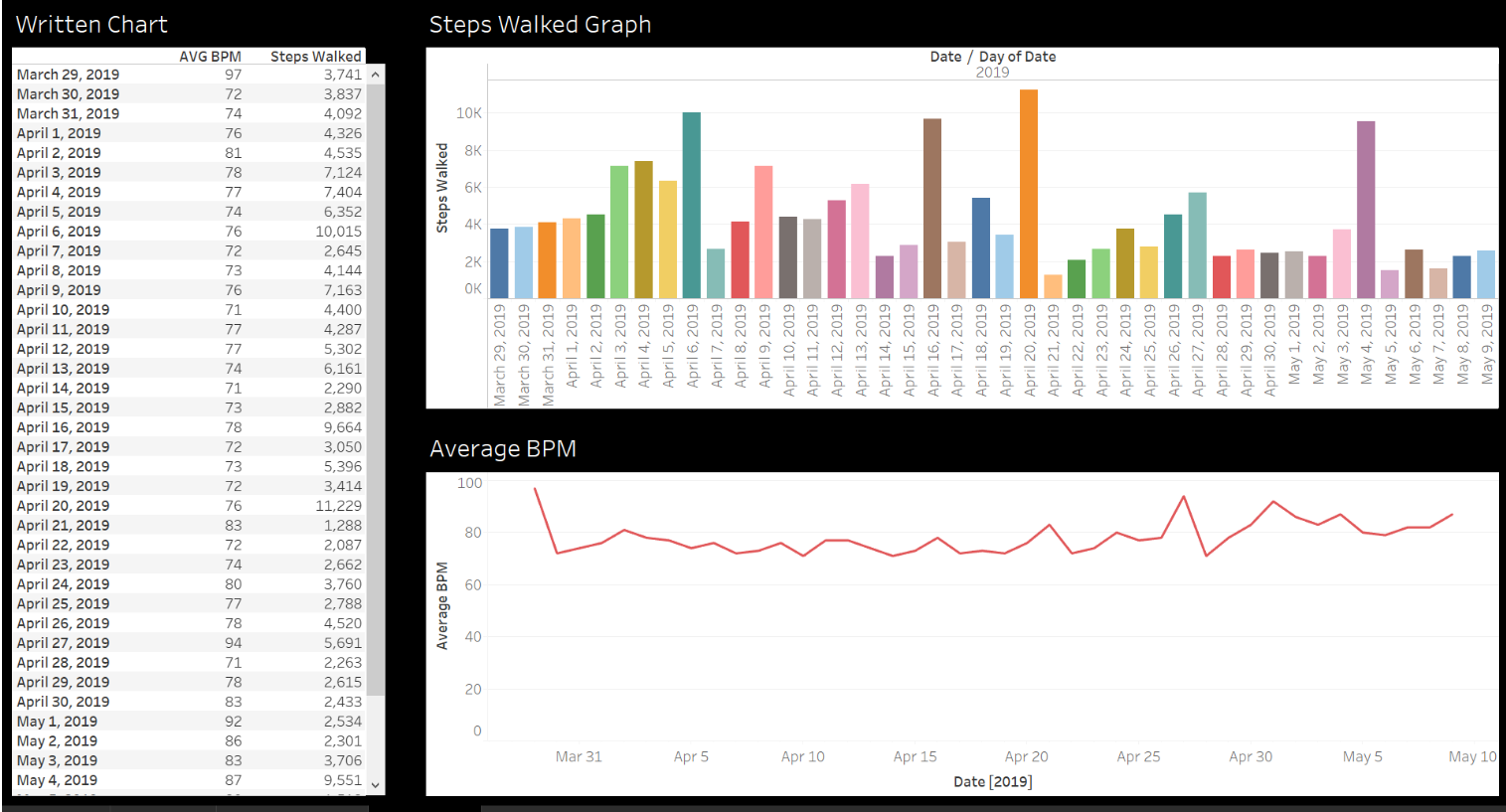
Number of steps and heartbeats per minute since purchasing my Smart Watch.
Paul T
I entered a 6 week fitness challenge and got a bit carried away. Lost 11kg in 6 weeks and had a lot of fun doing so (oddly).
Penola demonstrates how individual experiences can be universal. Mike notes, “I loved the way that Penola combined two numeric variables with a qualitative variable, because the story of her viz wasn’t in how a stock price fluctuated over time, but rather in how her friend reacted to those variables. The humble line chart, presented in this manner, conveyed emotion and connected with an audience through that universal recognition of hope, excitement, panic, sadness, and relief.”
Penola
I chose to use personal data of texts received from a friend investing in the stock market for the 1st time. Being an dedicated & passionate vegan, she wanted to invest in the Beyond Meat IPO and show support. Texts received from her were numerous - I did not include every detailed text - just those that highlighted her experience. Approval was granted to use texts.
Petra
This was my first challenge, need to learn more about data viz.
Link
Pris
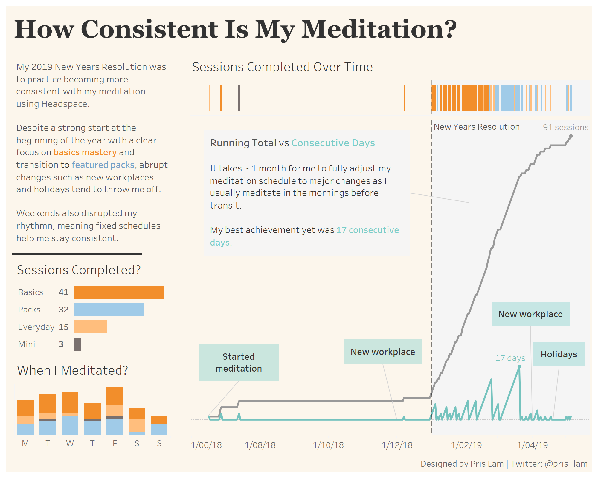
My 2019 New Years Resolution was to become more consistent with my meditation. I collected my meditation data from the Headspace app to create a visualization showing my sessions completed and trends.
Rebekah
I used notes I leave on all the recipes I try in my cookbooks as the data for this challenge, creating a basic bar chart to show the number of new recipes I tried each month over a two year span. My hypothesis was the year post-grad school would have a significantly higher numbers per month compared to the year during grad school.
Link
Rodrigo
After suffering a TBI in January 2015 Alice's life changed forever and a intense routine of therapies is now her new normal. This visualization helps us to keep track of her claims with our health insurance plan.
Link
Ross
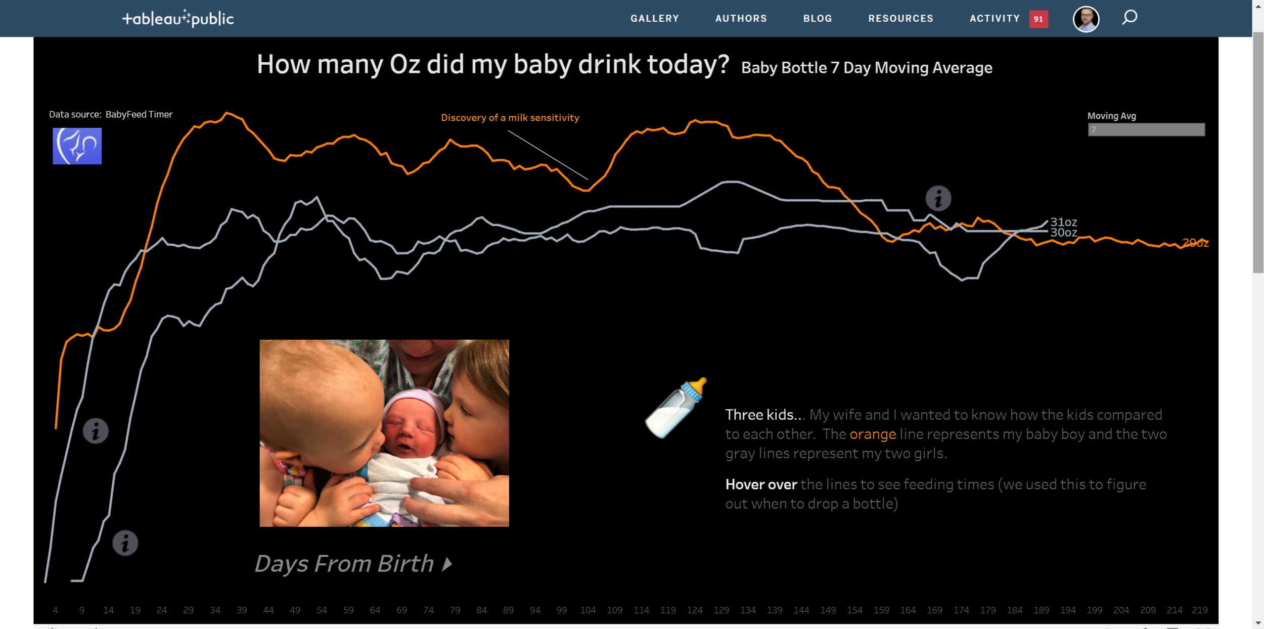
Four years ago my wife and I had our first child. I had a new job at Tableau and was baby in the data visualization world. We had a lot of challenges keeping track of when and who was feeding our baby. "There's got to be an app for that!" There was. We started logging everything and kept it up for the other two babies that came along. We had all this data and started to ask questions like, "when do we drop this nap?", "When do we go from 5 bottles a day to 4?". The App had some decent visualizations, good for looking at daily perspectives and none for comparing other kids. I exported the data as a csv and went to town.
Interactive viz
Samo
In this challenge, I looked into my effort of lowering my commute costs and how efficient are my changes.
interactive viz
Sandra
Kea is a pet parrot with a disease that has no cure, requires injections to manage symptoms, and requires careful weight monitoring. The data used are her weights recorded in 2019. I learned that the longer days (more vitamin D) have no obvious effect on her weight. House guests and the injections likely lead to a decrease in weight, but not always. I already knew she had stayed above the concern level of 540 grams. I used different colored and larger markers for the injection dates, to note her benchmark high weight, and for a special condition of multiple tornadoes in the area. The injections add to her stress, which can lead to weight loss; and the tornadoes were an unusual event that added to everyone's stress. Annotating the benchmark high weight added info and was helpful since that value is above the highest axis value shown. Since it's the only point above 565, eliminating the '570' value on the axis got rid of visual clutter. I used thicker orange lines to note when there were house guests, and thin gray lines otherwise. House guests can add to her stress, which leads to weight loss. I added annotations for context of the vertical axis, legend info, and for the horizontal line at 540 grams. I added title as an annotation to better control font size and color, and position. I used a white text box to cover up the legend of 535 on the vertical axis, which wasn't relevant but was needed to get the axis values that I wanted. I eliminated the horizontal axis and the grid lines on the vertical axis because they didn't add information. I intentionally started vertical axis values shown at the 'concern level' of 540 rather than lower values, such as 500 for the 'critical' level. Changes of 3 grams or more can be significant, especially if there are multiple days with decreases. The minor tick marks (hidden) are 1 gram changes. (Scale is accurate to 0.5 grams.) I explored eliminating markers for 'normal' days and decided to use very small markers of the same color as the connecting lines. Thought this added information without being visually intrusive. I tested printing in grayscale to make sure color choices did not lead to visual confusion on a non-color printer. Avoided red/green issue for colored markers.
Website
Seonaid
I chose to download my twitter archive for analysis... the initial impetus was that I noticed that I have been primarily retweeting recently, and I wondered what my patterns of use have been over the years that I have been using Twitter. The most interesting thing I saw was that since I tend to spend the summer outside, and often on the road, my August tweets are only about 2% of the total. I'm basically offline for the month of August, and this has apparently been consistent for the last 9 years.
Link
Simon
For this month’s challenge I attempted to learn a new technique in Tableau, a matrix style view. Using made up data I built this. Happy with the outcome and with real data there may well be some worthwhile trends and stories to pick out in future versions.
Interactive viz
Sohini
This is an analysis on the groceries I have bought over time.
Interactive viz
Tania
Since I first saw Gmail ads, I have always insisted I would never be the kind of person to click on them due to how creepy they are. Now that I can easily get all my data from here, I thought I'd put this assumption to the test.
Tiffany demonstrates that visual metaphor can be evocative. Mike notes, “Tiffany’s tale of KonMari-ing her closet was presented in a manner that built slowly over time as the audience interacted with it, mimicking the way the piles would grow and be sorted in a real-life KonMari process.”
Tiffany
Interactive data viz best seen on desktop. The data collected was an inventory of the items in my closet and their resulting fate during a KonMari decluttering session. The data took some time to collect, making the decluttering even harder!
Blog
Click ♥ if you've made it to the bottom—this helps us know that the time it takes to pull this together is worthwhile! Check out the #SWDchallenge page for more. Thanks for reading!
