#SWDchallenge: small multiples
Happy new year! To celebrate the onset of 2020, we’ve decided to focus the SWD challenge on a visual that historically hasn’t received much attention from us—but can come in quite handy in the right circumstance—the small multiple chart. Selecting a suitable graph depends on many things: the audience, you, what you’re trying to communicate, and even the underlying dataset. Let’s explore the dataset factor.
When you have a single set of categorical variables to display, choosing a chart type is relatively straightforward: a bar chart can get you where you need to go more often than not.
Add in a second variable or a temporal element, though, and things get a little more challenging. You’ll likely need to use both the x-axis and y-axis to encode the data. If it’s one variable that changes over time, you’ll likely opt for a line chart, with different lines plotted for each category; if it’s two variables, you might choose a scatterplot.
But what do we do when we have two different variables, PLUS a temporal element, for each of numerous categories? Or, consider the case where we are plotting geographic data, which already has a specific and unchanging latitude and longitude value for each category; how do we show change over time on maps?
One way is through animation. The late Hans Rosling famously used this technique in his animated bubble charts for the Gapminder project. But not all of us have the leeway to create animated versions of our visualizations (and, few of us are as skilled at live presentation as Hans Rosling was). What could we do, then, instead?
Enter: small multiples.
Small multiples go by many names: trellis chart, lattice chart, grid chart, panel chart... all of these names refer to an organized series of similar graphs, displaying a different view of the same dataset.
Almost like frames of a movie, as Edward Tufte once described them, panels in a small multiple chart can step the viewer forward in time as the data we visualize changes and evolves. Alternately, we can use small multiple charts to show each category separately, representing their unique values over time within individual panels, while organizing and sorting those panels in thoughtful and insightful ways. Small multiples can be useful to break down an overwhelming visual by displaying smaller pieces that are easier for you to analyze or for your audience to digest.
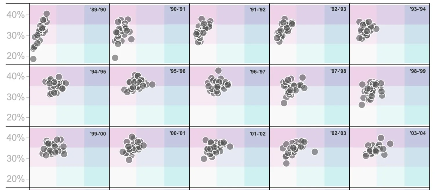
Let’s consider an example. Imagine that we want to show how basketball teams in the NBA have changed the way they play over the last 30 years. Teams nowadays take far more 3-point shots per game than they used to, even though NBA players are only slightly more skilled at making these shots than they used to be (analysts discovered that attempting a 3-point shot had more value than attempting an easier 2-point shot, because the risk of missing that 3-point shot was outweighed by the reward of earning 50% more points for a successful attempt). Let’s take a look at the data—spend a moment studying the following visual.
This small multiple chart shows two variables for each team in the league for each of the last 30 seasons: on the x-axis, the number of 3-pointers attempted per game; on the y-axis, the percent of attempted 3-point shots that were successful. Each point is a single team in a single season. The individual panels step you forward in time as the data changes and evolves. They help you see how the pack of all NBA teams is inexorably moving towards more and more 3-point attempts per game (the data points shift rightwards as you progress through the frames). We can also see that there are no longer any teams with sub-30% shooting percentages on those attempts (illustrated by tighter clustering upwards as you move forward in time).
A couple of things to think about when it comes to this chart. The goal of these multiples is to simplify the interpretation for yourself or your audience by segmenting a larger or complex visual into smaller easily digestible pieces. To facilitate this comparison across the different views, the axes and scale should generally be across the repeated charts. They also should have similar characteristics and colors. This makes it so that the reader only has to figure out how to read one graph and then they know how to read the rest!
Now it’s your turn!
the challenge
Pick a dense dataset or visual that feels tough to consume in a single graph, break it up to create a small multiple chart, and share it in the SWD community (if you haven’t yet joined, take a moment to indicate your interest in the form and you’ll receive instructions to access). You can make multiples of any chart type you like—bars, maps, lines or maybe even pies! The goal is to improve a visual through segmentation.
Share your creation in the SWD community by January 31st at 4PM PST. If there is any specific feedback or input that you would find helpful, include that detail in your commentary.
We are excited to see all of your small but mighty creations this month!
related resources
Here are some additional examples for inspiration. There’s a ton of great work out there—much more than we’ve called out specifically here—this is a starting point, but certainly not a comprehensive list (if there are other great examples you’d like to share, feel free to include links in your submission commentary).
NYT article: What Satellite Imagery Tells Us About the Amazon Rain Forest Fires
Nathan Yau’s post: Life expectancy by state, against the US average
Peter Bell’s Medium article: How Pew Research Center uses small multiple charts
More examples from Mike Cisneros: Internet Usage Around the World, Visualizing of 24 Presidential Campaigns Using Wagering Odds

