what is a pie chart?
This article is part of our back-to-basics blog series called what is…?, where we’ll break down some common topics and questions posed to us. We’ve covered much of the content in previous posts, so this series allows us to bring together many disparate resources, creating a single source for your learning. We believe it’s important to take an occasional pulse on foundational knowledge, regardless of where you are in your learning journey. The success of many visualizations is dependent on a solid understanding of basic concepts. So whether you’re learning this for the first time, reading to reinforce core principles, or looking for resources to share with others—like our new comprehensive chart guide—please join us as we revisit and embrace the basics.
Pie charts are one of the most common types of data visualizations. They are also one of the most widely condemned and misused. The good news is they do have a proper use case and it’s easy to use them appropriately.
In this post, we’ll discuss:
how a pie chart works
two specific use cases for a pie
how to identify whether your data is better served as something other than a pie
design tips for creating an effective pie
What is a pie chart?
A pie chart expresses a part-to-whole relationship in your data. Imagine an actual pie (I’ll let you choose your favorite variety!). Each slice represents one component and all slices added together equal the whole. Pies are perhaps so commonly used because, as Manuel Lima writes about in The Book of Circles, humans gravitate to circles as the universal symbol of unity, perfection, and infinity. We like things to be whole—and understand how the respective pieces relate to the whole. A pie chart provides us this comfort of a part-to-whole relationship.
Here’s a brief overview of how we consume a pie. Each pie slice has three visual components: its central angle, area, and arc length. Recent research by Robert Kosara and Drew Skau demonstrated that we read pie charts by area—or possibly in combination with arc length—which debunked some previously held beliefs that pies are read by angle. You can read more about their research in an illustrated tour of the pie chart study results.
Let’s look at an example. Imagine you have a portfolio of five products and you measure sales (in millions of dollars) for each. The sum of each individual product’s sales equals the total sales amount. You can see the part-to-whole relationship of each product’s contribution to the total in the pie below. In this instance, I put the total dollar volume at the top and labeled each segment with the percent of the total. Alternatively, I could have labeled each segment with the respective dollar amount. Which you choose is largely dependent on what you want your audience to see or do with the graph.
When should I use a pie chart?
Pie charts are probably better than any other visual for expressing a part-to-whole relationship. When you hear “percent of…” or “part of…” that’s one indication a pie chart could meet your needs.
There are two primary use cases for a pie chart:
If you want your audience to have a general sense of the part-to-whole relationship in your data and comparing the precise sizes of the slices is less important.
To convey that one segment of the total is relatively small or large.
Our sales example supports the first use case. Suppose we want to focus on how much revenue a given product—or set of products—contributes to the total. Given our natural construct of how we read a clock, it’s fairly easy to tell that Product A makes up roughly a quarter of total revenue and that Products A, B, and C combined are roughly two-thirds of total revenue. For these general part-to-whole relationships, a pie chart could effectively convey that information.
The two pie charts below are examples of the second use case. With each of these, I can easily make one broad conclusion—one slice of the pie is relatively larger or smaller than the others.
For applications with different datasets, check out Lisa Charlotte Rost’s examples in what to consider when creating pie charts.
When should I pass on the pie?
Generally speaking, pies should not be used for evaluating the relative sizes of categories, comparing data across pies, and visualizing percentages that do not sum to 100%. Let’s look at an example of each.
Comparing the size of categories: Pie charts break down pretty quickly if we need our audience to have a more nuanced understanding of our data than simply big, small, or about the same. To illustrate, consider the following example. If I asked you to compare the size of slices C and D, which would you conclude is larger? Taking it a step further, how easily can you estimate how much bigger?
This example demonstrates one limitation of data encoded as pie slices: humans’ eyes aren’t well-equipped to compare areas. The challenge becomes even more pronounced without a consistent baseline—like a y-axis in a horizontal bar chart—against which to make the visual comparison. As illustrated in the following, comparing the size of C vs D is much easier in the graph on the right. We’re also comparing one dimension (length) across two categories, instead of irregularly-shaped areas.
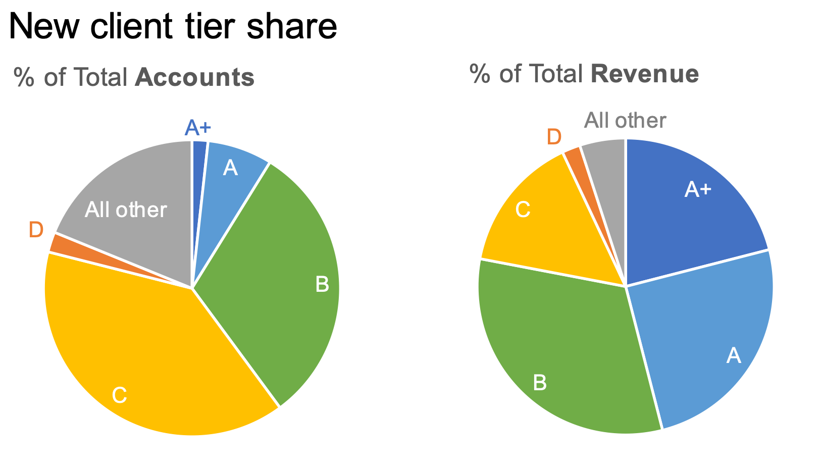
Comparing data across pies: this is a difficult task, because the things you aim to compare are separated visually and are located in different places on each pie. To illustrate, check out the pair of pies below, excerpted from Exercise 2.1 of Storytelling with Data: Let’s Practice!
Let’s say the primary comparison you want to highlight is how Tier B varies across the two breakdowns. Tier B is in different places across the pies—as a direct result of the variation between the two datasets. Because of this spatial separation, different positioning within the pie, and the irregular shapes of the segments, it’s hard to accurately judge the difference in magnitude.
Showing data that doesn’t sum to 100%: if the slices sum to something other than 100%, it is wrong. By definition, the pie must depict a meaningful whole.
I want to use a pie: how do I make a good one?
When using pie charts, here are a few quick design tips to make them more effective.
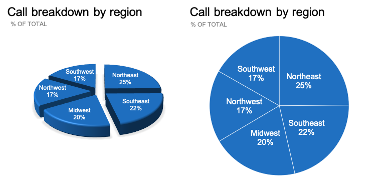
Avoid 3D and exploding effects. These elements introduce unnecessary clutter and can distort the data. This inability to make an accurate visual comparison was validated in the aforementioned Kosara and Skau study, where study participants misjudged the values in exploding pie charts to a higher degree than the flat pie.
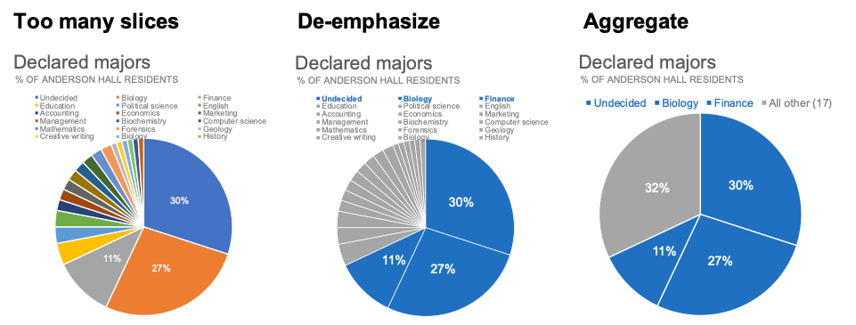
Don’t have a ton of slices. There isn’t an exact rule here, so approach with careful consideration towards your dataset and audience’s needs. You can improve readability by either de-emphasizing small categories with similarity of color (as shown in the following middle pie with grey) or by aggregating into an “All other” category, as illustrated on the right.
Sort your data meaningfully. Check out the two pies below. On the left, the data is sorted alphabetically (beginning with apples at zero degrees). The right pie is sorted in descending order starting with the largest category (pineapple). This takes into account our natural construct of reading around a circle.
Eliminate the legend and label the data directly. Check out the difference in the following graphs. Labeling directly, as shown on the right, reduces the task of going back and forth between the legend and the data. Whenever possible, aim to label your slices directly with the value so long as there’s sufficient space to make the labels legible.
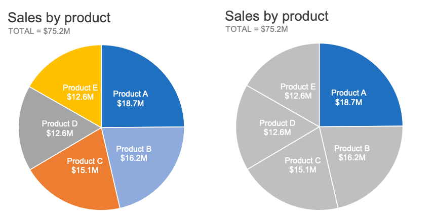
Use color strategically. When used sparingly, color is arguably the most important decision we make to focus our audience’s attention. Let’s assume we’d like to highlight Product A’s contribution to our sales portfolio. Which of the following pies more effectively draws your attention to Product A?
For another example of effectively designing a pie, check out how to make a better pie chart.
Where can I learn more about pie charts?
Here are some related resources to further your learning:
Practice with the exercises which graph would you choose? or alternatives to pies
Listen to the podcast episode it depends…
Discuss in the community conversation alternative part-to-whole approaches
Read the ongoing discussion and debate about the use cases for pies:
Alternatives to pies (SWD)
The great pie debate (SWD)
An updated post on pies (SWD)
Who made that pie chart? (New York Times)
Save the pies for dessert (Stephen Few)
F**k it, let’s use pies (Jon Schwabish)
Now that we’ve taken a tour through the ins and outs of pie charts, be sure to continue your journey through the rest of our “what is...?” chart series, by browsing other common visuals like bars and lines, or explore our comprehensive chart guide page for additional chart types.


