differences between histograms and bar charts
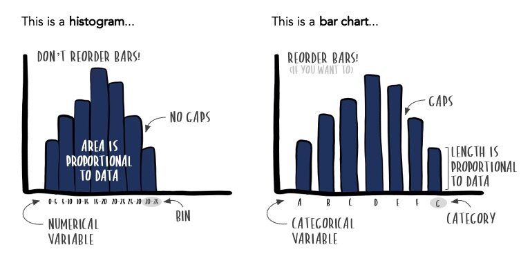
Consider the above illustration of two data visualizations.
A histogram is on the left, and to the right is a bar chart (also known as a bar graph). Histograms and bar charts look almost identical, yet they are dramatically different. Understanding their differences is important, so you know when to use each one and accurately convey—or consume—the insights they contain.
Let’s take a closer look.
Histograms and bar charts have different use cases
To understand when it’s appropriate to use a histogram versus a bar chart, let’s use a property sales dataset for residential homes sold in Greater Manchester.
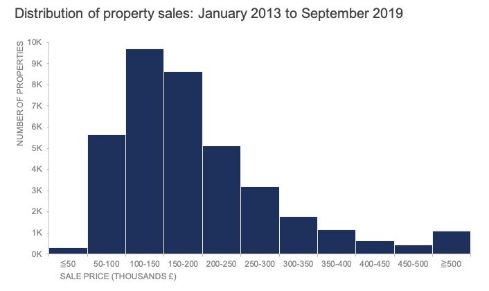
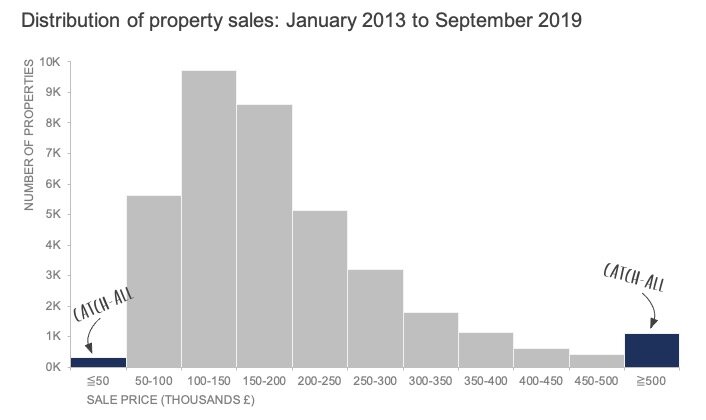
The following histogram visualizes this data and is inspired by Graeme Gourlay’s infographic (a December 2019 #SWDchallenge submission).
What can you conclude about this data?
I can see that the most common property price was between £100K and £150K. I can also identify that it’s rare for a property to sell below £50K. The histogram lets me understand more about the shape or skewness of the numerical variable, sale price. This is the main reason to use a histogram—when you want to understand the underlying distribution of a numerical data series. Histograms are prevalent in statistics, and therefore more common during exploratory analysis than explanatory analysis.
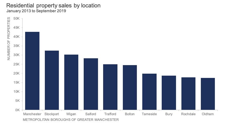
On the other hand, a bar chart works well to make comparisons across categories. Our histogram only answers questions about the overall distribution, but what if I want to know more about our data composition? Where were most of these properties sold? What types of properties sold: flats, terraced, detached houses, semi-detached? These are all questions about categorical, not numeric data. Below is an example bar chart showing the breakdown by location. (To learn more about bars, check out our complete guide, what is a bar chart?.)
Histograms and bar charts display different types of data
Histograms visualize quantitative data or numerical data, whereas bar charts display categorical variables.
In most instances, the numerical data in a histogram will be continuous (having infinite values). Attempting to display all possible values of a continuous variable along an axis would be foolish. Instead, the continuous data is grouped into ranges called bins. In the property sales histogram, the bins have a range of £50K.
Unlike histograms, bar charts have a finite set of categories—like the ten boroughs displayed in the above bar graph.
One caveat is when your numerical data is discrete—meaning it’s countable. With discrete data, the distinction between a histogram and a bar chart is less obvious. You could use either. The choice will depend on your purpose and how many discrete values you have. For example, property price is technically a discrete value, but because of the variability and wide range of values, it is easier to treat it as continuous—grouping values into manageable bins.
Histograms and bar charts have different formatting rules
With bar charts, as with most graphs, there is a fair amount of flexibility regarding format and design. Histograms, on the other hand, are subject to rigid rules. Let’s look at three main areas where bars and histograms have varying formatting constraints.
You can’t reorder bars in a histogram; you can in a bar chart
There is an inherent ordering with a histogram because the underlying data is continuous—or at least treated as such. It’s crucial to preserve the natural ordering just as you would with temporal data, going from smallest to largest.
This may or may not be the case for a bar chart. For any ordinal categories—Likert scales, age ranges—it makes sense to maintain the natural ordering. But in most cases, it’s okay to adjust the order of bars to match the data or insight (smallest to largest, largest to smallest, etc.).
In a histogram, bars should touch; in a bar chart, there is space
Bars should touch in a histogram to illustrate that the data is along a numerical axis.
In a bar chart, you’ll want to leave a gap between bars to distinguish the categories. There isn’t a specific rule about how much space to give, but opting for a gap width between 30%-40% is a good starting point.
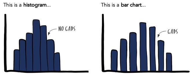
The different spacing between bars is an important graphing convention and one of the most telling visual distinctions between histograms and bar charts.
Histograms can have unequal bar widths; bar charts have equal widths
Histograms can have unequal bar widths if the bin intervals differ.
One thing to note is that histograms encode numerical data by both length and width, also known as area. The area of each bar in a histogram should be proportional to the data. This means that if you were to create different bin sizes, the length and width dimensions should adjust accordingly.
If we revisit the histogram for property prices, we can see that the ends have catch-all bars: less than or equal to £50K and greater than or equal to £500K.
This may or may not be an accurate representation of the area. It’s possible that all properties sold above £500K fell between £500K and £550K (equally sized bins). But suppose a few homes sold above the upper bound of £550K. In that case, the final bar’s length and width should change to represent the area proportionally.
It’s worth mentioning that I’ve seen many instances where the first or last bars of a histogram aren’t scaled correctly. If you’re looking to create a histogram with accuracy, consider sizing your bars to proportionally match the interval, or better yet, keep things simple by using equally sized bins.
In a bar chart, regardless of whether you opt for narrow bars or a wider option, the widths should be consistent. Bar charts plot categories, not numerical ranges, so the width isn’t meaningful.
To summarize, both histograms and bar charts are composed of bars, but that’s really where the overlap stops. They have varying use-cases, display different types of data, and have specific formatting rules.
Are you aware of other differences between histograms and bar charts? Are there additional chart types you’d like us to explore beyond our SWD chart guide? Let us know in the comments.
Learn with us! Check out our current workshop schedule and set yourself apart from the mess of 3D exploding pie charts with the principles of effective data communication.
