how you would visualize hurricanes
A few weeks ago, I posted a visual from The Economist on hurricanes and invited readers to makeover the graph and let me know what headline they would put on it. I was excited by the variety (and number!) of responses from all over the world. Thanks for your patience awaiting this follow-up post: it took a bit of time to pull 60 makeovers together in a sensible way!
First, let me summarize some of what I saw. People used a variety of tools (mainly Excel and Tableau, but also R/ggplot2, D3, Python, STATA, PowerBI, and others). Folks also visualized the data in various ways (lines, bars, stacked bars, area, bubbles, dot plots, maps, and more). Many people used multiple graphs. Some pulled in other data points (e.g. barometric pressure, wind, number of deaths, cost of damage). Many people chose to highlight the lack of pattern/trend in the data or otherwise changed the headline and takeaway(s) called out.
Here is the original graph from The Economist:
Common points raised about the above included:
Belief that the original headline ("Hurricanes in America have become less frequent") was misleading.
Raising doubt as to whether the way hurricanes are measured/categorized has been consistent enough through history to start with such an early point in time.
Unease at the inconsistent time intervals on x-axis.
Uncertainty regarding years with no hurricanes (whether missing data or really no hurricanes, whether/how this is accounted for in original graph).
Questioning of the value/validity of the trend lines, given that the apparent (and calculated) lack of correlation. Uncertainty expressed at why recent data points weren't included.
It's clear you had fun with this. There were a number of comments simply expressing excitement about the challenge and it seemed folks found it to be a stimulating exercise. I'm happy you thought so and would love to do more of these. Stay tuned on that front. I should mention also that I did not personally participate in this challenge—it would have been unfair after seeing all of your amazing remakes and I decided my time would be better spent compiling and sharing back all of the great work you've done.
A couple notes to those who submitted makeovers: first off, THANK YOU for taking the time and sharing your work. In my copying/pasting/condensing, if I've misrepresented anything or failed to include a social media profile you'd like to have linked, please send a note with specifics to makeover@storytellingwithdata.com and I'll take care of it. The makeovers are posted below in alphabetical order by first name + last initial (I omitted full last names in respect of those who would rather remain anonymous). If you thought you submitted a makeover but don't see it here, please send a note with your makeover to the address above and I'll add it (I think I got them all, but you never know). Also, I'll apologize up front for any fuzzy visuals—that's my doing (not yours)—getting everything into a common form for posting here was more challenging than one might imagine!
READER MAKEOVERS:
Adolfo H.
Adolfo visualized cumulative hurricanes in an annotated line graph:
Alex I.
Alex (LinkedIn) from Warsaw, Poland, recapped the following changes in Excel: "aggregated into 2 groups (major, non-major), tried to communicate 2 things with title: 1) about trend in overall number and majors; 2) long time gap since last major, pushed back/out non-data (gridlines, non-major series, subtitles), eye-catchy color for majors, labels for majors—to see that trend is stable for them, extra callout for recent majors back in 2005, downward sloping trendline for total number (although, here it's kinda cheaty, since last decade is only 6 years, but I decided not to reveal this cheat), and made order with Y axis (more clear I guess)."
Alessandro N.
Alessandro said he'd group categories together, as illustrated below, and accompany this graph with the following 50-year stats:
1900-1950: -3.1% total number of hurricanes, +60% hurricanes force >=4, -6.5% hurricane force <=3
1950 - 2000: - 24.2% total number of hurricanes, -12.5% hurricanes force >=4, -24.4% hurricanes force <=3
Andrew E.
Andrew chose a view that focused on major hurricanes with a line graph:
Andrew M.
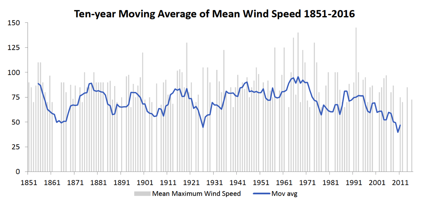
Andrew illustrated the hurricane data through three views, plotting both actual (bars) and moving average (lines) for number of storms, number of strong storms, and wind speed.
Ariane M. & Marina C. & Luciana B.
Ariane, Marina, and Luciana decided to keep the headline but group the years in a different way. They said: "We are using 5 because we don't have complete information for our current decade (2011 - 2020). So we're afraid of comparing apples and oranges. Another option of our group was not to mention the growing trend for category 3 hurricanes. We believe it would change the headlines completely!"
Ben B.
Ben (Twitter) used Tableau to visualize the hurricane data. Here is the Tableau Public version.
Billy W.
Billy (Reddit) was the very first to submit a makeover for this challenge. He writes, "There’s no significant trend on that chart (definitely not a downward one!), and the author does his/her readers a disservice by implying otherwise."
Bridge M.
Bridge (Twitter) created two views of the data, along with the following explanation.
Version A: In sticking with the original headline (and not reading the article), I came up with this (assuming I'd drop in the Source, and Major* qualifier would be included further below).
Version B: In perhaps sensationalizing the headline, I took a slightly different approach, partially to better handle the white space, but also because it's what I'd actually imagine reading.
Budana P.
Budana's suggested headline is: "Major hurricanes in America have become more frequent." With the following graph and comments:
This is a time series data. So a line chart is the go to.
I did not see value added in the message conveyed by segregation of hurricanes categories into 5, instead I grouped them into 2.
I omitted the current 10 years data point since we are currently short by 3 years. Presenting this point (2011-2016) would be prone to bias interpretation of the trends.
I added an emphasis of upward trends since 1971 to the most recent data point, highlighting the upward trending of both minor and major hurricanes enclosed in a gray rectangle.
Cindy C. & Amanda D.
Cindy and Amanda worked together on a bar/line combo:
Colin W.
Colin (Twitter) created an interactive visual on Tableau Public (where you can hover over specific data points and see details). Below is a screenshot. He also posted about his work—and how he applied the storytelling with data process—on his blog.
Craig D.
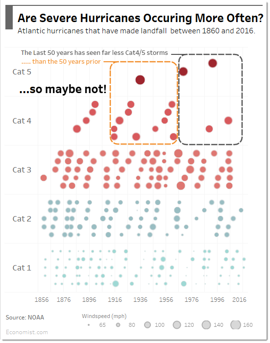
Craig (Twitter) from Syndey posed the question, "Are severe hurricanes occurring more often?" He wrote about his process on his blog. Also check it out in interactive form on Tableau Public.
Dangfun P.
Dangfun plots total and percent Category 3 and above with lines and bars and the headline, "Fewer but Stronger."
Daniel H.
Daniel (blog) from Germany created the following in R, noting, "I decided early on that I wanted to do a visual that includes all data from the source (instead of showing only aggregated versions) to give a visual representation of all the noise and randomness we're seeing there. Also I trashed a few variations with additional data (like death count and damage for the hurricanes) feeling that it made the graph way too complicated to read. It should be possible to get a comparable result in Excel by adding transparency to the plot points (it makes scatterplots sooo much nicer and adds density information)." He also blogged about his approach.
Divya R.
Divya questions the original headline, writing: "Ignore the horrible overlapping interval labels (every 5 years), but you see how the slope for all categories is only slightly decreasing and in all cases the Standard Error band (colored haze) allows for the possibility of the trend line to go in the exact opposite direction? So one cannot strongly assert that hurricanes are decreasing across categories. I'm using same scale to show that even relative frequency (higher for low category earthquakes) doesn't dampen the possibility but actually has larger SE bands."
"I've seen a number of your posts point out the above effect where artificial precision induces a false accuracy. I'm approaching the same from a core stats perspective. [This] doesn't make for a very good graph, let alone for a headline, but in favor of effective data communication over pure viz, it's a point pertinent to convey."
Eduardo M.
Eduardo highlights a declining trend via 30-year buckets:
Gavin M.
Gavin also highlights a decreasing overall trend, but also comments on a slight increase in the most damaging storms:
Glenn K.
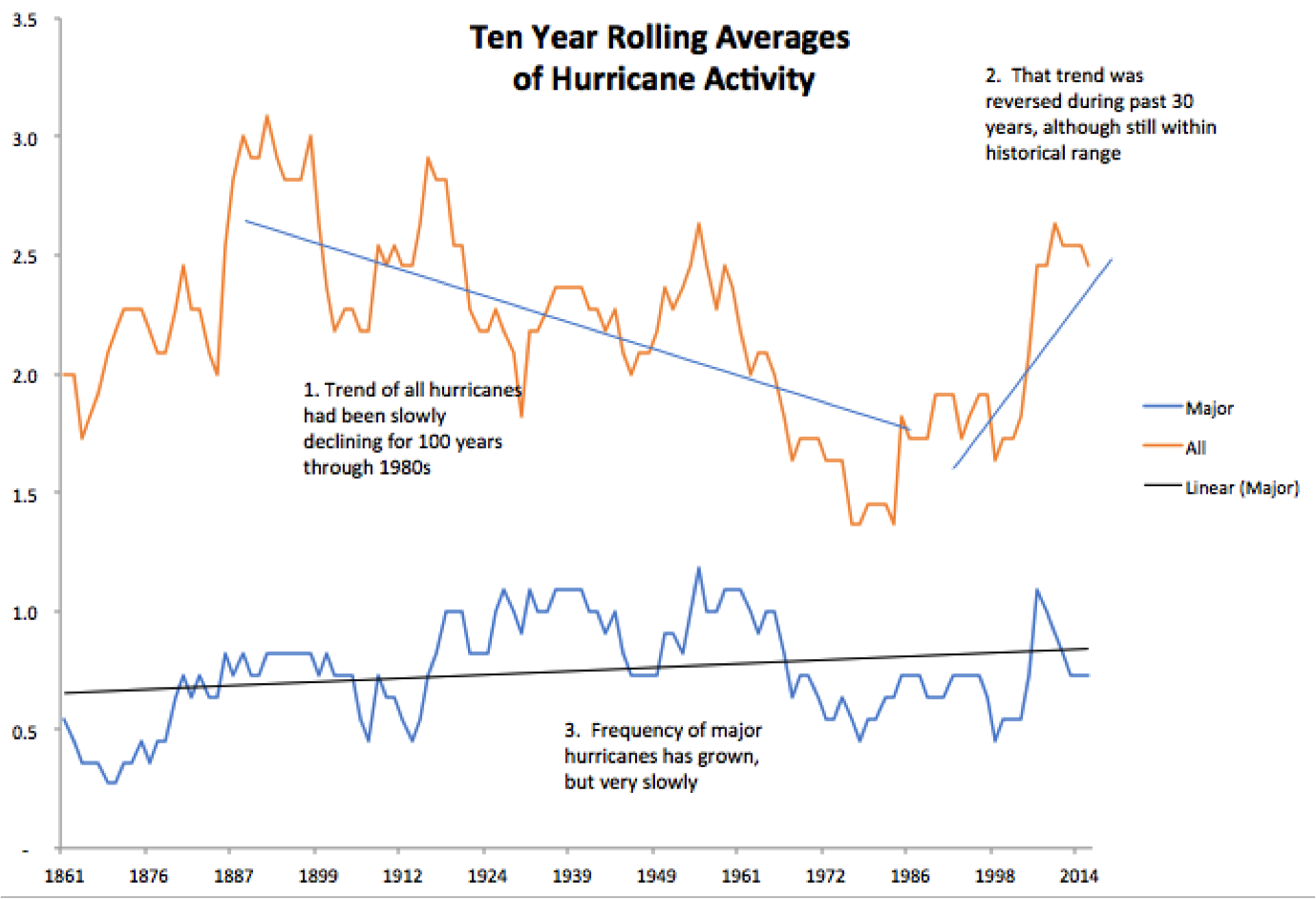
Glenn shows two views of the data, along with his comments: "Show the raw data as 10 year rolling averages. While this introduces a lag, it creates a trend that isn't dependent on grouping the data into decades, which is independent of the frequency. Only show total hurricanes and major hurricanes. Show the ratio of major to total, to see if hurricane intensity is increasing (it isn't, but total frequency is increasing)."
Gregg F.
Gregg (Twitter) from the UK shows two views of the data, commenting, "I had a think about this graph and the biggest problem for me was the dataset used. While hurricanes making landfall in the US affect more people, this view misses the bigger trend of the total number of Atlantic hurricanes. If the trend of total Atlantic hurricanes is increasing then the trend of hurricanes hitting the US will increase as well."
"Second, I would include an additional graph to show that the storms making landfall in the US is random and that it follows a typical statistical distribution."
"I think that these charts show the key takeaway from the data: The number of storms and intensity of storms varies each year but is generally on the rise. It naturally follows the more storms instead of less will hit the US in the coming years."
Heather A.
Heather (Twitter) focuses attention on major hurricanes:
Ivett K.
Ivett (Twitter) from Budapest says, "I enjoyed redesigning that stacked bar chart because there was another reason why I read again Cleveland's Graphical Perception study and your book. By the way I also learned a lot about the hurricanes." She also blogged about her process and visual perception in dataviz.
Jason C.
Jason plotted total and major hurricanes, drawing attention to and projecting a full decade for the final point of data:
Jon L.
Jon built a tool to explore the data in D3 and posted this plus his thoughts and some animated GIFs of the tool in action on GitHub.
Kat G.
Kat (Twitter) pulled together a couple graphs and annotations into a single view:
Kettki D.
Kettki in India writes, "The major concern of mine in ET_NOAA version was the absence of data, 'years when the hurricane did not made it to the landfall' and it’s an important part missing from the data. I thought seeing the pattern here is more important than the numbers, especially when we are analysing centuries of data together. And that the exploratory analysis would be the better approach to this. I agree that it is a challenging to showcase more than 150 years of information on small real-estate, and it made me thinking all over again. To begin with I was not in the favour of stack bar charts (as I did not think, adding # of storms would depict the right information) but now after working on this, it made me wonder."
Kevin K.
Kevin (Twitter | blog) created the following and posted on Tableau Public.
Kevin R.
Kevin R. created a line graph focusing on the decrease in total hurricanes over time.
Leonard M.
Leonard shared the following: "Since the goal of the chart was to show that major hurricane landfalls are trending upwards, I got rid of the background column chart showing hurricane counts per year. I found the column chart distracting: the counts fluctuate so wildly from decade to decade that it leads the viewer to question the accuracy of the trend. I also made the line continuous, rather than bucketed by decade."
"In my title, I would have coloured the words "major hurricane" to match the red line, perhaps negating the need for a legend altogether. The tool I used to do this (Power BI) doesn't have that option though."
"I do wonder how meaningful regression analysis is on such a dataset, given that measuring wind-speed in 1901 was surely less accurate than it was in 2001. Clearly, The Economist feels comfortable with it though."
Man H.
Man listed what was less than ideal in the original...
Color bars of the hurricane categories look cluttered. At the first glance, it’s hard to tell what do these different colors tell.
The blue/green bars are for the category 1-2 strong winds. Logically, people would think the green dashed line is for the category 1-2 winds too (just like the red dashed line for red Major Hurricane). However, this green line is for “All Hurricanes”. This is confusing.
Headline says “all hurricanes become less frequent”. This misses the important fact that chart also tells: Major hurricanes increased.
...followed by what was done to simplify, make more readable, and deliver a clearer message:
Drop the color bars for categories. Instead, I collapsed the categories into “strong winds” and “major hurricanes.”
Keep only one trend line for the Total Hurricane. Make the headline right inside the chart to make it more prominent.
Drop the major hurricane trend line since I don’t think such trend is significant based on the data.
Marco H.
Marco did a ton of analysis in STATA, outlining a number of observations and illustrating in tabular and graphical form (I've included just a subset here), which he summarizes in the following:
"For me the summary is, when we consider yearly data we find no evidence for statistically significant linear trends over time for major or all hurricanes over time. Moreover, different choices of periods of time or different starting points can produce different results: looking at the last ten decades shows us an almost significant downtick in major hurricanes."
Marco also writes:
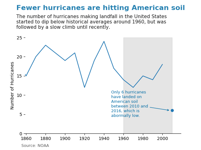
The Economist shouldn’t have used that last half decade in the graphic. It’s not representing the same ten year brackets, so just misleads the eye. What does it add? We don’t have data for the rest of the decade yet.
They shouldn’t have said NOAA produced this data if The Economist is the analyst and NOAA is just the source.
The choice of linear regression line of best fit is pretty hard to justify in data that takes small positive integers as outcomes. Best to look at Poisson, negative binomial or even better, time series regressions like ARIMA that allow you to model subtle lags in the data (e.g. the last three years affect this year).
One could go on…
Mark E.
Mark (Twitter) writes, "I’m not sure the outcome is sensational enough to justify a headline, but if I were to offer one it would be something neutral, such as 'Around one in three hurricanes exceed 178mph.' " Mark also blogged about his process.
Matthew P.
Matthew chose a horizontal bar chart, emphasizing the most recent decade:
Meike G.
Meike points out, "Great example of how data can be used to push an agenda! That's why I chose 2 versions for my makeover—one keeping the original headline (replacing "America" with "US" though), and one to tell a different story."
"Some design decisions I took: changing the x-axis labels to make them easier to understand, removing the category 1-5 distinction and just showing one development per graph (Total vs. % Major Hurricanes/Total), removing y-axis labels and labelling first and last value instead, removing trend lines, removing gridlines. Apart from that, I chose to remove the 2010's in the second graph—because as recent events have sadly shown, the hurricanes have not stopped in 2016. I left it in in the first graph, though, because that's what was done in the original version and it reinforces that message."
Michelle M.
Michelle's headline would be, "September: The Most Violent Month For Hurricanes." She says, "I experimented with a few things, and the biggest pattern that I noticed was that most hurricanes occur in September. Not too surprising, but I had fun making the data interesting to play with anyway!" Here is the Tableau Public version.
Miguel C.
Miguel from Portugal created two views of the data in Excel:
Mike C.
Mike (Twitter) writes, "The top half is the true re-viz of what The Economist was trying to say; the bottom half is a more in-depth interactive for viewers to engage with." Here is the Tableau Public version.
Min M.
Min (Twitter) chose a side-by-side layout and highlights the proportion of major hurricanes increasing:
Neil R.
Neil (Twitter) chose a "dumbbell" view, blogging about how to frame the title in dataviz and his process. You can also view this makeover on Tableau Public.
Nicolas D.
Nicolas chose a line graph to depict the data:
Olesia H.
Olesia used Python's matplotlib library, editing with Inkscape afterward. She says, "Unlike journalists from The Economist, I've decided to highlight the lack of pattern in hurricane data. Don't want to sound like climate change denialist but the trends shown in the Economist's graph may very well be just statistical flukes and the NOAA overview cited in the article explicitly says that 'It is premature to conclude that human activities – and particularly greenhouse gas emissions that cause global warming – have already had a detectable impact on Atlantic hurricane or global tropical cyclone activity.' "
Olivier C.
Olivier (LinkedIn) from Switzerland shared the following comments on the original graph:
Misleading choice of data. While the world is speaking about hurricanes in the context of climate change, the Economist graph refers to hurricanes LANDING on US coast. And actually the online source implies a certain radius from a given point, limited to 200km so probably some counting in missing! On top of that, the data includes 2016 only. Considering that 2017 is already a record year (which would highly impact statistical averages and trends), not featuring 2017 is also misleading. Note also that while Hurricane Sandy (in 2012) was not recorded as major (downgraded to CAT2 just before landing) and did cause enormous damages... So data should have been based on total of hurricanes in the Atlantic rather than only ones hitting US coasts. And based on those data, the conclusion would have been much more relevant. The decrease in frequency since 2005 could actually be just a shift of route (hurricane not hitting US or hitting other lands before and thus declining).
Misleading use of statistical tool which lead to wrong conclusion! The fitting curves are meaningless in this data. One year could very well unbalance the entire trend. As a matter of fact, adding 2017 is changing everything, and fitting curve trend inverse itself in 1950...! This is because the data shows a very consistent frequency rather than changing trend.
Bad dataviz: cumulated bars + cumulated periods. Absolutely meaningless!
Bad dataviz: the data was not including years with no hit. That shall be corrected before plotting a time-based axis.
Paul W.
Paul (LinkedIn) enjoyed trying to be a little artistic with it while still showcasing the analysis from the original version and adding a non-time based trend to it. You can view his makeover on Tableau Public.
Raf M.
Raf (Facebook) from Belgium shared the following view:
Rahul S.
Rahul (Twitter) said his story would have revolved around the following four views:
Rebeca P.
Rebeca (LinkedIn) "basically merged the hurricanes into two categories (minor and major) and looked at both frequency and intensity by decade."
Rob B.
Rob (Twitter) writes, "The Economist writer is clearly trying to articulate that the incidence of severe hurricanes has increased over time. Possibly an agenda linked to climate change, arguing that climate change is making hurricane season worse for America. They've loosely managed to portray this—as the trend lines show a falling absolute number of hurricanes, and a rising absolute number of severe hurricanes. But why not just plot the relative frequency of severe hurricanes during each time period?" Here is his Tableau Public Dashboard.
Robert vO.
Robert (LinkedIn) felt the original headline was "plain misleading!" He goes on to say:
"Overall, there is no significant linear correlation between year and number of hurricanes (r=-0.12), although this you wouldn't expect a large correlation, this could mean something. However, the the correlation between year and category 3 plus hurricanes is just plain zero. So bascially, the data is going all over the place without a clear trent for heavy hurricanes. So you shouldn't show a trendline and if you do make sure it is flat."
"Although a bit boring, this is the most relevant conclusion which should be reflected in both the headline and graph. The headline could be something like 'Every era will suffer hurricane hits' or 'Hurricanes are as bad as they were 100 years ago'. Well, I'm obviously not a copywriter but you catch my drift."
"The graph itself is not that bad, I have definitely seen worse. The color coding makes sense, as does the packing of years. The legenda could be a bit more clear and the trend lines just have to go because there aren't any."
"I would do a couple of things differently to support the main idea that there is no trend in total number of hurricanes or 3 plus category hurricanes:
Combining years in packages in 5 instead of 10 as it dilutes the variability in the data; some packaging makes sense to keep a sense of the bigger picture.
Number 5 category should be up high the graph, number 1 should be down
2016 has to go, as it is just a single year, it would suggest a period of not much going on.
You could also just show the total number of hurricanes and the major one (second graph).
Rody Z.
Rody wanted to focus on major vs minor hurricanes that make U.S. landfall, while giving scope of the total. Here is the Tableau Public version.
Ron P.
Ron notes, "I could see what they were trying to do. They were hoping to find a trend by filtering 166 years worth of data into decade-wide bins on a stacked bar graph. I liked the attempt, but wondered if there was a better way to filter the data. So, rather than binning it into ten-year buckets, I applied a 20-year moving average filter to all the data and plotted the results on separate line graphs." He shares the following two visuals:
Ryan T.
Ryan left the historical data there for context, but focused attention on the more recent decades:
Sam B.
Sam writes, "I have tried to simplify it, while keeping the major features."
Sharon R.
Sharon's proposed title would be: "No significant change observed in hurricane frequency since 1851. Cost and damage of storms has increased markedly and since the early 1990s." She goes on to write the following.
"Here are the main things that concerned me with The Economist’s viz:
It was hard to read and see any (real/significant) trends emerge because there was too much detail that could have been presented better. Instead of showing all 5 hurricane categories in a stack bar chart, the authors could have clustered the storms into “Major” - all hurricanes with a 3 or above measure on the Saffir-Simpson scale - and “Minor” (scoring <3). This makes it easier on the reader’s eyes with minimal loss of data integrity.
The year grouping both looks sloppy (font size, year format) and skews the trend line. Removing any grouping (simply plotting all the years on the x-axis) reveals a very minimal decline in frequency for minor and negligible increase in major hurricanes over the entire period. It is questionable whether these changes are statistically significant based on the R2 values.
There is a significant piece of data missing in the article and in the STORYTELLING: individual hurricane damage and how that trends over time. Specifically, some of the most damaging and costliest hurricanes measured 3 (Katrina, $105B estimated damage) or below (Harvey, category 2, est. damages at $180B). Therefore increases and other trends based on a hurricane's category assignment do not tell the full story, IMO. An article in Slate covers the topic of finding better metrics for measuring hurricanes."
"In my analysis I looked also at the damage data (in terms of cost) for the top 30 costliest tropical cyclones in the US (taken from NOAA, http://www.nhc.noaa.gov/pdf/nws-nhc-6.pdf). While damages are ascribed to only 30 of the 289 hurricanes in the data set (and this is less than ideal I realize), even with the limited data available it is clear the damages have increased dramatically over the last 60 years, across storm categories."
Srikanth P.
Srikanth shares the following views:
Teresa B.
Teresa (LinkedIn) says her headline would be “Hurricanes this half century on track with previous.”
Tim F.
Tim (blog) shared the following:
Todd L.
Todd writes, "So this took me waay longer than it should have. I was trying to create a calculated field in the pivot table to show just Major Hurricanes so I would have two values columns (Total and Major) but I couldn't figure it out. I ended up just hardcoding the data, which is disappointing."
"I may have forgotten some of the ideas in your book/website so this is a good refresher. [Here] is my best attempt. I wanted to extend the trend line more to the left but I can't seem to do it....but I at least think I'm in the right ballpark! PS. Grouping by 15 year increments seems to work better than 10 year increments b/c using the latter a) creates more bars and more clutter and b) creates a partial category for the last plot (2011-2016.)"
"FYI I realized after I sent it that the blue text could be worded better. Maybe something like 'Trend in total hurricanes doesn't align with climate change trends' is better. I just thought it needed a more impactful takeaway."
Ziwei Z.
Last, but not least, Ziwei shares the following stacked area graph, concluding "no strong trends"—
Huge thanks again to everyone who participated for taking the time and sharing your work!


