72 splendid slopegraphs
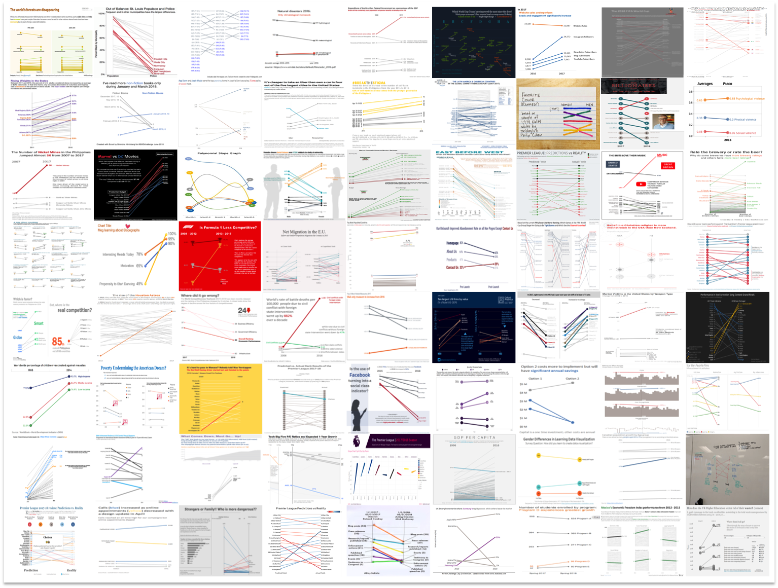
At the beginning of June, we challenged you to create a slopegraph. "Slopegraph" (also known as a “slopechart”) is really just a fancy word to describe a line graph that only has two points on the x-axis. Given the common use cases of focusing on change over time or difference between categories, hot topics included sports (lots of World Cup!), economics, finance, entertainment, and healthcare.
There were a number of standout submissions this month. We continue to see thoughtful use of color to focus attention (Sarah, Prince, Joseph, and Francis, to name a few). We noted pretty good use of words throughout entries, both to make data accessible and to summarize findings. Tiago and Simon B's submissions included strong takeaway titles, while Lisa & Joe L considered (and wrote about) the appropriate level of context needed in their designs. Speaking of designs, check out Munazzah’s use of a small multiples—in some cases numerous graphs allow us to better see an underlying story than a single one. Ludovic's visual uses a logarithmic scale in a totally accessible way (no easy feat). In terms of all around design (including interesting data), a couple of our faves are Samir and Pablo's creations. There were also a number of cases illustrating how slopegraphs can be used to show a ton of data without being overwhelming when visual hierarchy is clear (with strategic use of grey!)—Xan, Rodrigo, Nathan, Daniel C, and Adolfo.
We noted continued variety of tools being used: many in Tableau, Excel, and R, a couple in Illustrator (Kat, Jeremy & Sarah), at least one in Python (Deepika) and LibreOffice (Tobias), and for creativity bonus points we also received submissions on paper (RJ), whiteboard (Cameron) and using PlayDoh (Amy).
To everyone who submitted examples: THANK YOU for taking the time to create and share your work! The makeovers are posted below in reverse alphabetical order by first name (+ last initial when needed; we omitted full last names in respect of those who would rather remain anonymous; reverse alpha to make sure our submitters at the end of the alphabet get some visibility!). If you tweeted or thought you submitted one but but don't see it here, email your submission (including your graph attached as .png) to SWDchallenge@storytellingwithdata.com and we'll work to include any late entries this week (just a reminder that tweeting on its own isn't enough—we unfortunately don't have time to scrape Twitter for entries, so emailing is the sure way to get your creations included).
The next monthly challenge will be announced here on July 1st so stay tuned for another chance to participate. Be sure to check out the new #SWDchallenge page for a recap of past months’ challenges and submissions (bookmark it to refer to for inspiration when you need it!).
Without further ado—scroll down to scan seventy-two splendid slopegraphs!
Young
Tony
These charts lack descriptive title/label info because they are personal working diagrams as much as anything and *I* know how to read them! The blue colours highlight drivers that don't make it through Q1 and Q2. y is rank; items are labelled with driver code and time.
Xan
When I saw this front page from the St. Louis Post-Dispatch, I thought it was highlighting only Ferguson as being "out of balance," so I made a graph to get a better sense, and saw a few other municipalities in similar situations.
Tobias
Took me 2 hours with libreoffice! Next time I will try #Python.
Twitter
Tiago
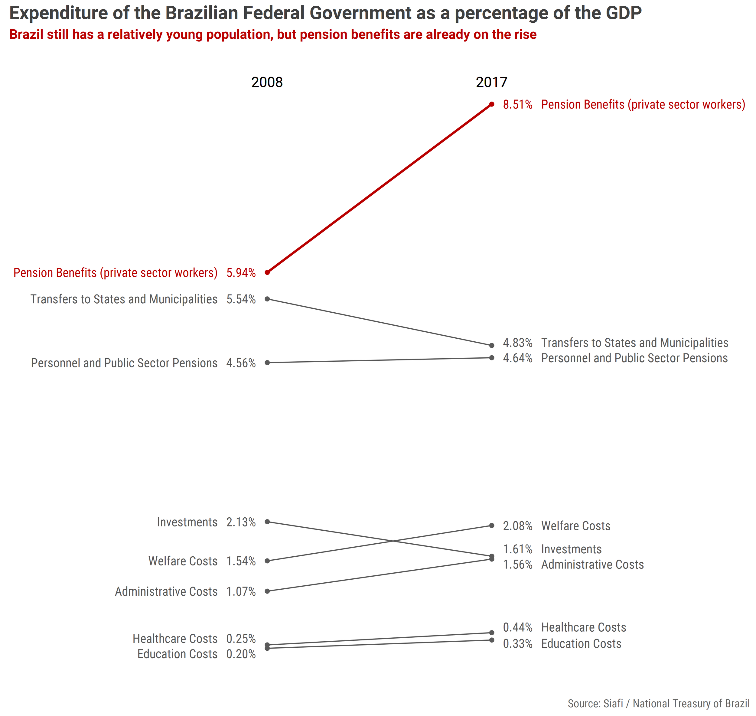
Brazil is currently experiencing the worst fiscal crisis in its history, with growing primary deficits, and public spending increasing at an alarming rate. As a recent World Bank study concluded, "Brazil spends a lot more than the country can afford and on top of this spends poorly." The graph was created in R with ggplot2 and compares the Brazilian Federal Government spending (as percentage of the GDP) in 2008 and 2017, using official data from the Government Financial Management Information System (Siafi). Debt and interest payments are not shown, since they are financed by bond issues, and not by taxes and regular government revenues. The graph tries to highlight the dramatic growth of what was already the biggest line item in the federal budget in 2008 (excluding debt payments): pension benefits.
Twitter | Github
Steve
Stela
For this month's slopegraph challenge I looked at YoY comparison of KPIs for a website performance. I used Excel to create this visual.
Simon R
For this month's challenge, I looked at the upcoming Football World Cup and tracked the difference in rankings from 2014 (before the previous World Cup) for the participating teams. I decided to highlight a few of the slopes and pushed the rest into the background whilst retaining the detail should people want to look up their team.
Simon B
With 2018 being a FIFA World Cup year I wanted to understand which teams were entering the tournament in worse form than when entering the previous FIFA World Cup in 2014. I used colour to highlight those teams with a worse FIFA World Ranking and then highlighted England in a darker colour, given they are my home nation. Finally I chose to utilise the left hand side and right hand side labels differently, this allowed me to provide the standing achieved in the last FIFA World Cup on the left hand side and the nation on the right hand side.
Siah
I chose to look at changing obesity rates in the U.S. for my slopegraph, and I created everything in Excel. Due to the number of U.S. states, the overall graph started to get a little messy, so I chose to call out the top 5 states with the largest percentage increases, and to highlight any states that had a decrease, since that is desirable, but also, unfortunately, far more rare. I then used the title to state the national average percent increase so that the called-out values could be compared to it.
Source
Shimona
I used data from my Goodreads account to analyze how many books I've read monthly and determine their genre. Before I finished the SWD blog and realized it's another challenge (and that I would make the deadline!), I created the graph using Excel and Stephanie Evergreen's infographic checklist.
Instagram | website
Sharon
Sarah
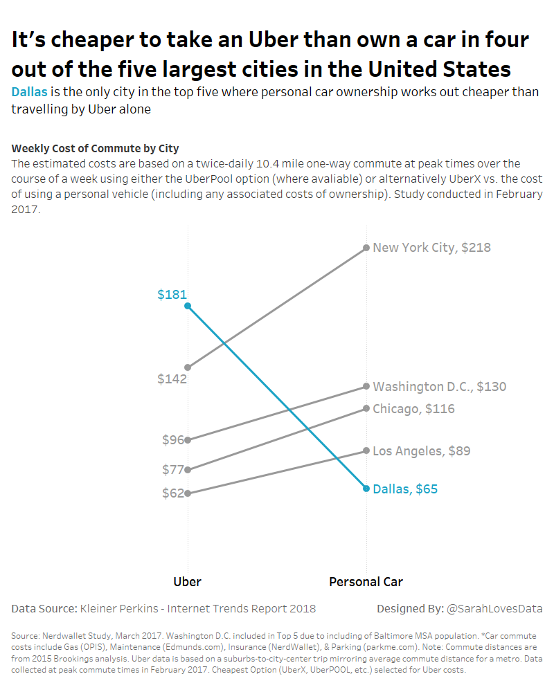
For the June #SWDChallenge I found a bar chart online which compared the cost of car ownership and use for a daily commute versus the cost of travelling by Uber alone. The data focused on the top 5 largest US cities and was based on the total cost of two short journeys a day over the course of a week. In the original viz each city had two bars (Uber & Personal Car), displayed side by side. I thought this would be an ideal use-case for a slopegraph since it was more difficult to see the difference in Dallas versus the other cities in the bar chart version. I made reference to Dallas in my sub-title and coloured it in blue to make it stand out among the other cities where it’s cheaper to travel by Uber compared to the costs of maintaining and driving a personal car.
Interactive viz| Blog
Samir
I was inspired by the death of Anthony Bourdain in creating this slopegraph. The aim of this visualization is to spark a conversation that mental health is something that should be taken seriously, especially in our country wherein talking about mental health illnesses is still a taboo.
Rodrigo
By using a slopegraph and highlighting the countries I would like my reader to focus on, I can achieve the objectives of showing the difference rankings for these countries after a decade (2007-2017). By keeping the non Latin American / Caribbean countries in a light gray tone I also provide the reader the global context for this selected nations.
Interactive viz
RJ
Richard
My slope chart visualises ‘who’s HOT and who’s NOT (so much) from the Forbes 2018 rich list the chart ranks this year’s top 10 richest billionaires and compares them to last years ranking. I have included labels on both side of the chart as there were ‘billionaires’ that appeared in 2017 and not 2018 and vice versa, reversed the colours to make the ‘billionaires’ who made ‘more’ money this year (ranked higher in 2018) were red (‘who was hot’). The report on my Tableau Public account has some interactive functions where you can highlight the rank and you will be given some further information on the billionaire and a photo!
Interactive viz
Prince
I visualized the rapid increase in the number of nickel mines in the Philippines from 2007 to 2017 using a slopegraph. I compared the rise the number of nickel mines with other mines and showed that the increase in number of nickel mines is much higher than other types of mines. I used Excel and PowerPoint.
Paula
Being curious about how many females enter STEM (Science, Technology, Engineering and Mathematics) as a career, I found a study in Canada from 2013 which showed percentage of enrollment based on gender and aptitude for math and separately, science, tested at age 15 on standard PISA tests. The slope compares female and male preference for subjects by percentage by high/low, science/mathematics and male/female groups. Females, of all aptitudes for Science and Mathematics choose Social Science over STEM. Most males, of all aptitudes choose STEM. Perhaps there is something more than aptitude that factor into female's choices?
Paul W
I reviewed the Top 5 Grossing films for both the Marvel and DC Comic Book Universes. The slope compares Production Budgets vs Worldwide Gross Revenue. Marvel is the clear winner (not a surprise to most moviegoers). While most slopegraphs use time to transition between the first and second points, I found that using the two different monetary figures was more impactful for this comparison.
Interactive viz
Paul M
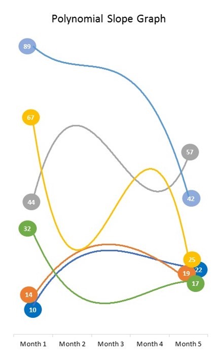
I like that a slope graph shows 2 key data points to keep the message simple, and a slope to show the incline / decline over a given time frame, but I think a straight line may hide the real story for some data sets. I think a polynomial trend line adds to the story without the clutter of additional data points. So, I’ve called it a “polynomial slope graph”.
Patrica
For this month's #SWDchallenge I looked at the Marvel Cinematic Universe movie earnings, both opening day/weekend stats as well as gross earnings compared to the movie's budget. I used R to do both my analysis and create the plots, which is very convenient. I really like how slopegraphs are very intuitive for the reader, and I can imagine using this type of graph a lot especially for public presentations.
Pablo
The dataset originally for this visualization is from Information is Beautiful and found fascinating learning about the influence of the Islamic Golden Age scholars and how long it took—sometimes centuries—for their counterparts in the West to achieve the same findings.
Interactive viz
Oni
Noel
Nathan
I compared the number of brewery ratings with the total number of beer ratings for each brewery. It’s interesting to think about why some breweries have a lot more beer ratings and some have a lot more brewery ratings. Slopegraph made with R and some edits with Inkscape.
Munazzah
How do arch rivals, Pakistan and India, fare when it comes to major development indicators? More here.
Meg
SHUT UP. I hadn’t heard of slopegraphs until I read this and, well, I’ll just let this illustrate the last 5 minutes of my life:
Mark
Ludovic
I usually use the slopegraphs to point differences between rankings and trends for two periods. Inspired by the book cover of "The Functional Art" by Alberto Cairo, I have decided to use the slopegraph to point the differences between two measures. Migration is an actual topic for most of the European Union countries, I wanted to show something about it, as we are not equals for migration flows but also as immigration can be vital for a population in decline. The logarithmic scale came later as I wanted to to focus on both absolute values and relative trends. I was surprised how log scale can be great to keep the ranking and to compare the trends (maybe I am wrong). More about log scale.
LINK | TWITTER
Lisa
I put into practice many of the clean design principles I learned from you at your workshop and by studying your book:
1. Understanding the context: I narrowed down the list of countries to those that are the most populous instead of including every country, since the audience is most likely interested in population growth in the top countries.
2. Eliminating clutter: I labeled just the top 3 countries and hid the labels for other countries. The audience can still hover over the other country lines to see the tooltip content for those countries.
3. Drawing attention to where you want it: I used line color sparingly and strategically just for the top 3 countries and used gray for all other countries. I also added lead-in text and an annotation to highlight the important insights in the data story.
Interactive Viz
Lea
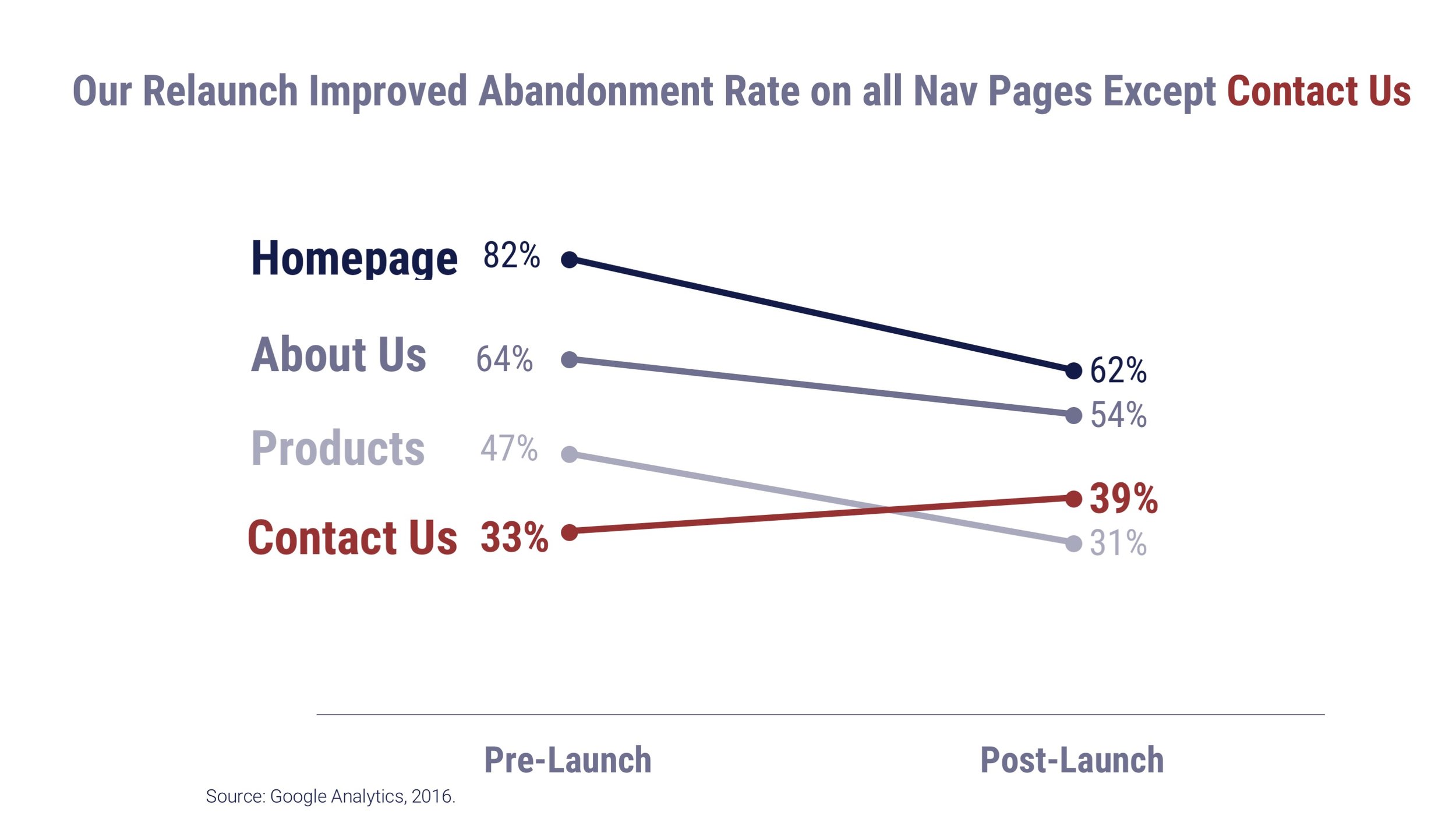
I love using slope graphs with digital marketing data, especially in use cases around pre- and post-website launches or enhancements. This slopegraph depicts the on-page rate of abandonment for key navigational pages on a particular website after a design relaunch. I wanted to highlight that abandonment improved on every page except for the Contact Us page, which pointed us to a user experience issue created by the relaunch. Super simple but it made a bold statement that got my stakeholders' attention!
Blog | Twitter | LinkedIn
Kat
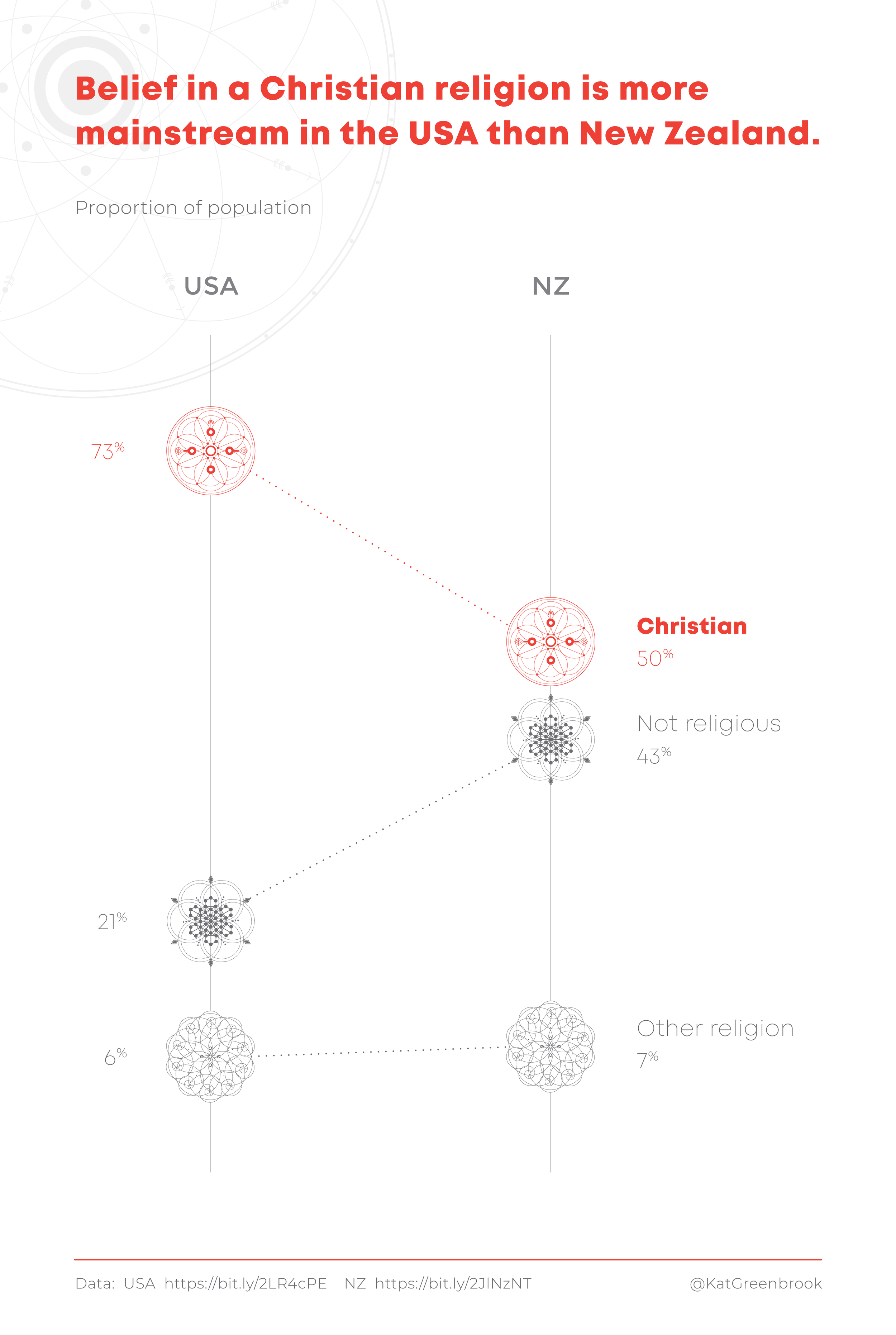
The slope graph was a new chart type for me this month. As it turns out, connecting discrete data points this way puts me outside my data viz comfort zone. I settled on making the lines dashed and will try to work on breaking my rules in the future :) This viz was created using Adobe Illustrator.
Joshua S
This piece doubled as a #MakeoverMonday challenge and a SWDchallenge! While I'm not much of a soccer fan, I really enjoy the challenge of presenting the results of statistical models. As soon as I saw this data, a slope chart felt like the most obvious choice—and made some of the major upsets / disappointments stand out pretty dramatically, while allowing a reader to follow each team individually. My tool of choice was Tableau (as per usual!).
@data_poetry | Data Poetry Blog | LinkedIn
Joshua H
For this month's challenge, I used data from OpenSignal and visualized the difference of mobile internet speed of the two network providers in various regions in our country. There's a huge competition over network dominance in the country between Globe and Smart that they forget the real competition outside the country. The Philippines still has a long way to go. I generated the slopegraph using Excel and used Publisher to add more details.
Joseph
I have done a simple slopegraph showing the change in fortunes of the Houston Astros between 2013 and 2017, going from being the worst team in baseball to winning the World Series.
Johniel
Attached is my entry for #SWDchallenge slope graph challenge. The graph shows the changes in battle death rate per 100,000 persons by type of conflict.
John J
For this month's challenge, I wanted to show the decline in the ranking of the Philippines on World Competitiveness Yearbook from 2017 to 2018 across the different factors of competitiveness.
Joe L
Slope Graph showing how the number of visits to the Top 5 most visited museums in England in 2017 has changed since 2016. The rise in visits for V&A in 2017 is likely linked to their exhibitions—most notably the Pink Floyd: Their Mortal Remains exhibition. Created using R.
Jeremy & Sarah
We’ve looked at the top ten largest firms by value in the United States. Now all the top five are tech companies, and they’re all climbing. Nos 6-10 are non-tech, and they’re not seeing the same performance. As all the data sits between 1% and 5%, this at first looked like a very crowded chart. We worked around this to some degree by separating out the top five and the next five – which also allowed us to make the most of the way the tech sector was restricted to the top band. With more time, we’d have liked to do more – possibly using the logos as well as the names, but also starting to bring in colour coding to emphasise the sectors. As usual, this was created with a combination of Excel and Illustrator.
Jason P
This month's challenge was a great opportunity to try a chart (slopegraph) that I have seen often, always liked, but never created before. You can read about this visualization and some of the decisions I made around color, title, data markers, data labels and more in this post on Medium. The article is split into two parts. Part One is for those that would just like to read about the process behind the visualization. Part Two is for anyone who would like to read on and learn some interesting facts about team's records in the NFL - the subject of the data visualization.
Twitter | Linkedin
Jamie
For the slopegraph, I revisited the same FBI Homicide data that I used for the bar chart challenge. In the original, I plotted a bar chart of the cumulative data from 2012-2016. For the slopegraph, I thought it would be interesting to see how the numbers changed between those two years. I started out thinking that it would not work very well, given the significant variation in magnitude of the data series. Given that my goal was to highlight the large difference, however, I ended up liking the results a great deal. It shows the difference in a way that I think is more effective than the other methods I attempted to create as a counter point (floating directional bars, percent variance bars, stacked bars side-by-side). The series at the bottom, while nearly impossible to distinguish, serve as context for the top series, and the interim, cumulative series, rather than as lines for direct comparison.
Klaus
These slopegraphs visualize the group stage of the upcoming FIFA World Cup. The teams are sorted based on the current FIFA/Coca-Cola World Ranking. Created with Tableau.
Interactive viz | Tableau Public | Twitter
Hanna
The June challenge provided me a good excuse for checking out the data of Eurovision Song Contest finals data as slopegraphs are often used in showing change. In the song contest, however, a country might not be in "the top 10" year after year in the same manner as in some sport. The winning song can be the funniest or the one with the best performance on stage. And there the catch of the winning country hosting the next year's contest. There was an interesting top-to-bottomish, bottomish-to-top kind of pattern visible. But that might just be these two years and I could be seeing things. I didn't check further.
Haley
This was a fun challenge in simplifying the visualization and finding data that works well with this chart type. I started working with a different dataset, but some points ended up being too tightly bunched and it wasn't easy to draw conclusions at a glance. Then I found this data about the percent of children with the measles vaccine, and I thought the clear upward trend in all income categories made it well-suited for a slopegraph. From there I just tried to make the visualization as clean and simple as possible.
Glenda
Francis
Who doesn’t like a good sports story? The performance of Max Verstappen at the Monaco Grand Prix of Formula One this year was thrilling and could be summed up in a slopegraph. Click here for the fuller story and some observations about the chart.
Fiorella
Femke
The graph shows the difference in Facebook usage among US teens between 2015 and 2018. I used the earlier dataset in another challenge to visualize the rise and fall of the top 4 social media platforms among US teens so when this research came out I was curious to see what the differences were. In the end I took it down a completely different route and focused on the teens' family demographics as that showed an interesting effect.
Interactive viz
Emily
Doug
I had never used slopegraphs until I took Cole’s class. After taking the class, I used this graph to compare the cost impact of two options and got very favorable comments about the graph.
Dorian
I used slopegraphs over the bar charts to compare averages before and after a chosen date. The color of the slope changes according to the difference. The data comes from Google Search Console. I used Tableau to build the visualization. I write at Canonicalized and tweet @canonicalizedco
Diego
Difference between critic and audience scores of Star Wars films. Made with Tableau from Rotten Tomatoes data. The Star Wars Episode VIII difference is stunning. Are you with the critic or the audience?
Interactive Version | Twitter | LinkedIn
Deepika
My first entry to the SWD Challenge shows the number of Internet Users per 100 people in African countries between 2005 and 2015. This was made using matplotlib, seaborn and Python. I have used the dataset from KNOEMA, which was used for the 2017, week-22 'MakeoverMonday' Challenge.
David W
When results of international tests in reading, math, and science are published every three years, they tend to be displayed in tables. This obscures changes over time and the American public tends to tune out. I took the data from the Organization for Economic Cooperation and Development (OECD) website and graphed math test scores from the last three administrations of PISA in Excel. A slope graph allows you to see that 15 year-olds in the U.S. started close to the international average and have fallen 17 points, or nearly half a grade level. Students in Singapore have risen 68 points, or one and a half grade levels.
David N
This was done in Excel ... just under 20 minutes, from the moment I powered up my Surface Book to when I saved the image (and that includes time to scrape my Strava data). It shows paired times for my bike rides down and up the hill my new house resides atop of. A fun #dataviz to put together, and the result shows what I expected ... now let's see if others can figure out what story the slopegraph is telling (obviously I am aware!)
Daniel T
Daniel L
Using Tableau Public and data from www.football-data.co.uk, I created the slope charts looking at points per game before and after changing manager during the 2017/2018 Premier League Football Season. Each team is split out using the columns in tableau in order to see the variance between each team.
Daniel C
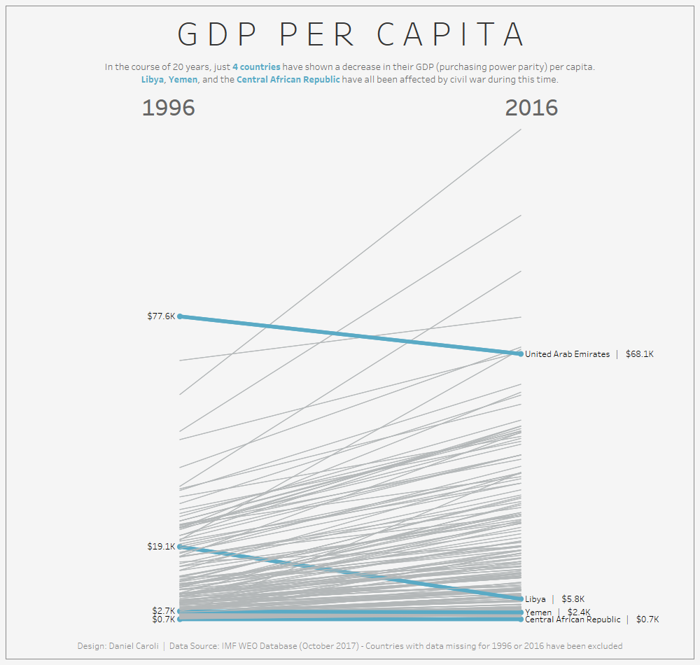
I looked at how GDP per Capita has changed over the course of 20 years. In this time only 4 countries have shown a drop in GDP per capita, three of these countries have been affected by civil war during this period. Data is sourced from the IMF WEO Database (October 2017) - Countries with data missing for 1996 or 2016 have been excluded
Viz on Tableau Public | Twitter
Crystal
For this challenge I used data collected by @Elijah_Meeks in his 2017 Data Visualization Community Survey. This slopegraph looks at the differences in how men and women are learning data visualization.
Tableau | Twitter
Charles
I was curious to see how Canada's population is evolving, so I used one of Statistics Canada's datasets from the 2011 and 2016 censuses to explore the different age groups. The slope graph highlights the growth of the 60-74 segment, and the gap between people 75 and older and the other age groups. Not so surprisingly, we can notice that people 60 to 74 are about to account for a bigger slice of the population than the youngest citizens. In fact, if we separate male and female population, there are now more women aged between 60 and 74 than there are younger than 14! Unlike many CSVs from data organizations, Statistics Canada's was very easy to prep for use in Tableau. I enjoyed the challenge, as it made me realize there might be new use cases for slope graphs in our organization.
LINKEDIN
Cameron
I started whiteboarding for the #SWDchallenge and have already figured out I should actually slopegraph my time lost to overthinking the simple things.
TWITTER
Brian
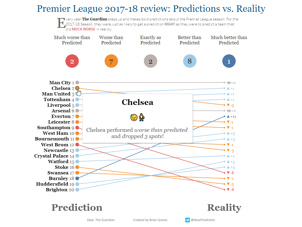
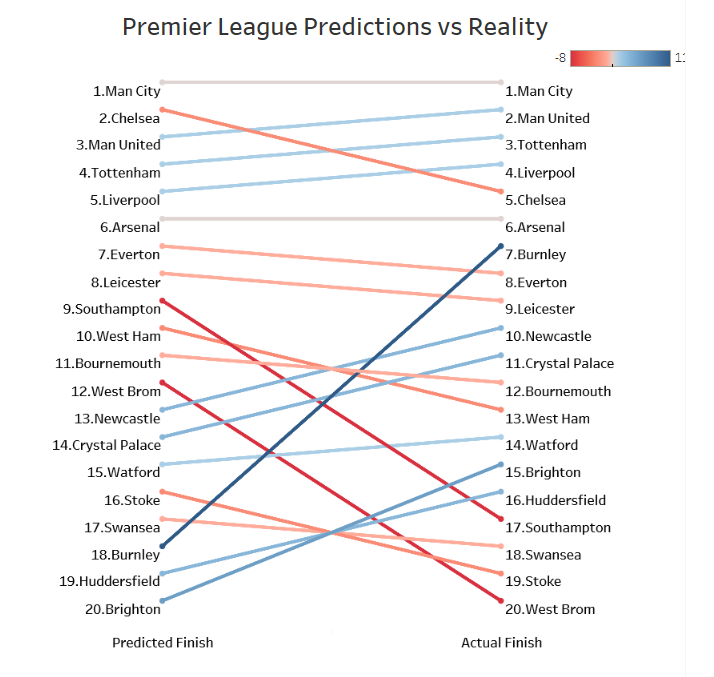
Description: Interactive Tableau dashboard showing Premier League prediction accuracy for The Guardian newspaper. Complete dashboard deep dive available.
Tools used: Tableau
Methods: 6 step Tableau slope graph tutorial
NewPrediction.com | @NewPrediction
Brett
For this challenge I used a data set that showed a design change for a client's website may not be a successful as we hoped. This was created in Excel.
Aparna S
I used tableau to visualize the data. I have focused on how the crime rates have change with respect to the relationships of the perpetrators to the victims.
Aparna N
Amy
Slopecharts are great to show the before and after of an event. I looked at how the actions and communications of the CFPB changed with the leadership. Made of play-doh, yes play-doh, as part of my ongoing project #DayDohViz
amycesal.com | @AmyCesal
Alistair
My take on slope lines takes the example of how the market share in smart phones has changed in the UK over the last 8 years and particularly the emergence of Samsung as a large player within this market. I thought it was interesting to see the way in which Research in Motion and Nokia had become marginalised—a large change over a relatively short time period I've highlighted in purple Samsung's performance to draw the attention to this. There were a number of companies with small levels of market share—I took the decision to group these up to keep the graphic relatively clean.
Agata
I wanted to experiment with color and how to use color to draw attention to different aspects of the data.
Linkedin
Adolfo
For this challenge I'm sending a viz that I made for the #MakeoverMonday. I decided to use a slopechart to show the rank change from 2013 to 2015 focusing on Mexico and keeping all the other countries grayed out on the background for context. Also I decided to use small multiples to shoe the different categories that were listed on the data.
LinkedIn
Adam G
This slope chart focuses on UK Higher Educations 'waste mass' disposal by type. Some interesting stories emerge as you interact by region and unpick the increases in type.
Interactive viz
Click "like" if you've made it to the bottom—this helps us know that the time it takes to pull this together is worthwhile! Check out the #SWDchallenge page for more, including details on the next challenge. Thanks for reading!
