from points to poignant
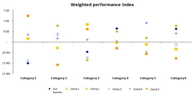
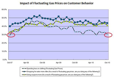
I love a good makeover challenge. I received the following graph in response to my call for visuals ahead of my visit to a Midwest retailer last month to run a session on data visualization. Check out this post for my thought process when it comes to visualizing this data and my resulting redesign.
a new year's resolution: declutter your graphics
It never ceases to amaze me how relatively minor changes can take a visual from a mess of data to a clear message that pops. In this post, I'll walk you through one such transformation.
label your axes
Exceptions to this data visualization best practice will be extremely rare. Check out this post for an amusing example of why labeling your graph axes is important.
5 easy tips
In my very first storytellingwithdata.com blog post, we start with the basics, exploring 5 straightforward tips to help you communicate effectively with data.


