audience, audience, audience
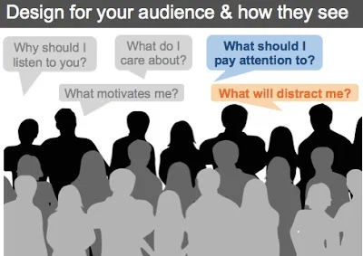
I sometimes feel a little like a broken record when I talk about communicating with data. My latest oft-repeated word is audience. We must keep our audience in mind throughout the design process and in general, try to make things easy on them. I spent a little time on this topic in a webinar yesterday and thought I'd turn some of my notes into a quick blog post, which is what you'll find here.
dogfood with data
My husband and I were watching TV one evening last week. One commercial caught my attention. It was a commercial for Eukanuba dog food. I do not have a dog. Still, there was something about the combination of music and video and text with a bit of data that left an impression. I find this commercial to be an excellent example of storytelling with data.
storytelling with data...scribed!
I was in Dallas earlier this week and had the opportunity to talk about storytelling with data with a few different groups. One of those was the DFW Data Visualization and Infographics Meetup. This afforded me the pleasure of meeting Randy Krum, president and founder of InfoNewt, and John Colaruotolo from Collective Next, who (as far as I'm concerned) is able to create magic with pens and a whiteboard.
the power of categorization
I am writing this post on the heels of a lovely albeit short European trip. It was part work, part play. In our spare time, my husband and I ventured out to one of our favorite restaurants. As I was perusing the wine list, I was reminded of the importance of categorization (yes, apparently my data-brain is on even at dinnertime). In this post, we'll take a quick look at how categories help us make sense of things: both in life and in data visualization.
the biggest bang for your buck
You've likely heard of the 80-20 rule. Basically, in business it's the idea that you can put in 20% of the effort and get 80% of the result (and avoid the remaining 80% of work that only yields an additional 20% of result). I was posed the question: "how can we apply the 80-20 rule to what we've learned today?" In other words, out of all of the meaty content we've covered, where should you start when it comes to having the greatest impact? Or, as I'll paraphrase it - where should you focus your energy to get the biggest bang for your data visualization buck? In this post, I'll discuss two easy things you can start doing today to have greater impact when it comes to communicating with data.
annotate with text
When it comes to storytelling with data, one very important component of stories is words. There are some words that absolutely have to be there: every graph needs a title and every axis needs a title. Label directly so your audience doesn't question what they are looking at. In this post, we'll consider the important role of words when it comes to communicating effectively with data.


