visualizing opportunity
When visualizing survey data, it's always seemed to me like showing where you're at is only part of the picture. There is important context that comes with where you could be. In this post, I explore this idea in the context of a specific example.
align against a common baseline
There is a recommendation I find myself often voicing to workshop participants: Think about what you want your audience to be able to easily compare. Put those things as physically close together as you can and align them along a common baseline. This post features a makeover applying this recommendation.
audience, audience, audience
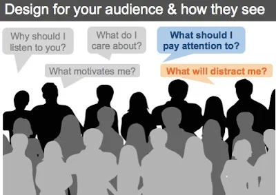
I sometimes feel a little like a broken record when I talk about communicating with data. My latest oft-repeated word is audience. We must keep our audience in mind throughout the design process and in general, try to make things easy on them. I spent a little time on this topic in a webinar yesterday and thought I'd turn some of my notes into a quick blog post, which is what you'll find here.


