#SWDchallenge: critique then (re)create

Have you ever looked at a graph and thought, “I’d love to rework that!”? If so, this month’s challenge is for you. You’ll have the opportunity to critique and then improve a confusing visual.

First, let me share some thoughts on the importance of crafting thoughtful critique before diving into a remake. In our workshops, we see firsthand how animated people become when presented with someone else’s graph—it’s easy to point out what we would do differently, or what’s “wrong” with others’ work. The real task is to frame our suggestions in a constructive way. Beyond not putting the creator on the defensive, there is a great secondary benefit to getting good at giving feedback: it sharpens your skills, too. Considering and critiquing work created by others helps you identify and articulate reasoning and approaches that you can apply in your own work.

How can you give good feedback? Here are a few questions to consider (and some related community exercises in case you’d like even more practice):

  • What do you like about the current visual? As mentioned, it’s easy to jump right into what you'd change. Instead, first pause and reflect on what was executed well. See how positive feedback can be framed in the exercise from data to single slide story.

  • Where are your eyes drawn first? This assessment allows you to determine whether the visual’s focal point is where you want it. In addition to focusing attention, details like formatting consistency, effective labeling, and other affordances can help people more easily consume the data. See how others executed this in the exercise attention to detail and intuitive design

  • What elements are confusing or complicated? Would you suggest removing anything to make the data stand out more? When we take the time to eliminate things that don’t need to be there, we make our audience’s job easier. See the benefit of stripping away the non-essential elements in the exercise declutter!

  • Could the data be visualized differently? Consider whether changing the graph type would show something it might not have otherwise. Sketch some iterations to free yourself up from the constraints of a tool. Don’t worry if your artistic skills aren’t perfect—practice this approach in the exercise let’s draw!

  • Is the takeaway or call to action clear? If not, how might it be brought to life? Data rarely speaks for itself—we have to help it. Use words to make the data accessible. Check out the various ways to accomplish this in the exercise how can we tie words to this graph?

Now, with all of this in mind, it’s your turn to critique and (re)create!

the challenge

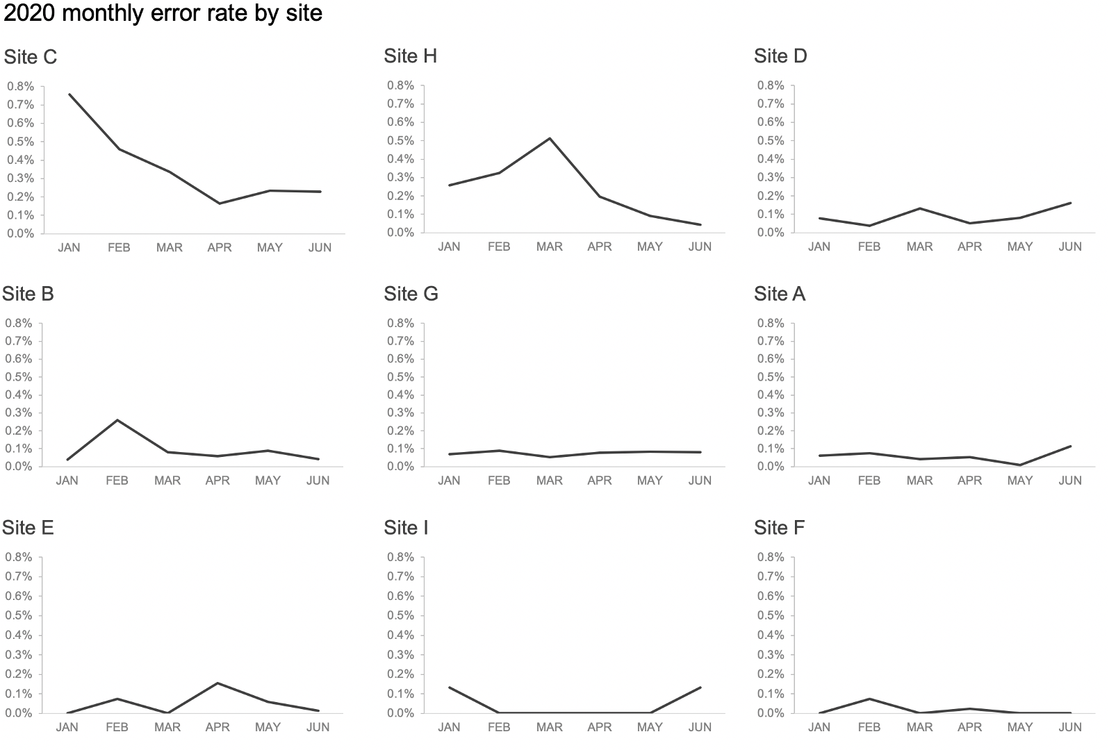
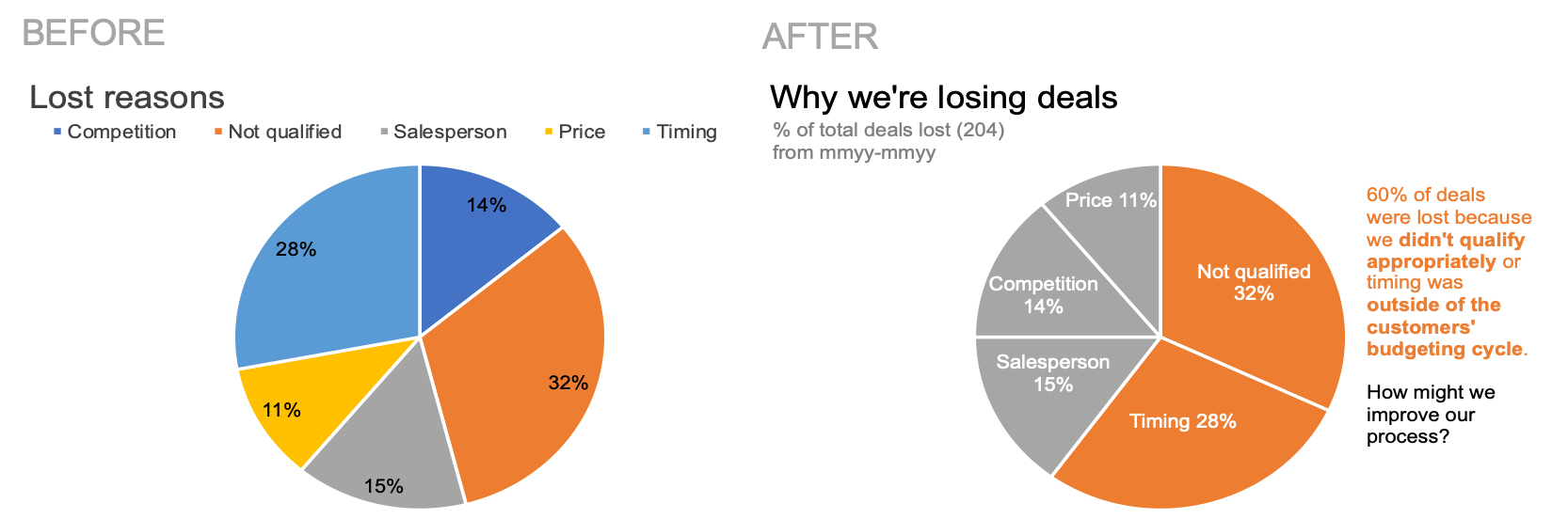
Consider the following graph. Your challenge this month is two-fold:

  1. Compose a thoughtful critique.

  2. Execute on your feedback and create a more effective visual.

December20SWDchallenge.png

Besides the considerations outlined previously, here are some additional aspects to think about as you compose your thoughts:

  • What additional data would you like to have?

  • Who might the audience be? Make assumptions as needed for the spirit of the challenge.

  • What broader story could this fit into? 

You can download the data and use your preferred tool of choice to create your makeover. Share your critique and remade visual in the SWD community by December 31st at 4 PM PST. If there is specific feedback you wish to receive from the community, outline in your commentary. After you submit, take some time also to comment on others’ remakes and add datapoints to those you like.

We’re excited to see your makeovers this month! 

related resources

Here are more resources on critiquing and remaking visuals. If you’re aware of other good ones, please include in your submission commentary.

words are your friend—when you choose them wisely

Have you ever looked at a graph and thought, I'm not sure what I'm meant to get out of this? 

When communicating with data, we sometimes forget the importance of words. We might assume that numbers—and the charts that visualize them—speak for themselves. Quite the contrary! Words have a very important place when communicating with data because they help our graphs make sense to your audience (who doesn’t live in your head). 

Here’s an example, excerpted from storytelling with data: a guide for business professionals. Check out how the text makes the data more accessible in the graph on the right compared to the original.

 
Before: intention is unclear

Before: intention is unclear

After: action and supporting context is clear

After: action and supporting context is clear

Let’s turn our attention to a cautionary tale. When we don’t choose our words carefully, they can have the opposite effect—resulting in our audience having to do unnecessary work to understand our graphs. This example is inspired by a recent graph makeover from one of our workshops (details have been changed to preserve confidentiality).

Consider the following visual. Before you study the data, read the headline, and make a note of what you expect to see in the graph. 

 
2_original.png
 

If you’re like me, I expected to see a chart depicting a lack of awareness with a corresponding data point showing that 91% of surveyed customers have never used the service. Upon further examination, I figured out that these three charts holistically represent the inverse measures(s)—awareness, consideration, and usage—compared to what’s annotated as the takeaway title. With some mental math, I then reconciled the 91% non-usage rate to the 9% usage rate in June 2020 (far right data bar) but only because I had enough patience and time to undertake this task! 

On a positive note, the designer of this original graph took care to put the main takeaway in words in a prominent place at the top. To further improve, we can alleviate some of the mental effort our audience might encounter with this visual by making a few alternative design choices. 

One option would be to reword the takeaway title to reference usage rates and employ similarity of color to provide a visual cue to the data it describes. 

 
3_option1.png
 

Another option—particularly if the conversation is better suited towards where we can improve—is to preserve the original title but change the graph to a 100% stacked bar to visually show the magnitude of opportunity.

 
4_option2.png
 

Both alternatives are shown below. Consider how the words chosen in these two views better enable you to see evidence of what they describe. You can download the data to see how I designed these two visuals in Excel.

5_comparison.png

This cautionary tale shows that if we don’t word our takeaways carefully, then our efforts (both in the analysis and the communication) might be for naught. In data visualization, words are our friend—but only if we choose them wisely. 

For more examples of using words effectively, check out a power pairing and transforming slide titles. Take it a step further and build your data storytelling muscle with an actual dataset in the SWD community exercise words help data make sense

a funnel makeover

 
Picture1.png


Today’s post outlines an alternative approach to using a funnel to visualize a process and related data.

You’ve likely seen funnels like those shown below. The intent is to show how something—customers, products, sales deals—passes through a series of stages until some desired action—conversions, purchases, views—happens. With this overview, you can help others understand the process with a visual representation.

 
Source: Google image search

Source: Google image search


While the funnel can be effective at showing a summary of the process, they are not particularly effective when it comes to measuring that process—and how each stage compares to each other in size. Why? Because a generic funnel doesn’t encode the metric it represents.

Let’s look at a specific example.

Imagine you are an HR analyst in a large organization. A new senior leader is coming up to speed on the recruiting process and related metrics. Your teammate put together the following slide for an upcoming meeting. Spend a few moments studying this visual. What observations can you easily make from this slide? What questions do you have?

 
before.png
 

Let’s first focus on the funnel. I can easily make one broad observation: there are 50 applicants for every 1 hire—and that applicants pass through three stages in between. As I start to intake the volume of applicants in each stage, now it starts to feel like work. I have to mentally picture (I’m a visual learner; others may be processing this differently) 50 applicants going to 17 applicants in the CV review stage, and so forth. This is more effort than necessary if I’m simply desiring to understand where the volume is concentrated. If my audience is a senior leader, I don’t want them to have to work to get a relative sense of the numbers.   

Let’s look at the supporting text at the bottom of the visual. This helps provide a sense of the volume of interviews conducted but it leaves me wondering so what?  Is this indicative of a successful recruiting operation that meets organizations overall hiring needs, or is it a call for action for a better process or more staff? Let me offer one approach to transition from putting numbers and pictures on a slide to creating an integrated visual to more quickly impart understanding.

Instead of the funnel, we could utilize a square area graph. For reasons outlined in the current #SWDchallenge, we don’t use a lot of area graphs. They’re ink-heavy and our eyes aren’t great at comparing areas. However, in the use case where you’d like to communicate numbers of varying magnitudes, a square area graph gives us an additional dimension: the width of a square (in contrast to a bar chart, where we only have height or width). The second dimension of a square area graph allows us to visualize more information in less space.

Check out the difference between the funnel and the same data visualized in a square area graph below. Each square represents an applicant and the volume of applicants in each stage is encoded by color. This design allows me to see the number of applicants in each stage.

 
square area graph.png
 

NOTE: Alternately, I could have designed my graph with 100 squares and rescaled the numbers so they could be expressed as relative percentages. However, I intentionally chose to use 50 squares and keep the same volume of people in each stage to emphasize the flow to make 1 hire. 

Next, let’s turn our attention to answering, “so what?” My redesign of the slide might look similar to what you see below. I can use the square area graph—paired with the supporting context from the original slide—to achieve the desired outcome. Our senior leader has to do less work to understand what is being communicated.

 
final.png
 

In conclusion, a square area graph can be an alternate choice for a funnel when you want to visualize and compare numbers along different stages of a process. You can download the accompanying Excel file to see how I created this visual. 

See the following for additional examples of square area graphs:

Have you seen instances of funnels used effectively? Leave a comment with your thoughts. If you’d like to try a more traditional area graph, flex your data storytelling muscles with this month’s #SWDchallenge.


how to make a better pie chart

A friend called me recently and started our conversation with: “I know you dislike pie charts, but…can you help me create one?” 

Spoiler alert: I don’t hate pie charts. They’ve received a bad rap over the years and with good reason—they are very commonly used when another chart type would be better suited. The appropriate use case for a pie chart is expressing a part-to-whole relationship. Their limitation is that it can be difficult to accurately judge the relative size of and compare the segments. To see examples of the correct use case for pies, check out what is a pie chart? and you can read more about the ongoing debate with these related articles: the great pie debate and an updated post on pies

My general recommendation on pies is that if you can clearly articulate why a pie chart is a more effective choice than another type of graph, then you’ve appropriately considered that it will satisfy your scenario. In today’s post, I’ll highlight a specific use case for a pie chart—and show how you can create an improved one. 

Let’s use my friend’s scenario to illustrate. She is a sales manager for a mid-size equipment manufacturer and is preparing for an upcoming sales meeting with her team. She wants to communicate the degree to which her salespeople are losing sales deals. She used her tool to create a chart similar to the one shown below.

Spend a minute studying this visual: what can you easily conclude about the data? What changes might you make? 


I came up with five changes I would make to the existing chart. I’ll address those momentarily, but first we had an in-depth discussion on why she was sold on a pie chart. Her rationale was that she wanted her audience—salespeople at her organization—to understand that they were losing nearly two-thirds of their deals for two reasons: not qualified and timing. We discussed the various limitations of pie charts and the trade-offs and she’d decided she’d be comfortable with them. One question I posed: how important was it that her audience have a sense of the volume of deals—that they be able to accurately judge the magnitude of the categories (lost reasons) relative to each other?

After a thorough discussion, we both felt comfortable that the pie chart’s part-to-whole relationship worked for what she needed—to convey that a large percentage of deals were being lost for two specific reasons and to focus her audience’s attention on identifying a possible solution.

With this intent in mind, I walked her through the five steps I’d take to design a more effective pie than what her tool created by default. There may be others you considered; I’ll focus here on those that sufficed given the context of her scenario:

  1. Sort meaningfully: In this case, this means ordering the data so that the largest categories (not qualified and timing) appear at the top of the chart. 

  2. Eliminate the legend: Labeling the categories directly reduces the work of going back and forth between the legend at the top and the data below.

  3. Specify what is being shown: I’ll include a more specific chart title and a descriptive subtitle specifying the metric being graphed (% of total deals lost with the volume of deals lost for context).

  4. Add a takeaway and call to action: I’ll add annotations near the data to answer the question, “so what?”

  5. Use color sparingly: I’ll use color thoughtfully to direct the audience’s attention.

Check out the impact of these changes in the visual below. You can download the file to see how I created this in Excel. 


Broadly speaking, these five changes greatly improve this default pie chart—but they’re actually not specific to pies. Rather, these are steps I find myself taking nearly every time I design a chart. Consider my changes together with those you may have identified: where might you apply the same to your own work?

 
Picture3.png
 

For more on improving pies, practice flexing your data storytelling muscle with the alternatives to pies exercise in our SWDcommunity.


Elizabeth Ricks is a Data Storyteller on the SWD team. She has a passion for helping her audience understand the ’so-what?’ as concisely as possible. Connect with Elizabeth on LinkedIn or Twitter.

a small (multiple) makeover for a big range problem

Today’s post is about a common challenge: when one data series is so large relative to the others that a single scale makes it nearly impossible to see any details. Consider the following line graph. It displays state and local revenue by transportation mode, which I created using data from the Bureau of Transportation Statistics 2018 Report.

 
Figure1.png
 

What can you conclude about this data?

I can see that Highway represents the largest portion of total transportation revenue, earning much more relative to the other modes. But figuring out how revenue has changed over time for a given mode is challenging since the lines look flat on this scale. Let’s look at a couple alternative views of this data.

I could improve visibility by pulling apart the four lines into distinct graphs—creating a small multiple chart. The separate charts allow me to set custom y-axis ranges to better display the trend for each series, as shown in the following visual.

Taking a step back, I can now make observations that were difficult to see in my original graph. Highway revenue has recovered to pre-recession levels, while Air transportation has experienced a slower recovery. These details weren’t obvious before, so from a visibility standpoint, this is an improvement. 

However, while this solves one problem, it simultaneously introduces another. In the transition from a single graph to four, where I’ve varied the y-axis min and max, I lose the ability to compare the relative sizes of each transportation mode. My small multiple chart requires some careful attention to detail and mental effort to process the data plotted along the different axis start and end points. It is exactly because of this, that a general guideline with small multiple charts is to have a consistent axis across panels. Unfortunately in this case, however, I can’t implement a single scale without sacrificing my insights.

How might I account for the drawbacks of an inconsistent scale, while still preserving the ability to see important details? Let’s look at one more view of this data.

 
Figure3.png
 

Vertically stacking the charts and arranging with the lowest dollar volume at the bottom to the largest at the top, and directly labeling the start and end points is one potential compromise. While I haven’t completely solved the problem of visually comparing relative sizes—which I’d argue is secondary to seeing how revenue has changed over time for a given mode—I did design with that ability in mind. In this iteration, I can quickly scan down each panel to put into perspective that $78B is greater than $4B. This makeover is an example of the tradeoffs we often face, which is why it’s important to be specific about what you want to communicate and keep that in mind when you build each graph. Some other changes I’ve made in this final version: I added a recession bar to easily compare pre- and post-recession values and annotated takeaways, so someone processing this chart can quickly glean the key points.

An unexpected bonus of the stacked version: it doesn’t differ too drastically from the original. Sometimes creating a makeover that resembles the original can work to your advantage, especially if you need buy-in from others to make the change. I’d call that a win! I can see details, compare relative sizes—sort of—and outline specific takeaways to get my audience focused on the right things.

Employing a small multiple view to split data apart certainly isn’t the only solution to the big range problem, but it’s one that I find myself using frequently. For additional small multiple inspiration, pop over to the community, where that’s the focus of this month’s SWDChallenge: leave datapoints on examples you like, lend feedback, or participate by creating and sharing your own small multiple chart!

You can download the Excel file to see how I created these graphs.