from dashboard to story

More and more organizations are turning to dashboards for monitoring performance and enabling data exploration. These user-friendly reporting tools offer a ton of advantages over older ways of doing things: they can dynamically update to display the latest information, link together multiple views of data, and often incorporate interactivity that lets users filter and zoom in on what they want to explore. 

As powerful and as useful as dashboards are, they’re optimized for the exploration of data, not the communication of specific insights. Once we’ve used our dashboards to uncover something worth sharing, we’ll usually be better served by making a separate presentation, designed to bring the findings to light and get others to act upon the information.

The path from dashboard to story might not always be intuitive. This article will use a dashboard from a recent storytelling with data engagement to illustrate how to transform dashboard insights into an action-inspiring story. 

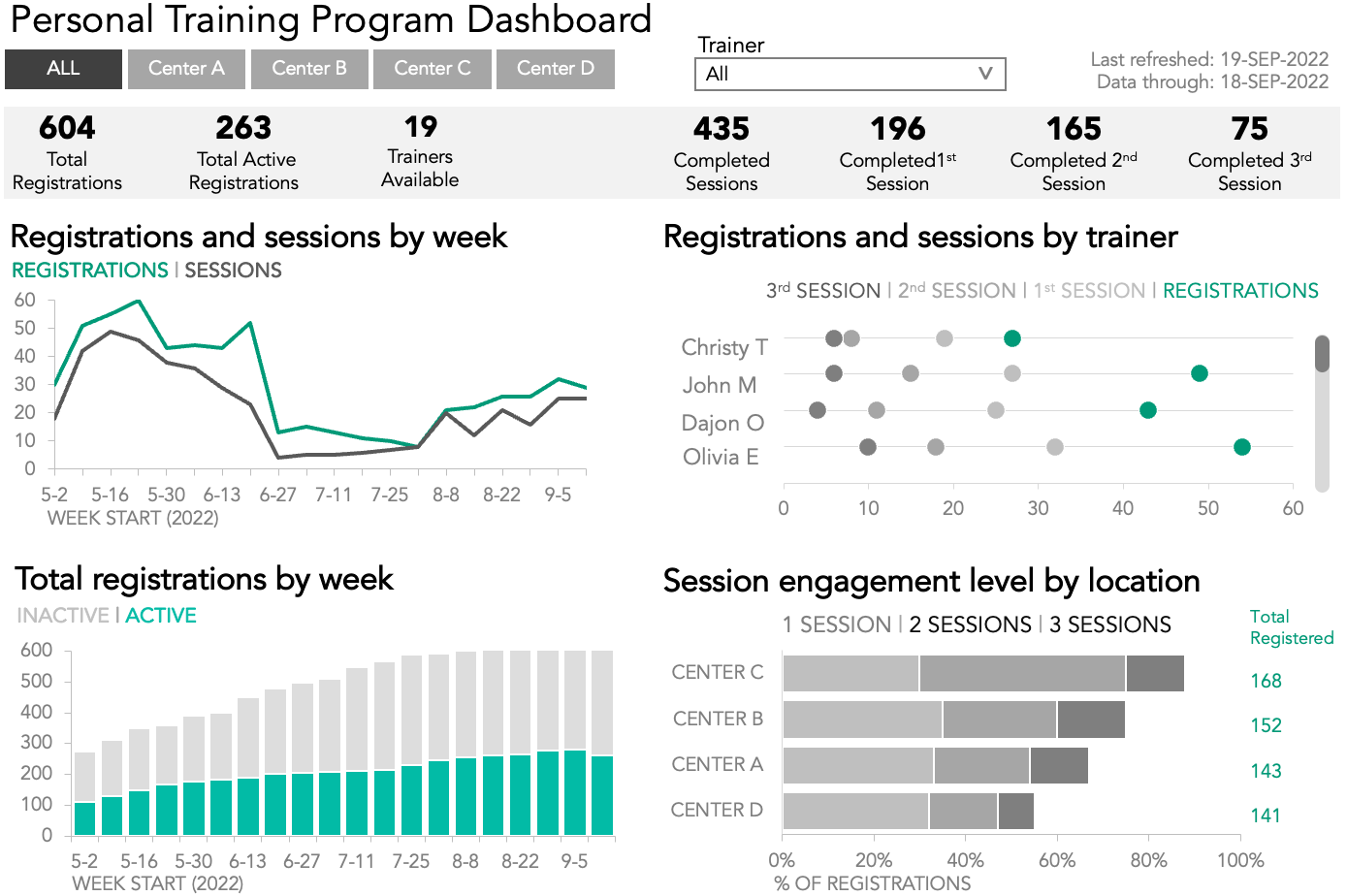
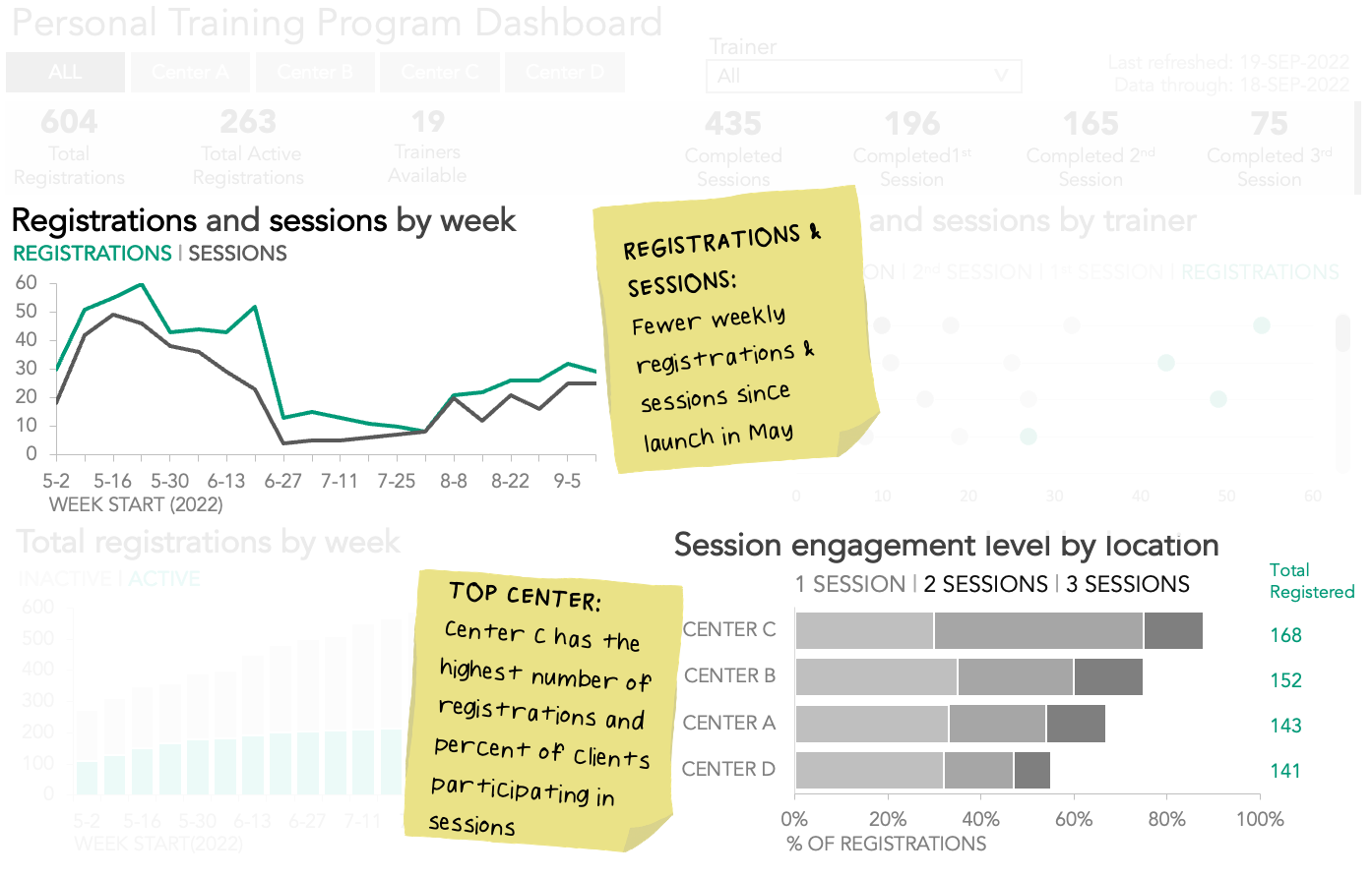
First, some background: a fitness chain created a dashboard to monitor weekly performance metrics for a personal training program. In this program, clients at the fitness center register to attend one-on-one sessions with a certified trainer. 

Filters at the top of the dashboard allow users to select and analyze specific locations and trainers. Overall summary measures are shown in prominent colored boxes just below the filters, and there are four charts that provide time-trended views and aggregated metrics by week, trainer, and location.

With this dashboard and others like it, exploring the data was much easier than ever before, but the client found it challenging to translate the results of that exploration into actionable insights that leadership could quickly understand.

Make a dashboard easier to read

Many of the lessons taught in our books are specific to making explanatory communications better by using techniques like focusing and telling a story. Since dashboard visuals update when filters are applied and data is refreshed, it is difficult to add specific text or focus attention on a particular data point to tell a compelling story. However, some of the storytelling with data lessons do apply.

Keep your audience in mind

When creating a monitoring report capable of exploratory analysis, one should be thoughtful of the audience, and the insights they need to glean from the data. To improve the overall user experience, leverage white space, alignment, and grid layouts. This will make the view easier to read and navigate at all levels of exploration. For more tips on designing effective dashboards, check out The Big Book of Dashboards

Choose effective visuals

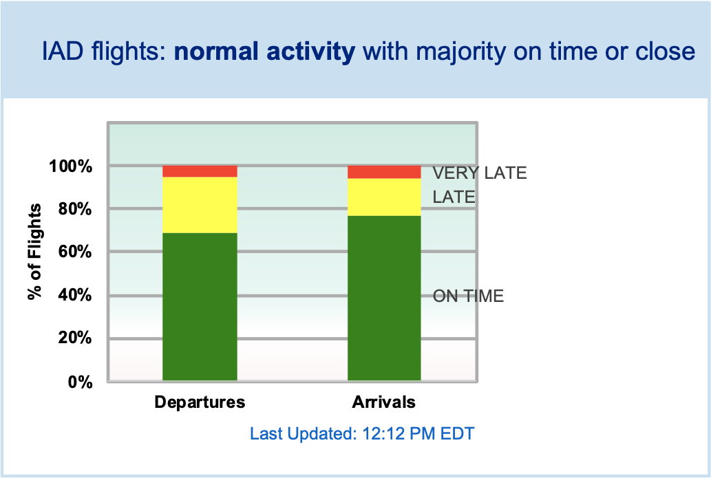
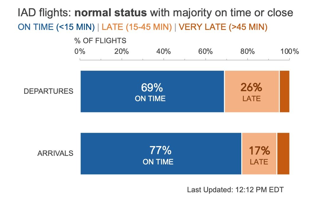
To enable quick discovery, select the most appropriate chart type for the data being depicted. Some of the charts in our dashboard would be easier to interpret as a different visual. For example, a line graph would show the trends for registrations and sessions better than bars. A dot plot would enable a simpler view of trainer sessions, while stacked bars would provide a relative comparison of each fitness center location.

Identify and eliminate clutter

Because dashboards are naturally busy, we certainly want to take steps to reduce the cognitive burden for users by removing items that do not add information value, like gridlines and borders. The amount of color used can also contribute to a cluttered feeling. 

In this simplified version of the dashboard, we’ve made it easier for our audience to see the data clearly by minimizing the number of data labels, borders, and colors.

Exploring data is different than explaining data

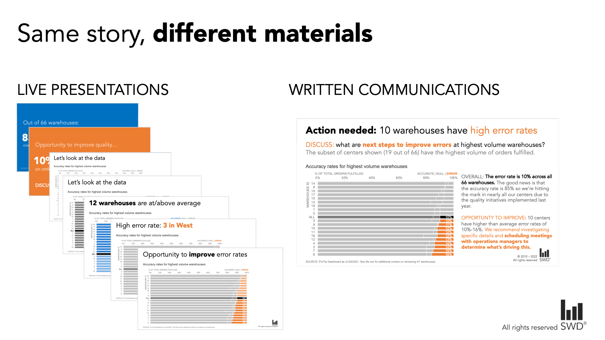
Dashboard interactivity makes data discovery much easier, but to drive meaningful change, it is usually more effective to craft a communication specific to the story we want to tell. Creating a presentation tailored to our audience lets us deliver our findings in a way that will resonate with them, and frees us from having to compete for attention with unrelated charts, filters, and text.

Isolate data from your explorations that support your specific message

In a presentation, we don’t need to share every bit of data we looked at in dashboards throughout the exploratory process. The point of looking at all that data was so that we could isolate the critical insights, and share those directly with decision-makers. Providing too much data runs the risk of overwhelming our audience. 

A more effective approach is to include only the most meaningful information needed to support our main message, or what we like to call the Big Idea. After crafting our Big Idea, we can use it to identify what data is necessary for our story—and what we can leave behind on the dashboard.

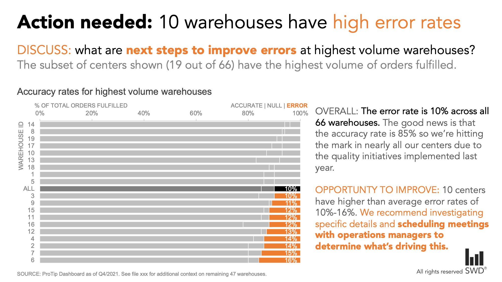
Imagine we oversee the personal training programs across all of the fitness center locations, and after reviewing the dashboard, we realize two important things.

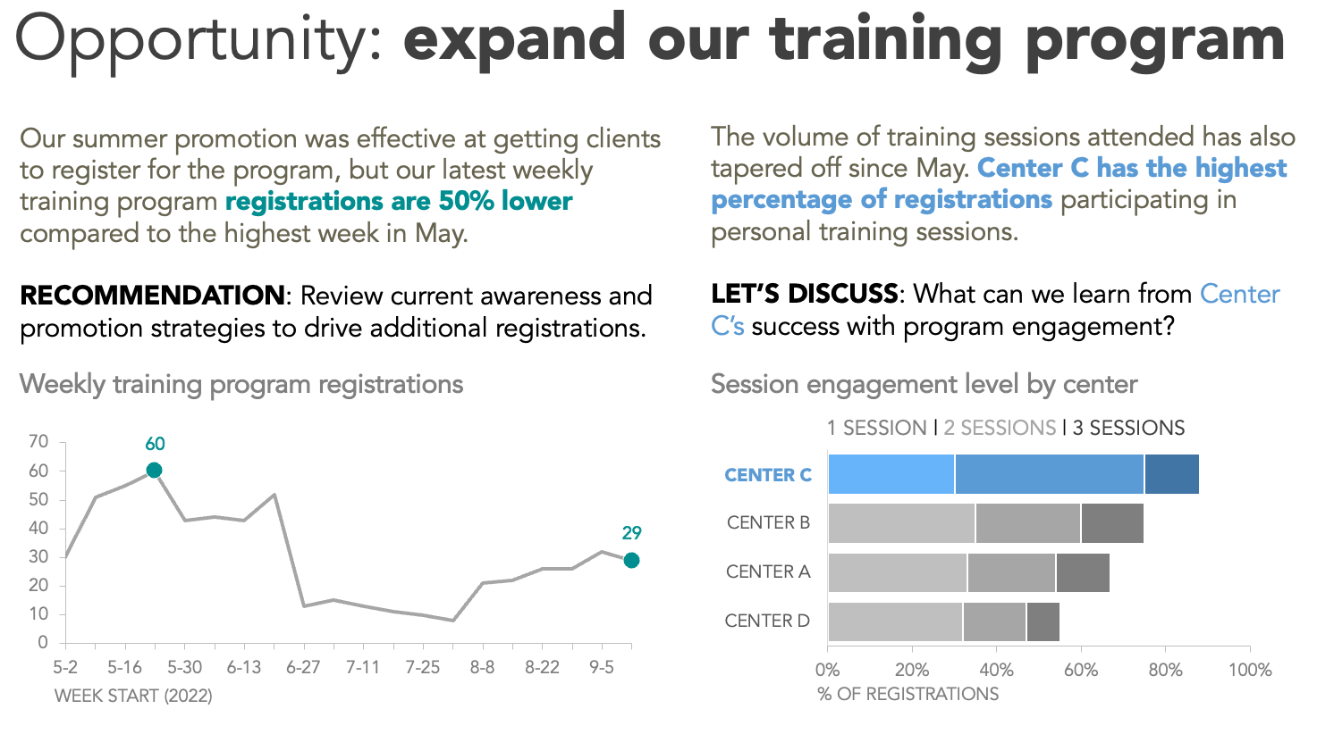
  1. Registrations and sessions have tapered off since launching in May. Our summer promotion was effective at getting clients to register for the program, but if we want to continue to grow the number of people we help through the program, we likely need another marketing push leading into the holiday season. 

  2. Some centers are doing a better job at getting registered clients to attend multiple sessions and there are likely some strategies we could learn from these locations. 

As a result of these findings, we want to meet with the head of marketing to discuss how to drive more awareness and engagement for the program. Our Big Idea might be: To help more clients meet their fitness goals, we should develop a new marketing strategy for our personal training program and apply learnings from successful engagement tactics across all locations.

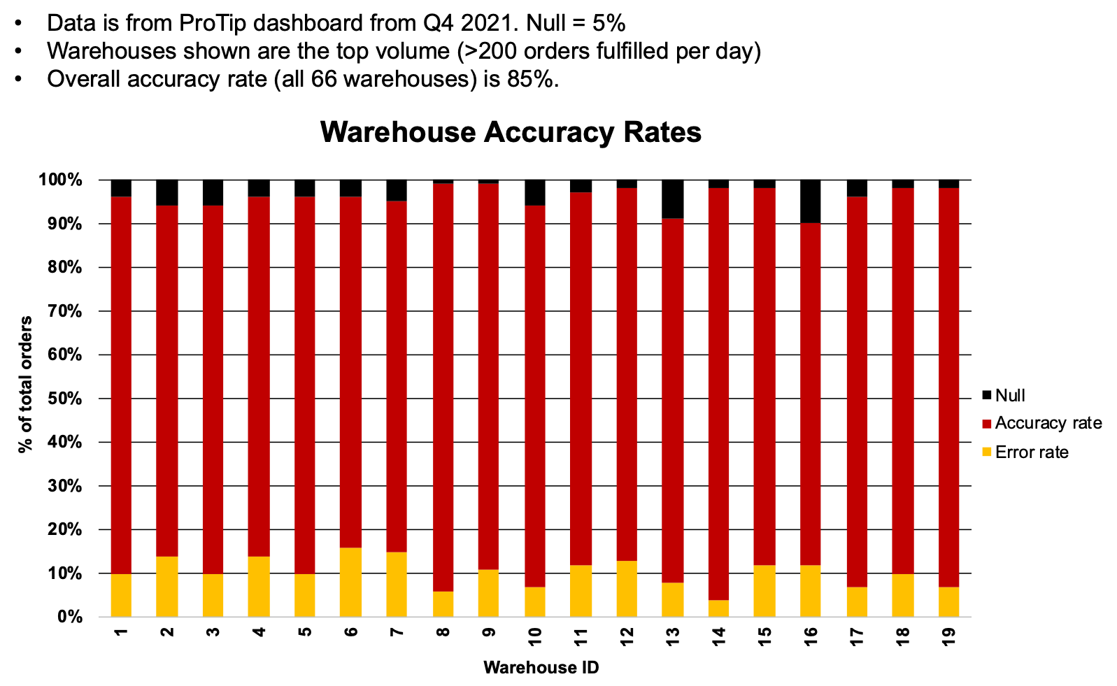
Since we want to have a targeted conversation with the head of marketing, we do not want to share the entire dashboard, as it includes additional data that could distract from our key takeaways. Instead, we want to isolate just the pertinent information. Using our Big Idea as a filter to identify the data needed as evidence, we focus on the two graphs highlighted below.

Now that we’ve identified our audience, articulated our Big Idea, and found the data needed to support our message, we are well-positioned to create our communication to the head of marketing.

Use words and color strategically

Words and color are a powerful combination for highlighting key points in our communications. By taking the data out of the monitoring report, we can more easily get our audience to notice the most important information. Check out how we can immediately call attention to the lower number of weekly registrations by using color sparingly paired with words.


Explicitly communicating our findings in words and recommending an action makes the so-what clearer to see. We use the same color in our emphasized words as we do for the key points in the graph, so there is a visual link letting the viewer know how the data and the recommendation tie together. Notice how these little changes make the story unmistakable.


To create an effective single-slide executive summary, we can incorporate an active slide title and call out the recommended action directly, to facilitate and encourage a conversation with the head of marketing about the next steps for promoting our personal training program. 

All this insight was present in the original dashboard, but executive leaders with limited time and bandwidth can’t be expected to do all the exploration necessary to find it for themselves. Interactive tools are incredibly useful for getting to insights more quickly, but when we need to present compelling stories that drive our audience to act, a separate and more focused communication is often more effective. 

To practice transforming a dashboard into a story, check out this related community exercise. We also welcome further thoughts on dashboard stories in this related conversation


If you enjoyed this makeover, explore more data to story transformations on our makeovers page and our YouTube channel.

a multi-level makeover: simplifying a shrinkage report

In retail, there’s an expectation that some percentage of product inventory will inevitably disappear without ever being sold to a customer. The term for this is “shrinkage,” and it includes things like shoplifting, employee theft, and various inventory control issues. 

Somewhere between 1–2% of retail inventory tends to be lost to shrinkage, even though retailers work assiduously to keep that number as low as possible. Tracking shrinkage values in as close to real time as possible helps managers and owners understand which mitigation efforts are proving effective, and whether or not there are new areas of concern.

Recently, I was able to work with a national retailer on improving the readability and visual impact of their weekly shrinkage reports. Within the organization, these reports are generated across multiple dimensions, so that managers are able to see current and historical data at various levels of geographic detail (national, regional, state, and store), as well as broken out by cause (shoplifting, internal, inventory control, and overall).

By way of example, here’s what a weekly report on the overall shrinkage for all of the retailer’s Mid-Atlantic stores looked like:

Three data series showing weekly shrinkage at Mid-Atlantic locations.

There are opportunities to improve this visual, but I appreciate that the graph is appropriately titled, that the legend is clear and easy to find, and that the most recent data point is the only one that is labeled. On its own, it’s an acceptable view of the data, albeit one that could be strengthened.

When this visual is considered in its greater context, however, the need to improve the legibility of this graph becomes obvious.

These charts are generated at multiple levels of geographic and thematic detail. Each one is then shared as part of one large report, with almost no visual variation from region to region, level to level, or week to week:

Two pages from a shrinkage report, where 20 line charts look very similar to one another.

Here’s just one snapshot of a report that runs dozens of pages, including hundreds of visuals, reproduced with incremental changes every week. 

Every graph on the page feels nearly identical and carries equal visual weight. When the information is presented in this fashion, it is nearly impossible for a reader to see any greater trends, to scan for important outliers, or to know where their attention should be paid.

It’s a struggle to focus on a single view for more than a second or two. (I’d be stunned if anyone could tell at a glance that of the 20 graphs in this two-page layout, four of them appear twice—and that’s with each one titled clearly and consistently.)

Given this context, it became clear that there were two distinct opportunities for strengthening this report.

  • Simplify the basic structure of the standard shrinkage-report graph—irrespective of level of detail—and make it easier for a viewer to see the current weekly status and any concerning trends.

  • Suggest an improved overall report that adds more visual breaks and reference points for someone reading the larger report, and ensures that there is both consistency in the overall layout as well as visual cues differentiating different levels of detail.

Remaking the graph

Let’s revisit the overall shrinkage graph for all Mid-Atlantic locations:

I began by simplifying the graph skeleton—everything that supports the data, but isn’t the data itself. For this visual, that included the borders, the gridlines, the axes, the legend, and the title. 

  • Borders | This graph, like almost all graphs, didn’t need a defined border. Our eyes can easily tell where a graph begins and ends, and the border just adds visual clutter.

  • Gridlines | In most cases, gridlines provide little benefit in exchange for the level of visual interference they cause. I’d guess that I remove gridlines from graphs 99% of the time, since I’d prefer my data series to be presented free of distractions.

  • Axes | I added axis titles and faded the black lines down to a less-aggressive gray, on both the vertical y-axis and the horizontal x-axis. The y-axis didn’t NEED to go to zero, since we’re showing lines rather than bars, but the scale was so close to zero it felt misleading to stop at 0.5%. On the horizontal axis, I removed the repeated “WK” label, and rotated the text so that each week number was easier to read.

  • Legend | I kept the legend at the top, but incorporated it more intentionally with the graph title.

  • Title | Moving the title to be left-aligned, and written out in sentence case, makes it easier for a reader to scan it quickly. The alignment also provides a nice frame around the graph without resorting to drawing an actual border.

Cleaning up the borders, gridlines, axes, title, and legend of the original graph provides a stronger "skeleton" to build on.

The first step of the transformation involves cleaning up the graph “skeleton”—all of the structure in the visual that allows the data to be seen clearly and understood easily.

The next step was to address some of the distracting elements in the data series themselves. 

  • The data markers were an obvious place to start; I always think of them as the graph equivalent of boldfaced text. Markers are a great way to highlight the key points in a visual, but using too many at once undermines the whole effort by making it seem like everything is equally important. Since this was a weekly report, it seemed obvious that the current, new data point should be emphasized; additionally, year-over-year and year-over-two-year comparisons could be made more easily if those points were also marked. Finally, I made each data marker a circle; having unique markers for each year seemed unnecessary.

  • Similarly, I chose to include data labels for the three marked points (current week, YoY, and Yo2Y), but made the current value much larger and easier to read. I also used similarity of color to make it easy to figure out which label went with which data point.

  • The color in the data series was also up for consideration. Normally, I’d want to gray out all the lines except for the current year. However, knowing that there was likely to be significant overprinting in these auto-generated reports (where the 2020 and 2021 lines might be hard to distinguish from one another if both were gray), I decided instead to simply fade those colors so that the 2022 color was the most attention-getting.

Using data markers, labels, and color sparingly helps make the most recent and relevant data stand out in this graph.

With sparing and thoughful use of data markers, data labels, and color, we can emphasize information that will be most important and relevant to a reader, while also providing visual cues that will point out pertinent comparisons.

The final step for this graph was to add some additional context.

  • The company had set an organization-wide target of 1.25% shrinkage or less from all causes (0.75% from shoplifting, 0.25% from employee theft, and 0.25% from inventory control). I decided to visualize that target in the plot area of the graph itself.

  • To demonstrate how these graphs could be used in a specific presentation, rather than in a weekly report, I created a version that used additional annotation to highlight a particular takeaway.

Adding reference lines and takeaways in text helps a viewer understand the information in context.

Adding key takeaways in text above the graph, plus incorporating reference lines in the view itself, makes it even more likely that a reader will understand both the data being presented and what future actions it might suggest are indicated.

With the graph restructured, I could then focus on making the complete report easier to understand.

Remaking the report

As a reminder, here is the original look-and-feel of the report:

Here’s just one snapshot of a report that runs dozens of pages, including hundreds of visuals, reproduced with incremental changes every week. 

A sample two-page view of the much-longer weekly shrinkage report.

Whether you’re building a slide deck, a dashboard, or a report, it’s critical to organize the material in a consistent, scannable, and thematically meaningful way—particularly if it’s a regularly-updated communication that people will be consuming over and over again. 

While I was not able to fully redesign the report, I was able to offer a sample makeover, and suggested a few specific considerations to the retailer if they wanted to pursue that project separately:

  • Create a visual hierarchy. I wanted to make it clear to someone scanning the page what the section header is, what the subsection headings are, and if a graph is at an aggregated or more granular level of detail. This makes it easier for people to find the information they’re looking for, at the specific depth that interests them. To this end, I proposed that each page begin with a header describing the specific geographic region and level that the graphs that followed represented.

  • Be as consistent across graphs as possible. Even though the visuals would be automatically updated every week, I felt it was important that within each type of graph (all-cause shrinkage, shoplifting, internal, inventory control), the y-axis would have the same scale, regardless of geographic level of detail. That would make it easier to compare across stores, states, regions, or overall. The alternative would be to have the scale for each graph defined automatically by that week’s data, and that minor inconsistency would add just a bit more cognitive burden to a reader than is necessary.

  • Repeat layout and positioning across pages. Ideally, the first thing someone would see on a single page would be the header, clearly identifying the region; then, the overview/summary statistics for that region would follow in the top left; next, just below those statistics, comes the “all-cause” graph (which would be larger than the other graphs); and finally, smaller and aligned on the right-hand side of the page, the sub-category graphs. Any space below these graphs could be used for other insights, recommendations, or additional graphs.

Compared to the existing document structure, this would add whitespace, visual breaks, and thematic structure that would make it easier for someone reading the report to find and consume any particular graph of interest.

A suggested layout for the overall report leverages consistency, scannability, and thematic organization to make the document easier for all readers to understand.

In this sample redesign of the report, the breaks between levels of detail are clear; there is both variation and consistency to help a view stay oriented within a graph, a page, and across multiple pages; there’s more white space for ease of reading, and there’s a clear visual hierarchy to make the entire document much more scannable.


Strengthening a communication can happen at multiple levels. Depending on your needs, your availability, and the intended use of the end product, you may find yourself focusing on small details in a single visual, the overall structure of the larger document, or a little of both. 

The good news is that many of the considerations for improving communication at the tactical level… 

A before-and-after view of a redesigned line chart showing weekly shrinkage rates.

…also apply at the strategic level. 

A before-and-after makeover of a multipage report showing weekly shrinkage rates.

If you enjoyed this makeover, we encourage you to check out this collection of other walkthroughs on our blog, which we’ve developed based on our real-world client work; if video is more your speed, you may prefer to explore some of the live graph transformations that we’ve collected on our YouTube channel.

an accessible makeover

 
Here is a side-by-side comparison of the original FlightView chart on the left and the final accessible makeover on the right.
 

We share data visualization makeovers to illustrate how seemingly minor changes can make data more accessible. Without additional context, the word “accessible” can take on a couple of meanings. “Creating graphs that are easy to understand” is one interpretation. Another is “designing charts that support people with various disabilities.”

Both of these meanings are valid and worthy goals. Unfortunately, many makeover efforts lean more heavily on the first interpretation—my own creations included. This isn’t to say that designing straightforward charts and being inclusive are separate endeavors, but more effort is required if the goal is to be accessible in all ways.

A few years back, Amy Cesal penned a guest post sharing five ways to make your data visualizations accessible—with the second definition in mind. You can read her post here, and I’ve also listed the suggestions below.

  1. Add alternative text

  2. Employ a takeaway title

  3. Label data directly

  4. Check type and color contrast

  5. Use white space

Today, I’ll step through each of Amy’s best practices to create a fully accessible data visualization makeover.

I’ll leverage a chart from FlightView, a free resource to track flight and airport status. This is an awesome application I rely on regularly when traveling; however, I’ve always thought the charts could be more accessible. 

FlightView's original 100% stacked bar chart showing flight status at the IAD airport using green, yellow and red to indicate on time, late or very late status.

Source: https://www.flightview.com/airport/IAD-Washington-DC-(Dulles)/delay

So, let’s start with the first suggestion: to add alternative text.

Add alternative text

Now, I’ll be the first to admit that I’ve skipped writing alternative text too many times, and I need to do better. Alt text allows people using screen readers to interact with graphics and images. Amy suggests that alt text for data visualizations should be concise and include three things: the chart type, type of data, and the takeaway. Also, a link to the underlying data should be available in the surrounding descriptive text.

As far as I can tell, the original graphic does not include alternative text; however, a block of text nearby offers related information.

In the graph’s original context, this could be considered “enough” descriptive text to include; but often, graphs are plucked out of their original context and shared in other articles, presentations, and posts—just as I’m doing here. Including alt text in the original would mean that the explanation is then carried forward for any other future uses of the visual. 

My alternative text for the above graphic could be, “100% stacked bar chart showing flight activity at Washington Dulles International Airport (IAD) by status with the majority of departures and arrivals currently on time or close.” For illustrative purposes, I’m assuming the graph is static, but the alt text would need to be dynamic if used on the FlightView site. I’ll also link to the data file at the end of this article.

Employ a takeaway title

Takeaway titles help all individuals looking at a chart understand the purpose. The current title is descriptive and leaves the interpretation to the user.

Let’s be more pointed. 

An updated visual with the new title, "IAD flights: normal activity with majority on time or close."

Label data directly

By default, many tools add color legends to charts. Keep in mind, though, that the farther apart a legend is from the data, the more work it is for someone to scan between the two, which slows down and complicates the process of understanding the visual. Legends can also be problematic if the colors aren’t easily distinguishable, so removing the legend and labeling data directly is a good habit when possible.

An updated visual where the legend was removed and each category is now labeled on the graph.

While I do have plenty of space on the right side of the bars, the gridlines and background shading make the labels look messy. We will address this in the next step.

Check type and color contrast

Sufficient contrast among the colors in your viz, and between any text element and the background color it appears on, is essential for accessibility. Fortunately, there are several free, online tools available to help identify any problem areas. I’ll use the colorblind simulator Coblis and the WCAG contrast checker extension

First, let’s look at the results of our colorblind simulation.

A view of the latest graph with a colorblind simulation filter shows that the red and green categories are almost indistinguishable.

The red and green sections are not easily distinguishable. Fortunately because I labeled the data directly, one can still determine that the majority of flights are on time and a small portion are very late. 

Next, let’s see what our contrast checker thought of this visual.

After checking for contrast (using Level AA compliance), a view of the latest graph shows that the footnote and data labels are not easily visible.

The contrast checker helps me realize that the tiny blue footnote could be challenging to read. Also some of the data labels are challenging to see against the chart background. 

Let's update the stack colors to use complementary colors (orange and blue), remove the chart background, and improve the footnote's visibility.

An updated visual improves contrast by using blues and oranges, removing the light green chart background, and changing the text labels to dark gray on a white background.

Use white space

Typically, I advocate for removing outlines or borders around data, but white outlines are the exception. Adding a white border (on a white background) helps to visually separate each section in a stacked bar chart (or a pie chart) so that they don’t bleed into one another.

An updated visual includes a white border or spacing between each stack in the 100% stacked bar chart.

Final thoughts (and makeover)

I’m pretty happy with the improvements here. The best part is that all five of these steps were super quick to implement, which means that in a matter of minutes your visuals can go from impenetrable to accessible.

Here is a side-by-side comparison of the original FlightView chart on the left and the final accessible makeover on the right.

Now, are there more changes I’d like to make? Yes! I’m not a fan of the light blue background shading and border. I’d also prefer to orient this chart horizontally (a personal preference), widen the bars, clarify the categories, remove some of the boldfacing, and even label the key sections. Altogether my final tweaks could look like the following. 

100% horizontal stacked bar chart showing flight activity at Washington Dulles International Airport (IAD) by status with the majority of departures and arrivals currently on time or close.

Creating accessible designs is important, and should become a regular part of the design process. (I’m speaking to myself!) If you’d like to practice implementing these steps, check out the exercise in the community to create your own accessible data visualization makeover, or browse the related Excel file to experiment with the above dataset.

what your audience really wants


Today’s post is a makeover-focused one, based on a graph I recently encountered. I’ll illustrate how to improve this less-than-stellar graph using the entire holistic SWD process taught in the best-selling book:

  • understanding the context

  • choosing an effective visual

  • eliminating clutter

  • focusing attention strategically

  • telling a compelling data story

By working through real-world examples, such as the one we’ll talk about today, you can practice applying this process, and become more confident when incorporating similar changes and strategies into your own work.

Consider the following visual from a national retailer, showing warehouse performance. The details have been modified (to protect client confidentiality) but the spirit of the original remains the same.

When critiquing someone else’s work—particularly when it’s been removed from its original context as it is here—it’s always helpful to start by assessing what was done well.

  • Visual choice: I’m familiar with a bar chart, including the specific variation shown here, the 100% stacked bar, so I’m not faced with the hurdle of trying to decide how to decipher an uncommon visual type. With some modifications (which we’ll get into later), this visual type should work well to explain the main message of this communication: the breakdown of performance (accurate vs inaccurate rates) across the warehouses of interest.

  • Words: I also appreciate the helpful context included at the top of the visual stating the data source, as of date, why this subset of data is shown, and the overall picture of 85% accuracy. 

That said, there are many ways we can improve upon this visual to tell a concise and action-inspired data story. I’ll outline the changes I’d recommend and my rationale for each. 

the quick hits: declutter, focus and words

A few simple things go a long way without a ton of effort and time. The biggest bangs for your data storytelling buck are typically eliminating clutter, using color intentionally, and clarifying the intended takeaway with words.

I can improve upon the original by making the following changes:

  1. Use a different color palette. There is a positive/negative connotation to this data, so I’ll elect to use blue to signal the positive (accurate) and orange, its complement on the color wheel, to accentuate the negative (errors).

  2. Declutter. The original graph has many elements that make it appear more complicated to process than it really is, like gridlines, harsh bolding, rotated x-axis labels, and an out-of-place legend. I’ll declutter, leaving only those elements that add enough value to make up for their presence.

  3. Use words more effectively. If I want my audience to understand that this data is conveying a success story, I shouldn’t assume that they will come to that conclusion on their own. I’ll not only state it in words, but tie the words to the data they describe using similarity of color. 

You can see all of these changes applied in the visual below.

Check out the difference already!

While this is certainly an improvement over the original, we can continue to iterate and develop an even more effective final product. 

rotate the graph horizontally

As already mentioned, I like the choice of 100% stacked bar to show the relative percentages. I have two baselines for comparison: with one at the 100% value along the top and one at the 0% value along the bottom, I can be thoughtful about which series to place along these baselines to enable an easier visual comparison. 

One change I’d recommend is to rotate to a horizontal orientation, as shown below. I’ve intentionally removed color here to keep the emphasis on the choice of graph. In the case where we had longer category names, this orientation would allow for more space to spell out the entire name without rotating labels. You can read more about horizontal vs vertical bars in this prior post.

consider how the graph will be consumed 

When you’re with your audience—whether virtually or in-person—your graphs and presentation slides can include less context and detail physically written down or shown, because you are there to fill in any blanks. The reverse is true for written communications, where people have a higher tolerance (and perhaps demand) for more detail. This is why live presentations are better suited for sparse slides than written communications.

Check out how the same presentation might look different if we were delivering it live with a series of slides, versus sending around a single summarized view for people to read on their own:

Now let’s pull it all together.

don’t just show data, tell a story!

Watch my live presentation—and more discussion on how to build your data storytelling muscle—in the replay from a recent live chat on our YouTube channel:

An effective data story doesn’t just happen. Getting comfortable applying all the components considering the context, choosing a visual type, intentional design and creating a story takes time and practice. But it is worth the effort, because any communication is likely to be more effective when we move beyond simply showing data, and instead take intentional steps to inspire and drive action.

This is what your audience wants from you.


If interested, you can download the data and create your own makeover version in the exercise bring the data to life. For more examples of visual transformations, check out the before-and-afters in our makeover gallery.

bar charts and dot plots and line graphs, oh my!

A client in one of our recent custom workshops was looking for ways to improve upon a very busy chart. The original graphic combined bar charts and dot plots and line graphs, oh my! 

Here is what it looked like, with the details and numbers modified to preserve confidentiality:

combo chart

Take time to understand the context

When faced with any unfamiliar but complicated graph, it can be helpful to think about it piece by piece to gain a better understanding of what’s being communicated. That way, we’ll have a better handle on how we can improve the overall visual. 

The goal of this chart is to allow managers to compare their store’s performance against its forecasted range and the actual performance of other stores in the region. 

  • Each of the green bars represents the “inventory turnover ratio” for one of several retail store locations—this is a measure of the number of times inventory is sold and replaced in a year. A lower turnover implies weak sales and possibly excess inventory, while a higher ratio implies either strong sales or insufficient stock. We know this metric was important to the person who made this visual, because “Inventory Turnover Ratio” is the title of the entire chart.

  • There are two lines in the chart—a blue one and an orange one—representing the upper and lower range for the forecasted turnover ratio across all locations in the region.

  • The dots, also colored blue and orange, depict the predicted range of the turnover ratio for a given store. 

With this background, let’s now consider how we can communicate all this information while making it easier for the intended audience to understand it. 

Reduce the effort required by the audience

Now that we know what the chart is displaying and the goal of the visual, we can consider the best way to present the information. There is a lot to take in with the number of metrics being displayed. Removing any elements that take up space but do not add to the understanding of the data will reduce the amount of work required to decipher the graph.

Asking yourself what you can eliminate is always a good first step to improving a visual. We will remove some clutter by deleting the gridlines, taking away the data labels, getting rid of the 3D effects, formatting the axis to not have trailing zeroes, and cleaning up the store names to be more consistent. 

Remember the blue and orange lines that were used to show the range of turnover ratios across all locations? To simplify this visual, we’ll get rid of those lines; instead, we’ll include a category called “REGION AVERAGE” in our series of bars. That makes the chart less busy while still providing an overall reference point.

The decluttered chart reduces cognitive burden, but we can further improve readability. Any time we have vertical bars with diagonal text, iterating to a horizontal bar chart makes the category labels easier to read (assuming the data still fits in the space with which you are working). So, let's switch the orientation. 

horizontal bars

We’ve made progress: it takes less effort to read the horizontal text, and the data stands a little more since we stripped away some non-essential elements. However, there is still quite a lot of information to take in. 

Arrange the information intuitively

There should be logic in the order in which information is displayed. It is not clear if the order of the locations in the original graph is intentional. Instead, let’s arrange the categories to make it easier to see how each store’s inventory turnover ratio compares to other locations. For instance, we could sort the stores by their individual ratios:

ordered horizontal bars

The ordered data makes it possible to quickly see the highest and lowest turnover ratios. However, visually speaking, the heaviness of the bars overwhelms the lightness of the dots, which makes it difficult for a viewer to compare a store’s actual ratio to its range of projected ratios. Moreover, the three different colors that we’re using aren’t playing nicely together: notice how challenging it is to see orange dots against the teal background of the bars. 

What could we do to make it easier to see where the turnover ratio fell within the forecasted range? One possibility would be a change of chart type: show the range between upper and lower bounds as a connected dot plot in a muted gray color, and then plot the actual inventory turnover ratios as points within that range. 

dot plot

What a difference! By reconsidering the way we chose to plot our data, we reduced the cognitive burden for the audience by presenting the information in a more intuitive manner. For the series that included a specific, calculated value—a measured ratio—we chose to visualize it with a single point rather than a bar; and for the portion of the graph in which we were reporting the minimum and maximum boundaries of a range, we chose to present that range with one continuous bar, rather than as two discrete points.

Emphasize the data thoughtfully

The design of this visual makes the data easier to interpret, but if we showed this graph to five different people, we will probably get five different interpretations of what the most critical message is. For instance, one person might say that Castle Rock is underperforming since its actual inventory turnover ratio was far below the projected range. However, another person might think that Castle Rock is a success story since it had the highest turnover ratio in the region.

One final consideration in strengthening any visual is to focus attention on what we think is important so that the main takeaways we hope to communicate are clear. Two effective ways to do this are: to use color sparingly to highlight the key points; and to incorporate words to provide context around the data.

We could tell a number of different stories and focus on several different aspects of this chart. For example, we could strategically use color and words to call attention to the stores with turnover ratios that are lower than their forecasted range. 

dot plot makeover

Check out the impact of simplifying, arranging, and emphasizing the information. These adjustments reduce the effort needed by the audience to interpret the chart and understand the key takeaway. 

makeover before after

For more examples of visual transformations, check out the before-and-afters in our makeover gallery. Then, practice honing your data storytelling skills by undertaking an exercise in the SWD community.

how does this graph make you feel?

Using color strategically and sparingly is often the quickest and easiest change to improve your data communications. Today’s quick post is a cautionary tale about not using color strategically—both in quantity and color choice. 

I recently encountered the following graph. At first glance, how does it make you feel?


If you’re like me, I feel alarmed. I feel even worse after examining the chart title and legend—warehouse accuracy rates, encoded as red. This doesn’t seem very positive! 

The reason I feel on alert is because of cultural associations with the color red. Western audiences often interpret red as a signal of danger, anger or alarm. It can also be associated with love, excitement, or passion, as we explored in a past SWD challenge. In this example, my brain didn’t immediately associate “accuracy rate” with “passionate love,” so I assumed that this chart was delivering some bad news.  

As it turns out, I was mistaken. This data actually represents positive performance of warehouse fulfillment. These warehouses are filling orders accurately about ~90% of the time. (A caveat here: without knowing more about the underlying context, we can’t be certain that 90% accuracy should be considered a good score, but for illustrative purposes, let’s assume that it is.)

To avoid the knee-jerk reaction of alarm (and improve the visual’s overall effectiveness by bringing the data to life), I’m going to make a few simple changes to this graph:

  1. Utilize a different color palette. There is a positive/negative connotation to this data, so I’ll elect to use blue to signal the positive (accurate) and its complement on the color wheel—orange—to accentuate the negative (errors).

  2. Eliminate clutter. The original graph has many elements (gridlines, harsh bolding, rotated x-axis labels, legend placement) that make it appear more complicated to process than it really is. I’ll strip away these non-essential elements, leaving only those that add enough value to make up for their presence.

  3. Use words effectively. If I want my audience to understand that this data is positive, I shouldn’t assume that they will come to that conclusion on their own. I’ll not only state it in words, but tie the words to the data it describes using similarity of color. 

Check out the difference! Does the revised graph still evoke feelings of alert? Likely not. 

The “after” graph still has room for improvement. The data could be sorted differently and there's an opportunity to add additional context and a call to action. You may see other things you’d approach differently as well. Join me Thursday, March 24 at 11AM Eastern time for a live chat on our YouTube channel, where I’ll continue to transform this visual into a data-driven story. See you there—click the link above to set a reminder and access the event!