student makeovers
This fall, I had the pleasure of teaching Intro to Information Visualization for MICA's MPS in Information Visualization. It was a 4-week course, where we explored some fundamentals of data visualization and storytelling as it relates to communicating effectively with data. One of the assignments was a visual makeover, where students were asked to select a less-than-stellar visualization from the media, identify the underlying story and create a new and improved visual using data together with narrative to tell an effective visual story. Check out this post to see some of the impressive before-and-afters!
the right amount of detail
In my workshops, we spend time discussing the importance of context when it comes to putting yourself in a position to create an effective data visualization. In my mind, there are two flavors of context that are important. In this post, we discuss these and look at an illustrative example.
how I would visualize this data
Check out this post for my remake of a data visualization challenge I posted to my readers.
logic in order
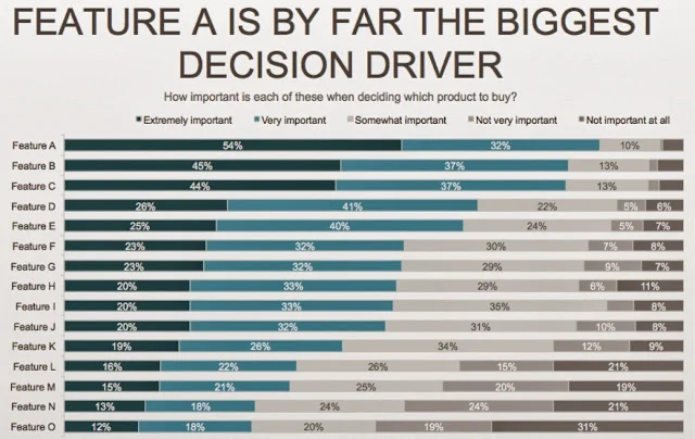
There should be logic in the order of your data. While I would say this recommendation is universally true, I'll focus in this post on a very specific example to illustrate the concept: leveraging order for categorical data in a horizontal bar chart.


