storytelling with data in 140 characters or less
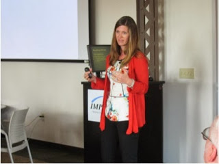
A few weeks ago, I ran a storytelling with data workshop for the IMPACT Planning Council in Milwaukee. It was a fun session (hosted by the School of Public Health at the University of Wisconsin, which is housed by a beautifully renovated former Pabst brewery building) with a super engaged group (plus my mother-in-law in attendance!). Last week, IMPACT shared with me a reconstruction of the workshop using the tweets published live during the event.
I found this pretty cool, so thought I'd share the bite sized morsels from my session here.
- Cole Nussbaumer, kenote speaker at data viz wrkshp takes podium
- Nussbaumer blogs about data viz at Storytelling w Data
- Cole says understanding the situational context of the data is key
- Who do you want to communicate to? What do you want to communicate? How can you communicate?
- Keep in mind what background info is relevant? What sound bite could you use to clearly articulate ur message? No more than 3 minutes
- Ur big idea must be a complete sentence that tells the audience abt the context of ur data
- V imp to choose the right way to display ur data. Sometimes plain text is best option
- Table or graph? Tables interact w our verbal system. Graphs interact w our visual system
- Line graphs are for continuous data, usually across time. Bar graphs are for noncontinuous data
- Bar charts shld always start from zero
- Exploding 3D pie charts misrepresent the relationships btwn the sections. Don't use them. Our eyes have difficulty judging size of areas
- There are many diff types of graphs. Always use the type that makes the most sense for your data and audience.
- @laurynbb:And kill the 3D bar chart - data viz wkshp “@planningcouncil: Give your graph to a friend to see if they understand it”
- You know you've achieved perfection in design when you have nothing more to take away
- Gestalt principles of visual perception: proximity, similarity, enclosure, closure, continuity, connection
- Eliminate clutter from your graphs.
- Get rid of anything that makes the audience work . Make it easy for audience to understand the point you're trying to make with the data
- @HelenBaderFound: RT @planningcouncil: Eliminate clutter from your graphs. #zentweets
- To focus attention where you want it, understand how ppl perceive info
- @HelenBaderFound:Follow @planningcouncil for tips on presenting your nonprofit's data, beautifully and effectively.
- Nussbaumer recommends Stephen Few's book as a good resource on data viz
- Ppl can keep abt 4 pieces of data in their memory at one time so design your graphs accordingly
- @HelenBaderFound Thx for following our live tweets of Cole Nussbaumer & Thx for your support of this wrkshp!
- @laurynbb: VizComm tenets “@planningcouncil: You have 8 secs to get audience's attention”
- The most effective data viz will still fall flat if you don't have a story to go with it.
- Stories stick in our minds in a different way than facts do.
- Use text to highlight key points in your graph
- Plot, twists and ending are components of your data story. If there's no twist - if it's not interesting, don't share the data
- Tactics for making story clear: horizontal & vertical logic, repetition, reverse storyboarding, fresh perspective
- Your graph is the evidence that backs up your story
- Cole says Excel can be used to make good graphs. It's not the default charts but a good user can make excel work
- Light backgrounds on graphs are easier on the eyes (and ink) than dark backgrounds
- Any time you cut out info be sure to think abt what context you might be losing
- Everything in a data viz (text & visuals) needs to reinforce the same message
- Rather than hope the data will tell you what it's about, be clear what your question is & then organize the data to answer the question
- Cole asks what distinction do you make btwn data viz and infographics?
- Infographics came out of journalism but have changed over time so now they are more glitz than data
- Just putting in a graph or infographic in to fill white space is not a good reason
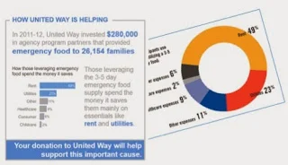
- Donut graphs are even more difficult to read than pie charts; don't use them
One of the makeovers we discussed in the workshop.
- @MilwaukeeStat:@planningcouncil and @storywithdata – thanks for putting on the best data viz gathering Milwaukee has ever seen. Well done!
- @storywithdata Thanks, Cole, for inspiring 50 Milwaukee data geeks today with your advice on good data visualization!
- @storywithdata:@planningcouncil Thank you for the invitation to speak to your group - an engaged and lively bunch - I had a fantastic time with you all!
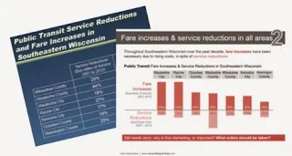
Another visual makeover from the workshop.
The full PDF (that puts my session back into the context of the rest of the afternoon, including a brief segment by Milwaukee mayor Tom Barrett) can be found here. Big thanks to the IMPACT Planning Council for hosting the event and allowing me to post their recap here!


