simple vs. sexy
When it comes to shoes (women's shoes, at least), there are use cases for each. Is the same true for visual displays of information?
My bias (in visuals, if not in shoes) is for simplicity: simple graphics are typically easier to understand and draw insight from. Glitz in infographics is a turnoff for me; it often adds clutter without informative value, making it harder to understand what to pay attention to.
That being said - is there a use case for the sexy infographic?
To explore this question, I decided to test out Circos, an application for "circular visualization". The software was originally created to visualize genomic data, but is now being advertised more generally and has been featured a number of times in the New York Times and other media. When I initially looked at it several months ago, I wrote it off, not immediately seeing scenarios where it would be useful.
But then a couple weeks ago, I was thinking about visualizing a matrix: movement into, out of, and between certain groups. I sketched a few diagrams as I was brainstorming ways to look at it visually. I had a concept drawn out that I thought would work, but was a little unsure how to bring it to fruition with the programs I typically use (most often, Excel). So I started looking through my list of tool resources. When I came to the Circos site, I knew this would be the perfect situation to try it out.
Here's the scenario:
At the company where I work, lateral job transfers are frequent. Transferring to another team or department is a way for an individual to learn new skills and broaden their experience. One interesting thing to understand is how individuals move throughout the organization: in what relative volumes, what areas are net importers or exporters of talent, etc.
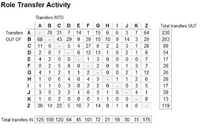
One way we can see and understand this movement is in a matrix. Below is an example of what this could look like. (Note: the data shown here are artificial.)

You can read across a row to see transfer activity out of a given group, or down a column to see transfer activity into a given group. Note the operative word: read. People read tables. You have to spend quite a bit of time looking at the numbers to start to draw insights. They don't jump out at you visually, the way they do in pictures (graphs).
Granted, there are some things I could do to add visual cues to this table to make those insights easier to draw. I could turn it into a sort of heatmap through use of color, drawing more attention to where the large volumes are coming and going. Or I could embed summary graphs of aggregate movement in and out to give a visual of relative magnitudes.
But rather than make minor changes to this simple visual, I want to explore the other end of the spectrum: sexy.
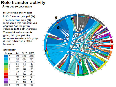
Here is what the same data looks like, plotted with the Circos Table Viewer:

It is a little overwhelming at first. But after taking a bit of time to orient myself to what I was looking at, I found the visual insights started coming quite quickly. By far the highest transfer volume is coming from and going to groups A and B. It's also quickly clear that groups A and B are both net exporters of talent (more people transfer out than transfer in), and you can follow the lines to see where people are coming from and going to. The visual allows you to look for anomalies and the unexpected. Maybe I'm a big dork, but the visual exploration is sort of fun - certainly more fun that it was in the initial matrix.
Earlier today, I found myself observing an unplanned test with this visual. I was at a 2-day offsite, and the topic of internal mobility came up. I fetched the version of this based on real data and showed it to a couple people during one of our breaks. I subsequently put the piece of paper with the visual on it in front of me on the table. Over the next hour, everyone within reach grabbed it at one point and spent several minutes focused on it. You could visually see on each person's face the cross-over from curiosity to scrutiny to understanding and the discovery of a visual insight.
I'm not sure the same would have happened if the paper had shown the initial matrix on it.
Rather, my guess is the table of numbers would have remained untouched. (I'm totally tempted to try this to see whether it holds true, and plan to do so at the first opportunity). I think the reason people picked up the paper was because the visual was different. It is confusing, but visually appealing in a way that grabs your attention and ignites a desire to understand what, exactly, this complicated looking thing is trying to convey.
In summary, if this test is any indication, I believe I've landed on two solid use cases for the sexy graphical display:
- To reveal new insight: The clearest use case to me is if your visual allows for a better understanding of what's going on than a simpler graphic will.
- To grab attention: Sexy graphics can garner attention in a way that a simple or more standard visual may not. Note that grabbing attention alone isn't enough - the visual needs to be able to also hold the audience's attention long enough for them to figure out how to read it, or won't be successful at revealing new insight. Walk your audience through what they are looking at to make the visual more accessible.
Are there other situations where sexy graphics win over simple?