bubblechart for gadget trends
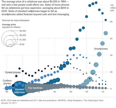
Last month, hot on the heels of the Consumer Electronics Show, the Washington Post included an interactive graphic to show the rise and fall of various gadgets sales over time across a number of categories (communication, computing, television, video and photo, audio) and the concurrent change in gadget prices.
Here's a screen shot of the communication graphic:

It takes a bit of patience to get your bearings, as there's a lot going on, but once you do, there are some interesting trends to observe and questions to ask. First, let's dissect the visual: time on the x-axis, millions of gadgets sold on the y-axis, the different shades of blue represent different types of communication devices - in order from dark to light - corded phones, standard cellphones, cordless phones, smartphones, and (in grey) fax machines. The size of the circle indicates the average price, according to the legend at the upper left.
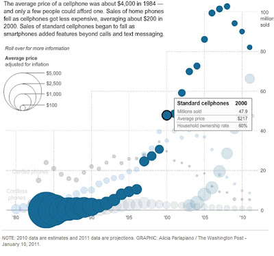
This is an image that invites exploration. Mousing over the different series gives you more detail on demand, and also prompts some nice highlighting via preattentive attributes, with the series you mouse-over remaining in its bold color and all else fading to the background, as shown below.

So now, in the above, we can see the rise of standard cellphones through around 2008, when the popularity of smartphones increased (far right trend), causing the sale of standard cellphones to fall. Some interesting things jump out to me that I would want to explore further - for example, I'm interested in what led to the sharp increase in units sold from 1996 to 1997 and again from 1999 to 2000. Through this graphic, I also learned that the first standard cell phones were sold when I was just 4 years old for an average price of over $4K! I'm curious whether the size of the phone follows roughly the same trend as price - my guess would be it does. It's truly amazing how far technology has come in the past couple of decades.
The catch with interactive graphics like this is that you have to have an audience who is patient enough to explore. They also tend to work better for just that - exploration - when there's no specific conclusion that you're looking for your audience to draw. Perfect for a news article. Not so much for a sales pitch, for example, where you'd want to be in a little more control of your audience's attention.
Mark, if you're reading this, thanks for sharing the article with me!