beautiful visualization
I have a growing collection of books on the topic of data visualization. I seem to accumulate them more quickly than I can read them. But every once in a while I have an opportunity (an uninterrupted hour or two) to narrow the gap. I encountered one such occasion this afternoon. I had checked all of my to dos off my to do list and decided to give my eyes a break from the computer screen to look at actual physical pages for a bit. My eyes appreciated the change in visual medium; my brain appreciated the content.
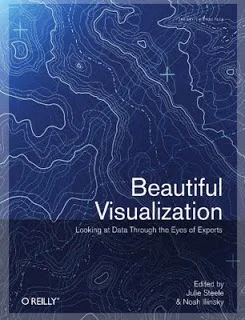
The book I occupied myself with is called Beautiful Visualization: Looking at Data Through the Eyes of Experts. It's a collection of writings on various topics from experts in the field of infoviz. Some of the names I am familiar with (Jonathan Feinberg has a section on Wordle, Aaron Koblin and Valdean Klump do a deep dive on flight patterns, Martin Wattenberg and Fernanda Viegas write about visualizing Wikipedia), but many are new. For my afternoon reading, I chose two from this latter category.
The first (which, technically is the last, at least in the order in which the book is written) is Jessica Hagy. Interestingly, finding her name in this book was the second time I encountered her work today. I had lunch with a connection from one of my speaking events and we were chatting about our favorite blogs; one of hers is Indexed, written by Jessica Hagy. The blog consists of a daily posting of an index card, on which Jessica has drawn a clever (and often quite amusing) visual display of data. It might be my new favorite blog. In Beautiful Visualization, Jessica uses this same style to discuss the ever increasing amount of data in our world and the power of images to make that data more accessible in a much faster way than words can. If you want to understand the parallel between an elephant and visualization, you need to read the book (the likeness is uncanny!).
After starting at the end of the book (very unlike me, by the way, I typically do everything in order), I went back to the beginning. The first section, by Noah Illiinsky, is titled On Beauty. By his definition, a beautiful data visualization is one which is novel, informative, efficient, and aesthetic. His guidance on how to achieve this is as follows (descriptions are in my own words except where noted and highly condensed):
- Step outside default parameters. My favorite line from this section (actually, from everything I read): In most situations, well-defined formats have well-defined rational conventions of use: line graphs for continuous data, bar graphs for discrete data, pie graphs for when you are more interested in a pretty picture than conveying knowledge. (Making fun of ineffective pie charts pretty much speaks directly to my heart!). His point here is that to be beautiful, a visual must be novel and create shock and awe. I'm not sure I agree with this sentiment, but more on that in a bit.
- Make it informative. I certainly can't argue against this one. Noah says that a clear understanding of message and the needs of the audience are key here (um, yes). If you can't state those concisely, you're nowhere near the point of trying to put together a visual.
- Make it efficient. Every bit of visual content will make it take longer to find any particular element of the visualization. In Duarte language, this is the step where you dial up the signal and dial down the noise. Visually emphasize what matters and get rid of the stuff that doesn't or push it to the background so it doesn't distract.
- Leverage the aesthetics. Use the basic components of the graph (titles, axes, etc.) to increase the utility of the visualization. Make the visual something that's comfortable for your audience to look at. They're more likely to look at it.
My one hesitation with the above is the first rule. In some cases shock and awe is good, but I think whether or not that is a necessary condition for a beautiful visualization is highly context dependent. Perhaps it's my penchant for bold, blue bar graphs, but in business communication, I generally find simple graphics to be the most beautiful (perhaps due to their relative rarity?). Though I suppose in reality what I'm generally aiming for is not beauty, but rather effectiveness. In that case, my personal spin on the above would be to say that necessary conditions of an effective visual display of data are that it must be informative, efficient, and aesthetic.
It's certainly great food for thought. I'm looking forward to the remaining 18 sections!
