tables that make sense
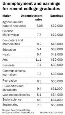
While catching up on some online reading this morning, I came across an article in the Washington Post titled "College Majors and Their Income Potential". I was curious how my brother, a recent grad with degrees in Italian and Political Science, would stack up. Here is the table that was included with the article:
I started to read the table. It looks nice: visually clean, no unnecessary clutter. When I first dove into the detail, I thought it might be ordered by increasing Unemployment Rate: 7.0...7.7...8.2...5.4? Nope. Ok, perhaps it's ordered by increasing Earnings: $32K...$32K...$46K...$33K? Nope. Alphabetical by Major? Nope. Doesn't even seem to be bucketed into degree types, given that Computer and mathematics are up at the top, while Engineering is at the bottom.
The table is not ordered by anything meaningful, as far as I can see. I find this frustrating. Sure, I can use it to find what I'm looking for (I'm guessing the Humanities and liberal arts segment is what my brother's degrees would fall into...highish unemployment rate and lowish salary would help explain why he's happily crafting his art as a bartender at the moment). But if I want to get much more out of it than that, or really understand how a single degree stacks up to the rest, it's difficult. In other words, the table is overly taxing to read: I have to search through to find the lowest and highest values, and it's really hard to figure out the what the ordinal set (which degree ranks 1st, 2nd, 3rd by the column of interest) would look like.
The lesson? When using tables, think about how your audience will use it and order it in a way that will facilitate that. In this case, I would suspect there are two ways the audience would want to use the table: 1) those who will do what I just did: seek out a single degree, then have interest in understanding it in the context of the others and 2) those who are interested in understanding what the top few or bottom few degrees are based on the figures. Some reordering would help both audiences' needs be met.
In general, think about whether there's an intrinsic order to the segments that you need to leverage. If not, order by the values your audience will be most interested in or based on the point you are trying to make. If high unemployment rate is your message, order your table by decreasing unemployment rates so the ones your audience encounters first - those at the top - help to reinforce the message you are trying to make.
Bottom line: make your table make sense.
