my penchant for horizontal bar graphs
I have a penchant for horizontal bar graphs.
First and foremost, this fondness comes because they are so easy to read. When processing a bar chart, your eyes compare the endpoints. The placement of the bars on a common baseline (whether horizontal or vertical) makes it easy to see quickly which category is the largest, which is the smallest, as well as the incremental differences between categories.
One use case for horizontal bar charts, in particular, is when your category names are long: the orientation of the chart allows the text to be placed from left to right—as people in Western cultures read—thus improving the legibility of the information you are providing (vs. being forced to make your category names diagonal or vertical, both of which I recommend avoiding due to difficulty reading).
Also noteworthy is that the orientation of the bars can change the way the information is consumed simply by virtue of how it is organized. In some cases, this may make a horizontal bar chart preferable to the standard vertical bar chart.
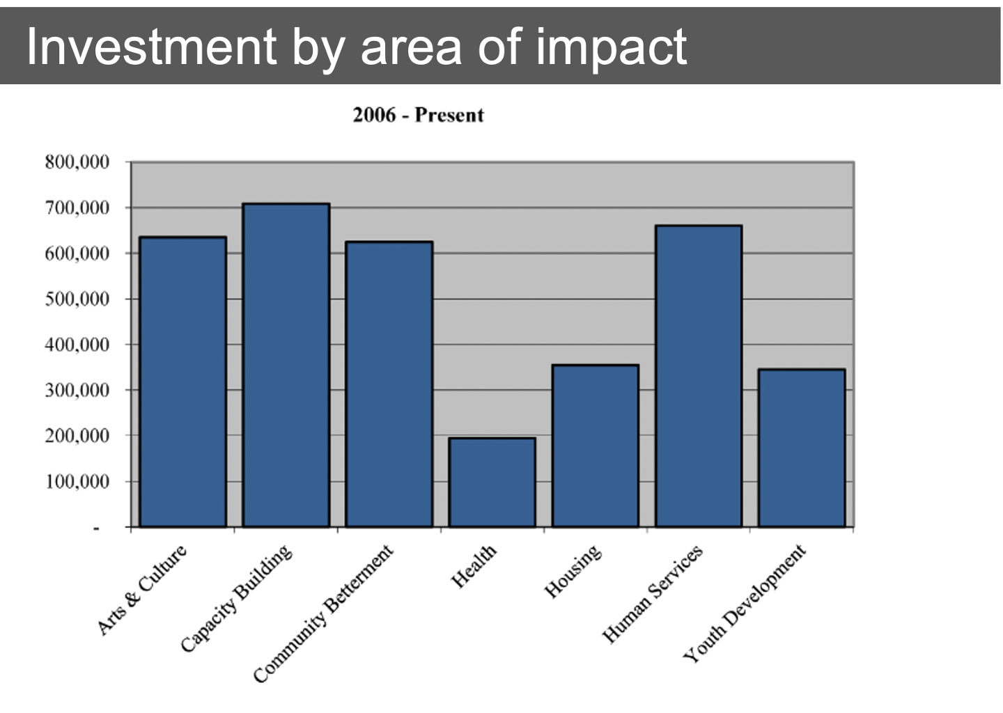
Let's consider at an example. Look at the following chart, taking note of the process you use to take in the information:
When I review it, my eyes first read the overall title, then move leftward to the top of the y-axis (which would be the perfect place for an axis title, so I know what I'm looking at). Next, I scan across the tops of the bars, following a sort of Z formation, only at the end do my eyes encounter the category names, which I have to read and then put back into the context of the data above them to attempt to draw insight from the information that's being presented.
This isn't the end of the world. But it takes time. Time that I think we can make better use of.
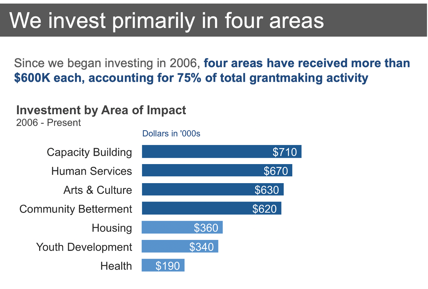
Let's compare when the information presented in a slightly different manner. In the remake below, I've made a number of changes:
Replaced the descriptive title with an active one, using that precious real estate (the first thing our audience encounters!) to outline a takeaway and set the stage for what will come next.
Added insights with text (using the preattentive attributes of bold & color to draw your attention to the important part), placing this at the top for additional context on what to look for in the data before you get to the actual data.
Flipped the chart on its side, making a horizontal bar chart and orienting the category labels from left to right. Easier to read, right?
Ordered the data from greatest to least. This creates a visual construct, making the data easier to consume. (Note: if there is an intrinsic order to your categories that's important, you would preserve it, but in absence of that, sort either ascending or descending by value).
Labeled the x-axis (what was the y-axis in the original version) to make it unquestionable what is being plotted. I removed the actual axis, instead labeling the bars with the numerical values they represent directly.
Eliminated unnecessary clutter: background shading and gridlines be gone (there was also clutter in the previous y-axis labels with the trailing zeroes, but that had already been taken care of by eliminating the axis).
Reduced the width (or height, now that we've flipped it on its side) of the bars. My recommendation is generally to have the bars take up more space than the white space in between them, but you don't want them so wide that our eyes start to try to evaluate area (in error) vs. height. The first chart was bordering on too wide per this last point.
Used color strategically within the graph to tie the insight at the top to the evidence in the chart that supports it.
Here's what we end up with after these changes have been made. Again, take note of the order in which you process the information:
As I scan, my eye pauses on the title, the dark blue text, then the graph title, and finally to the category titles at the left and corresponding data at the right. In this case, by the time I get to the data, I already know what I'm looking at (due to labels) and what I'm looking for (due to explanatory text above the graph).
Because we know how to read bar charts, the first instance above probably isn't something you would consider difficult to read. But note how a few changes make the information so much more accessible.
This isn't to say that horizontal bar graphs will always be preferable to their vertical counterparts, but rather to highlight some things to think about as you are choosing between the two. When in doubt, plot your data both ways and compare side by side to judge which will be the easiest for your audience to consume.

