multifaceted data and story
Last weekend, I ran workshops for two kdmcBerkeley 1-day sessions on Data Storytelling: Tools and Techniques for professionals working in the public health domain in California. To illustrate the concepts we covered, I used an example based on data from kidsdata.org that showed the percent of 7th graders meeting state fitness standards by race over time.
This is a rich dataset in terms of the number of facets one could focus on and the number of stories one could use it to illustrate. We looked at a number of different potential stories, and how you can change how the audience views the data and what they pay attention to through what you emphasize (and deemphasize). I thought these techniques might be of general interest, so will share them with you here. (The full Excel workbook is downloadable via the link at the end of this post.)
Here is what the data looks like:
As a first step, if we simply plot the above data as a line chart in Excel, we get the following:
I've said this before: the "insert chart" step in your graphing application should be the very first step in your data visualization process (not your last!). We focused on the above in a discussion on clutter: identifying elements that aren't adding informative value and getting rid of them. In this case, we can do things like: eliminate chart border, gridlines, and series markers, drop the trailing zero from the y-axis labels, and reduce the number of x-axis labels so the text will fit horizontally. We also decided the Multiracial line was more distracting than informative, with only 2 data points, and that it wasn't critical to the story we wanted to tell, so we removed it. We reduced the work of going back and forth between the legend at the right and the data it describes by labeling the data series directly. We removed Excel's random color choices (another Cole adage: never let your graphing application choose your colors for you!). After all of that, you end up with something like this:
The next step is to figure out where we want to draw our audience's attention. As I mentioned, there are a lot of different things we could focus on and stories we could tell with this data. Let's look at a few.
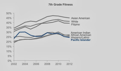
We could draw attention to the Pacific Islander group. If we look at 2012 vs. 2002, there hasn't been much change. In the early 2000's, there was some improvement, but then this fell. As of 2012, Pacific Island 7th graders in California have fitness levels lower than every other race:
Or, we could focus on the gap: American Indian, African American, Hispanic/Latino, and Pacific Island 7th graders in the state of California have markedly lower fitness levels in 2012 than their Asian American, White, and Filipino classmates:
We could draw emphasis to the change over the past decade: from our beginning point in 2002 to the latest data in 2012. We see a general up-to-the-right trend. Which is a good thing. Right?
Except that, if we focus in on the past two years (since 2010), we see a declining fitness trend across every race:
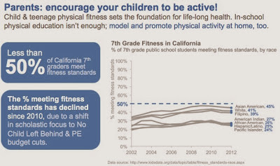
If we step back and think about context: these numbers are all low! In fact, across the board, less than 50% of California 7th graders are meeting fitness standards:
And 50% is not the maximum. If we actually think about (and show) the opportunity of where the numbers could be, we see something like the following.
This isn't to say any of the above specific emphasis or stories are right or wrong or better or worse. It depends on context: who are you communicating to and what do you need them to know or do? Use the answers to these questions to determine what data to show and how to show it (without misleading). Note also how, when we emphasize one story, it actually makes it harder to see the others. This is something to be careful of, especially when you're in the exploratory analysis phase - you don't want this to lead you to inadvertently miss something important.
In this particular case, we talked about a (contrived) situation where we were working for a California non-profit on a new marketing campaign aimed at parents to encourage them to promote more physical activity for their children. We assumed also that the 7th grade data broken down by race the best data that we had available, recognizing that the ideal dataset doesn't always exist, or isn't always accessible, so trying to work with what we had.
Here's what the final version looked like:
If you're interested, the Excel file containing all of the above visuals (as well as the step-by-step decluttering that I summarized above) can be downloaded here.


