love and hate for NYT graphics
I rarely find myself in front of a computer these days. My time has been overtaken by a tiny little man (related post), who insists on spending hours a day with me, sitting in a rocking chair, at least one arm rendered otherwise useless by cradling and cuddling (not a bad way to spend one's time, I must admit). Only in the past couple of days have I emerged from my lack-of-sleep haze to realize that it only takes one hand and my cell phone to reconnect with what's happening in the world via Twitter and Feedly.
It was during one such cuddling-and-catching-up session that I came across the recently published New York Times article, Gains seen for Medicare, but Social Security holds steady. To be honest, I'm less interested in the findings, but the data visualizations within the article caught my eye.
At first glance, the two visuals look really clean and well-designed. Still, I am initially a skeptic when it comes to looking at any data viz. I started out hating the two data visualizations included in the article, but with a bit of patience, my feelings morphed from hatred to... well... I guess we can call it love and hate. Let's take a look at the two visuals included in the article and do a little analysis of each.
Here is the first:
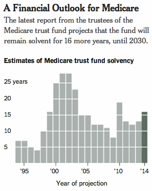
My initial thought was that, with time on the x-axis, the above should be a line graph. But I was too quick to judge: it's not exactly time that's being plotted, but rather the forecast for expected Medicare solvency at the given point in time. Given this, it makes sense to treat the points as discrete (rather than continuous) in a bar chart, as has been done above.
My next would-be beef was with the gridlines drawn across the bars. Gridlines often add clutter, bringing little informative value with them (and making the visual appear more complicated than necessary - related post). But the increments of 5 on the y-axis and coordinating gridlines allow your eye to do a bit of math without your brain really having to. The gridlines within the bars could perhaps be made a little thinner so your eye would still see them without the cluttering effect, but this is minor.
While it took a little time to like the above components of the graph, other design features were love at first sight: it's well-labeled with clear title, axis titles and labels, the words above the graph tell you what you are meant to takeaway while attention is drawn to this point in the data - the most recent forecast - via difference in color.
Now let's turn our attention to the second visual included in the article:
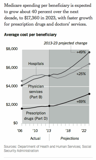
This time, I'll begin with the components I like. Again, the takeaway is clearly articulated via text. Everything within the graph is clearly labeled. But in this case, I'm having a hard time moving to full-on love. The background shading and gridlines - though I can understand the motivations for them - bother me. And the labeling within the graph just doesn't seem as clean to me as it could be from a placement standpoint.
I really wanted to remake this visual, but was unsuccessful in finding the data being graphed and not patient enough to take the time to eyeball it. When I was considering the design choices I would make (get rid of grey background and gridlines, change the forecast portions of the lines to dashed lines, label the series with both title and % change to the right of the 2023 projections), I read the takeaway at the top again and realized that I don't even agree with it. The callout says the forecast is for faster growth for Prescription drugs and Physicians, yet the slope for the Hospital line is steeper (faster growth) than the Prescription drugs line. I assume it's true that the increase over the entire period forecast for Hospital is 25%, as noted, but the forecast is for a brief reduction followed by rapid increase, so I find this description to be misleading.
Based on the data alone, to me more interesting is the inflection point and subsequent forecasts for Physicians and Hospitals. Historically, Hospitals have accounted for the majority of cost, but this is projected to change, with Physicians expected to make up a bigger (and rapidly increasing) proportion of beneficiary cost going forward. Interesting. I wonder why that is?
Perhaps this is explained in the article. But my call-to-duty by the little man is bound to be soon, so rather than go back and read the article, this is where I'll wrap up today.
My hatred turned to love in the initial visual, but I failed to get there in the second case.
What do you think? What do you like about these graphics? What would you change?

