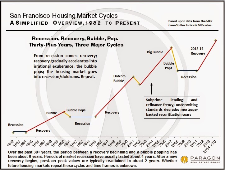
SF housing cycles visualized
If you've been in this situation, or a similar one, you've perhaps also wondered (like us) whether prices will continue to increase at the rate they have been, or if there is an elusive bubble that is about to pop. To that end, we came across the visual below, which depicts a simplified view of San Francisco housing market cycles over the past few decades.
If you've followed this blog for long, you might expect that I will next proceed to rip the above visual apart. But I am not going to.
I actually really like it.
Sure, there are some minor things that could be changed. But let's focus instead on the good: it's well-labeled, both in terms of titles and text annotation on the graph itself. There is a clear narrative that calls out some interesting things in the data. For example, over the past 30+ years, the period between a recovery beginning and a bubble popping has been about 6 years.
According to the graph, the last recovery began in 2012, which would put the next bubble pop at approximately 2018.
Which means there's still time to buy before we hit the peak...