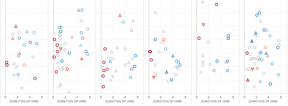
scores of scatterplots!
This month’s challenge was to make a scatterplot. Forty-seven people accepted, creating and sharing their work! Topics ranged from the light-hearted Star Wars, superheroes, and conversation topics between two friends, to more serious things like immunization, alcohol consumption, income, life satisfaction and diabetes.
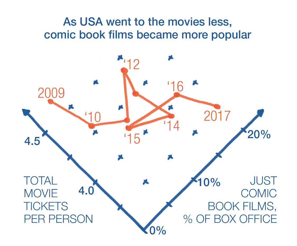
I was excited to see a handful of people layer on the additional dimension of time in a connected scatterplot: Antonio visualized 400 Italian names in an artful view that invites exploration, Bosley clearly depicted home runs by hits over the decades, RJ illustrated that people are going to the movies relatively less but watching comic films relatively more (check out his tilted axes to help orient us reading time left to right), and Tiago helps us understand misery in Portugal by political party (it’s definitely worth the scroll down to see it!).
There were relatively fewer takeaway titles or prominent stories highlighted in the various visuals, perhaps because scatterplots simply seem to lend themselves to being explored. That said, a couple who did employ smart focusing tactics via color and words to highlight specific takeaways include Dennis with his firefighter response times in the Netherlands and James’ impact of the change of a call center script. While some computed correlations or added trendlines, others used the scatterplot to illustrate the lack of relationship between dimensions.
I appreciate the steps that many took to make their scatterplots accessible for exploration: clear titling, reference lines, and in some cases dividing the plot into halves or quadrants. To highlight a couple nice overall designs that caught my eye: Alex packed in a ton of data in his bubblegraph view of birth and death rates by country. Frans’ “Hidden Gems” plots nearly 18,000 data points, making accessible through thoughtful color and words, inviting us to explore the small multiple view.
In terms of specific interesting design choices that stood out to me, I liked Jeremy & Sarah’s tails that put the focus on the 2020 expectation, but provided the context of wealth and age in 1995. Lisa, Marc, and Steve W. included summary frequency distributions (“marginal histograms”) to summarize and lend additional understanding of the data. Simon used clearly labeled shaded bands to help us understand how the data points in the scatterplot relate to each other and to help with interpretation. Luida’s whimsical flower-like pies, which plot relative happiness, simply made me happy to look at and explore.
There was an impressive variety of tools used this month: Excel, Tableau, Qlik, PowerBI, R (ggplot2 and more), Plotly, Inkscape, and Illustrator. I love hearing that people are using the challenge to practice new tools, or to try something in one they know that they haven’t done before.
To everyone who submitted examples: THANK YOU for taking the time to create and share your work! The makeovers are posted below in alphabetical order by first name. If you tweeted or thought you submitted one but but don't see it here, email your submission (including your graph attached as .png) to SWDchallenge@storytellingwithdata.com and we'll work to include any late entries this week (just a reminder that tweeting on its own isn't enough—we unfortunately don't have time to scrape Twitter for entries, so emailing is the sure way to get your creations included).
The next monthly challenge will be announced on November 1 and will run through midnight PST on October 8th. Do you have ideas on what you’d like it to be? Leave a comment with your thoughts! Until then, check out the #SWDchallenge page for the archives of previous months' challenges and submissions.
Without further ado, scroll below to explore scores of scatterplots!
Adam
Scatter plots. This month I took an unnecessarily in depth look at a deck of DC TOP TRUMPS Comic Super hero/villains. I had fun both creating a league table from the performance categories and then took a look at the correlations between the generated overall score and individual categories using scatter plots and linear regression.
My favourite takeaway is that there is no significant correlation between a superhero's intelligence and their overall score and ranking.
Blog: coffeetableviz.wordpress.com
Twitter: Twitter.com/greenynorfolk
Linkedin: linkedin.com/in/adam-green-29a2b886/
Alex
For the October SWDchallenge I've made a viz about Natural Increase in the World.
The main idea of my viz is to compare Birth Rate and Death Rate for different countries on a scatterplot. The dot sizes are shown population and the colour is region. It is possible to filter countries by Natural Increase and Birth Rate/Death Rate Ratio and find fast growth coutries or countries with negative Natural Increase.
Please find the interactive viz here: https://public.tableau.com/views/NaturalIncreaseandDecrease/Dashboard?:embed=y&:display_count=yes
Alexandra
I'm excited to be taking part in October's challenge - my first! It helped me to overcome the inertia in creating my first public viz as an aspiring data viz practitioner. The Atlantic previously reported on a study that found that countries with greater gender equality tend to have fewer women in STEM. I wanted to recreate the study's scatterplot with a few tweaks to show possible regional or income level patterns. I used R for data cleaning and initial plotting (more details in this blog post). It was in Tableau I created an interactive chart.
Anand
I went long-form on my submission and posted it here.
Thanks for all the great stuff in your articles, challenges, etc.—always inspiring!
Anna
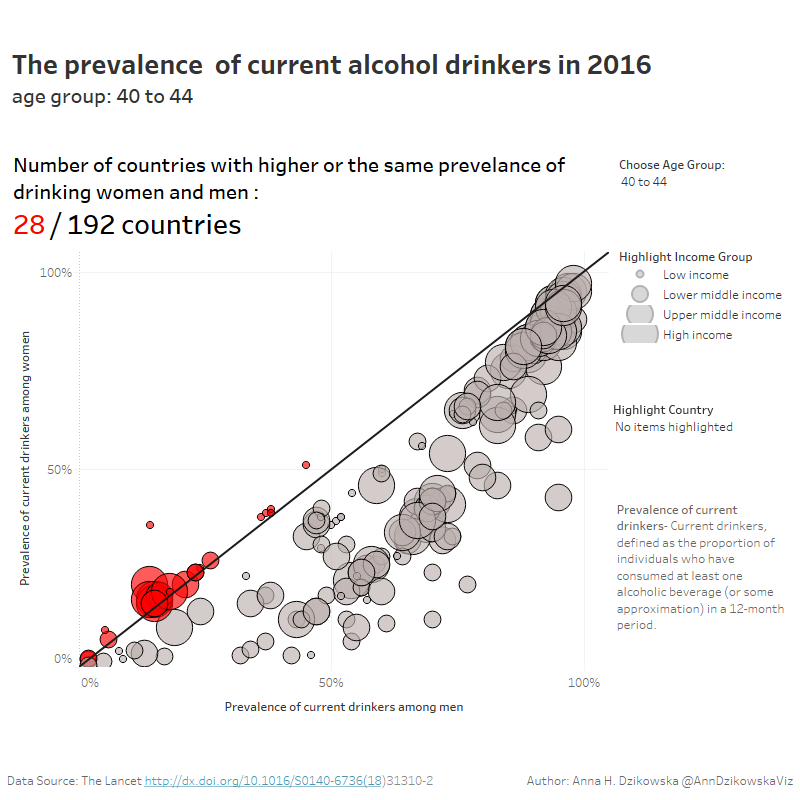
I've used data from the Lancet article: Alcohol use and burden for 195 countries and territories, 1990–2016: a systematic analysis for the Global Burden of Disease Study 2016 and created in hashtag#tableau scatterplot with 45' reference line.
Interactive Viz: https://public.tableau.com/profile/anna.h.dzikowska#!/vizhome/SWDChallengescatterplot2018/Scatterplot | @AnnDzikowskaViz
Antonio
An interactive connected scatterplot that displays popularity and
trend of first 400 Italian names: http://rinaldi6109.github.io/nomi/.
Details here (in Italian language):
https://www.antoniorinaldi.it/da-achille-a-zoe/
https://www.antoniorinaldi.it/la-moda-dei-nomi/
Bosley
For my SWD Challenge submission I took a look at the baseball databank’s records of hits and home runs since 1900. I ended up going with the connected scatterplot because I needed to show how the relationship between hits and home runs has changed over time. In order to make the chart more readable, I decided to go with 20 year buckets for seasons so that it simplified the data being communicated and was easier to follow. I found that with 10 or 5 year buckets, it was impossible to ensure that labels were easy to read and the overall message match what the data said about the relationship between home runs and hits.
Brett
This was created used Excel and explores a possible relationship between measles immunization rates and life expectancy in N. America.
Casey
For my scatterplot visualization, I chose to use data from the Social Progress Index. This organization gives countries a score from 1-100 that reflects the quality of life in those countries. This index is made up of a number of other metrics, and I wanted to see how correlated they were with the overall index. I added in a map as well to be able to visualize geographical differences.
To access the tableau dashboard you can visit here: https://public.tableau.com/profile/casey.terp#!/vizhome/SocialDevelopmentIndexComparisons/SocialProgressIndex
Christopher
Platform Used: Qlik Sense
Blurb: In developing a multiple linear regression model to understand factors that impact the price of a diamond, carat weight was determined to be the most influential feature. The below scatter, demonstrates how carat weight impacts the price of a diamond. As carat weight increases, so does the price of the diamond. Data set contains over 50K unique diamond IDs extracted from www.bluenile.com
Crystal
Research shows that the use of praise in a classroom can have social, emotional, and academic benefits for students whereas the overuse of reprimands can have negative consequences for students. This scatterplot uses example data based on an average of three 10 minute observations, to show the distribution of teacher use of praise and reprimands across classrooms in one school district.
Daniel
This shows the current Premier League Football managers at 8/102018.
Each dot is a team one of the managers have managed plotted against the number of games they were manager for and the win % at that club.
Within the tooltip is there other clubs to give context about their wider managerial career. Created in Tableau https://tabsoft.co/2E6nWit
Dennis
I don't use the scatter chart very often to visualise data. Because of that I learned a lot while developing this visual. The inspiration for this visual mainly came from your example of the managed distribution. I came across a dataset having numbers for 2017 for the different safety regions of fire departments within The Netherlands. Because I wanted to highlight a positive case I looked at the regions that showed a good performance. As my main tool of visualisation I used Power BI.
Looking forwards to the other results of this month and maybe some feedback on my scatter chart to see where I can make further improvements.
Ella
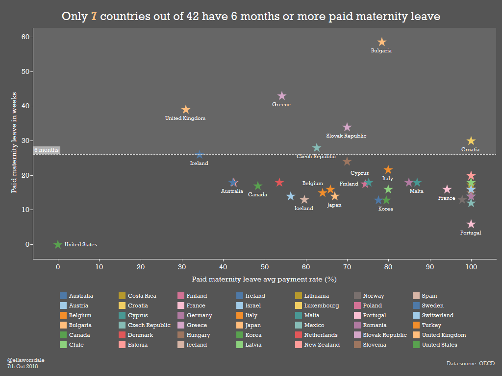
Used some old Makeover Monday data to throw together a quick scatterplot looking at maternity leave by country. Interesting stuff! Hope you like the stars.
Frans
I'm happy to share my October scatterplots with you. It's a data exploration of all the (almost) 18.000 players in FIFA 18. A small ode to the FIFA 19 release, last week. (I'm not a gamer...:)
I used tableau for the prep/ viz and Illustrator to put things together.
The viz is on my website: infogram.nl/blog
The link to the Tableau public version is: https://public.tableau.com/profile/frans.geurts#!/vizhome/fifa18scatterplotsv2/potential?publish=yes
Glynn
This is my entry into the challenge. These are the average marks given by the captain to the umpires who stood in their cricket matches last summer.
Each grey dots represents an individual umpire (all 77 of them). I have highlighted my own score (bit disappointed with it in all honesty) and the overall average mark for all 77 umpires.
I have started the graph at 5.00 as there were no umpires below that score and it would compress the graph too much if I started at zero.
Hanna
I decided to try a new tool for the October SWDChallenge. I have been meaning to learn R and here was the chance. Designwise there is a long road ahead.
Data consists of the total number of traffic accidents in Finland. The scatter plot shows the number of accidents each month in every region against the temperature (°C). For comparison, the total number of accidents for the whole country is visible in each region and the most dangerous temperature range for driving is highlighted as well.
Tool: R for everything
Thanks again! It was fun and a good excuse to learn something new. Although I have to admit that not managing to create what I wanted to see was very difficult :)
James
I have chosen a scatter plot (created in excel) to look at the impact of a change in call script in a contact centre.
The key message of the graph is that there has been a reduction following the change (i.e. a positive movement), to highlight this I have removed all but a few key figures… the reasoning being that people will be more interested in the movement and the headline figures rather than the individual data points in each data set.
When comparing two sets of data points in a scatter plot it can be difficult to distinguish the two so I have chosen to add a ‘trend line’ to each so the overall movement can be seen more clearly, in this case handling time reduced by 29 seconds from 758 to 729
Jared
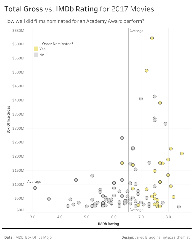
I had a look at films released in 2017. I wanted to visualize the performance of films nominated for Academy Awards against everything else released in the same year. My chart was made in Tableau.
Jason
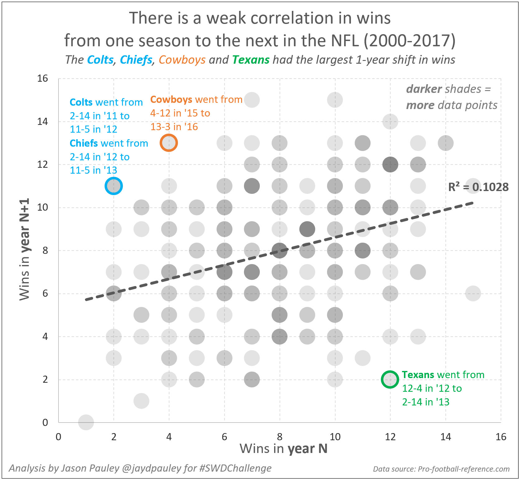
For the October #SWDchallenge I'm sharing a scatterplot that I recently created to illustrate the lack of consistency in the NFL from one season to the next. The data points for each team and season are widely dispersed along the trend line when comparing records from Year N to Year N+1. If there was a stronger correlation from one year to the next, the dots would be a much tighter fit around the trend line.
There are a number of reasons that a team’s record has such high year-to-year variability in the NFL.The small number of games in a season (16), strength of schedule, injuries, luck, and the draft are a few variables that drastically impact a team’s consistency. Lucky and unlucky teams often regress to the mean the next year. Nearly 30% of Superbowl teams and 47% of all Playoff teams won’t even make the playoffs the next year.
For my design choice, I’m using color to identify a few of teams that had the largest positive or negative change in their record over one year. Ideally, I would generally use team colors, but I decided on colors that might stand out more; also two teams with different team colors shared a data point. I added grid lines to make it easier to identify the wins from each axis associated with the data point – my grid lines are thin and light to avoid distraction. Because there are many overlapping data points, I used transparency in the marker color so that the audience can see when dots are layered on top of each other. This same effect could have been solved by a bubble chart with the size of the bubble representing the number of data points, but I thought this was a cleaner view. I collected the data from pro-football-reference.com. I analyzed and visualized the data in Excel.
Jeremy & Sarah
This has been more controversial than we expected, with argument raging about whether this is a scatterplot or “a cunningly disguised time series” (which I don’t think was intended as a compliment). Sarah and I like the approach of building onto a conventional scatter plot to give an idea of change over time. This chart only shows two points in time – 1995 and 2020 projections, but I think that’s enough given the number of points on the chart.
It’s been interesting to look at the countries which are ‘superstar’ performers, and those which have an almost horizontal trajectory, which could spell trouble in the future.
Jon
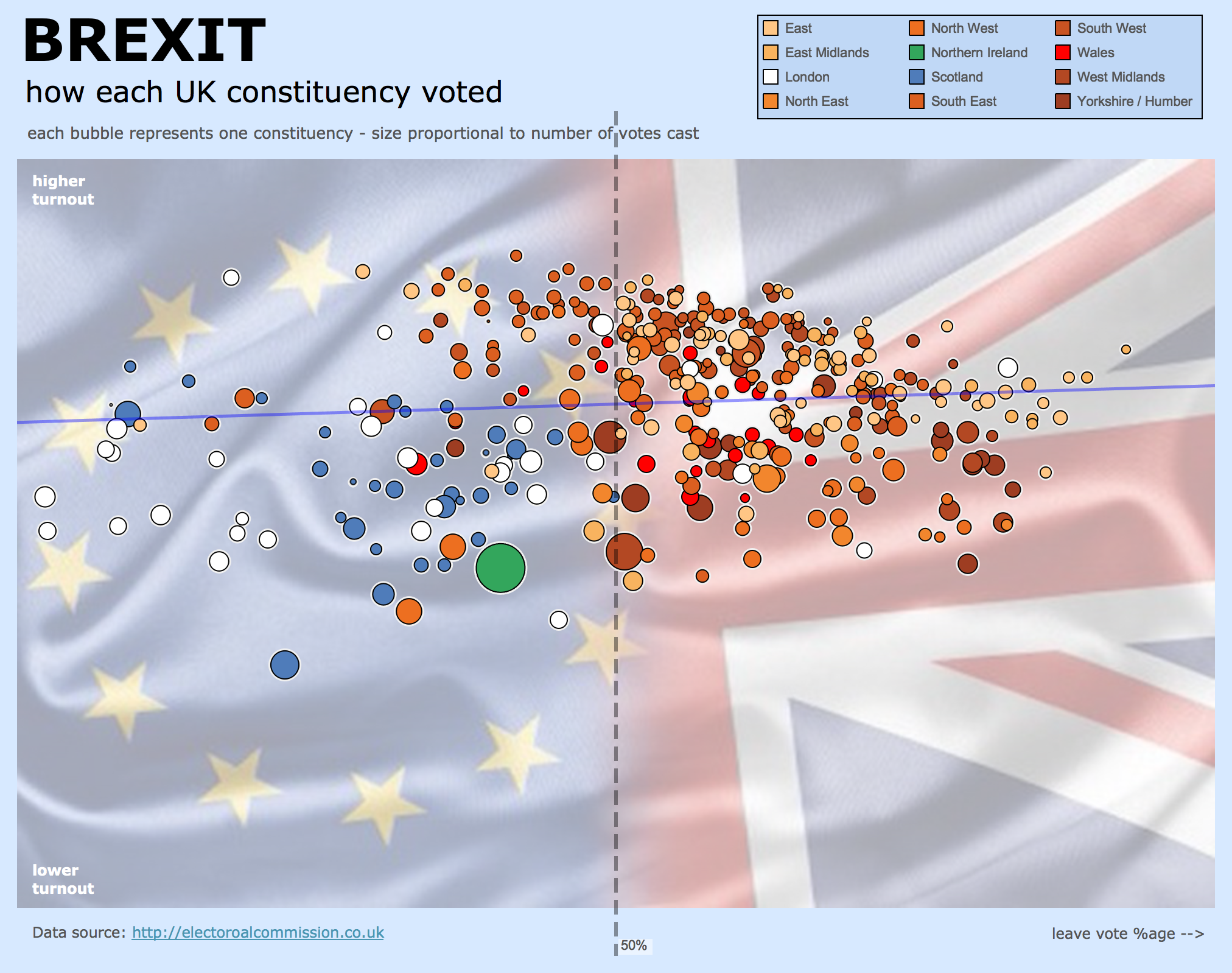
I’ve created the attached scatterplot/bubblegraph using Tableau, and have published the visualization with short (for me, at least) narrative on my blog, at https://highereddatastories.blogspot.com/2018/10/story-telling-with-data-challenge.html
Kat
I got swept up in this month’s challenge and a simple scatterplot became somewhat of a muse for telling a bigger data story. The process was a reminder of how hard some scientific articles are to read!
This graphic was created using Adobe Illustrator and Photoshop (with the help of a Wacom drawing tablet).
The full version can be viewed here: www.roguepenguin.co.nz/green-turtles
Klaus
For this month’s challenge I created a five-dimensional bubble graph to be used in a portfolio analysis in a business context: two dimensions on the x- and y-axis, one determining the size of the bubble and two in a donut chart. It might get messy very quickly when displaying too many objects, that’s why the number of objects displayed has to be limited (imo).
Created with Tableau | Klaus Schulte on Tableau Public | Klaus Schulte on Twitter
Lily
I’m a nurse at a community health center (CHC) in Austin, Texas and wanted to see if there were connections between clinical outcomes and the average cost of care per patient. I believe it’s possible to achieve good health outcomes without spending tons of money but I wanted to find examples of health centers in my state that are achieving it.
CHCs submit clinical and operational data to the federal government each year, in what is called the Uniform Data System (UDS). I discarded a number of the UDS metrics because they were output measures rather than outcome measures. For many, there was no real pattern, just a blob of results, which drove me to look at identifying the below-average-cost, above-average-performers. I kept it at the state level because CHCs in the same state operate under similar conditions – and because we know each other and can ask for more information about strategies and tips.
If you’re interested… CHCs are non-profit clinics that provide medical, dental and behavioral health care to people regardless of health insurance status, income, or ability to pay co-pays and bills. Many of us don’t have the staff or time to devote to data analytics. If anyone is looking for a way to use your data visualization skills in your community, I would bet that a CHC near you would be excited to have your help.
UDS data: https://bphc.hrsa.gov/uds/datacenter.aspx
Link to my viz on Tableau Public: https://public.tableau.com/profile/lillian.mitchell#!/vizhome/UDS2017_0/Scatter
Lindsay
This is a bit of a play on a scatterplot where I wanted to visualize the distribution of education financing across two discrete categories -- low- and lower-middle-income countries in sub-Saharan Africa. I opted to use transparent circles to allow for overlap between countries and only labeled those with values above the $10 million mark since those would be of most interest to the audience.
Lisa
For the October scatterplot Storytelling With Data Challenge, I chose a data set with a theme that I thought fit nicely with the month of October: Star Wars Characters--always a favorite Halloween costume category. I wanted to stick with a simple scenario, so I found a short list of 50 Star Wars most popular and unpopular characters. I decided to plot screentime and popularity rank and then added average lines to divide the scatterplot into 4 quadrants.
More details about the steps I took can be found on my blogpost: https://lisaadell.com/home/2018/10/6/storytelling-with-data
Luida
I used personal data in order to make the challenge. The visualization demonstrates the level of happiness or general satisfaction during the time period from 1st of September till 3rd of October 2018.The process consisted of recording everyday during that time period how happy/unhappy I feel from 1 to 10 range. After I started sketching out how I would like to visualize it and after deciding to go with a scatterplot version I put the data in a spreadsheet and made a chart. Then transferred everything into Adobe Illustrator and adjusted the design.
Marc
The dashboard was built as part of a #DataPlusWomen event to build a Web Data Connector for Tableau using the Punk API. I created this scatter plot to better understand the range of beers available in the data and the relationship between their strengths and bitterness. Marginal histograms were added to show the distributions of each variable in the data.
Twitter: @Marc_DS5
Tableau Public: https://public.tableau.com/profile/marc.reid#!/
Maximillian
It is a data-driven representation of the structure of recent philosophy, using umap-embedding and hdbscan-clustering on citation-data from 50000 papers. It was plotted with ggplot and then reworked with Inkscape.
To find out more about the graphic, or find more philosophy-dataviz, please look here: https://homepage.univie.ac.at/noichlm94/posts/structure-of-recent-philosophy-iii/
or here: https://twitter.com/MaxNoichl
It's maybe a bit atypical as an example for a scatterplot, as the axes can not be interpreted.
Michael
I love your podcast! I noticed the current challenge is a scatterplot, and I very recently did this one as a joke for a lifelong friend of mine. I do wacky pranks like this now and then. I'm planning to turn this into a poster as an amusing "gift."
It's a scatterplot of subjects my friend Rich and I agree or disagree on, with a chart explanation at bottom. I did it in Illustrator. It didn't take long to create, but coming up with a list of topics we've talked about over the years took a while. I deliberately left off the data points, because I thought the placement of each subject was fitting enough. Background color saturation indicates intensity of feeling for a subject.
Narendran
I saw your post on Twitter about the scatterplot challenge. I had created a kernel on Kaggle that dealt with scatterplots with the help of the Plotly package. Here is my submission:
https://www.kaggle.com/meetnaren/plotly-experiments-scatterplots
Neil
Short on time for #SWDchallenge so here is a static version of one of my first ever vizzes a couple of years ago. After being inspired by @HansRosling I knew how good scatterplots were for encoding information and this viz proved it to me at first hand.
Nick
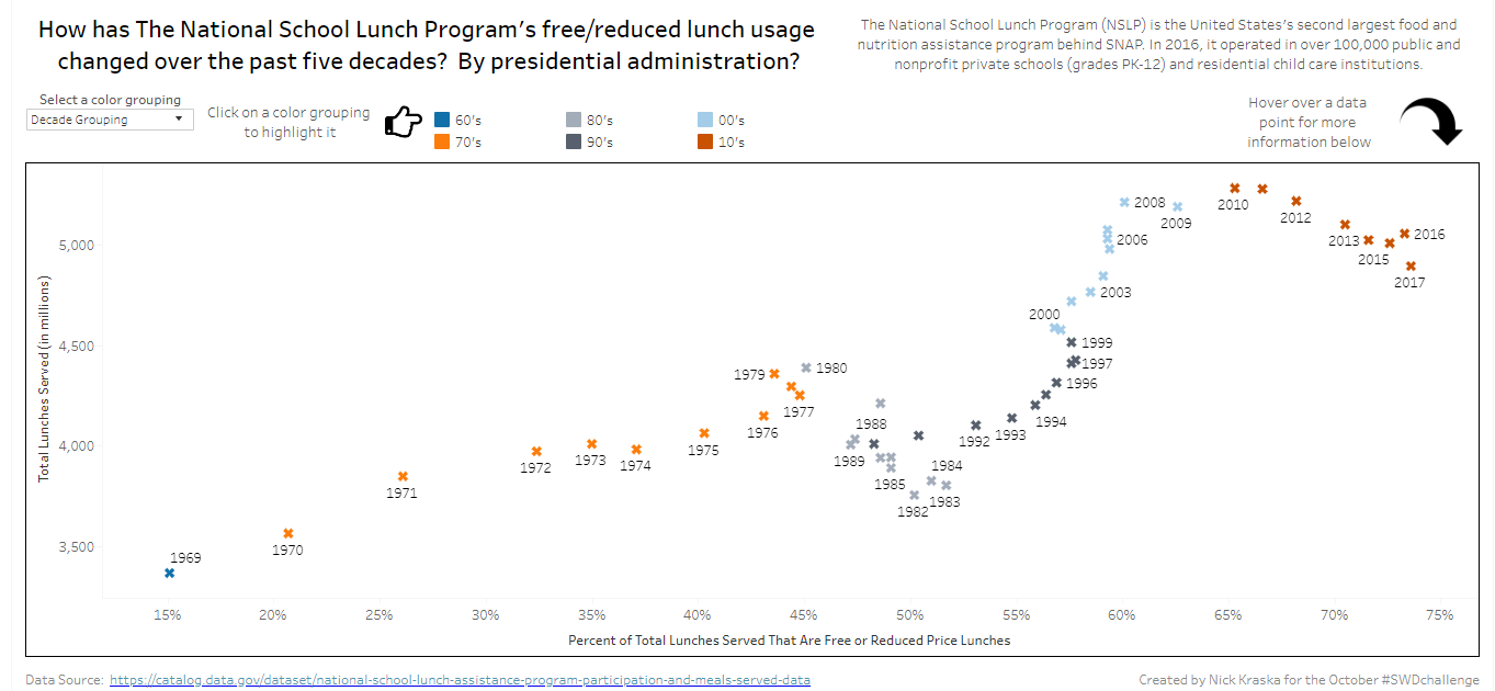
I went with this data set because the story that it tells is that since 1969 to 2017 the free and reduced lunch program usage is up 59%. Seeing that many meals are needed on a yearly basis in our school systems shows that the wealth gap in our country is growing at an alarming rate. It was interesting when I put the presidential info in the data set that during president Reagan's terms the program actually shrunk from 49% usage to 47% usage. That appears to be the only administration where it shrunk in usage while all others had increases.
https://public.tableau.com/views/OctoberSWDchallenge-Scatterplot/Dashboard1?:embed=y&:display_count=yes
Paul
I visualized "The 500 Greatest Albums of All Time" as ranked by Rolling Stone Magazine. By plotting the albums by rank and over time, you can find interesting things in the data. I also added some interactivity to the viz to make it easier for people to find their own insights. Users can filter by genre, click-select the album dots to filter the data table, and select an album from the data table to highlight it on the plot.
Here are a few of the fun facts I found within this viz:
9 of the Top 10 are Rock albums
No top Reggae albums released since Bob Marley
Hip Hop rose to popularity in the mid-80s
Only 2 Pop records appear on the list: Blue by Joni Mitchell and Stardust by Willie Nelson
Electronic music actually started becoming popular in the late 1960s
Thanks for the challenge! My viz can be found on my Tableau public profile here: https://public.tableau.com/profile/paul.wachtler#!/vizhome/SWDChallengeOctoberRollingStone500GreatestAlbums/500GreatestAlbums My Twitter handle is @PaulWachtlerPMP
Rajeev
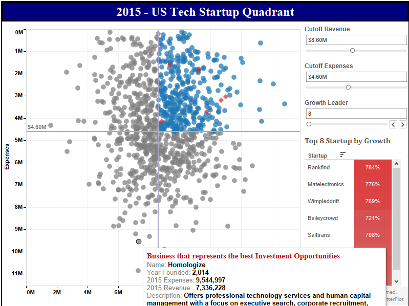
Which companies in US are blazing a trail for the rest? One way to judge – although imperfect – would be the amount of money they have raised. Using Startup data, I generated this constantly updated list of top startups and tech companies in 2015 who have raised the most money from investors.
Ramon
This is a data visualization I created on April 2016 using scatterplots to show the association between the prevalence of diabetes and the obesity in women and men adult populations.
I thought it is a good fit for the October #SWDchallenge.
Title: Diabetes and Obesity in 200 Countries from 1980 to 2014
Development tool: Tableau Desktop / Tableau Public
Designed by Ramon Martinez, Twitter: @HlthAnalysis
Blog: Diabetes and Obesity are on the Raise http://www.publichealthintelligence.org/content/diabetes-and-obesity-are-rise
Link to the dataviz in Tableau Public: https://public.tableau.com/views/Diabetesandobesity/ObesityandDiabetesontheRise?:embed=y&:display_count=yes&:showTabs=n
Tableau Public Author’s profile: https://public.tableau.com/profile/ramon.martinez#!/
RJ
Rob
I created this bubble chart in Excel using data downloaded from an OECD website.
It shows how the US differs from other OECD countries when it comes to health care spending.
The US per capita spend is more than twice that of most other OECD countries (horizontal axis), and it is the only country where the government funds less than 50% of health care (vertical axis).
You can see by the size of the bubble that the US spends almost as much as all other OECD countries combined.
Excluding the US and Switzerland (another outlier) there is a correlation between per capita spend and government funding.
Germany and Scandinavian countries rank high in both measures.
The spending and population data is from 2017. The % funded by government is no longer provided by the OECD so I used 2015 data that I downloaded from an earlier version of the website. To reduce clutter, I excluded a few small OECD countries such as Iceland and Luxembourg.
Simon
The focus of my viz is the ratio of how many games players take to score their goals. It is for this reason I removed the x and y axis labels and replaced them with labelled reference bands. Hopefully this meant people focus less on the exact number values of each of the 100+ data points and more quickly identified key takeouts that the bands help identify. Viz
Stela
Steve B.
I created a scatter plot looking at the relationship between the price of avocados and their sales. I used colour to distinguish between the different years, and added best fit regression lines to make the relationships clear. Finally, I added some commentary directly to the plot to highlight what I think are some of the most interesting points within the dataset.
Steve W.
I'm a big fan of marginal histograms as they can often add insight to scatterplots and highlight tables.
See also https://www.datarevelations.com/marginal-histograms.html & http://www.datatableauandme.com/2017/12/how-to-density-scatter-plot-with.html
Tiago
I used consumer price index and unemployment data from Portugal (1985-2017) to create a connected scatterplot and talk about about an economic indicator called misery index, which is calculated by adding the unemployment rate to the annual inflation rate. The index can be seen as a simple metric to check the health of the economy. The farther from the point (0,0), the worse is the economy. Regarding the scatterplot, I used orange and pink for the dots and connecting lines to encode the ruling party at the time. I also added two dashed lines corresponding to two different values of misery index, which help us drawing conclusions like:
Right after the adoption of the Euro currency in the early 2000s the economy was in its best shape, but it started to degrade slowly in the following years, mainly due to rising unemployment.
After the 2009-2011 crisis, the misery index was as high as in the late 80s, early 90s, but the main reason was high unemployment, not high inflation.
After 2013, the economy started to turn around and now the misery index returned to the levels of 2005.
Sources:
1. https://www.pordata.pt/
2. https://inflationdata.com/articles/misery-index/
Tim
Hopefully gifs are ok. I've been looking for an excuse to play around with the gganimate package in R and this seemed like a good one.
My data source was a list of all the centuries scored in men's ODI cricket, from Cricinfo. I think the animation shows nicely the way the game has changed over the years - particularly the increase in scoring rates shown as the cloud of dots move gradually towards the upper left (the grey diagonal line shows a 100% strike rate). You can also track which countries were dominant in different eras through the colours.
Definitely not a finished piece of work - I really wanted to include the countries as a variable, but haven't figured out a less busy way to do this. Still, it was a fun exercise and I'm looking forward to an excuse to animate some more useful data!
Tom
With just over week until the new NBA season, I decided to analyse some NBA data. The plot depicts offensive and defensive win shares for every player from the 2017/2018 NBA season with the size of each bubble representing salary size and the colour representing the player’s position. Win shares is estimated as the number of wins produced by a player from their offensive and defensive contribution. James Harden, LeBron James, Anthony Davis and Andre Drummond all stand out as the NBA’s top contributors both offensively and defensively. My scatter plot was made using R, particularly the packages ggplot2, gghighlight and ggrepel. The Data was also retrieved from basketball-reference.com using the nbastatR package. Check out my twitter for previous SWD Challenges @tomokeeffe1.
Click ♥ if you've made it to the bottom—this helps us know that the time it takes to pull this together is worthwhile! Check out the #SWDchallenge page for more, including details on the next challenge. Thanks for reading!


