happy holidays!
Earlier this month, I put forth a festive challenge: visualize data related to the holidays. A few dozen people accepted, tracking down data, crafting and sharing creative visualizations on topics like holiday music, cookie calories and winter temperatures. There were snowflakes, ornaments and many real—and fake!—trees.
A great variety of tools were put to use this time around: Excel, Tableau, Google Data Studio, PowerBI, PowerPoint, Illustrator, Leaflet, D3, R/ggplot2, and Python/matplotlib. I love hearing about people trying new tools, or figuring out how to do something new in one they already use. It’s also awesome to see new names: a number of people mentioned this was their first time participating in the challenge—welcome!
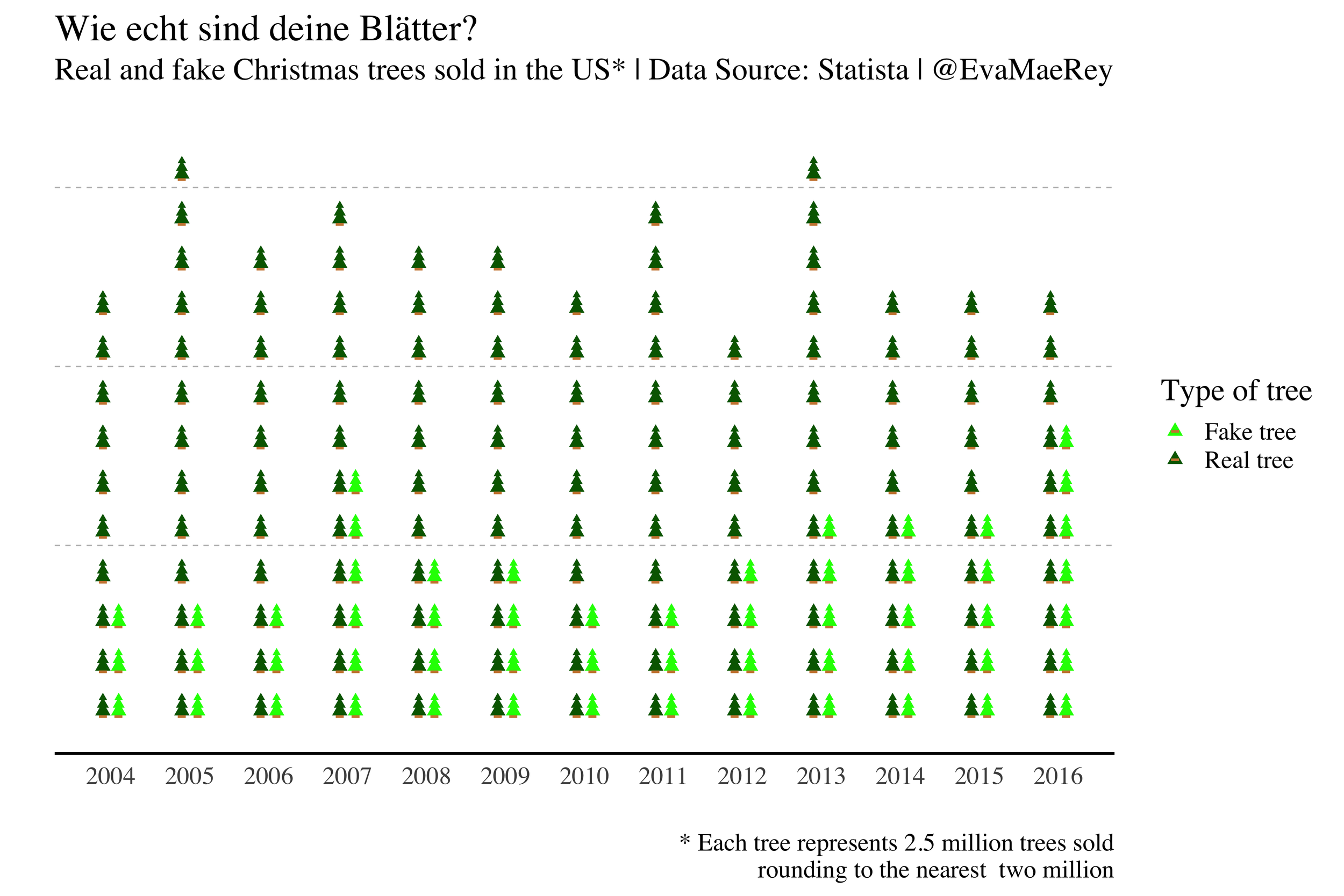
In addition to variety in topics and tools, many different types of visuals and encodings were used, too. Wei depicted popular Halloween candy by state in a histomap. Lotte’s line graph tracks cookie consumption calories against those burned through daily walks (projected through Christmas!). Xiaohong showed Madison high and low temps over time in a radial line graph (br!). Ben showed US airport business via a jump plot, while John leveraged one for holiday music. Bj’s treemap shows 48 years of Candlelight Processionals. Gina built her own miniature trees to represent real and fake sales over time. Kat focused on words and one main stat to deliver a sustainable shopping and wrapping recommendation. Joost created a heatmap of white Christmases in the Netherlands, while Crystal’s snowflakes show what percent of US cities see holiday snowfall (only 26% for me here in Milwaukee…a white Christmas is not looking likely this year!).
I enjoy seeing how some of the conversations on Twitter inspire people to iterate on their creations. For example, Frans shifted a graph onto its side to create a slope-like area graph fitting for the winter sport topic. Steve got the clever idea to turn his initial “Tableau broke and made art” viz into a top-down tree view of superstore sales. Emily iterated with self-directed feedback, remaking a visual she originally put together years ago, improving it by simplifying and focusing.
In terms of vizzes not to be missed: check out Kevin’s beautiful stars and follow the link to the interactive version, where relative size represents Bible word frequency (with a toggle between old and new testaments!). Cory’s interactive map of NFL game temps is also fun to explore and see the shifting temperature distributions as you move from city to city. Be sure to watch—and sing along to—Neil’s animated 12 days of Christmas. Don’t miss Dennis’ pie, it’s a good one! Finally, it’s well worth a scroll to the end of the reverse-alpha list to see Amy’s perfect play doh turkeys and Adam’s UK Christmas stars. A number of people chose to visualize something personally important to them related to the holidays—it seems to me when the topic is important to the creator, the careful design is evident, and perhaps helps the rest of us care about the topic more than we otherwise might have.
To everyone who submitted examples: THANK YOU for taking the time to create and share your work! The makeovers are posted below in reverse alphabetical order by first name. If you tweeted or thought you submitted one but but don't see it here, email your submission (including your graph attached as .png) to SWDchallenge@storytellingwithdata.com and we'll work to include any late entries this week (just a reminder that tweeting on its own isn't enough—we unfortunately don't have time to scrape Twitter for entries, so emailing is the sure way to get your creations included).
Stay tuned for the next challenge in early January (likely a few days into the new year to allow us all time to get back into the swing of things). In the meantime, enjoy perusing the following (mostly) cheery charts.
Happy holidays!
Yves
Please find attached my entry, "That Time of Year!", for the December #SWDchallenge. My three year old loves Olaf's Frozen Adventure, so I used the song lyrics to get in some text mining practice with R and visualized the results with Tableau Public. My dashboard was also shared on Twitter here.
Social Media
Twitter: @licencetoviz
Tableau Public: Yves Perrier
Methodology
I created a text file for each of the songs (lyrics obtained from: https://genius.com/albums/Various-artists/Olaf-s-frozen-adventure-original-soundtrack). I combined the files into one DataFrame, then I used R's tm (text mining) package to pre-process the data. I removed English stopwords, punctuation, whitespace, and made every word lower case. I created a term document matrix with the frequency of each word by song (words as rows and song titles as columns). I also created a text file with the lyrics for each character, and repeated the pre-processing steps to create a second term document matrix.
I connected to those two data sources to create the dashboard in Tableau Public. I used a combination of filter actions, highlight actions, and set actions for the interactivity. As a final touch, I followed the tutorial at Embedding YouTube videos in Tableau – DataRemixed to embed a Youtube video of the audio for each song.
Xiaohong
I was born in Hubei, China, and Hubei has humid subtropical climate with four distinct seasons. The minimum temperature in winter is 34 degrees F. Winter was cool and damp in my memory. It wasn't until 2002 that our family moved to Wisconsin that I first felt what was really cold. Wisconsin has four months of winter with some heavy snow every year. The minimum temperature can reach -30 degrees F. Our two children were born in Wisconsin, where they ski in the winter, swim in the summer, and grow up healthy and happy.
This month is the end of 2018, and there are 365 days in this year. The daily high and low temperature data are like the happiness and sadness in our lives. Every day is a holiday for me that is worth celebrating. Wisconsin is the home of children and my home State. On the occasion of the New Year, I’d say Wisconsin, I love you! ! ! !
Wei
I attached my holiday visualization using Data Studio. Here’s the link for the interactive viz: https://datastudio.google.com/open/12IYfO03LdHfH-VRLkK8LZgxjW5OpGf_X
Veri
Designed in Excel. Hope it helps my fellow expats in Germany!
Steve
My abstract Christmas tree viz: https://public.tableau.com/profile/fennsk#!/vizhome/SalesasBirds-EyeChristmasTree/MerryChristmas
Stela
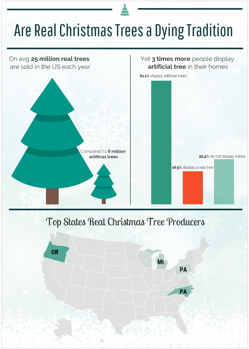
It was very hard for me to find data, so this is my attempt at data storytelling and infographic with very little data I could find.
Ryan
I always look forward to watching NBA games on Christmas Day so I decided to create my viz around this tradition. I wanted to show the large difference in games played between the big market franchises (like New York and Los Angeles) and smaller markets.
Regis
I began by googling Chanukah data but stopped when I realized that the Chanukah holiday is itself an act of the most elegant story telling with data. The 8 candles lighting the darkness call out the 8 days of miraculous oil supply. The interactivity of adding a new light for each night stimulates and cultivates telling the story of the Maccabees.
My inspiration here comes from Pamela Germain's top 30 Christmas songs. What a task! Thank goodness I only had to hunt for 9 songs. The design challenge became how do I account for the multiple languages in the lyrics—Hebrew, Yiddish, Ladino, English. When space ran out in my tool tips I opted to keep the language of the song, and a little bit of English if possible.
I hope you have a lovely holiday!
Peter
Here is my submission for the December challenge (and my first ever submission!).
I chose to look at Christmas carols and to experiment with topic modelling. Using a corpus of 126 carols, I ran a technique called Latent Dirichlet Allocation in R to identify 10 topics that are found in carols. The choice of 10 topics is fairly arbitrary. Once I had the topics, I wanted to visualise some key insights. I chose to focus on the prevalence of the different topics and whether they played different roles. Some don’t appear very often as the key topic but play a supporting role in many carols. I also wanted to show that some carols have a single key theme, whilst others included many topics. The visualisation was done in Excel and then pulled together in PowerPoint.
As an aside, I don’t think the LDA analysis worked that well in this instance, but it was still interesting to work out how to visualise it.
Pam
The data was provided by A Dash of Data.
Interactive/Downloadable Workbook: https://public.tableau.com/profile/pamela.germain#!/vizhome/Top30ChristmasSongs/Top30ChristmasSongs
My Tableau Public Profile: https://public.tableau.com/profile/pamela.germain#!/
I wanted to work with custom shapes. I used the method on https://www.evolytics.com/blog/how-to-map-anything-in-tableau/ to plot out the ornaments.
Neil
Tableau Public: https://public.tableau.com/profile/neil.richards#!/vizhome/partridge/Dashboard1
Louise
Tableau Public | Twitter: @FeedMeData_
Lotte
Starting December, I always bake Christmas cookies with my children. We do not save them for Christmas, but eat them during December and see what is left on the 24th of December where we celebrate Christmas in Denmark.
This year, I have also signed up for a “Christmas calendar” at work where the goal Is to go for a walk every day of December up till Christmas. To complete a full calendar, you start out by walking 1 km, the next day you walk 2 km, then 3 km and so on. The distances of a full calendar was a bit extreme for me, so I signed up for a ¼ of a calendar meaning that the max distance is 6 km. We are allowed to mix the distances as long as we complete all of them during the 24 days.
December is very much about Danish “hygge” and with that comes a lot of extra calories from cookies and lovely food. I thought it would be interesting to see how the intake of calories from the Christmas cookies balanced with the calories burned by the extra walks from the calendar. The target would be to hit a net amount of zero. The graph made it horribly clear during the first couple of days, that it takes quite a bit of walking to burn off just a few cookies… As the challenge ends on the 10th of December, I have had to estimate the last days up till Christmas, being realistic about the intake especially during weekends.
Lora
Tool: PowerBI
Click to visit the dashboard online
Lisa
After reading an article about the original meaning behind the classic Christmas song, "I'll Be Home for Christmas", I decided to research data about war time events during Christmas for this month's challenge. I stumbled upon a data set highlighting 5 key military events that happened on Christmas Day and visualized this data using a timeline and key images for the data markers.
Here is a link to my blogpost explaining more about my process: https://lisaadell.com/home/2018/12/10/war-on-christmas-day
Here is a link to my Tableau Public visualization: https://public.tableau.com/profile/lisa7055#!/vizhome/ChristmasViz/WaronChristmas
Kevin
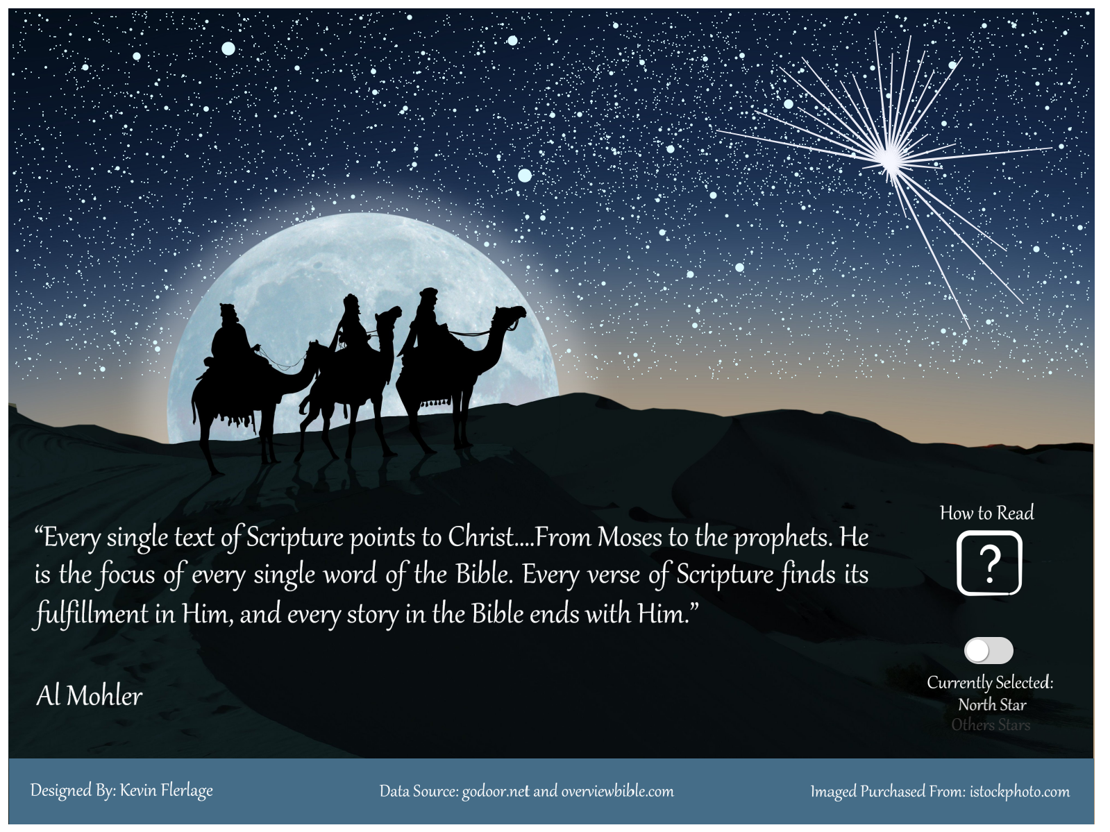
Attached is an image and link to my Holiday SWDchallenge viz. The visualization was built in Tableau. It focuses on the birth of Christ and the words of the Bible leading up to his birth and those words of the Bible after his birth.
Link to Viz on Tableau Public (background is an image and Tableau Public has had some issues loading images recently. If it does not work properly, simply refresh the screen).
Tableau Public Profile: https://public.tableau.com/profile/kevin.flerlage#!/
Website: https://www.kevinflerlage.com/
Twitter: https://twitter.com/flerlagekev
Kat
One of the biggest mistakes I see people make when communicating with data is using TOO MUCH DATA.
Your message will not get stronger with more data. It will get lost.
If your aim is to communicate in the most effective way, play around with other ways to engage an audience. Get creative!
Data works better when it's not left to speak for itself.
Karan
Background: Being in retail economics myself, I thought it would be the perfect place to reproduce a chart that my firm had previously created, showing the total retail and food retail growth rates over time.
Inspiration: I got the inspiration from SWD's previous post captioned "how do I incorporate visual design into our monthly slide deck?" I was going through our linkedin page and saw that what we had captioned could easily have been shown in the chart, so I decided to do just that.
Notes: This might be slightly considered as cheating since I'm submitting a chart which I made on the 2nd December (one day before SWD challenge was posted). I hope this can be an exception.
If you have any suggestions on how I could improve this chart that would be greatly welcomed.
Joost
It took me a while to figure out what I was going to visualize for this month's #SWDchallenge.
After searching for data for some time I stumbled upon a table from the KNMI, an institute that measures all weather conditions in the Netherlands since 1901. In the table they show the years in which they measured a "White Christmas" in The Netherlands: a Chritmas where both days a closed snowcover was measured at KNMI headquarters in The Bilt, Utrecht.
I visualized this table in a heatmap in which every cell represents a year (both Christmas days) and every row represents a decade. The white cells represent a white Christmas. In the process of visualizing this data, I noticed that a white Christmas is not very likely in the Netherlands. Even though many people (me included) kind of expect a white Christmas every year.
I learned not to get my hopes up this Christmas through this exercise.
John
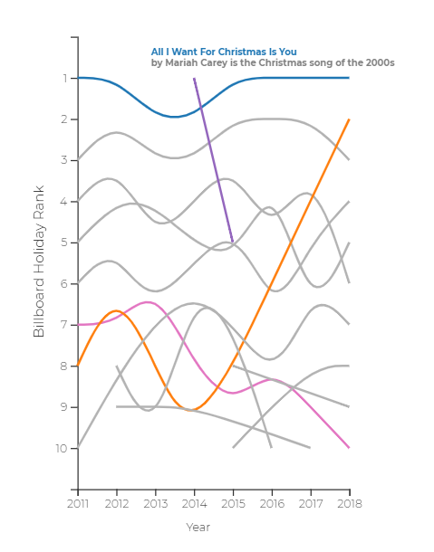
For this SWD Challenge, I was interested in seeing how the popularity of Holiday music has trended over the past few years. I turned to the Holiday Billboard Top 100 to curate rankings for the top 10 Holiday songs over the past 8 years (I looked at rankings from the second week of December). In order to best visualize how rankings trended over the past 8 years, I developed a bump chart in Tableau. I was also interested in discovering if a song's release data had any influence on its popularity between 2011-2018, so I plotted release dates on a simple timeline. Users can select a song or multiple songs to highlight in order to trace popularity through the years. Here is the Tableau workbook so people can do their own exploring: https://tabsoft.co/2QLMRgo
Takeaways from the visualization:
The mid-1960s were a golden age for great Christmas music. 1963-1966 was the most prolific stretch of time in terms of turning out Christmas songs that are perennially present on the Holiday Billboard Top 10 to this day.
Mariah Carey's "All I Want For Christmas For You" typically sits on top of the charts each year, and is usually only truly threatened when the popular stars of the day like Justin Bieber ("Mistletoe") or Ariana Grande ("Santa Tell Me") release huge hits.
Johanie
This is my first participation to the SWDChallenge. I use data from Association of Quebec Christmas Tree Growers and R to make this graph. I wanted to share exportation and total production of Quebec Christmas tree on the same graph to show the importance of the exportation over the year. I put an image in my graph just for fun and because it's Xmas! Blog in French here.
Jim
For this month, I used data from the Throwback Thursday project in the Tableau community, looking at sales of real/fake Christmas trees from 2010-2016. The data itself was pretty simple, so I went with a light-hearted approach using curvy timelines to "trim" trees with the average cost of real vs fake. To help complete the story, I showed trends of both trees sold and revenue over the period. I found it interesting that the number of real trees sold is pretty constant, while sales of fake trees are growing pretty rapidly. I suppose there are a limited number of real trees that can be sold each year, which now makes me wonder about how many real trees are harvested but not sold. That will have to be a viz for another day!
You can find the interactive version on Tableau Public at https://public.tableau.com/profile/jimmyv2276#!/vizhome/ChristmasTreeSales2010-2016/ChristmasTreeSales
Twitter: @jimvansistine
James
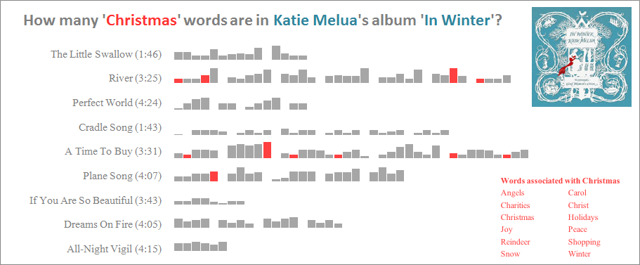
For the 'Holiday' challenge I decided to look at how many 'Christmas' words are in an album I associate with Christmas... Katie Melua's 2016 album 'In Winter'.
I chose the top 12 'Christmas-words' in the album and identified which line in each song they occurred in. Interestingly only 3 of the songs contained any of the 12 words, and of those they only appeared in 11 lines.
Unfortunately I ran out of time to compare to a more traditional album so see what the frequency would have been in one of those albums.
Jaime
I've created a visualization using data from Billboard.com's Holiday Charts from 2011-2018. It was visualized using d3.js and used animations to help draw out the path of the rankings of each song through the years.
More details with a write up on my blog, datawithcoffee.com
Heather
Thanks for the fun challenge this month! Here's a link to my Data Studio report. I wanted to do something cookie-related, and ended up finding the raw ingredient data from Statistics Canada!
Hanna
At first I wanted to look at tourism data but couldn't find the right data to suit my needs and so I turned to alcohol sales. I copied and pasted (by hand) the data from sales reports from four last years and concentrated on December sales only. For the visualisation I decided to concentrate on percent change to keep scales the same and more comparable instead of keeping the original units of number of products and litres. Every once in a while it's good to get back to basics as percentage calculations are not the most intuitive ones always.
Tools: Excel, Illustrator
Twitter: KumpulaHanna
Gina
I had lots of fun making this plot obviously. I actually used data from an old @makeovermonday but decided to go after isotope/pictoplot. I used ggplot2, and build the trees from point shapes - a triangle (shape = 17) and a dash instead of importing an icon. This leaves the legend with something to be desired. Still I’m finding the main result charming. Letting the icons represent even more trees would probably be a good idea, so the icons can be a bit bigger. Thanks for the visualization challenge! :-)
Frans
Emmanuel
MS Excel was used to plot this data taken from the National Fire Protection Association. I figured out that not all data points in the red line (number of fire incidents) need to be labeled so I just labeled the numbers on those peaks and dips. It was also emphasized in the NFPA report that the peak civilian injuries are from late 80's to early 90's, so I emphasized them with a darker set of bars.
Emily
For this challenge, I decided to revisit one of my earlier visualizations I did in 2013 about holiday spending (below, left). I used the same data from 2013, but focused the viz a little more instead of all the available data (below, right). I like this one a lot more!
Eddie
A journey is about planning the days and nights, travelling from one place to another, and preparing the budget. But ultimately it’s a unique experience and memory.
Dennis
I think this speaks for itself.
Crystal
I've been wanting to try small multiples and also filled shapes and this month's holiday #SWDChallenge gave me a chance to try both in one viz!
Corey
Attached is my submission image for my visualization of NFL game temperatures around the holidays, and here's a link to the block: http://bl.ocks.org/cguastini/65fd29d7efe3d69c329cf030a658a35b/218dd7c09f68015cfcae419b1bffd23b54b5eaef
I scraped the data off the Pro Football Reference site using python then made the front-end visualization using D3 and leaflet. The most difficult part of working with the data is that NFL teams move, and more and more teams are playing indoors. The teams in the Northeast are the most interesting to look at because they play outdoors and have longer histories.
Linkedin: https://www.linkedin.com/in/corey-guastini-8194678b/
Caroline
For this holiday challenge, I wanted to find names often used in December. This was trickier than I thought as the Social Security Administration’s file of baby names only includes birth year. My quest resulted in this data story, Old-Fashioned December Names, which I published on Public Tableau: https://public.tableau.com/profile/caroline.pierce#!/vizhome/Old-FashionedDecemberBabyNames/Old-FashionedDecemberBabyNames. The story explains where I found the data and some of the challenges I encountered.
Thank you for this challenge. I try to do one visualization a month, and this challenge provided me with a fun December goal.
Bj
For this month's challenge I am submitting a visualization of the Candlelight Processional narrators by year for Walt Disney World. This is the 60th year of the Candlelight Processional which started in Disneyland in 1958. The tradition was brought to the Magic Kingdom at Disney World in 1971 and in 1994 moved to Epcot. I have performed with the Cast Candlelight choir—the folks in the green robes on stage for 16 years. The hardest part of this was generating the dataset. I did a lot of research and a fair amount of guessing to assign narrators to nights for shows before 2002.
The yellow heat map design was inspired by the choirs in gold that flank the tree of singers in the middle of the show.
I hope you enjoy it and that you visit us and attend the Candlelight Processional in person.
Link to Viz: Tableau Public
Link to the show which was livestreamed for the first time ever on 12/4 at 8:15pm. #DisneyParksLIVE: Watch the Replay of ‘Candlelight Processional’ Now
Ben X.
My plot was made in the Python library, matplotlib. It shows the top 10 busiest domestic airports in the United States from 2000 to 2009 during November and December. I believe this plot is a good representation that Chicago may be the gateway to the rest of the Midwest. There are a few things I would change if I had more time. First, I want to label each circle marker with a number. Second, I should shrink it down from top 10 to top 5 because it is a little bit cluttered with the top 10. Lastly, I want to do some maintenance issues like aligning axes titles properly and figuring out a better way to label each line without using a legend.
Ben K.
My name is Ben and I’m very excited to submit my first challenge. This visual presents top 5 Christmas songs and the royalties it had made so far this year.
The Visual was made using Power BI. The data is taken from: https://www.prezzybox.com/apps/christmas-song-royalties.aspx using a web scraping technique. The online visual gets the data live and directly from the website which means that the values will update over time. In addition, you can hover over the name of the song to learn more about it.
You can access a live version of the visual here. My Social media accounts: LinkedIn | Twitter .
Anna
This month I usded data set from Deollite Survey about Chrismas Spending Expectations. I created it in Tableau and used Power Point for custom glowing shapes.
Anand
Happy Holidays!
Amy
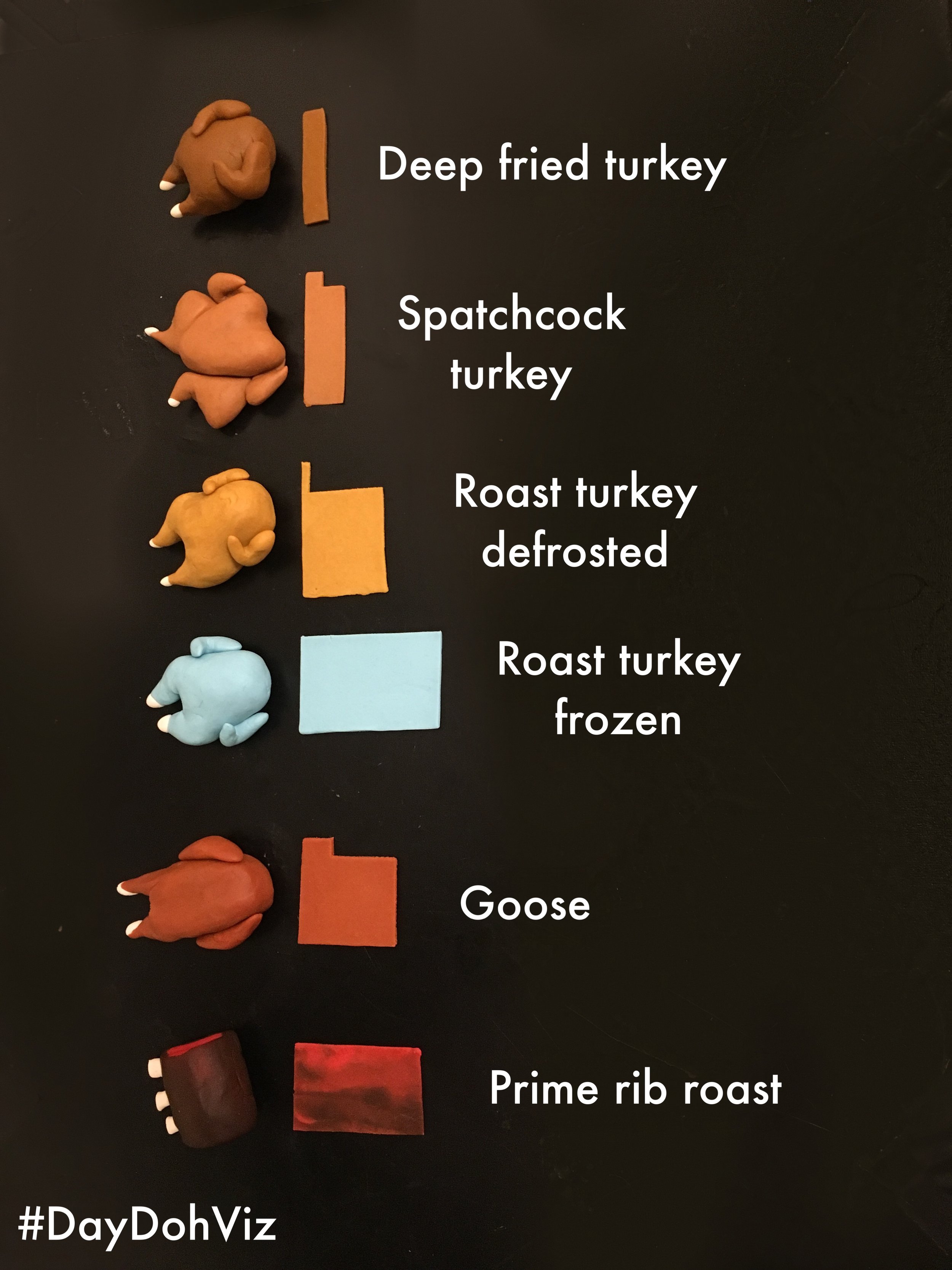
Common 12 pound Christmas proteins with cook time on the x axis and temperature visualized on the y. Low and slow for frozen turkeys, and hot and quick for a spatchcock.
All made out of play-doh! http://daydohviz.com
Adam
The concept was to try and present a christmassy styled viz to fit with the brief ‘lets visualise the holidays’, so what better than Christmas No.1’s. Enjoy and Merry Christmas to all!
Blog:coffeetableviz.wordpress.com
Twitter: Twitter.com/greenynorfolk
Linkedin: linkedin.com/in/adam-green-29a2b886/
Click ♥ if you've made it to the bottom—this helps us know that the time it takes to pull this together is worthwhile! Check out the #SWDchallenge page for more, including details on the next challenge. Thanks for reading and happy holidays!


