April #SWDchallenge recap: square area graphs
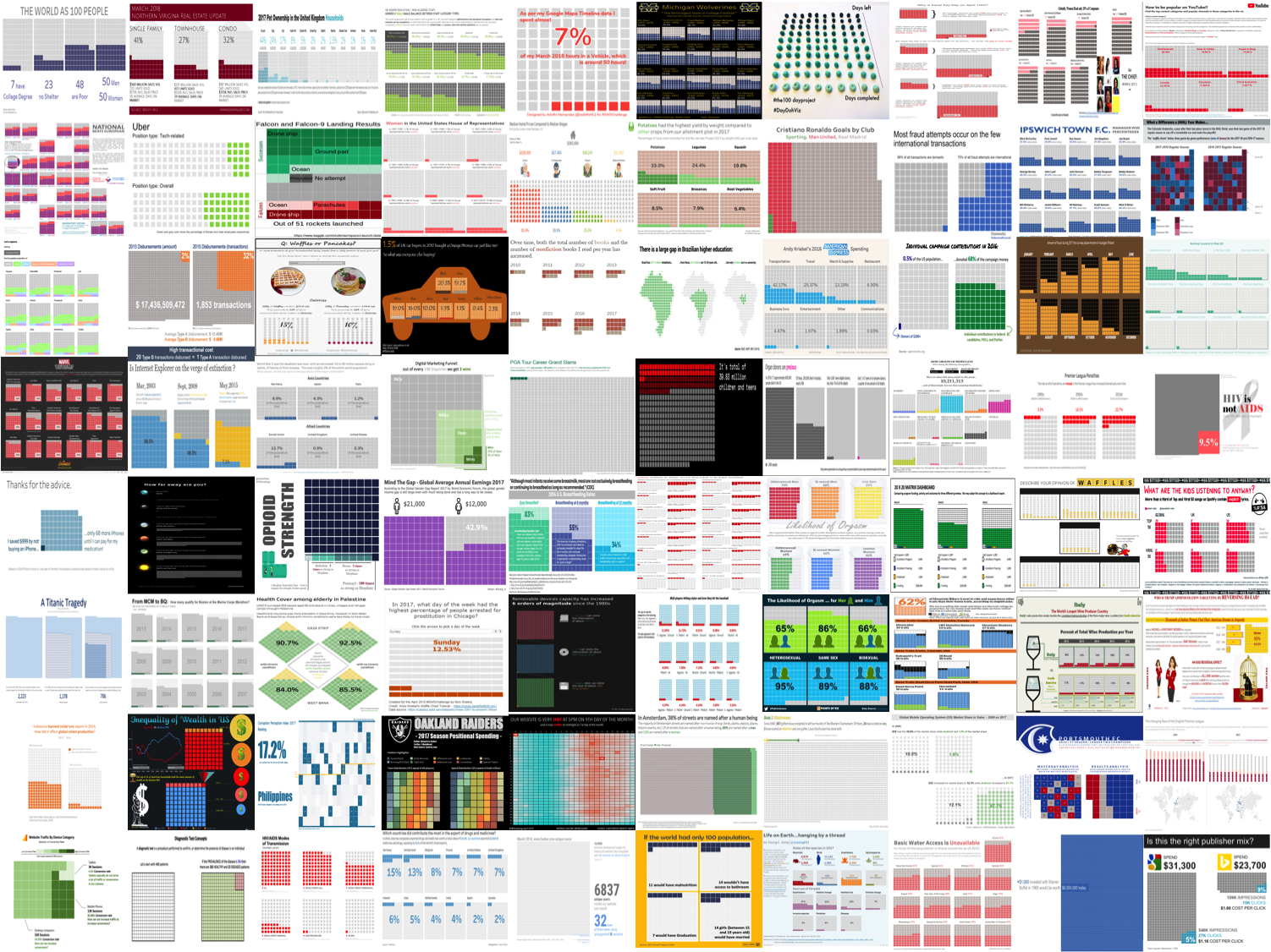
Check out all of these beautiful square area graphs! I was highly impressed by both the sheer number and high quality of entries to this month's #SWDchallenge. At the beginning of the month, I challenged you to create and share a square area graph—or waffle chart—and nearly 80 people did. Many people mentioned that this was their first endeavor creating this kind of graph, and I'm thrilled to hear the challenge inspired you to try something new.
A variety of tools were used, with some great resources shared and created coinciding with the challenge. A number of people utilized Andy Kriebel's tutorial for building waffle charts in Tableau. Jon Schwabish created an interactive square area graph in Excel (and shared a "how to" post). Jon's was inspired by Nathan Yau's Animated Square Pie Chart (these visuals are called a lot of different names!), which was built using D3. I believe their was a wider variety of tools used here than we've had on any of the challenges to date—Excel (check out how Adolpho formatted a scatterplot into a square area), PowerPoint, Tableau, PowerBI, Adobe Illustrator, Inkscape, Python, R, D3, and Play Doh (yes, actual Play Doh!—see Amy's #100DayProject submission).
The topics were varied. Sports continue to be a popular theme and the square area graphs lend themselves well to depicting sports positions and seasons in addition to the typical wins/losses. There were a number of entries focused on various aspects of gender inequality. A couple people had fun with a waffle or otherwise breakfast-themed focus. Other wide-ranging topics included real estate, elections, disease transmission, opioid strength, breastfeeding and movie scores to name a few. It was neat to see a number of work-related vizzes as well, on areas like website traffic, unsupported browsers, and the marketing funnel.
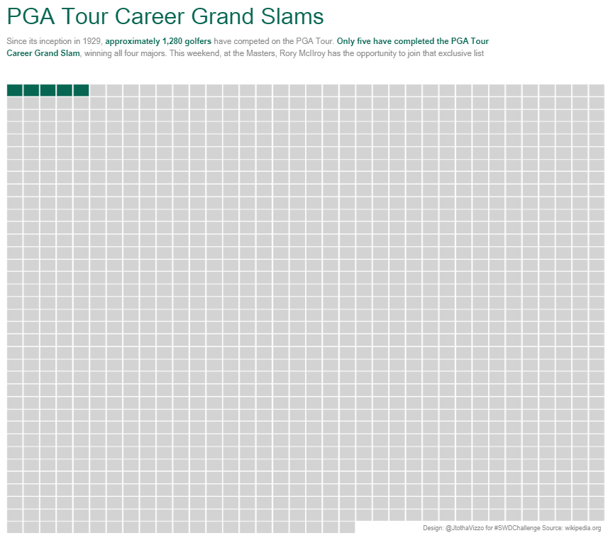
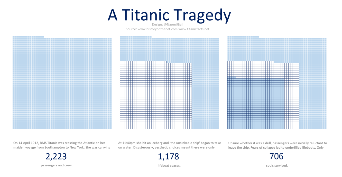
In terms of standout entries from my point of view this month (and I'll just call out a few here, but reiterate that I was impressed by many of the submissions!)—I like how Arnold visualized the overlap between national and EU election turnouts. For an illustration of simple and effective, check out Jeff's PGA Tour Grand Slams. Felipe's square area graph in the shape of Brazil caught my eye and works well to highlight the low number in university. Awesome use of color in both Hannah's illustration of the number of hours the sun can be seen in Finland over the course of the year and Naomi's A Titanic Tragedy. John's Organ Donors are Precious creates awareness through clean design and beautiful use of color and words. I appreciated David H's nice design and comment, "Would a bar chart make this comparison easier? I think so, but the waffle chart is definitely an aesthetically pleasing alternative." This seems to be a sentiment a number of people share.
To everyone who submitted examples: THANK YOU for taking the time to create and share your work! The makeovers are posted below in alphabetical order by first name (+ last initial when needed; we omitted full last names in respect of those who would rather remain anonymous). If you tweeted or thought you submitted one but but don't see it here, email your submission (including your graph attached as .png) to swdchallenge@storytellingwithdata.com and we'll work to include any late entries this week (just a reminder that tweeting on its own isn't enough—we unfortunately don't have time to scrape Twitter for entries, so emailing is the sure way to get your creations included).
If you didn't get a chance to participate or are otherwise anxiously awaiting the next challenge, it won't be long—this Tuesday (4/25/18), we'll announce a special edition of the #SWDchallenge in honor of #InternationalChartDay. Stay tuned here for details on that.
An array of spectacular square area graphs follows—big thanks to everyone who took part!
Abisola
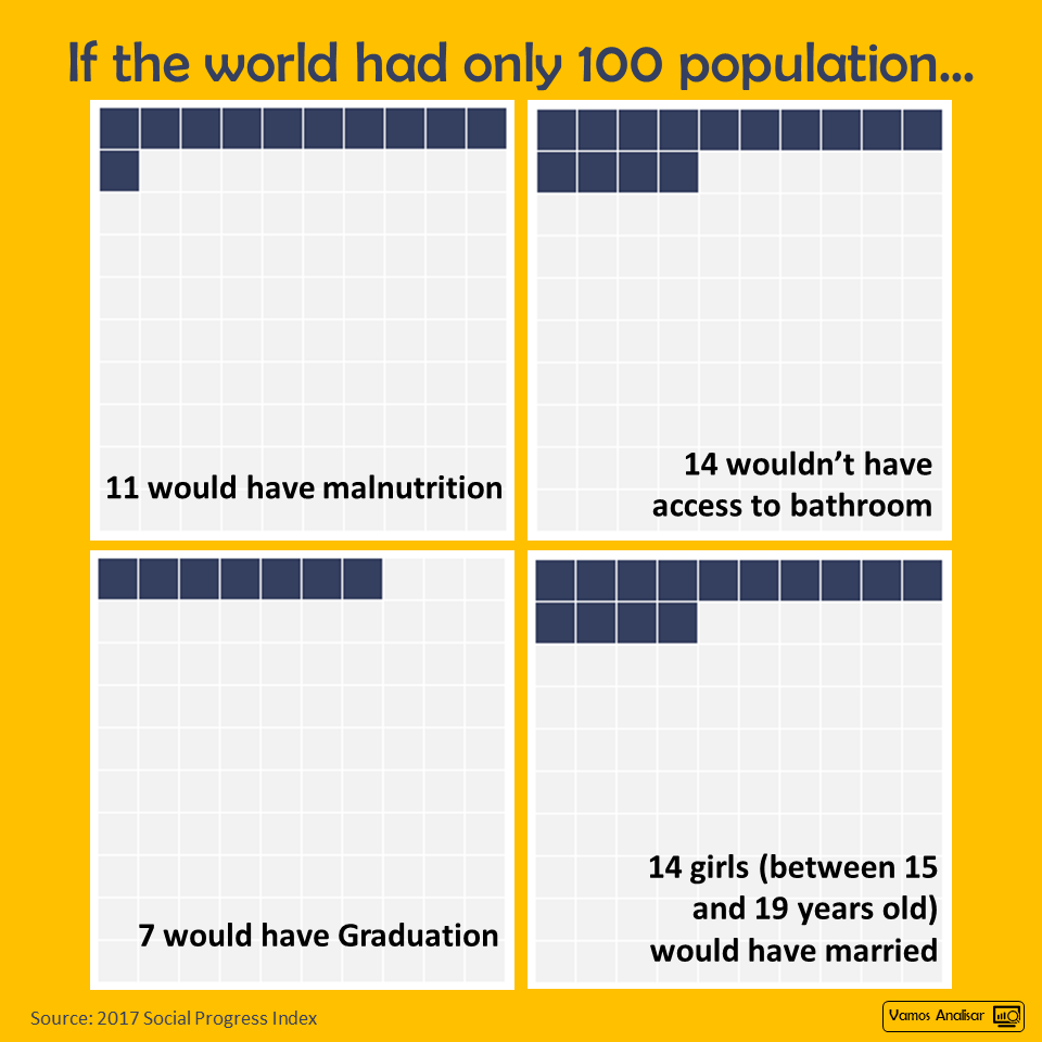
I picked one from #MakeoverMonday last year (week 48) and I followed Andy Kriebel's tutorial on waffle chart. It was very very helpful. It's amazing the insights that lie underneath data. Only 7% of the world's population having access to a college degree is scarily low. Not everyone needs to go to college to succeed but I believe the main issue here is that there is no even opportunity for them to go. Most likely due to funding and other circumstances. If there is an equal number of men to women, why are women under-represented in Government, STEM professions, Lawmaking, Policy etc? What are we doing to ensure Women get more representation?
Blog
Abraham
In March 2018, single-family home sales represented 41% of units sold and 56% of the total sales volume in Northern Virginia. With days on the market decreasing year over year, homeowners can expect higher sales prices in the Spring sales season. This chart was designed in Excel. Data provided by Bright MLS. Visit www.AskAWalker.com for the latest real estate sales trends in the Northern Virginia area.
Adam C.
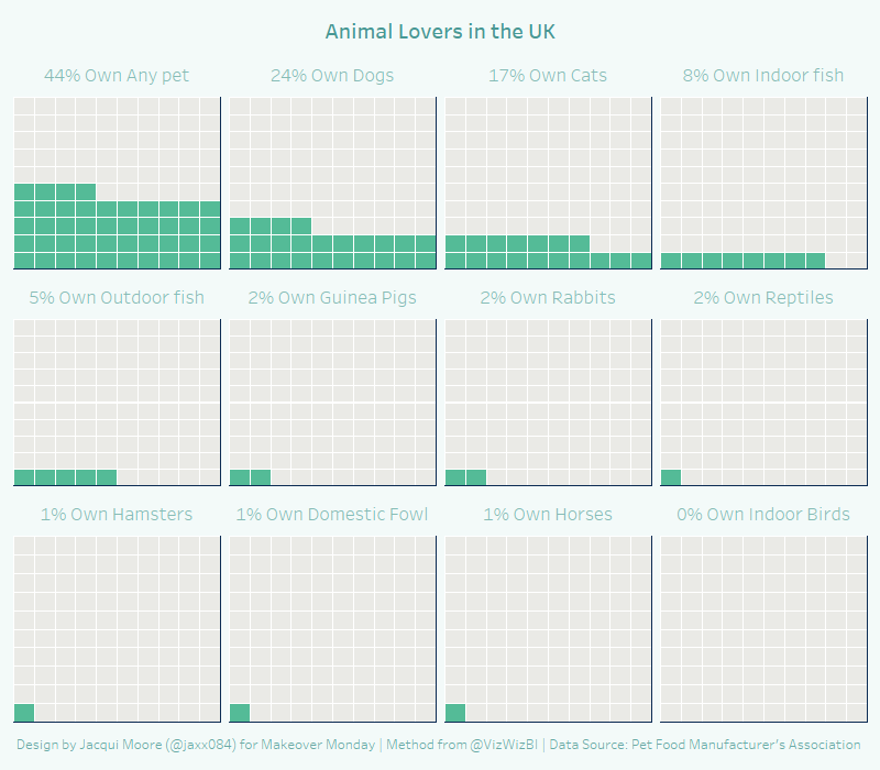
I am using a chart I made for #MakeoverMonday two weeks ago for the #SWDchallenge showing pet ownership in the U.K. The data is not perfect as you can see 700,000 indoor birds are not 0%, but I elected to show the data that was provided. The colored squares on the waffle chart communicate the percentage of U.K. households that have that animal in their homes. The overall gradient communicates the raw number of animals. I haven't seen this used before, but I really like it because I think it points out that people may own more than one animal (fish for example).
Link | Blog | Twitter | LinkedIn
Adam G.
This waffly viz focused on UK Higher Educations Non-Academic Staff base (2016/7) and presented the gender split by staff category type.
Interactive viz | Blog | Twitter | Linkedin
Adolfo
It's a simple Waffle chart from data I received from my Google account (shockingly to me because I thought I did set up to not track me) of the number of hours I spent in a vehicle last month (March 2018). I was surprised - and depressed - by the fact that I spent 50 hours - more than 2 days - of my life sitting in a car/plane/bus! The chart is pretty straight forward, maybe the interesting part is that I created it in Excel by using a Scatter plot, I simply set up the data to be arranged as a matrix of dots and then changed the shape to squares. I did it in that way because I read in your post that you created yours by using the Excel cells and I wanted to test if it could be done with a chart. It requires some tweaking with the formatting but that's what I like about Excel charting, it's like a handcraft work!
Twitter | Linkedin
Alistair
I've been watching 'All or Nothing: The Michigan Wolverines' series on Amazon prime and kept getting annoyed at the constant use of the word 'winningest' as an adjective to describe the team. Anyway my waffle chart shows the Win ratio by coach through their history from 1879 to present day.
Amy
I'm participating in the #100dayproject where you create something every day. In my project, #DayDohViz, I create visualizations out of Play-Doh. It constrains precision, and encourages working with my hands and in 3D. There's 8 days done, and 92 to go.
Angie
Aparna N.
Aparna S.
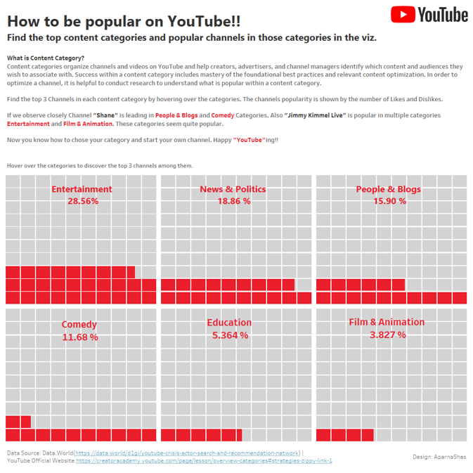
For this months submission I got the data from data.world, to understand the popular channels on YouTube and how we can utilize it to know from where to start our very own channel on YouTube.
Interactive Viz
Ashutosh
The Economist, which usually publishes high-quality charts, published an article following Google’s firing of James Damore. This article discussed gender diversity at tech firms. It included a dot chart, which at first, seems like a nicely designed chart. But when you look at it carefully, you observe that this dot chart hides the small proportion of female employees, especially in technological roles, at these companies. Hence I decided to use R to create a waffle graph. Read how I improved this and another waffle chart from the Wall Street Journal.
Site | Twitter | LinkedIn
Arnold
Submission compares EU election turnout to national election turnouts. I tried to visualize two percentages, and the way they overlap and the fact that "national" is always bigger than "European." The chart was done manually, based on an older design created using python (svgwrite) for a blog post.
Link
Charlie
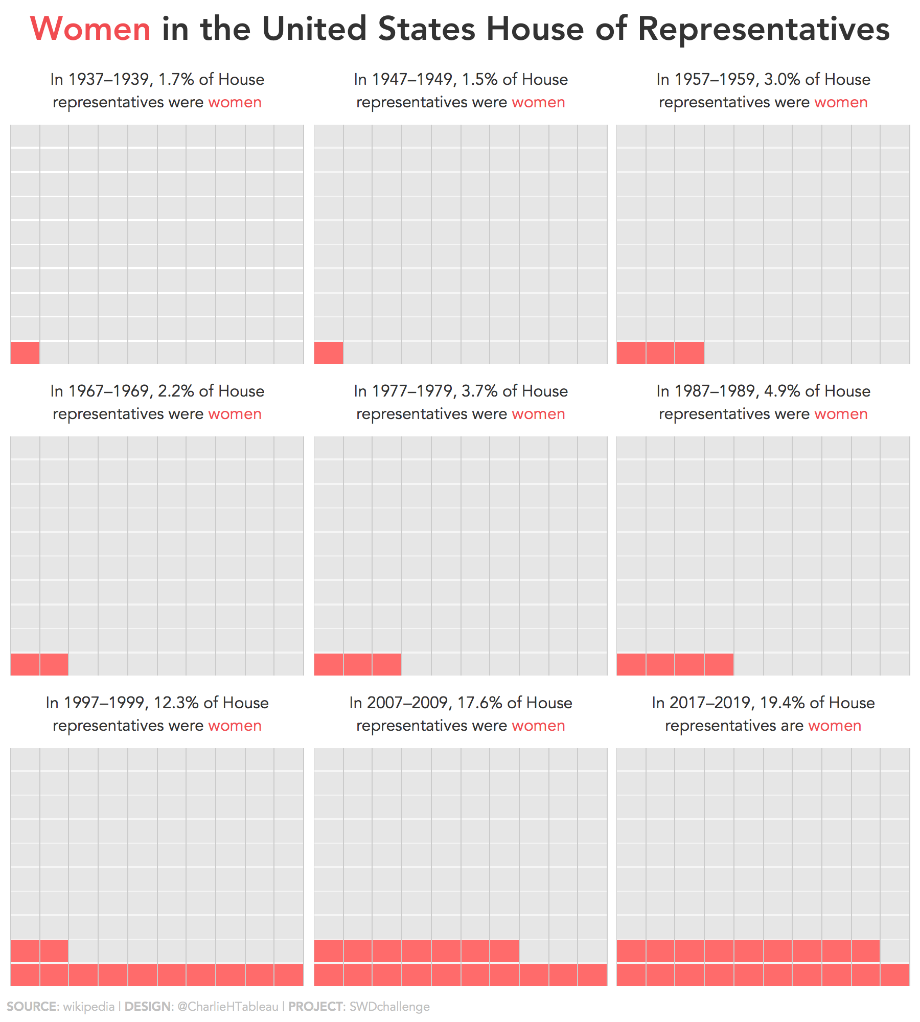
I decided to go with a 3x3 grid to create a nice symmetrical view, and one which extended far enough back in time to show that women’s representation is increasing significantly of late, but still has a long way to go.
Christopher
Last year I came across some interesting data from a blog post on Trulia.com about who can afford to buy a house in particular U.S. metro areas when looking at the median earnings for doctors, police, teachers, and restaurant workers. I created the viz to show the percentage of those four occupations that could afford a house in the area that the user selected with the drop down parameter.
Interactive Viz
Colin
This was a collaborative project with my wife which collated data about crop yields by weight from our allotment plot for the ‘My Harvest Project 2017.’ For more details please check out this blog post. My colour scheme is based upon the greenery of the crops as they grow in our allotment plots! Please find the version published on Tableau Public.
Daniel
This waffle shows the goals scored by Cristiano Ronaldo for the 3 clubs he has played for.
Created in tableau public.
Dave
Attached is a visual I created based on a client situation and is an example of where I find a waffle chart or square area graph can be useful. Here I have used it as an alternative to pie charts. I find these visuals useful when the data being visualized is related to individual people, transactions, or items. I created this using a table in PowerPoint. I find this a quick method because you can set the height and width of the cells easily and use cell shading for the colors. This type of visual can also be created using special characters as I explain in this article.
David H.
With Mick McCarthy leaving Ipswich Town Football Club at the end of the season, I was curious to see how his record compares with previous managers. Would a bar chart make this comparison easier? I think so, but the waffle chart is definitely an aesthetically pleasing alternative.
Tableau Public profile | Twitter
David N.
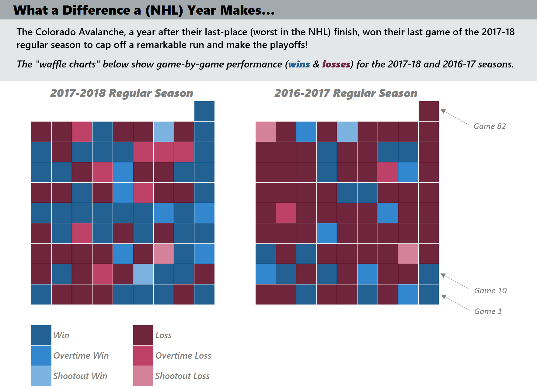
A "slightly modified" waffle chart (given the one extra square necessary to represent the full 82-game schedule of the NHL) for the game-by-game performance of the current (2017-2018) and prior year (2016-2017) seasons for the Colorado Avalanche. Given they went from worst in the league to making the playoffs, I thought it would be both a fun and enlightening way to represent how they improved. Listing the current year first and the prior year second, while not following "natural time" flow of increasing to the right, does follow similar KPI-like format of the current period being listed first for focus. The visual was created in Excel, and besides the conditional formatting formulae applied, the cells themselves use only one formula to pull the six outcomes for every game from two season results sheets.
Edith
Here is my submission for April Challenge. It's based on the amazing work of Reveal from The Center for Investigative Reporting. Full interactive viz is available here. It was built with d3.js
Eduardo
Elena
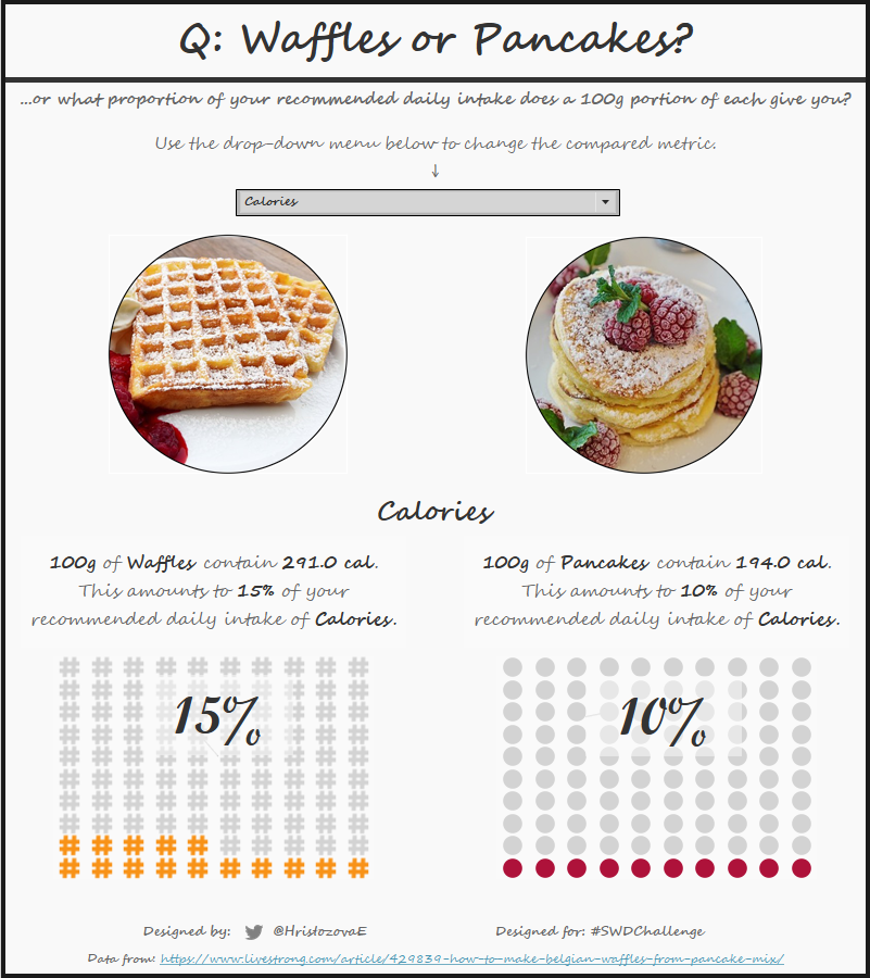
This is a data visualisation designed to compare the nutritional value of waffles and pancakes by showing their proportion of an adult's recommended daily average intake. The visualisation was created in Tableau and an interactive version is available on this link. The design was inspired by the topic - light, colourful, simple, resembling a recipe in a cookbook. Apologies to anyone who may get hungry or develop a craving for waffles or pancakes after seeing the viz!
Ella
My first attempt at a Square area chart / waffle chart, and really enjoyed making these! I thought I would look at some car data and see who else had bought an orange car like me. Apparently black is far more popular than orange.
Emily
I used personal data to make a series of square area graphs using Tableau.
Felipe
When thinking of differences between big numbers I instantly wanted to look at my country's gaps in opportunities. The data itself was really easy to find, and I used good ol' Excel and PowerPoint to create the visualization (guiding myself with a map from Google Images).
Fiorella
Haley
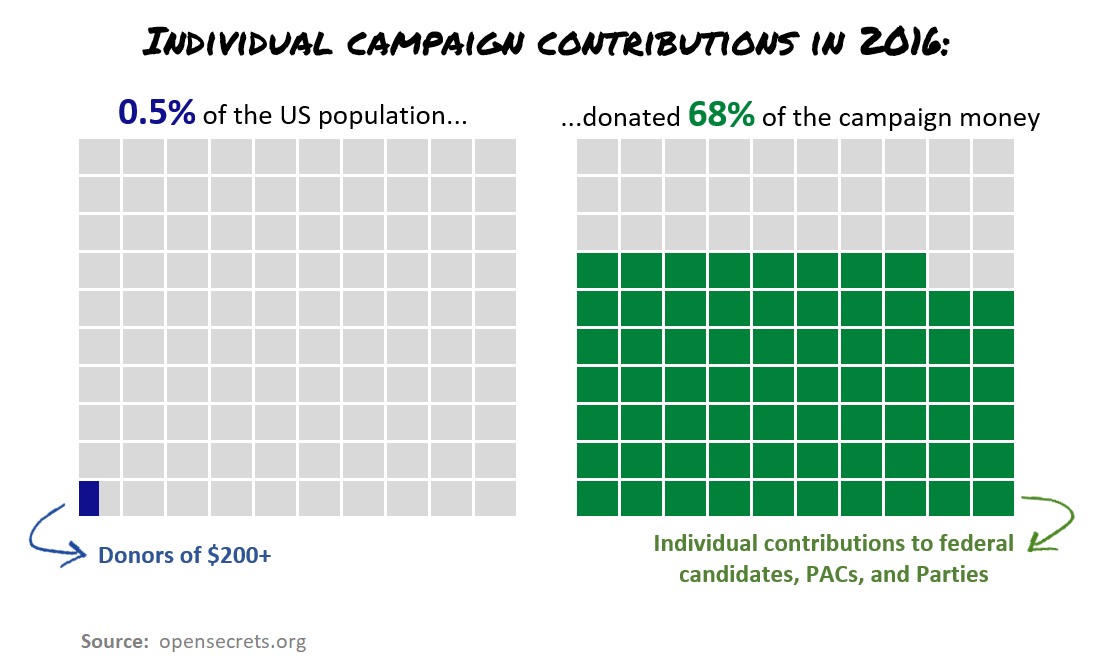
I was looking for data about money in the 2016 election and found these stats about how a tiny percentage of the population donated the majority of campaign contributions. OpenSecrets displays this with 2 pie charts, but I thought 2 waffle charts would effectively emphasize the huge difference between the numbers. I used Excel to make this visualization.
Hanna
I wanted to look at the number of hours sun could be seen in the northernmost place in Finland: Nuorgam. The data is from here. From the times of sunrise and sunset, I calculated the number of hours the sun might have been visible each day in Nuorgam, Finland. I then calculated the percentage of these during each month. These calculations do not take into account cloudiness, simply the number of hours the sun is above the horizon. Also, the graph does not show when the sun is visible, simply the percentage of hours. I used Excel for the number crunching and for preliminary sketching and Illustrator for the final image.
Jacqueline
or this waffle chart I used the Makeover Monday data set, Pet Ownership in the UK. I used Tableau, and the method by Andy Kriebel.I'm @jaxx084 on Twitter, and on Tableau Public.
Jade
My first SWD Challenge and a little nerdy, but it’s a list of the Marvel Cinematic Universe movies and their associated Rotten Tomatoes scores as square area graphs. Created using Tableau.
Interactive Viz | Twitter
Jambesh
I set out to find the most popular browser, by share of market and how a popular browser at one point of time is at the doorstep of extinction.
Jason C.
For this month’s challenge, I created a series of square area graphs that represent the % of the population lost from the major combatants in World War 2. I used Tableau to create the viz, using data from Wikipedia.
Jason P.
I spent the last few years of my career focusing heavily on the digital marketing funnel...analyzing, visualizing and presenting data on the progression of a lead all the way to a win. This information is generally best presented using a funnel graph or perhaps a bar-chart rigged to have the appearance of a funnel. I don't necessarily think this data translates perfectly using a square area graph, but I wanted to experiment with it and find out. In this data set, each of the categories is a subset of the larger one that it is nested in. A drawback that I noticed right away was that the nested categories will obscure the count of squares for the parent category. For example, there are 12 opportunities, but that may be interpreted as nine opportunities because the three wins are a different shade of green. What I think is most important is that the intended audience receives the message in the best possible way. So, this is still an image I would consider using when presenting this data to people who live and breath the marketing funnel because the nature of the data/categories would be implicit. However, I would not use this type of chart when sharing this information with an audience who is less familiar with the marketing funnel.
You can find me on Twitter at @jaydpauley and Medium at Jason Pauley – Medium.
Jeff
With the Master’s golf tournament top of mind at the beginning of April, I kept hearing about the fact that with a Master’s win, Rory McIlroy would become just the 6th golfer in history to complete the career grand slam (to win each of the four Majors). That seems impressive in of itself, but I wanted to know, in its history, how many golfers had competed on the PGA Tour. This seemed like the perfect use case for a waffle chart and the April #SWDChallenge. As we now know, Rory did not end up becoming “green square” number six on my chart. There’s always next year!!
Twitter | Blog | Interactive Viz
Joel
This is a game where you test how would a situation like in Syria affect your own country. It's made with D3.js.
Link
Jon
A while back, I was playing around with whether small multiple waffle charts are a good data visualization. I was playing around with this viz from Nathan Yau to compare it to a bar chart to see how it differs. While a bar chart makes the comparisons easier, it's not quite as much fun, so instead, I decided to try to remake it in Excel (Nathan was kind enough to provide the data here).
Joseph
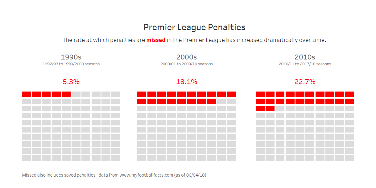
This visual was made in Tableau using data about penalties scored in the English Premier League.
Joshua H.
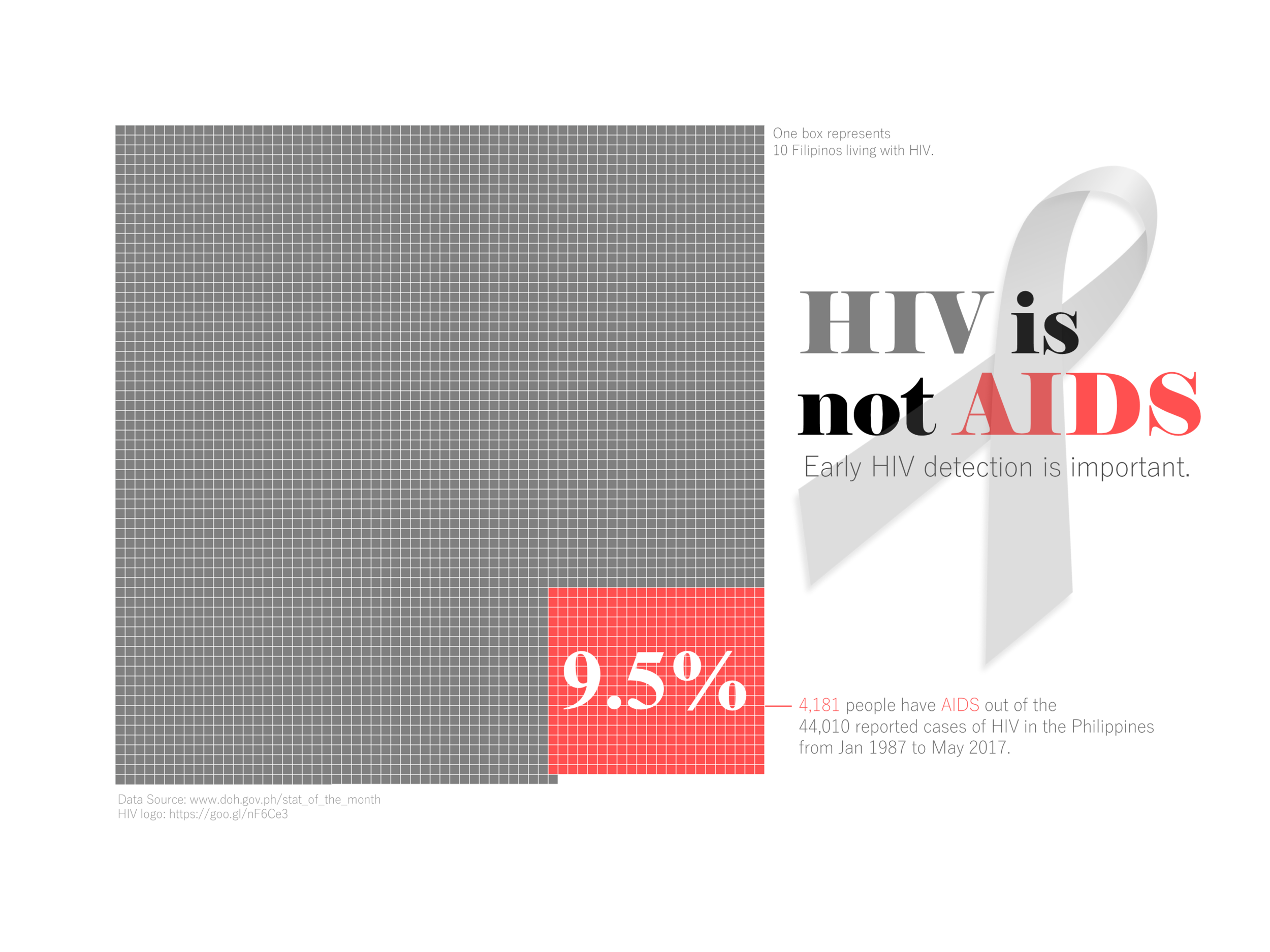
For this month's challenge, I want to change some people's perspective about HIV and AIDS. Not everyone with HIV develops AIDS. HIV is a virus that weakens the body's immune system. AIDS is a syndrome; the final stage of HIV infection. A person with HIV will only develop AIDS if the virus is not detected early. Medications are available not to cure the virus, but to prevent it from further destroying the immune system . I used the data from my country to also stress that almost 10% of HIV-infected Filipinos already developed AIDS. This is to urge everyone to get tested regularly and to spread awareness about safe sex. I used Excel to visualize the square area and Powerpoint to add other details.
Joshua S.
I've been spending a lot of time thinking about Lisa Charlotte Rost's thoughts in her video presentation "Designing Data for Empathy". Lisa notes how big numbers are often emotionally ineffective. Meanwhile, I face massive costs to treat my Ulcerative Colitis, and I think it's hard to get people to understand exactly how much chronic conditions can cost. While I usually describe the cost in terms of college degrees, a recent statement from a public official provided a nice contrast that I think makes big numbers easier to understand, and a waffle chart is a perfect way to demonstrate that contrast.
LinkedIn | Tableau Public
Kat
A square area graph to explore the number of light seconds between us and our solar system neighbors. This viz was made using Adobe Illustrator. For full space travel follow the link.
Lindsay
For this month's challenge, I took a look at the relative strength of opioids as compared to Morphine, often referred to as a Morphine Equivalent Dose (MED). I didn't want to use percents or multiple charts to show this relationship. Luckily, however, Fentanyl is 100x stronger than Morphine so the typical 10x10 block worked. I wanted to add in Carfentanyl, but that would required a 100X100 block as Carfentanyl is 10,000x stronger than Morphine. That being said, instead I decided to keep all the blocks together as relative comparisons to each other. Additionally, I steered away from the red colors, which are often associated with death and lend themselves to topics such as the opioid crisis, because I felt that it has been overused. So color, annotations, and size of text was thoughtfully added to enhance this message.
Liyang
Madeline
Mahfooj
Mark
Michael B.
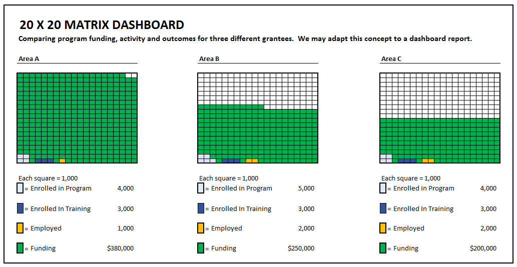
We oversee 22 grantees across the state and are looking for a good visual to show how they compare when reviewing outcomes vs. the amount of funding they receive. The grid might be the answer for which we were looking. I learned that scale is key and creates problems trying to compare areas receiving vastly different amounts of funding. We have one grantee that receives less than $500,000 and one that receives over $30 Million. Finding the right scale that also allows the reader to pick up much smaller activity and outcome data can get tricky.
Michael M.
I was unable to resist the urge to visualize waffle-related data for this challenge. The data set is from a market-research firm, based on a survey of 400 people, and what drew me in was the notion that anyone on earth would have a very negative opinion of waffles. Neutral I can understand...but very negative? Hard to fathom....hence the viz.
Naomi
For this challenge I wanted to compare "numbers of vastly different magnitudes," inspired by the use case in your blog post. Admittedly this example isn't as extreme. Created in Excel. In the process of sense-checking my numbers I created an even bleaker version that perhaps tells the story more effectively, but didn't meet the brief of a square area graph.
TWITTER
Nathan
I happened to be playing around with some historical data I scraped from the Marine Corps Marathon website when the challenge was announced and since the Boston Marathon is next week it just seemed to make sense to see how many people run Boston-qualifying times at MCM.
Neil
With so many traditional waffle charts, I couldn’t resist something a little different. Admittedly I chose the diamond arrangement partly just to stand out, and create a talking-point. But I do like the way that it allows for annotation in the central area.
Nick
I have Chicago Crime dashboard out on my public profile already that I update every 4-6 months. I love finding weird facts/trends in a data source. When I looked at the prostitution figures by day of the week it makes me wonder if the police are less busy during the week with more serious crimes and can spend time cracking down on it or if they don't have as many officers schedule throughout the weekends as they do through the weekdays? This was the first time actually building a waffle chart for me so it was educational. Not sure how useful the waffle/square area charts are overall, but in certain instances I think they can help brighten up a dashboard without being overbearing.
Nicolás
My submission is about the increase in storage capacity for removable devices during my lifetime. This visualization was done using Inkscape, the color palette was taken from
by Tristen Brown.
Twitter
Nikolay
The chart explores the groups of baseball players by the style of their at bats and how and where they hit the baseball. Data processing was done in R and visualization was done in Power BI.
Pablo
I created this one just over a year ago using a data set by Anna Vitals on the likelihood of orgasm for both female and male people.
Interactive Viz | Twitter | Blog
Patricia
For my first #SWDChallenge, I worked with the SpaceX Falcon-9 and Falcon Heavy rocket launch data from Kaggle and investigated the distribution of landing outcomes. I had the choice of going with one box per rocket, but I went with the scaled graph instead because I thought it looked cleaner.
Paula J.
Since we were travelling and mountain biking, I decided to make that my theme. I am actually an intermediate rider and had a lot of fun. I was inspired by the singletracks infographics which actually mentioned how mountain bikers like to travel. The places we rode are not the most popular but we had a good time and it was not crowded. Awesome views! I did this all in Excel this week.
Paula M.
Italy's wine production nearly doubles the combined total production of the three major wine countries from South America. Created in Tableau and used Waffle template from Andy Kriebel.
Source: International Organisation of vine and wine
Pavani
Pooja
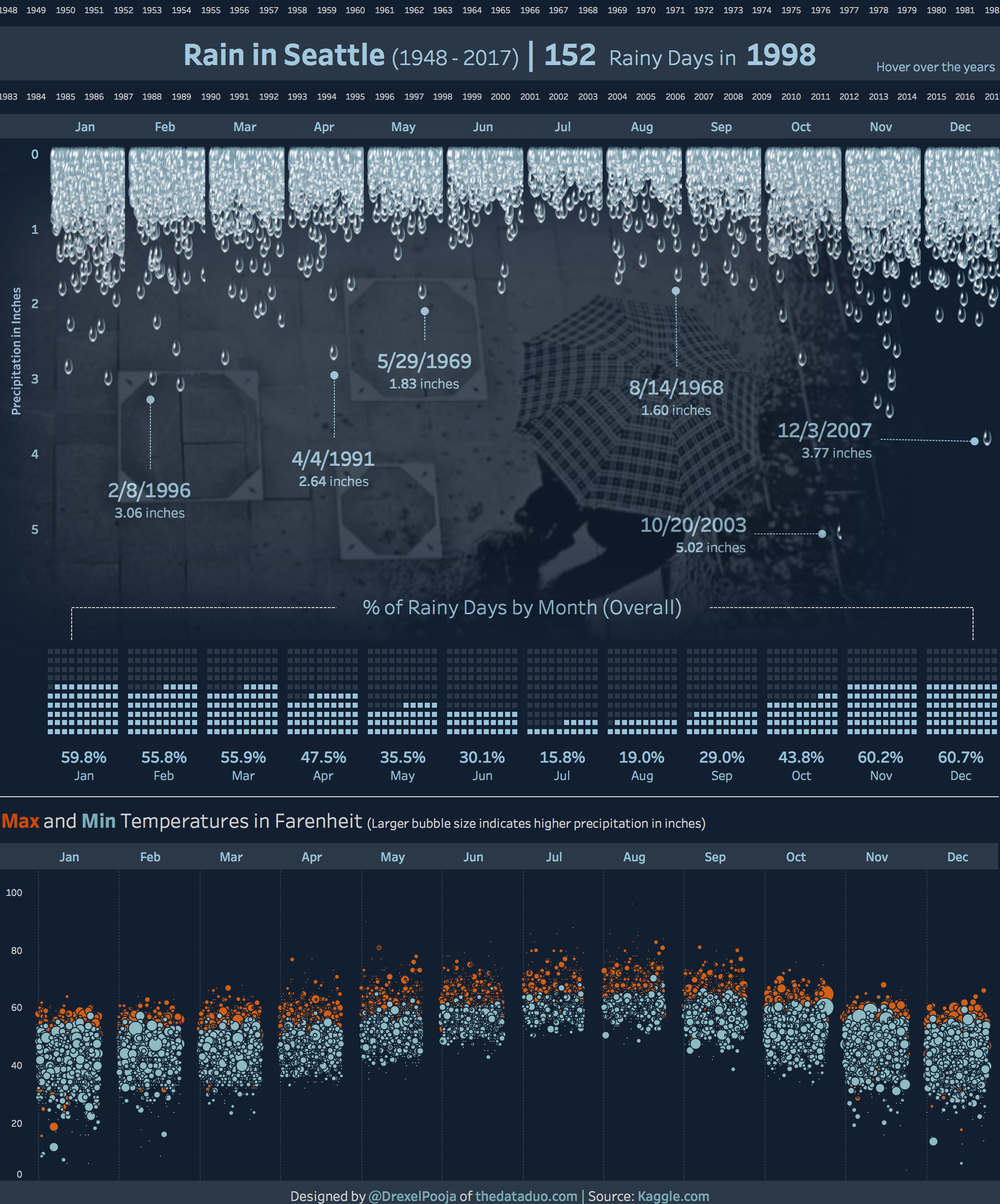
I visualized 25,000+ days of consecutive weather data in Tableau.
Interactive Viz | Twitter | LinkedIn | Website
Prince
Rajeev
Reynaldo
The data I’ve used came from the corruption perception index from transparency.org and just highlighted where my country stands. I used the square area graph where the squares are ranks of countries part of the index.
Source
Richard
My first #SWDchallenge submission visualizes the Oakland Raiders 2017 salary cap by positional spending. The waffle chart on the left shows position distribution over the 63 man squad with some player information in the Tooltip. The right waffle chart then shows how the $160 million is distributed across the team. You can use the Colour Legend to highlight each player/position in the team.
Twitter | Source
Rodrigo
Sara
This month I created a square area chart with information about the street names of Amsterdam. In collaboration with Leon de Korte (designer at De Correspondent) I analyzed how many streets are named after humans, and how many of these are men versus women. The full article on our findings can be found here (in Dutch). We used d3.js and waffle.js
Sean
For this challenge I enjoyed the weekend watching The Master’s. A tradition that my and I have shared for many years. On Sunday, during the final round, Charley Hoffman shot a hole in one at hole 16. And that got me thinking, how rare are aces at The Master’s? They are pretty rare but not as rare as an Albatross. That is a when a golfer scores a 2 on a par 5 hole. So I started digging into the data and found that one golfer has done both.
Sema
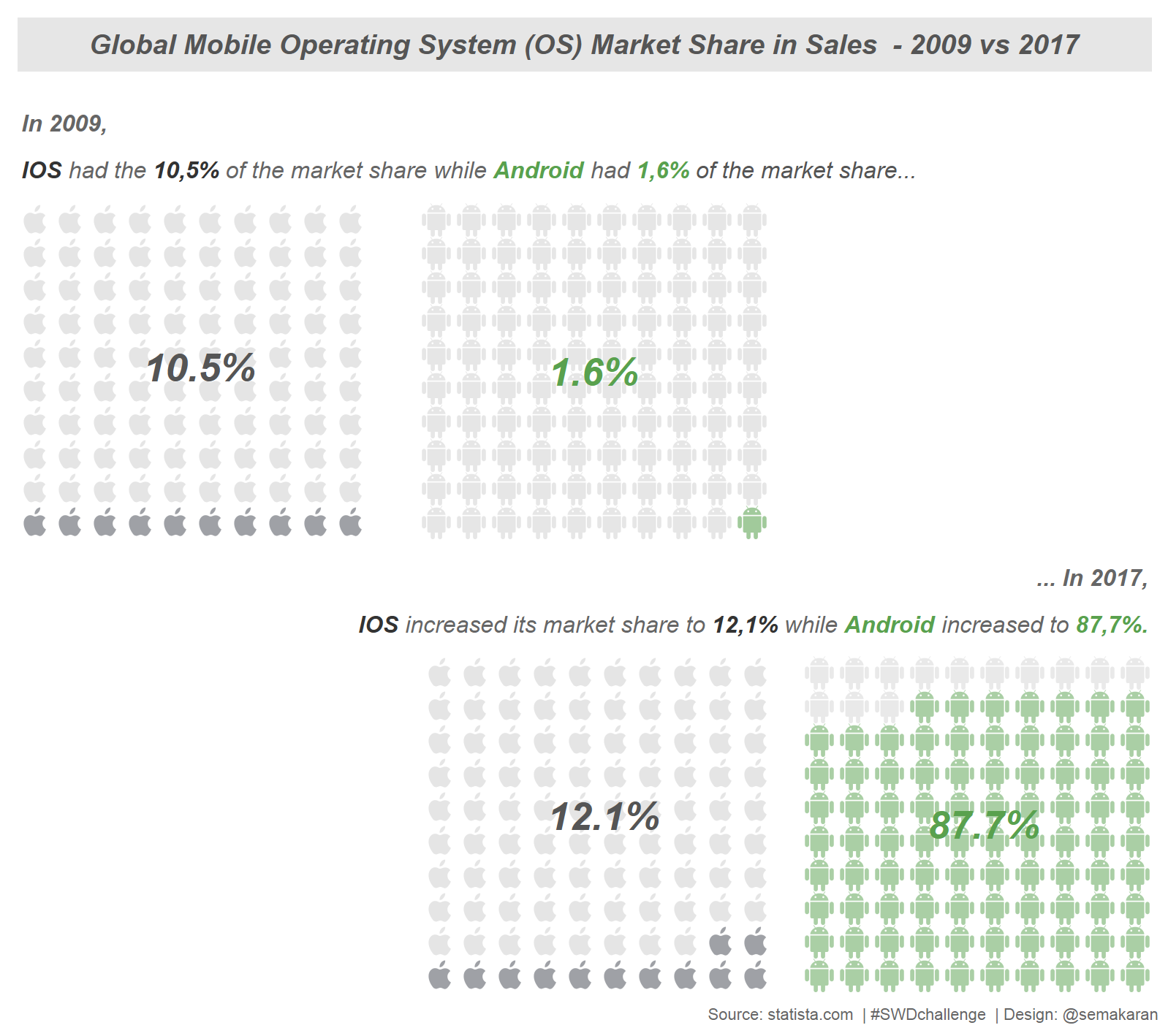
I just changed my personal preference of mobile operating system (OS), from Android to IOS which triggered me to do some search on this topic. I was wondering how is the OS market share and found the data from 2009 to 2017 on statista.com to use with square area graph, which is my favorite. Instead of squares, I used the icons and brand colors to make even more intuitive to read. I preferred the bottom squares to the right because personally, I find it easy to understand, it's kind of pouring some liquid into a glass and I accept every percent as a drop and choose this direction.
| Tableau Public | Twitter | Linkedin
Simon B.
When coming up with ideas for a square area chart it struck me how this chart type is very well suited to visualize a sporting season; a season is made up of individual games and as such a game fits the concept of a square representing each data point. Originally I had planned on using 1 chart that visualized how many games the football team I support, Portsmouth, won, drew and lost last season; however when doing so I kept thinking an square area chart must be able to be used in more creative ways to add additional value and context to the analysis. This is when I came up with the idea of visualizing 2 charts; 1 for the overview of wins, draws and losses and a secondary chart still depicting the result of each game but this time ordered by the actual sequence of matches. I was drawn to this approach as the second chart allows you to see 'form' throughout a season, for example Portsmouth won 10 of the final 12 matches and this can easily be seen by the cluster of blue squares towards the end of the second chart.
Simon R.
For this challenge I looked at how the English Premier League (Football/Soccer) has changed over the past 26 year in terms of the number and variety of countries represented.
Tiago
My goal was to present some concepts from diagnostic tests such as sensitivity, specificity, prevalence, positive predictive value and false omission rate. I used Excel to produce this visualization. The squares were colored according to patient condition (health/ill) or according to the test result (if it was a true/false positive or true/false negative). I haven't used any specific dataset for this challenge. The numbers were all made up.
Tristan
The Philippines has one of the world's fastest HIV infection growth rate. Understanding the modes of transmission can help governments and private sectors target groups at risk for assistance.
Legend: 1 square/box = 1% of known HIV/AIDS Cases
Source: HIV/AIDS & ART Registry of the Philippines Report, Department of Health -- Bureau of Epidemiology, January 2018
Tushar
Umberto
Consider this as a sort of joke, even if it reflects everyday reality. I work in a Web Agency based in Italy, leading the Front-end development team, since the 90's. Lots of clients still ask us to make their super-modern websites fully compatible with outdated and obsolete browsers. I took a real Google Analytics report from one of our client's website, anonymized it, and used it to draw the waffle chart. We live in 2018... is it worth investing ten (or whatever) thousand dollars for making websites backward compatible and satisfy 32 users?
Data source: Google Analytics report (Audience / Technology / Browser & OS) exported in CSV format
Quick Prototype: d3-waffle
Redrawn in: Sketch
Young
Few weeks ago, I stumbled upon an article written on 2014 in the journal, Nature. The article is about the status of the species of living organisms on Earth that are under threat of extinction. I was inspired by this article to generate a visualization for this month's submission.
Zak
With this months challenge, I quickly chose to visualize water availability by country. It's a data set that I came across recently, and one that stuck with me. It was important to me that I create a simple screen with an attention-grabbing title and also that I use color to highlight the message of the viz. You can find more of my work on Tableau Public and by following me on Twitter @zaksviz.
Thanks again to everyone who took the time to create and share your work! Stay tuned for a special edition of the #SWDchallenge in honor of #InternationalChartDay. Details will be announced here on 4/25/18.
