May #SWDchallenge recap: the waterfall chart
At the beginning of this month, we challenged you to create and share a waterfall chart. This is a special case of the bar chart: less common but with the right data, super effective at depicting a beginning quantity, subsequent additions/subtractions and an ending quantity. Many readers chose financial data for their submissions (where waterfalls are commonly used) but with 45 submissions this month, we had a wide range of topics. As always with this monthly challenge, we encourage you to try something new but always consider if the data lends itself to this visual type in practical application.
Let me call out a few highlights. Several readers incorporated annotations nicely into their visual (Alistair, Arnold and Stela—bonus points to Stela for including a takeaway title!). Catherine, Ligia and Patricia rose to the secondary challenge of adding a call to action to their audience. Several readers (Adam G, Alicia, Jeremy/Sarah and John T) varied the layout for a horizontal view, which also worked well. Steve Wexler, author of The Big Book of Dashboards, showed how a waterfall could used to depict the change in monthly subscribers over the course of a year in an organization.
We had a good number of graphs created in Excel this time around (with many utilizing the Jon Peltier method), but we also continue to see a wide spectrum of tools used in the challenge, including Tableau, Qlikview, Python + Matplotlib, R, d3.js, Google Sheets, and even Amy's Play-doh.
To everyone who submitted examples: THANK YOU for taking the time to create and share your work! The makeovers are posted below in alphabetical order by first name (+ last initial when needed; we omitted full last names in respect of those who would rather remain anonymous). If you tweeted or thought you submitted one but but don't see it here, email your submission (including your graph attached as .png) to swdchallenge@storytellingwithdata.com and we'll work to include any late entries this week (just a reminder that tweeting on its own isn't enough—we unfortunately don't have time to scrape Twitter for entries, so emailing is the sure way to get your creations included).
The next monthly challenge will be announced on June 1st, so stay tuned for another chance to flex your data viz muscles.
Huge thanks to everyone who participated this month and enjoy these waterfalls!
Adam B
Adam G
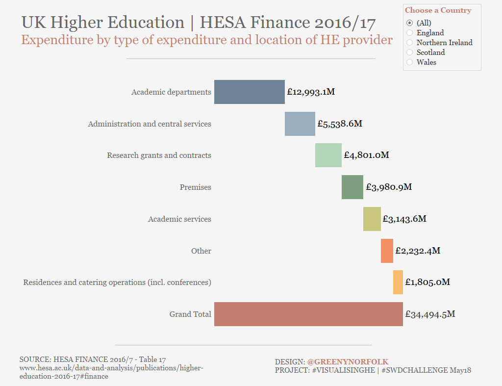
This Waterfall chart viz focused on UK Higher Educations Expenditure by type and UK region (2016/7). Explore the interactive viz to see the UK countries visualized waterfall style!
Interactive viz
Alicia
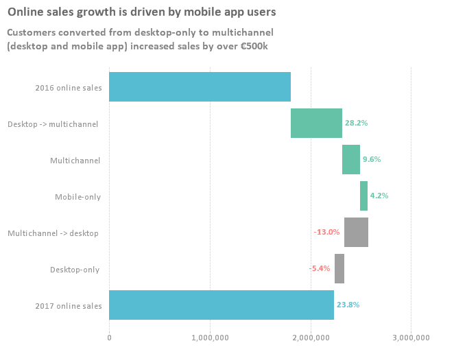
The chart presents growth in online sales broken down by customer type, based on the mix of channels they used - desktop and mobile app. It was created in QlikView.
LinkedIn
Alistair
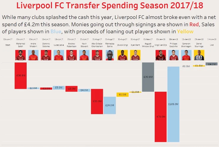
For this month's challenge I chose to show the Transfer balance of Liverpool FC throughout the 2017/18 season. Many teams spent a lot during the transfer window, with the now champions Man City net spend exceeding £220m. Contrary to some of their rivals, Liverpool had a net spend of only £4.2m. I thought the this data was well suited for the Waterfall challenge as allows viewers to see the changes to the balance as well as the details around the transactions.
Amy
April got EXPENSIVE. A look back at my income and spending over the course of the month with annotations. Made of play-doh, yes play-doh, as part of my ongoing project #DayDohViz
Arnold
How the 🇪🇺EEC/EU territory grew and shrank throughout the years up until Brexit. Created using Python and Matplotlib and finished manually.
Aparna
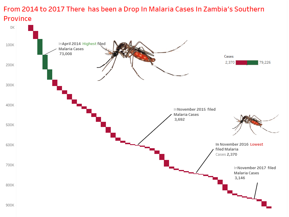
I created a viz filed malaria cases in Zambia.
Interactive viz
Brett
I started following the St. Louis Blues a few years ago, and I thought it would be interesting to see if their power play unit was less successful this year because of big drops in production by specific players or if the drop in production was spread out between many players. I used a stacked column chart in Excel to make this visualization, and I found the data on the website quanthockey.com.
Catherine
I work in a treasury department of a financial institution and we daily do the cash management. Every hour of the day, we need to know how much cash comes in and out. In the dashboard, I also represent it by product because that's a different way to look at the cash that comes in and out that is very useful. Before the market closes, if for example the ending balance is more than 25M$, we need to do some money market to lend money and if it's below 0$, we need to borrow money because we can pay penalties or extra costs if we are short in a bank account. That's why there is an alert (red circle) in my example: the ending balance is 45M$ so we need to take action.
Charles S
I wanted to find a subject more meaningful than the usual sales chart, and was floored when I started to look at the World Bank's population data for Syria, and how the Syrian War has been and still is such a tragedy. I used Tableau to build the chart, which made it a bit tricky! I chose the Syrian flag's black/red contrast to make a clear cut between the growth and decrease in population. I deliberately truncated the Y axis, which I do not usually do, but in this case since there is no comparison between countries, it should not in my opinion create any bias. The main objective is to show the evolution over the last 20 years (of the available data), before and after the beginning of the war.
LinkedIn
Crystal
I chose a nerdy and lighthearted topic, Magic the Gathering (MTG), for my first #SWDchallenge and my first waterfall chart. This visual shows the life damage and gain from the last game in the 2017 U.S. National Championship Finals between Oliver Tomajko and Gerry Thompson. For those who are new to MTG, it is an adversarial trading card game where players start at 20 life and lose when they either reach 0 life, have no more cards in their deck, a specific card says they lose the game, or a player concedes. In this final match, Gerry Thompson concedes after realizing he will soon lose to his opponent with the final score ending at 12-8.
Interactive | Twitter
Cynthia
I used Excel to create a waterfall graph to identify areas for improvement related to cargo that arrived later than the agreed date. Failures or Exceptions are assigned an exception code, then the exception codes are rolled into Buckets or Exception Categories. Each week the waterfall graph is shared with the customer, then the teams work on improving processes to reduce the exceptions. Error bars were added to the graph to illustrate current and target performance. In this example the region is performing above target (93.7% with Target of 93% or higher). The closer to 0 the error bar the fewer failed shipments. The Performance Degradation at the bottom represents the impact to performance of each category. The Customer Exception Category had a 0.9 point impact to performance.
Daniel C
The graph attached was developed in 2016 to show the gain & loss relationship in a public tender ran in México. Due the fact that I was at that time reading your book, the graph is heavily influenced by your teachings.
Dylan
I used the numbers from your headcount example. Using a line instead of bars allows us to start the y axis above zero. This helps to show the values where there are small up/down changes, as opposed to over a large scale caused by needing to show high start/end positions with bars. Using a line also, for me, makes the overall position change clearer. In situations with more steps, or where events aren't organised into increases/reductions like the headcount chart, I think this would be beneficial. I should confess; I'm not a fan of waterfall charts! I made this in Excel. With more time I'd have used d3 for the stepped line and better labeling options.
Haley
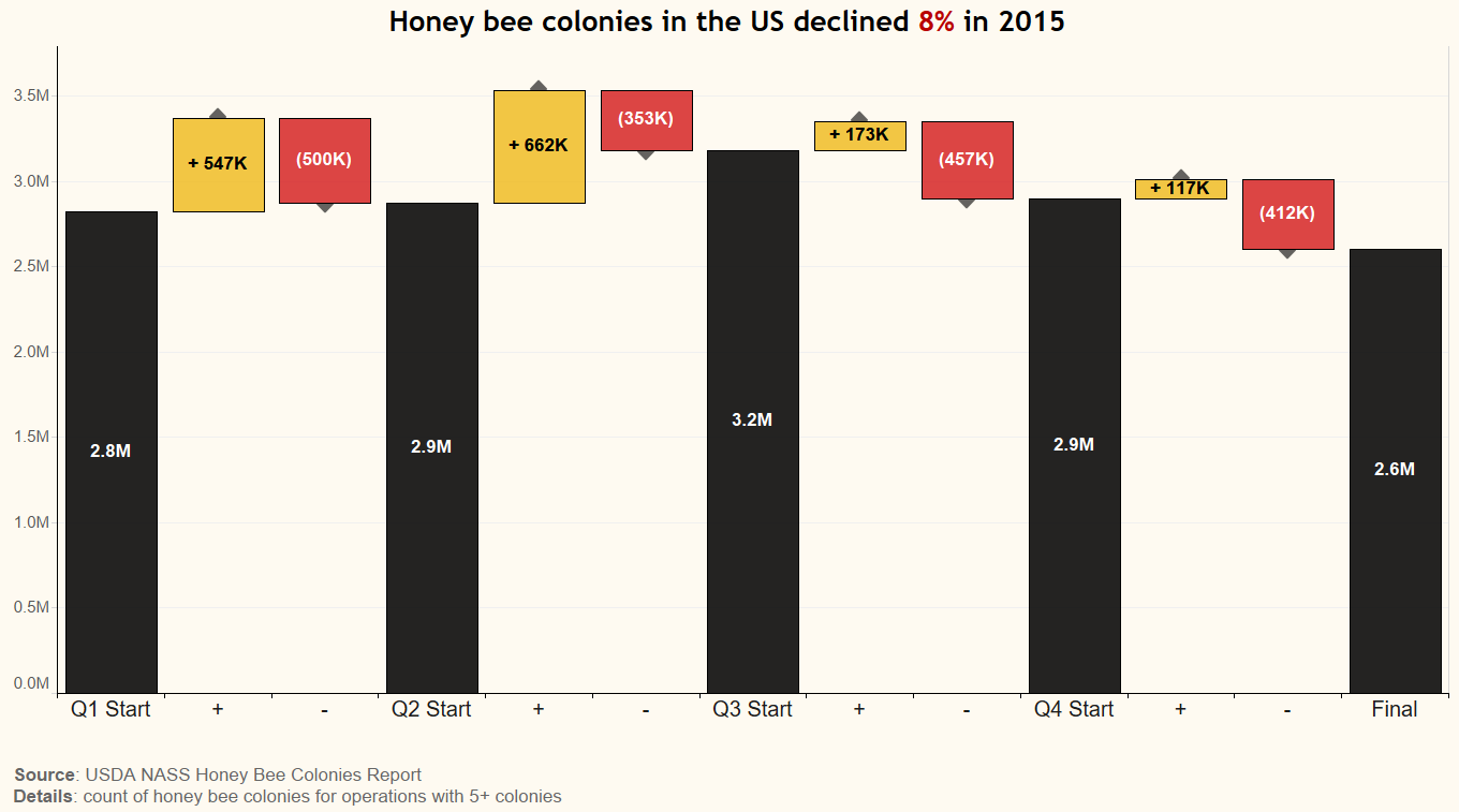
This visual (made in Tableau) shows the fluctuation of honey bee colonies in the US over the course of 2015. The waterfall chart helps show how the number of colonies increased for the first half of the year and then decreased in the fall/winter. I experimented a little with how to make the gains and losses more clear, and ended up using directional arrows on the bars and +/- labeling on the x-axis.
Hanna
This time I tried a minimalist approach to explore the number of school aged children (7 - 15 y/o) in Finland. Waterfall charts usually show the starting value, but as the changes were so small when compared to the original value I decided to treat the first number as a reference. This allows the reader to see easily where the number of children is in reference to the previous years. Color choices are minimal as well. Made with Google Sheets entirely.
Data source
Jamie B
This is a hypothetical rework of existing charts (normally line and/or bar charts) plotting inbound overseas shipments building up to busy season of a distribution company. Analysis would be performed following the busy season, comparing inbound shipment/delivery schedules (~30 transit times) with Purchasing plans, staffing projections, sales, etc. The top chart re-imagines the monthly shipped/delivered line chart pair as a waterfall. I think it helps to show the change in 'In Transit' shipments month to month by comparing the in and out together, but also has a failure in that, at no point were the inbound shipments as high as the highest bar, since they're aggregating values from throughout the month. The secondary chart zooms in on a month and shows the daily in/out, which I think gives a more realistic picture. Whether I would use a waterfall for these displays in the future is up for debate, but it was an interesting exercise. Made with Excel, using a variation of the Jon Peltier method (even though there is a built-in waterfall in Excel now, it lacks the control that I want):
Jeremy & Sarah
Here’s our entry for May’s waterfall challenge: we’ve looked at predictions about how the US employment market will change by 2026, and wanted to show which segments would see the most jobs gained – and which would lose the most. We’ve opted for a vertical chart mainly because of the lengths of the labels for each segment, and how long the labels were.
John T
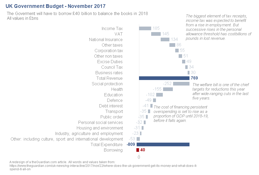
My attempt at your waterfall challenge, done in Qlikview. I found this a tougher one than before as I haven't ever really found a good use for waterfalls other than in financial reports, which is what I went for in the end despite hunting around for other interesting data. I also wanted to make a 'real' waterfall chart (i.e showing parts of a whole). I've seen other entries that could arguably be called step charts rather than waterfalls. But maybe that's just me being picky. It's a redesign of this article in the Guardian online. I felt the way they showed the breakdown in the article didn't seem to have a natural order and didn't hang together that well.
Johniel
The chart shows increasing trend of terrorism deaths and incidents in the Philippines in later years.
Twitter
Joshua S
As a patient with Ulcerative Colitis, I've been thinking about different ways I could help advocate for other patients using my experiences and talents in data visualization and population health. I found an opportunity when I started looking through my claims over the last year, and I started to wonder just how much it cost to get me back into remission. This is the result of me trying to share my own health costs story through data visualization.
LinkedIn | Tableau Public
Kat
I like to user test data viz I create and the first draft of my chart failed completely. It seemed waterfall charts are not intuitive for a lot of people to read—unless the chart can be explained or the user already has an understanding of the data (or the user is part of the Storytelling with Data community on waterfall chart month). Initial comments included things like “why are the bars floating” and “what do the different bars represent.” Therefore, I’ve included more elements than I usually would if I were making a simple bar chart, to aid in the UX of the viz (legend, axis, data labels, direction arrows).
Ligia
In this graphic, it’s represented the Cash Flow of a campaign to prospect new customers. Each month show the Return of Investment (ROI). This evolution monthly represent a growth of +61% compared to 2016. The months that more contribute for this performance are March, July and August, in this last month the company has reached best revenues.
Luisa
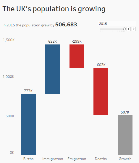
I decided to visualise the growth of the UK's population using data on births, death, immigration and emigration. I picked a dataset that enabled me to put specific dimensions on the x-axis rather than a date so I wouldn't be tempted to used a stepped line chart. I used Tableau to visualise the data.
Interactive viz | Twitter
Marta
The same day the challenge was post, I was reading a book about European robins, and I found interesting the fact that a lot of them came to my country, Catalonia, to spend the winter here. My objective is to show this fact in a chart, including the data of the robin observations in my country during one year and a simple illustration depicting the bird.
Instagram
Munazzah
Inspired by this article in Cambridge's local newspaper, I visualized the change in selling price over the past 20 years of the last property sale listed on Rightmove.
Neil
I enjoyed this challenge - the idea of choosing data to a pre-determined design is a great practice and is something I’ve advocated recently. I hope to blog about this in the next few days. Thanks again for setting the monthly challenge.
Interactive viz
Nick K
Patricia
I wanted to take a look at the number of endangered species in the US. It's interesting to see the flat periods coinciding with certain legislations and milestones, and how clearly this data supports the call for conservation. I used Tableau for this visualization.
Paula
Inspired by a Statistics Daily data set, I am showing the change in cross border vehicular traffic between the US and Canada and visiting or returning to Canada. There is a big change in 2009 in traffic where US visits to Canada plateaued after a decline and returns increased till 2013 and then decreased. Many more Canadian's return than American visit. This was done in Power BI because as it is one of the default chart types and is quite easy to make without much data manipulation.
Rodrigo
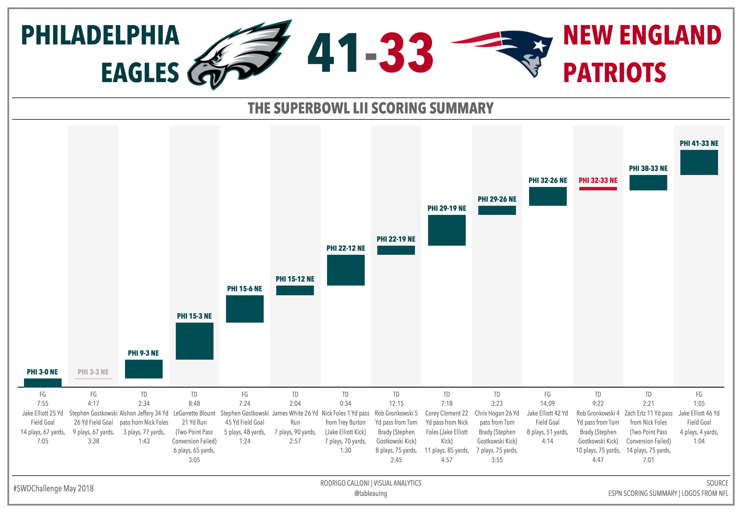
My goal on using a waterfall chart (for the first time) was to show the scoring progress of this year's Super Bowl. The length of the bars was used to show the difference in the scoring between the two teams. Color was used to highlight the team that was winning the game at that moment and by that we can find out that Eagles led almost all the way. I believe that by using charts like this we can highlight the differences/gaps and also let the visualization "breath" with the generous white space that is the result of the absence of the full bars.
Interactive viz
Sam B
The key point to convey was that growth at current accounts and from new accounts was not keeping up with the losses at current accounts. The hole they were digging each year was just too deep for their marketing efforts to replenish.
Sarah
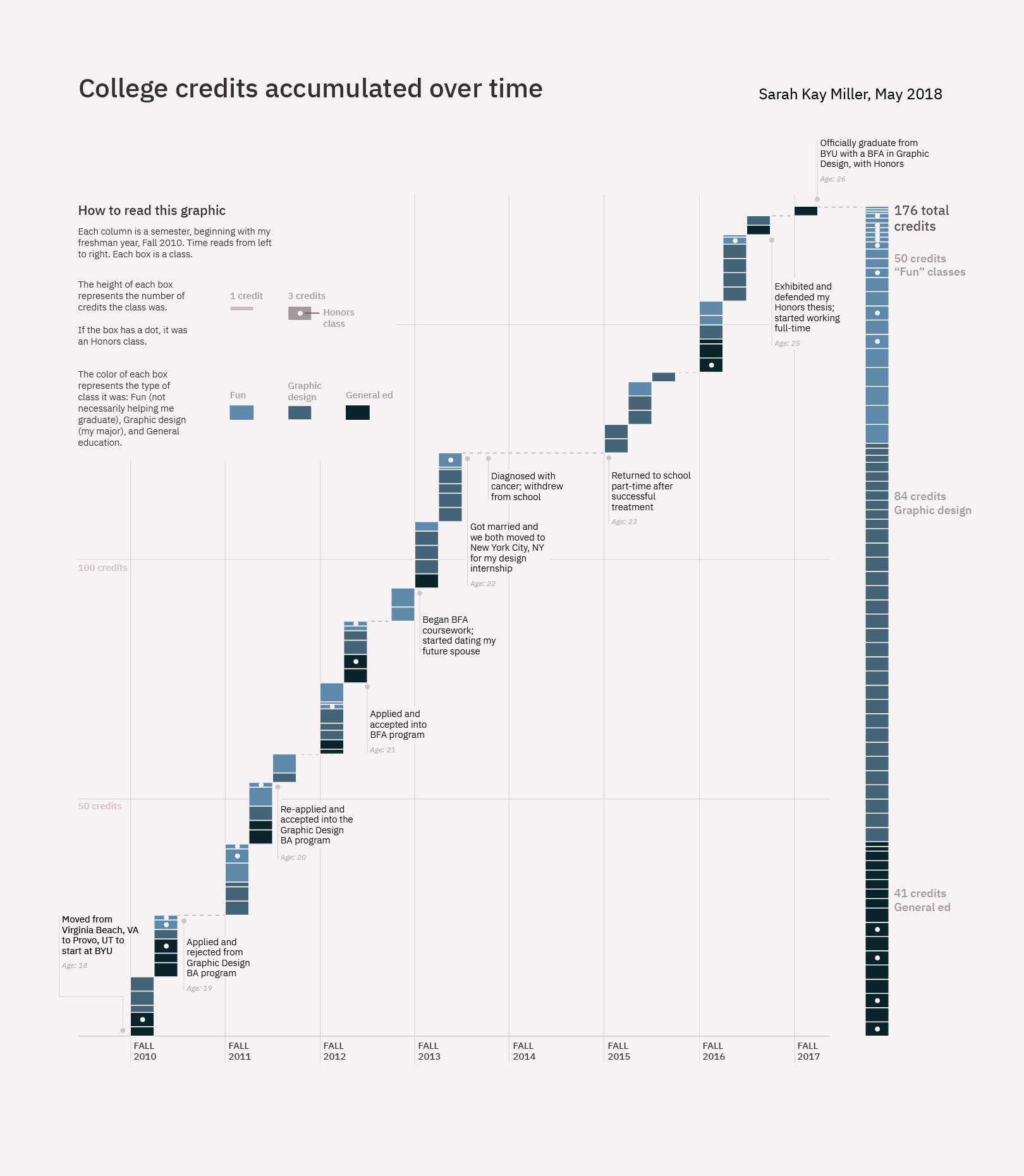
I visualized the college credits I accumulated over time while attending university. It took me seven years to complete my undergraduate degree. Each student has a unique path through higher education. This is mine. Read more about this project on Medium | or view my "making of" process on Instagram
Scott G
Given the tight labor market, companies are wondering if they should provide their road warriors with better but more expensive travel policies. I built this simple break-even model in Excel. It is designed to let travel and HR managers plug their answers into the yellow cells, and see the results in the waterfall chart. The chart shows the relevant dollar amounts in two places - the chart components,and the labels.
Shahnaz
I have used Sample-Superstore-Subset-Excel. I have created Waterfall chart in Tableau. Waterfall chart is filtered by Region using Product Container as a Category.
Sharon
Waterfall charts are great ways to visualize pricing data, especially when used for internal decision-making in business/product groups and in guiding the Sales organization. Read more to learn why in this blog post. This waterfall chart is taken from a real work analysis (anonymized) that showed how various sales deductions, as well as production costs, reduced the profit per unit of product sold. When presented to executives and the Sales and Product organizations, concrete actions were taken to address the issue of how to decrease the price-to-profit gap.
Simon B
Having never created a waterfall chart before I wanted to explore if the chart type could be applied to a non finance related data set. I chose the history of the 100 metres world record since 1964, when automated timings began, as I thought each time the world record was broken the margin of the new record compared to the previous record would be an interesting use case for the way a waterfall chart visualises the cumulative effect of positive or negative changes in a measure. Whilst I was happy with my first effort I had a nagging irritation that the waterfall chart I had created wasn't able to represent the length of time between world records; each new record was an individual discrete data point on the chart. It is for this reason I tried a 2nd attempt, creating a continuous time series waterfall chart, where by the line between waterfall bars represented the length of time between each world record.
BLOG
Simon R
For this months challenge I looked at the passenger and ship movements on the Titanic. Each section of the waterfall looks at the crew or class of passengers as the ship made it's way from Belfast to its final destination. Finally, I decided to apply a colour variance to gender.
Stela
I wanted to relate it to digital marketing (what I do). The type of data I am using I would usually visualize with a bar chart.
Stewart
I just finished creating a waterfall chart design for a client wanting to visualize their margin. They are a forestry company that have multiple operations that contribute to the costs of harvesting and processing logs, so I used a waterfall in order to show the total revenue and how costs are distributed across the business. I used Adobe XD to create this chart as part of a prototype of an executive level dashboard. The data is made up as a means of example.
LINK | Twitter
Steve W
Steve Wexler, author of The Big Book of Dashboards, shared this waterfall chart from Chapter 24.
Website │ email │ twitter │ Newsletter │ Big Book of Dashboards
Tiago
I used a waterfall chart to show the price breakdown of one liter of gasoline in Portugal. I highlighted some areas in the visualization to show the impact of taxes on the final price at the pump. In the end, this viz looked like a waterfall chart inside a waterfall chart.
Interactive viz | Data source
Tyler S
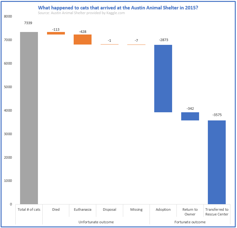
I felt a waterfall was very effective in communicating to a viewer the outcomes of cats at the Austin Animal Shelter. Before this chart, I didn't realize how many cats were able to return to owners, be adopted, or find a new home at a rescue center. I used Excel and a bit of brute force to create the design. I avoided dash lines, because I felt in this case it didn't add much value, since all the values were decreasing. I chose only two colors to represent the two types of outcomes.
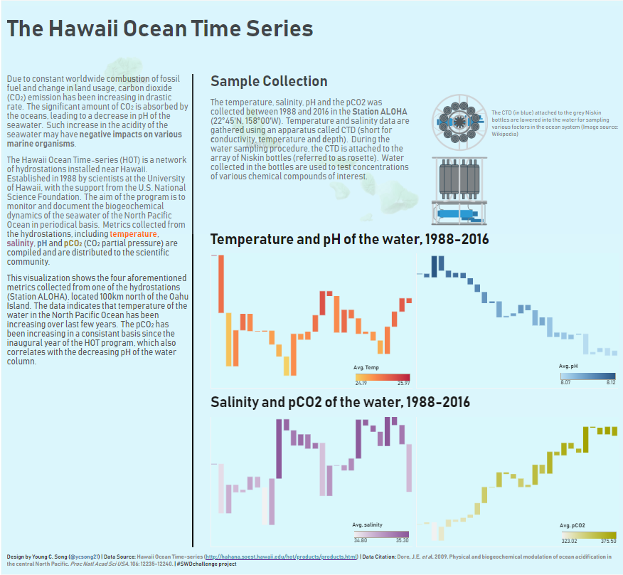
Young
Please find the attached figure of my #SWDChallenge submission for this month. Here, I have visualized four metrics recorded over 20 years period in the Hawaii Ocean Time Series.
If you've read to the end, take a moment to click the ♥ below—this helps us know that the time-intensive process of pulling the monthly recap together is worthwhile. Big thanks to everyone who took part—both the participants and the specatators. Thanks for reading!


