plots with dots!
This month, you were challenged to plot data with a dot—a dot plot, to be exact. More than 50 people shared their creations, many using their dots to depict point in time and group comparisons. I always enjoy seeing the variety of topics, and in this month's challenge we saw a good amount of sports (MLB, college football, NBA, soccer, Tour de France), currency comparisons, wine and movie ratings, gender inequality, elections, facts from Factfulness (Lisa) a guitar chord chooser (Ben) and even Yahtzee game scores (Chris). There were a number of work examples shared: Courtney finds some interesting gaps between the skills employees see as important vs. those they are interested in developing, Ella uses a dot plot to depict staff engagement, James shows varying handling time across call centers, and Lea makes her client happy with a dot plot illustrating their apps outperforming competitors'.
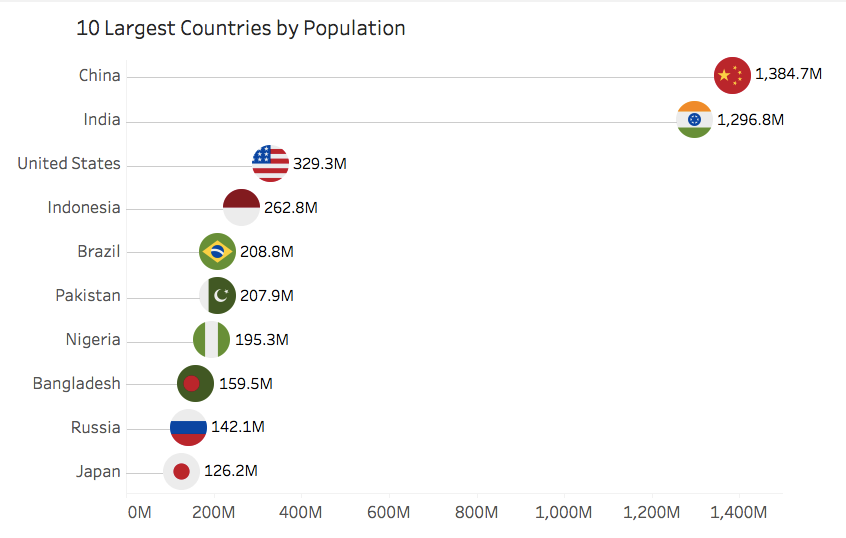
A handful got creative, replacing the standard dot with flowers made of Play Doh (Amy), team logos (Charles), tomatoes, popcorn & trophies (RJ), and flags (Tim). There were several examples of tails used well to show directionality (check out David, Louise, and Tom's submissions, also Brett uses empty and filled in circles to clearly depict then vs. now). Some of the examples graph a ton of data without feeling overwhelming (see Dan's poorest & richest countries, Jason's MLB best and worst, and Nick's wintertime golf weather).
While I encourage you to browse through all, a few others that caught my eye in particular were Silvia's "natural listeners," Tiago V's exit poll breakdown, Paul W's "LeBron effect", and weather in Kat's new home city.
To everyone who submitted examples: THANK YOU for taking the time to create and share your work! The makeovers are posted below in alphabetical order by first name (+ last initial when needed; we omitted full last names in respect of those who would rather remain anonymous). If you tweeted or thought you submitted one but but don't see it here, email your submission (including your graph attached as .png) to SWDchallenge@storytellingwithdata.com and we'll work to include any late entries this week (just a reminder that tweeting on its own isn't enough—we unfortunately don't have time to scrape Twitter for entries, so emailing is the sure way to get your creations included).
The next monthly challenge will be announced here after the Labor Day holiday in the states on September 5th and will run through September 12th. Check out the #SWDchallenge page for the latest, including a recap of previous months' challenges and submissions.
Scroll below to see this month's deluge of dots!
Adam
Having vizzed Tour de France stage data throughout the race as it unfolded, I instantly thought of this dataset when the theme of SWDChallenge Aug18 was unveiled. Dot Plots are a great way to present difference, and I thought dot plots were a lovely way to highlight the difference in time between the first and last past the post per #TDF2018 stage to understand which stages split the pack in this years tour.
Interactive viz
Alexander F
This plot shows one of the main findings from a political science paper I've coauthored with Jesse Crosson, Tim LaPira and Casey Burgat: Members of Congress that have been elected to Congress more recently spend less money in legislative staffers. We use new data to investigate how Members of Congress use their office budgets (MRAs) to hire different types of staffers. Each dot represents the estimated difference* in the share of a Member's total office budget spent on legislative staffers, based on whether they were first elected before or after the year on the X axis. The yellow line indicates the beginning of the "Republican Revolution" and the "Contract with America." Members first elected in earlier congresses invested more heavily in legislative staff. However, our findings suggest that the early 1990s introduced a new era of Congress in which every subsequent wave of incoming members has spent less on legislative staffers.
Alexander V
For the August SWDchallenge I've downloaded a dataset named 'Wine Reviews' from Kaggle.com. The dataset is based on wine reviews pudlished on winemag.com. It is a big resource about wines where some professionals evaluate wines from different countries.
The main idea is to compare wine ratings and wine prices of the Italian wines. I have made a categorized dot plot to show 4 different categories of wine's quality with abilities to find wines by variety, by region, by winery. You can find more information about wine rating hovering over an info sign on my interactive viz.
Amy
Lots of wedding budgeting and #DayDohViz in my life lately. They combined in a #SWDchallenge dot plot! Purple roses are totally below expected range and pink are somewhere in the range. Made from play-doh. Data from brides.com and my wedding spreadsheet
Andrew
This was created using two graphs in excel and a bit of finessing in Powerpoint.
Anna
I have used data from OECD Health data 2018 and compared smoking females and males aged 15+. For better visibility you can choose sorting order and measure (smoking females, males or difference between men and women).
Interactive viz
Aparna
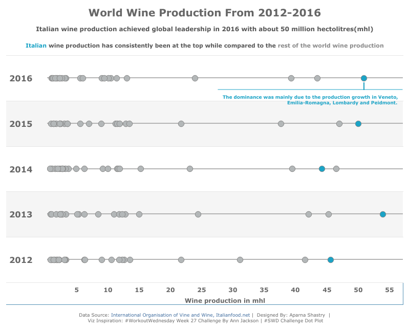
For this month’s #SWDChallenge I chose the world wine production data. The viz is built using Tableau. My inspiration for this viz was Ann Jackson’s #WorkoutWednesday week 27 Challenge.
Interactive viz
Ben D
My dot plot is a graphical summary of the current MLB standings. The black dots reflect the actual win / loss record for each team and the blue dots the Pythagorean winning percentage - an estimate of how many games the team would typically win based on the runs scored and allowed. Roughly speaking, when the black dot is to the right the team has been lucky, and when it's to the left, unlucky. Red & blue text means the team is qualified for the playoffs. A few more annotations might be helpful in explaining - but on the other hand this is in a sense a domain-specific graphic for baseball. This is a one-dimensional version of a "2d dot plot" graphic I made previously and explained here - although the 2-d version contains some useful detail, I think the 1-d version actually summarizes the story more clearly.
Ben J
This one is a dot plot that’s also a diagram, and it shows where to place your fingers on a guitar fret to create a chord. Chords are organized into keys, and are musical notes included in each chord are indicated by color, using the viridis palette.
Interactive viz
Brett
For the dot plot challenge I used the Big Mac Index data set. This data is normally used to identify the values of currencies, but I thought it would be interesting to focus on how much the cost of a Big Mac has changed from whenThe Economist started collecting this data in 2000 to 2018. This was created in Excel.
Charles
As you mentioned in the intro to this month's challenge, dot plots are not that common in my data viz toolkit. So I was eager to test how I could build one, and on which data it would make sense. So I decided to compare the 2017 stats of 2 MLS teams with very different achievements: Toronto F.C., who set a record for most points in a season, and D.C. United, who were dead last in the Eastern Conference. This is the result using Tableau. It is a rare occurrence where I have decided to switch the actual dots to shapes representing the team logos, but it made sense with the subject.
Chris
Dot plots are great for showing competitive data so I thought I'd show an example using scores I pulled from the score pads of our latest night playing Yahtzee.
Interactive viz
Courtney
Perfect timing - I was looking for a way to display some survey data, and I think the dot plot worked well to show the differences between the two question types. I've attached my example - created in Excel.
Crystal
Dan
I rarely have the luxury to deal with small amount of values. Being involved in making sense of business ERP data, I always face high cardinality of data (many distinct values) that makes the usual categorical graphs to fail. This is one of the reasons I am using the dot charts family way more often than any other form of display and when I have the time I study and write about different ways to improve that. For this month I decided to submit you a second design that shows an exploratory approach for simultaneous access to both distribution tails. For this purpose I used an alternative to Cleveland dot plot that was introduced by Stephen Few in 2017 under Zvinca plot. This chart can encode far more values than a regular dot plot or any other categorical related chart by using a layering/wrapping technique. This design uses Global Finance article contents found with the title: The World's Richest and Poorest Countries. The article describes their reasons for using per capita GDP, adjusted for purchasing power parity (PPP) to rank the world’s richest and poorest countries for 2016 followed by a table showing the computed values.
As the title suggests, the reader is invited to explore the list of Richest and Poorest countries, so I decided to show how a variation of Zvinca plot can be used to provide this information in a compact space, providing the full context of all values. In the absence of poor/rich definition, I split the countries list in two, using the median calculation and I highlighted top/bottom 25 countries from both ends of the range. In top of that I provided an additional distribution context, using a KDE piled plot () with an orthogonal arrangement of the dots. 25 was calculated based on available space divided by the height of the font and is not a restrictive value. It can be very well related to first/last quartiles, but for this case would have been too many labels to display. Each table on the left/right can be scrolled independently and the selected "layer" will be reflected accordingly.
Dave
I wanted something quite simple so that we can see what has changed whether than be positive or negative. I didn't want to focus on the actual numbers themselves just the change and relative position. This will form part of next months VisualisingHE post which will focus on the national student survey for UK HE.
Interactive viz
David
Here’s my attempt at the challenge (my first one, btw!) It’s supposed to be an improvement on a legacy chart.
Blog
Dorian
I created the following visualization as a part of a Makeover Monday challenge. I tried to create a beeswarm chart in Tableau using R to work with the data. You can interact with the viz on Tableau Public. Here is the blog post on how I built it.
Ella
I thought I would use some survey data from work to help see the changes between our first survey and our second survey following some internal improvement work. Not really used dot plots before but really easy to create in Tableau and really effective.
Heather
This dot plot was created using Tableau Public from data published in the 2018 Tennessee Educator Survey. A dot plot seemed like a good way to compare teachers' opinions vs administrators' opinions.
Jade
With Midterm Elections currently going on, I re-visualized a table from an article by FiveThirtyEight. I created a connected dot plot using Tableau to show the gap between male and female voting trends.
Interactive viz
James
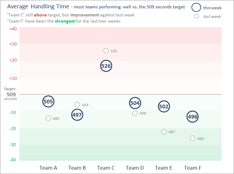
I've chose to look at 'Average Handling Time' (AHT), within a call centre environment (i.e. the average length of calls in seconds). AHT is generally measured in seconds because small movements can have a big impact; a 10 second increase in AHT could cost a company £250k+ over a year. Bar/column charts often don't work well for AHT as the data rage is generally concentrated in a narrow band well away from a base zero axis. Line charts can be useful if you are looking at a time series; however, in my example chart below (created in Excel) I wanted to look at individual team performance. Using a 'dot chart' you are able to see each team's performance relative to each other, the target AHT, and to their own previous week's result. The example below demonstrates how you can use an 'awkward' target of 509 as the baseline, measuring performance above or below in 10 second bands.
Jason
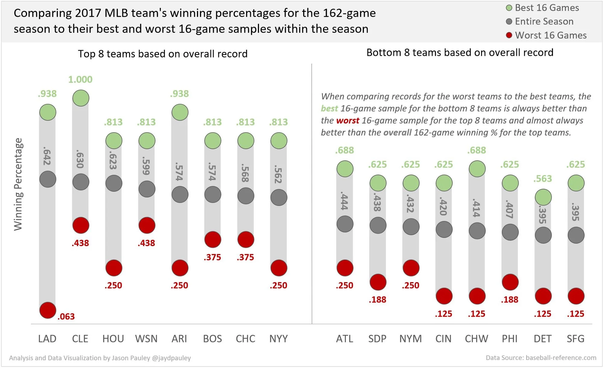
I created this connected dot plot as a way to illustrate how small sample sizes can lead us to draw the wrong conclusion. Randomness (or noise) can have a large impact on an NFL team’s record, given that they play only 16 games in a season. Because of this, a team’s record usually doesn’t reflect their true ability. The greater the number of games a team plays, the less randomness there is, and the closer a team’s record is to their true ability. In this visualization, I decided to use MLB teams (162-game season vs 16-game NFL season) to exemplify randomness by exploring every 16-game stretch for the top/bottom 8 baseball teams. Then I and compared their best/worst stretches to their overall 162-game record. This visualization is a part of my post about randomness in the NFL, which you can find here.
This chart was created in Excel. The red, grey and green dots are three separate line-graphs with markers (and the lines deleted). The dots are connected with a stacked bar. Part one of the two-part stacked bar starts at zero and ends at each team’s minimum dot – the bar’s color and borders are removed so the bar is not visible. The 2nd bar stretches from the minimum to the maximum point. Although the bar wasn’t critical, I thought adding this would help visualize the range of each team’s best and worst 16-game stretch.
Twitter | Linkedin
Jared
I used NBA 2017-18 season data sourced from www.basketball-reference.com, and decided to simply plot the number of games won/lost by each team. I had initially tried to make it in R using ggplot2, but decided I didn't like the end result and went back to good ol' Excel instead.
Jeff
For the August dot plot challenge, I decided to have some fun and focus on Fantasy Football. With the season right around the corner, I took a look at who the Top 20 projected players were for each position, in 2018 and compared that against their 2017 actual production. What I found was a few things. First off, not many players are expected to regress from their 2017 production. In fact, only Russell Wilson and Todd Gurley are expected to see major regression in 2018. Reason being that both had ridiculous 2017 seasons. And secondly, from injuries to suspensions and beyond, so many things factor into a player's fantasy value. I've been playing fantasy football for awhile now and can remember back in "the good ole days" when the lists of top players didn't change much from year to year. That is not the case today. Of the 60 players listed, 4 are rookies, 6 are in a full-time starting role for the first time, 8 are returning from serious injuries that ended their 2017 seasons and 2 were suspended for at least a quarter of the 2017 season. That means 1/3 of the Top 60 players listed missed either a significant portion of 2017 or did not play at all!! Good luck in those drafts everyone!!
Twitter
Tableau Public
John
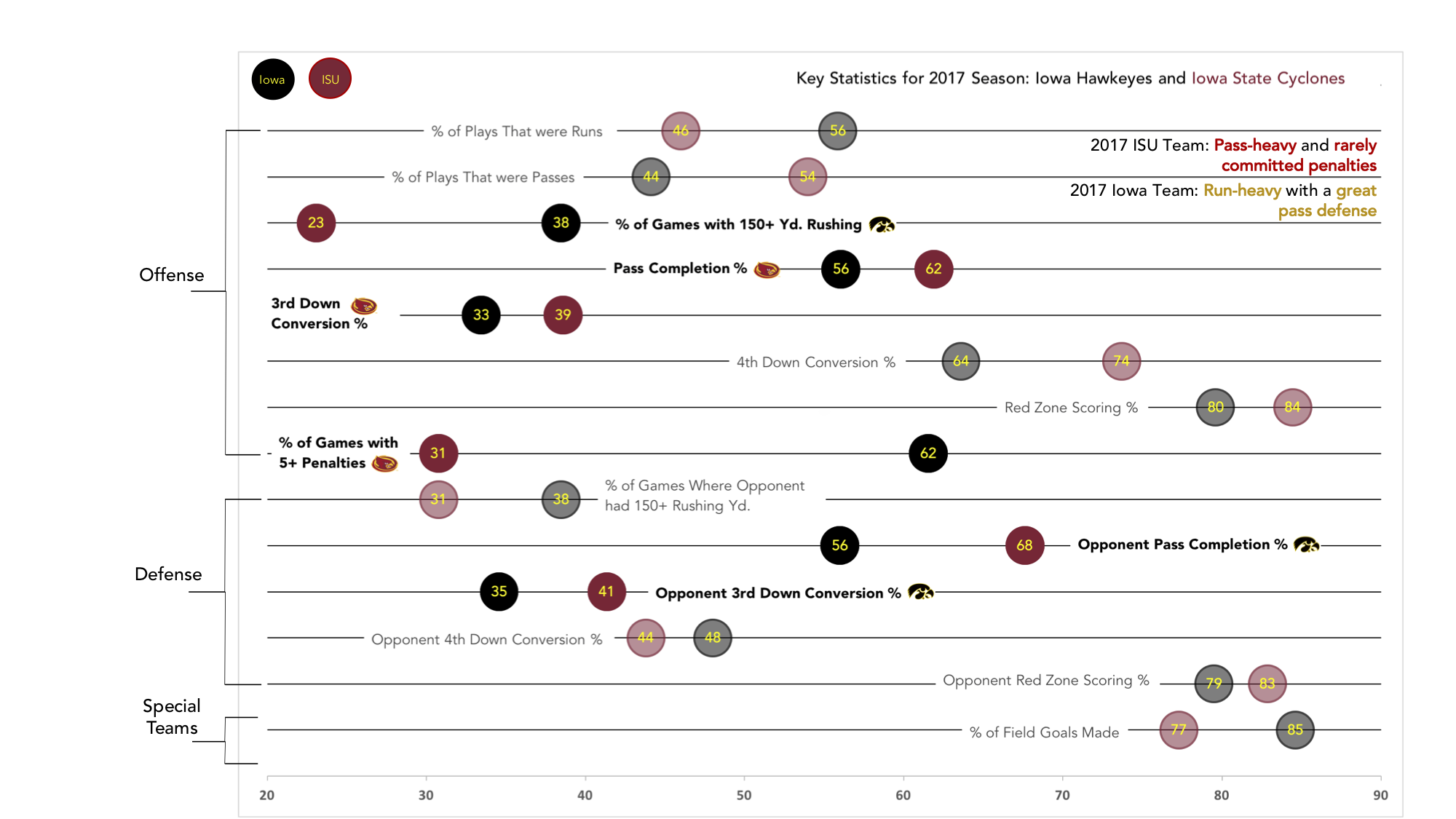
As a current MBA student and a former undergrad at the University of Iowa, I wanted to dedicate this month's SWD Challenge to Iowa's upcoming college football season. Football camp kicked off this week and the start of the season is right around the corner. I wanted to look at how Iowa stacked up against their in-state rival Iowa State last season, considering the face-to-face showdown was a thrilling 44-41 victory for Iowa in overtime. The two teams play very different styles of football (and play in very different conferences in terms of philosophy), yet both ended up with 8-5 records. Both teams lost to teams they shouldn't have lost to (Purdue over Iowa, Kansas State over Iowa State), and both won games that shocked the nation (Iowa over Ohio State, Iowa State over Oklahoma). Given the variation in style of play, and similarity in both head-to-head competition and season-long results, I thought it would be interesting to visualize both teams' 2017 season using a Cleveland dot plot chart. I plotted key offensive and defensive statistics - all in terms of some sort of percentage - on the Cleveland dot plot chart. Dots corresponding to statistics that seemed more significant to each team's success were bolded to help the reader identify key insights. For these key stats, I included the 'winning' team's logo for quick interpretation of which team had the better result for that particular statistic. Statistics that were interesting but not vital to a team's success were made slightly transparent to de-emphasize. Stephanie Evergreen's post about creating dot plots in Excel was extremely helpful, and I followed her instructions to generate this plot. Here are the key insights from the dot plot:
- Iowa State is more pass-heavy, and have better results in terms of pass completion percentage.
- Iowa State is better at converting on both 3rd and 4th down.
- Iowa State was incredibly disciplined in terms of not committing penalties relative to the Hawkeyes.
- Iowa's pass defense was fantastic compared to ISU, allowing a significantly lower pass completion percentage
- Iowa is a run-heavy team and had significantly more games with 150+ rushing yards
In summary: A pass-heavy team that rarely commits penalties and a run-heavy team with a great pass defense can have very similar seasons and can make for one entertaining head-to-head game.
Kat
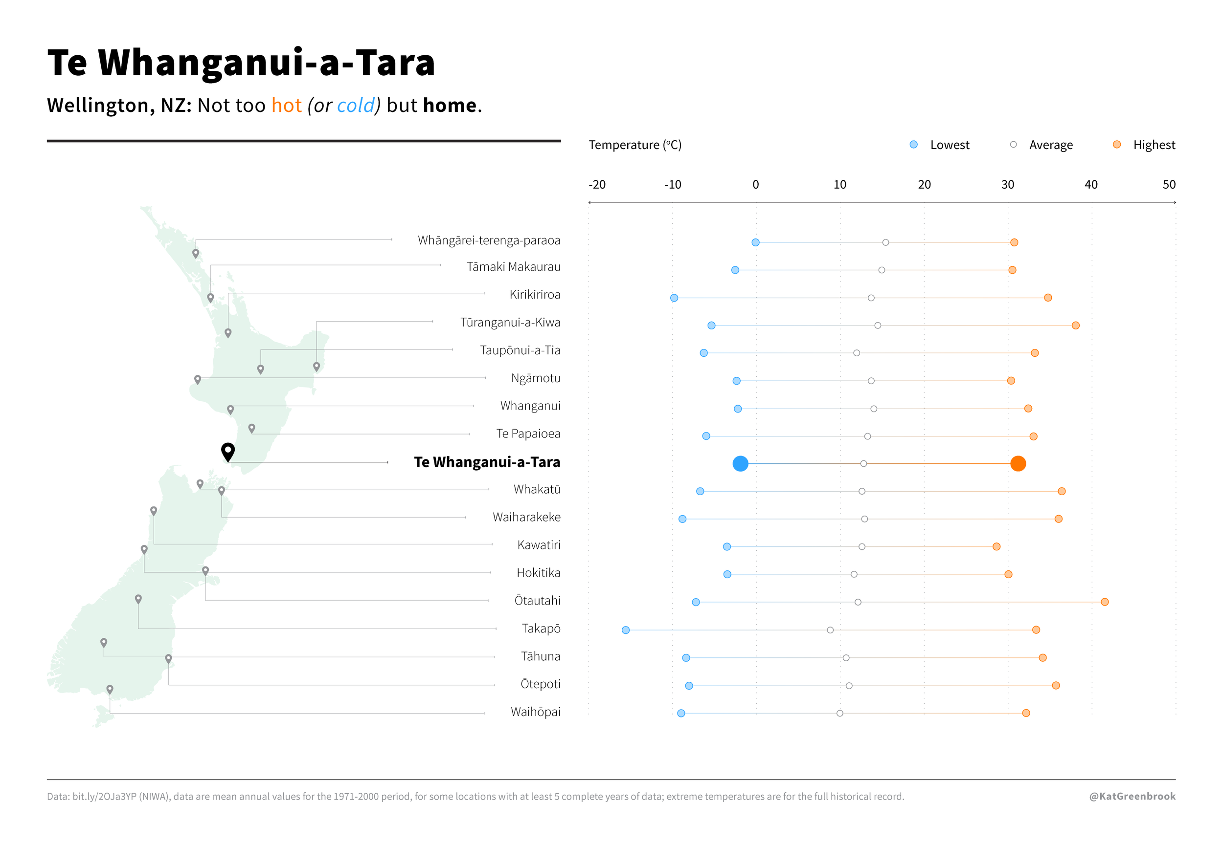
This month's #SWDchallenge is a spotlight on the city I now call home: Te Whanganui-a-Tara - also know as Wellington, New Zealand Created using Adobe Illustrator.”
Lea
A client engaged me to help their stakeholders clearly understand how their company's apps were performing in the app store vs. their top competitors. A dumbbell dot plot worked perfectly for this to show top rankings on the right and lower rankings toward the left and both rankings on four separate category lines. I used nothing more than Excel to create this and referenced a dot plot tutorial by Stephanie Evergreen. The font scheme is the Open Sans Family.
Blog | Twitter | LinkedIn
Leigh
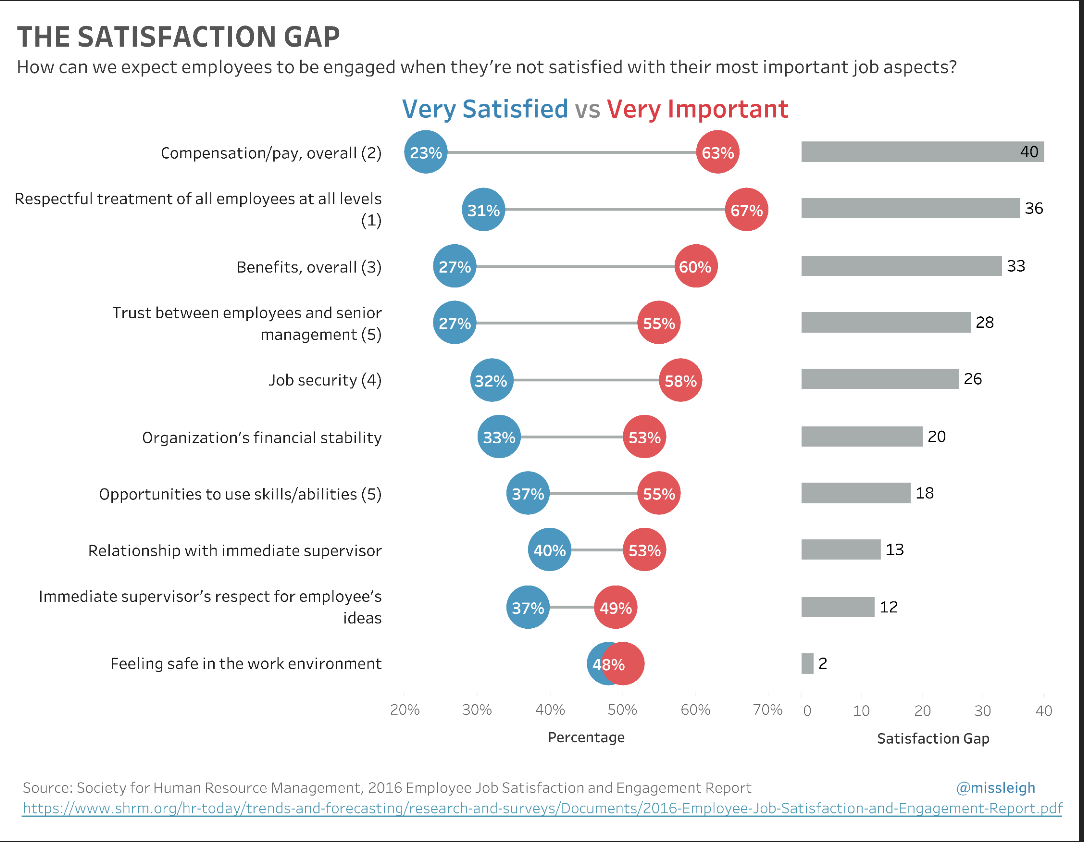
This piece was part of an analysis and presentation for the Professional Business Women of California on Employee Satisfaction & Engagement.
Lisa
For this month's Storytelling with Data Challenge, I decided to make a connected dot plot using two points for each world condition category. The points (dates) for each category plotted are "then" and "now". I used Cole's client makeover dot plot as my example to follow. I chose to visualize data from Hans Rosling's book, "Factfulness". The dot plot message communicates a data story that shows that our world might actually be getting better instead of worse. I used Tableau to create my dot plot. I created a filled circle chart and added an annotation between the two circles in order to keep the category label close to the data points. I created a set for the "then" dates and changed the circle color to match "then" in the title in order to achieve quicker cognition for the audience. I did the same for "now".
Louise
I would consider this to be a combination of the Cleveland and Connected Box Plot so I guess just another variation? I think in this case with just one it’s relatively easy to pick out the most recent period and means colour is not necessary to distinguish between the periods, so can be used for a different insight.
Tableau Public
Mahfooj
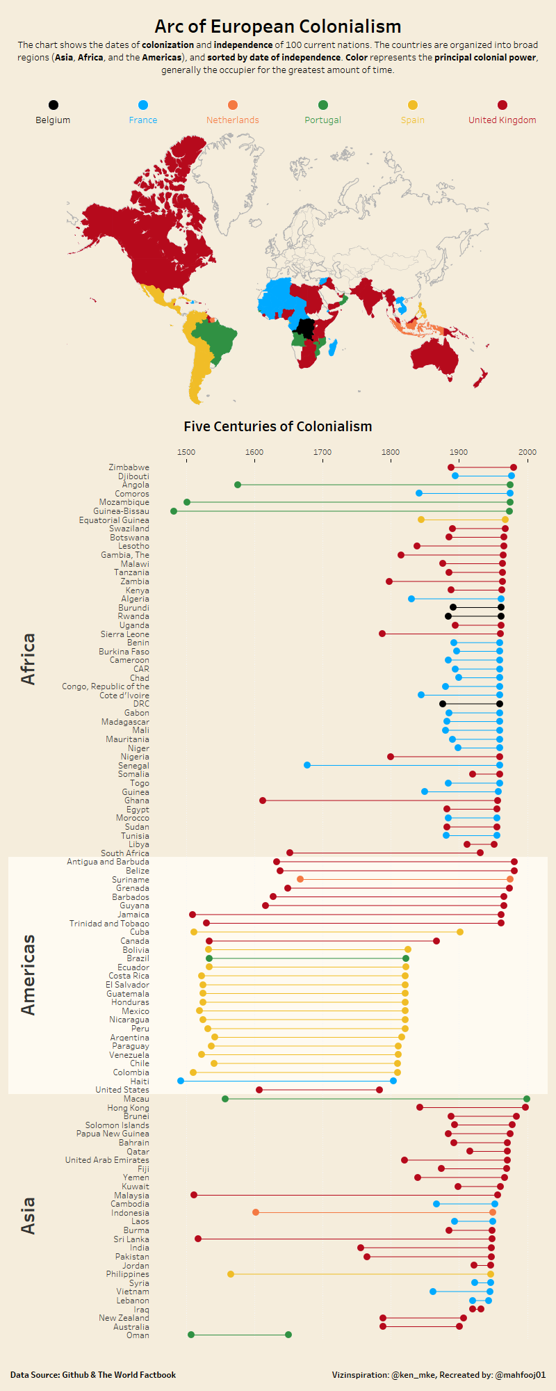
The chart shows the dates of colonization and independence of 100 current nations. The countries are organized into broad regions (Asia, Africa, and the Americas), and sorted by date of independence. Color represents the principal colonial power, generally the occupier for the greatest amount of time.
Interactive viz
Mark
Here are female employees at tech companies along a 100% axis.
Interactive viz
Marta
The dot plot presents gender gaps in voting in general elections in Europe with data from the 8th Round of the European Social Survey, using R and the e-ssurvey package (among others). Gender gaps in voting are calculated as the ratio of declared election turnout among women divided by the election turnout among men. Countries are sorted according to the descending order of the turnout ratio. Values above 1 indicate that more women went to vote than men. This is the case e.g. in Russia, Estonia, and Slovenia. In Czechia and Italy turnout was higher among men than among women.
Blog
Michael
My submission is a part of #MakeoverMonday and focuses on the Big Mac Index. I wanted to show the vulnerability of certain currencies, for which I think the connected dot plot works great. To emphasize the most recent value I changed the dot color to blue. Other dots (as well as the bar) are white to deemphasize individual dots. For easier read-out, the background is colored according to over- or undervaluation - instead of just using a zero line. To make the chart look more complete the background shading is extended to the title as well. If seeing the range of valuation is not enough, a trendline will appear in the tooltip when using the interactive version.
Nick
I chose this data because I through it would be fun to see the different outliers over time and check out the days in the wintertime that I could play golf on. One of the interesting things I saw in the viz was since 1964, there has only been one day in the month of August that has been under 60 degree. Thanks again for the fun challenges that help us use our data tools in ways we normally wouldn't.
Patricia
For this month's #SWDChallenge, I tackled the change in Gender Inequality Index of the OECD Countries using a dot plot, using the same dataset I used for a project I did recently for graduate school. It's interesting that dot plots show a different kind of story and I could see the uses of such kind of plot. For instance, all of the countries improved their GII but we can clearly see some countries made bigger improvements compared to others. I used Python/Plotly here.
Paul M
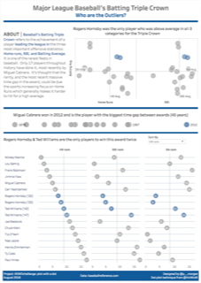
Major League Baseball’s Batting Triple Crown - Who are the outliers? It’s a small dataset, so like you mentioned in your post, I thought it would be good to viz with dots. Tableau Public: Major League Baseball’s Batting Triple Crown - Who are the outliers?
Paul W
I visualized what I'm calling the "LeBron Effect" - LeBron James' impact on points per game for teams that he's currently on and what happens to those teams when he leaves. The dots compare each team's average points per game against the NBA team average. By combining the dots with a timeline, and using separate rows for each team, it becomes obvious that teams have done much worse in the seasons after LeBron has left. This doesn't bode well for the Cleveland Cavaliers this coming season. This viz also brings a new meaning to the term "Cleveland" dot plot.
Interactive viz
R.J.
Sana
My first ever submission to the #SWDchallenge based on the topic of toughest sport by skill.
Interactive viz
Sara
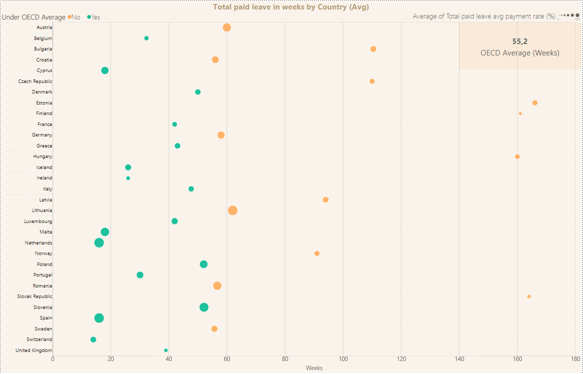
I used Power BI to help me explore the parent leave in the OECD dataset. For that I decided to split the countries by being under or above the OECD average for paid leave in weeks. We can see that Lithuania has 100% total paid leave payment rate and it is above the OECD average number of paid weeks (62). Is that better or worse for the children than Estonia that has in average around 50% payment rate for 166 weeks? SOURCE: OECD
Silvia
This data visualization is a makeover of this chart available on Wikipedia's English page about "Hearing range". I took the data from Wikipedia and put it in Excel, then created the visualization with Tableau Public. As in the original chart, I used a logarithmic scale, otherwise the small differences of values in the first part of the scale wouldn't have been visible. At first, I thought I shall maybe put the focus on humans' hearing range compared to other animals. But then, I decided it'd be nicer to just give readers some surprising facts about hearing skills in animals and let them wonder "how would it be if humans could hear the sound of clouds like elephants, or fly without seeing like bats?"
Personal website | Twitter | Interactive viz
Simon B
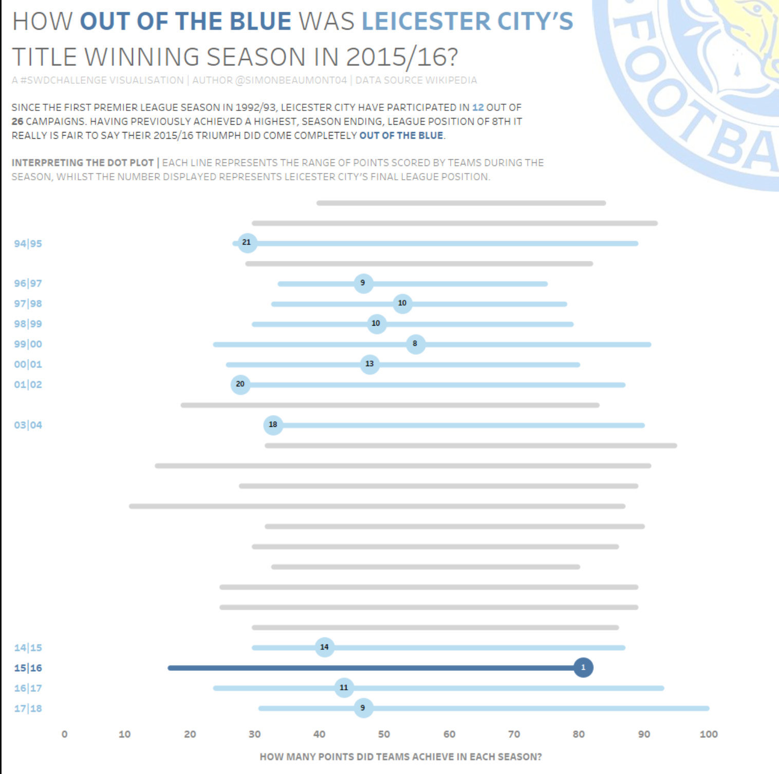
For my dot plot I looked at the spread of points achieved by teams in the English Premier League, since it first began in 1992/93 and then highlighted those achieved by Leicester City. The reason for choosing Leicester was they recently won the title and many people viewed this as a once in a generation achievement. By highlighting the points of Leicester I was able to draw attention to their Premier League history, whilst putting it in the context of the range of points across all teams for every season. Lastly I added some context by quoting the league position in the highlighted dot and colour coding the seasons to identify those years that Leicester were not playing in the Premier League, due to a previous relegation.
Simon R
For this month's challenge, I looked at the disturbing rise in knife crime in London. I used the dots to shows the differences between the two periods and also added a percentage difference heat map which I used to order the Boroughs.
Steve
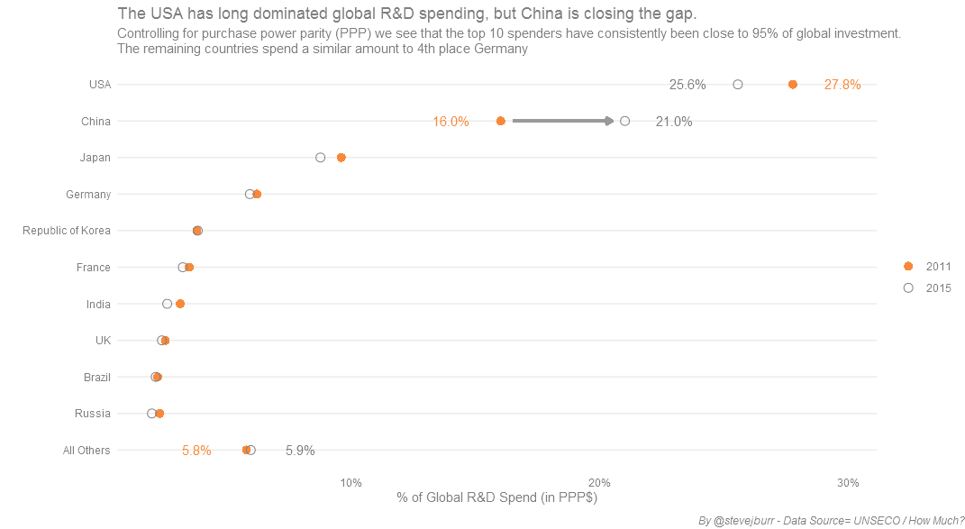
This visualization was produced as part of Makeover Monday this week - which was remaking a bubble chart showing global R&D spending by country. This was done using ggplot2 in R - I decided to focus on only the top 10 countries due to the long tail of smaller countries being really hard to show on one static chart. I wanted to add a change over time element, in contrast to the original single year view, and this informed my main take out. I added an arrow to draw attention to the same point as my title. When I've talked about dot plots with one of my colleagues, he said he often struggles with them due to colour-blindness, and so I always try to encode the different categories with both colour and shape to make this easier.
Sumeet
Here is my submission on Dot Plot Viz. I have used Tableau Desktop 10.5 to create this viz.
Interactive viz
Theodore
This is my first submission to #SWDchallenge, trying to learn more about data viz and figured this was a great way to do it. I moved to Chicago in the last year so I thought this might be interesting. I plotted the average number of riders for each day of the week for some 'L' stations in Chicago. The green dots are kind of like downtown-ish type places. The pink dots are the two main airports of the city. The blue dots are the central stations for two close by neighborhoods. I just kinda randomly chose these stations that seemed to have connections and interesting variation. I wish I was more familiar with matplotlib to be able to add a better description on the image somewhere, but oh well.
Tiago M
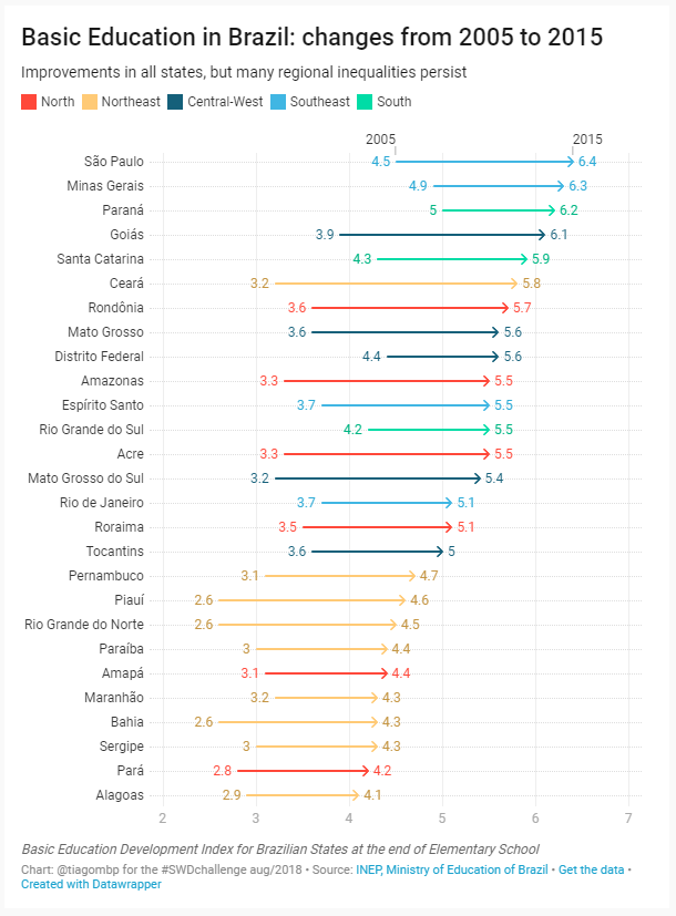
After reading Cole's post, I thought that the dot plot would be an excellent option to show how some variable might have changed in time across several categories that could be grouped using color. I thought that this challenge was the perfect opportunity to give a try to Datawrapper, a simple online tool to create (beautiful!) charts for the web. I ended up choosing the "basic education index" ("Ideb"), which is the official education quality indicator used in Brazil, based on standardized tests taken by all Brazilian students at the end of each level (elementary school, middle school, high school) and on pass rates. The graph shows the evolution of the index measured at the end of elementary public schools from 2005 to 2015 for all Brazilian states. The colors indicate the state's region. Brazil is geographically divided in five regions, with the North (known for the Amazon Forest) and the Northeast (known for the beautiful beaches and arid countryside) being the poorest and least developed regions, whereas the South and Southeast comprise the richest states. Brazil is very unequal at every possible level and metric, and I think the chart does highlight some of the regional inequalities in the country, with many states from the North (red) and the Northeast (yellow) still lagging behind in education, but also showing that some states from those regions managed to achieve impressive improvements in this time frame, like "Ceará", "Rondônia" and "Amazonas".
Blog | Twitter
Tiago V
I used data from the 2016 US presidential election to create a dot plot showing the voters preference according to gender, age, income and party registration, among others. I chose the candidates political parties colors to distinguish between them (Trump - red, Clinton - blue). In case of a tie, a single purple dot was used.
Interactive viz | Source
Tim
Tom
The data is from the World Bank and ggplot2 was used to create the graph.
Young
For this month's #SWDchallenge submission, I use a connected dot plot to compare the sizes of genomes from various living things.
Click "like" if you've made it to the bottom—this helps us know that the time it takes to pull this together is worthwhile! Check out the #SWDchallenge page for more, including details on the next challenge. Thanks for reading!


