how YOU visualized it
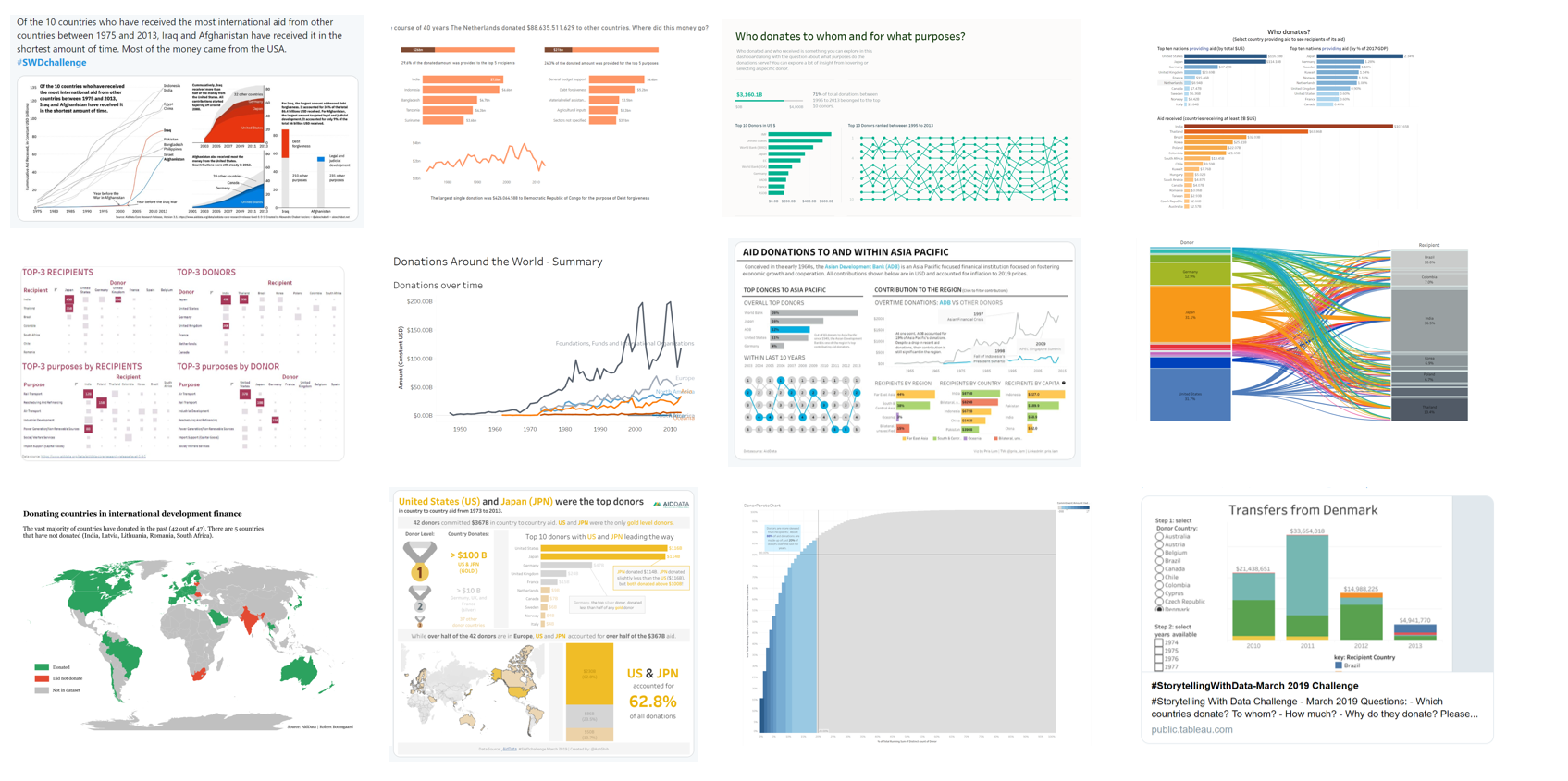
A sampling of the many visuals created this month
The March #SWDchallenge took on a slightly different flavor. Rather than summoning you to try a certain graph type or approach, this month’s goal was effectiveness. We sought to see how people varied in answering specific questions about the same dataset. Data was sourced from AidData in partnership with Enrico Bertini, Associate Professor at NYU, who will be undertaking some data visualization research based on this challenge.
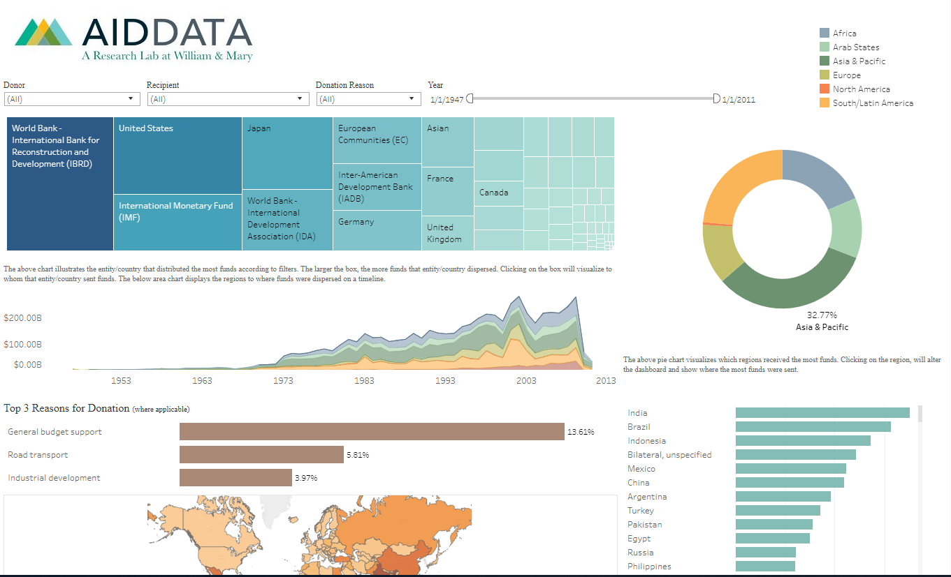
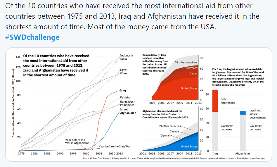
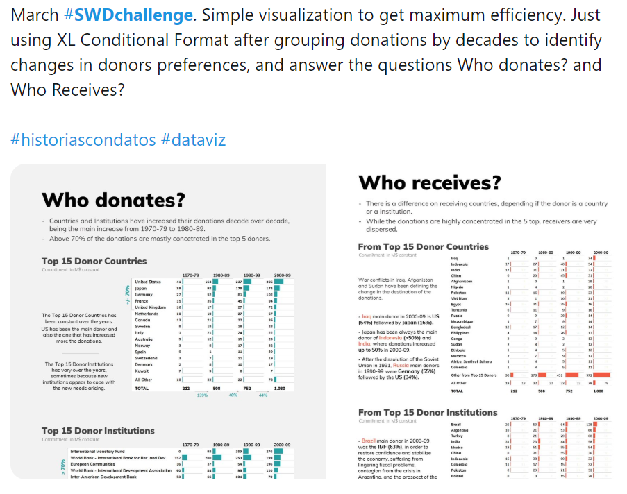
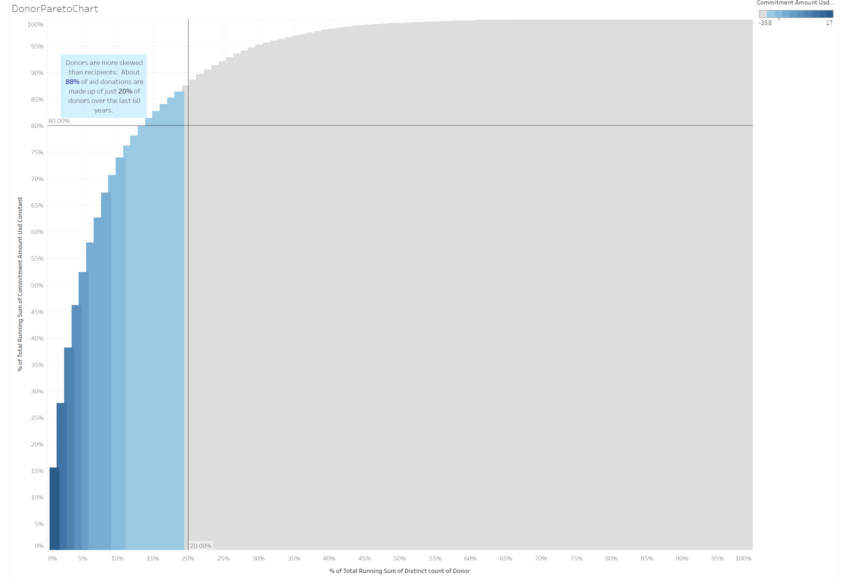
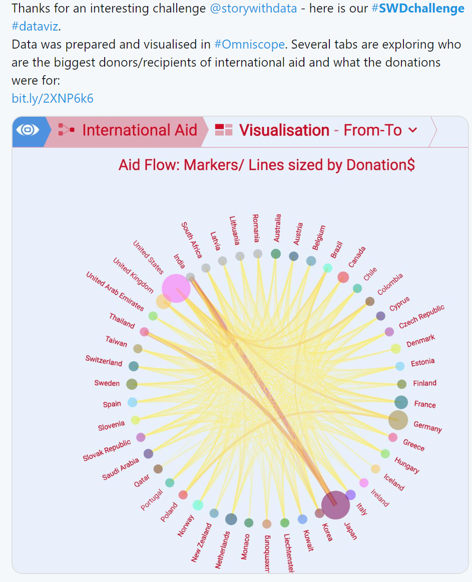
Sixty-nine people submitted a response to answer the primary question posed (“Who donates?”) and related sub-questions on the interesting patterns in the distribution across countries and recipients. With so many ways to visualize same dataset, you’ll see evidence that there isn’t a single “right” answer when it comes to how we show and communicate with data. Data can be visualized in countless different ways and by varying views of the same data, we enable our audience to see different things.
To everyone who submitted examples: THANK YOU for taking the time to create and share your work! We aren’t going to call out specific entries this month, so as not to introduce bias. By participating in this month’s challenge, you’ve helped Enrico push forward some important research. We’ll be sure to share more on that front once it’s available. The submissions below are posted below in alphabetical order and include the link to the original Tweet or interactive visual.
We encourage you to scroll through the entire post and be inspired by your peers’ approaches to this challenge! Spoiler alert: inspiration will be a central theme in the next challenge, which will be announced on April 1. Until then, check out the #SWDchallenge page for the archives of previous months' challenges and submissions. Happy browsing!
Alex
Alexandre
Ana
Anand
Anna
Anthony P
Anthony S
Arthur
Ash
Ben
Bill
Cameron
Charles
Dashibodi
Declan
Dennis
Dmitry
Edwin
Equal Pay Act
Fiona
My approach to this challenge was to answer the question based on 2013 data, looking at who the top 10 donors are, who they have made donations to and for what causes. One thing that I have done differently was to group the purposes into broad categories to give us a rough idea on what efforts the top 10 donors are focused on contributing to. (I am looking to write a medium post about my approach soon.
Geoff
Gianni
Gordon
Haley
Impacsis
Ioannis
Jaclyn
Jayleen
Joakim
Johanie
Jonas
Joost
For this month’s challenge I decided to use Power BI as an opportunity to get more familiar with DAX. I focused on all donations by The Netherlands to other countries. Because there are a lot of recipients and a lot of purposes in this dataset, I decided to show only the top 5 recipients and purposes. But because this shows only a part of the picture, I also wanted to visualize the part of this top 5 in the total amount. I did this with the stacked bar chart and the accompanying text. The interactive visual can be seen here.
Kate
Kubasova
Lora
Lorenzo
Michiel
Mohit
Narendran
Natalia
Pallavi
I have visualized a simple line chart with a cumulative sum of $ metric, for the Top 5 Donor countries, to answer the 'Who Donates' question. The visual plot shows that since 1973, United States has been donating the highest $. However, it also shows that Japan is closing in on the Top spot, and likely already has.
Patti
Pragyansmita
*link
Pris
Rebekah
Rob
Robert
Rodrigo
Thanks for the challenge. Developed a little mobile first visualization that allows people to select their country and check the top donors, the total cumulative over time and also how they distribute geographically.
Link
Rolando
Royce
Ryan
Sam
Samo
Sanaaya
Seonaid
Sohini
Steve B
Steve W
Suzanne
Taryn
Tereza
Tiffany
Timea
Vidya
Visokio
Vizu All
Vizzy
Wendy
Xan
Link
Click ♥ if you've made it to the bottom—this helps us know that the time it takes to pull this together is worthwhile! Check out the #SWDchallenge page for more. Thanks for reading!
