everyone's emulations
A sampling of “honorable copies” submitted
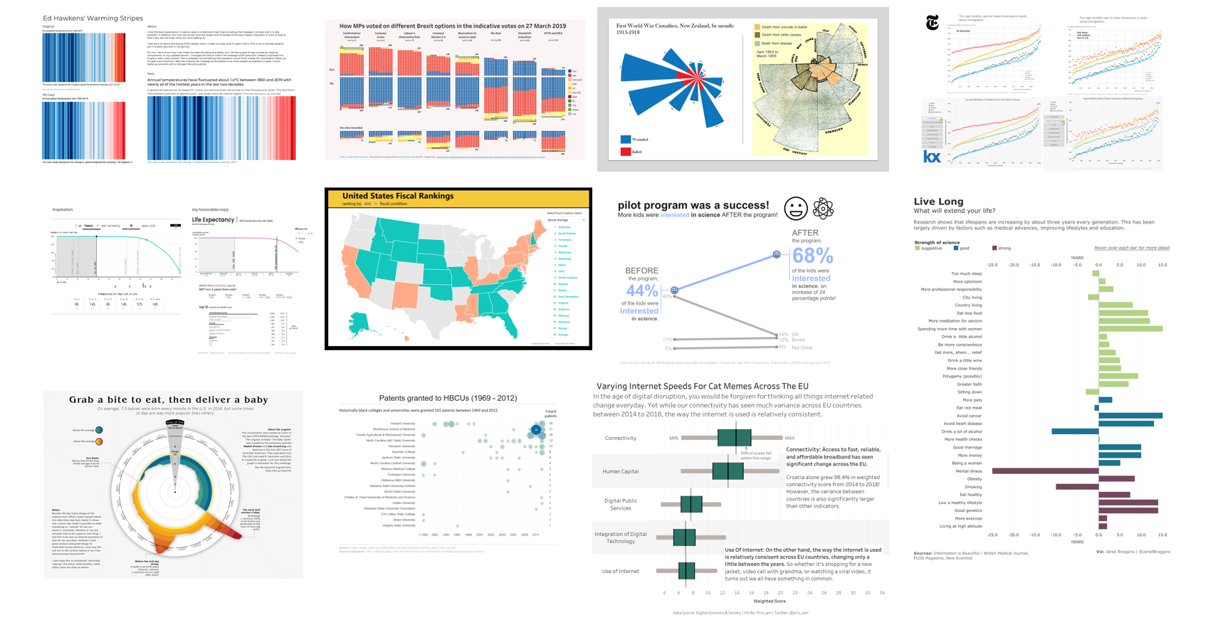
This month, we pulled inspiration from Austin Kleon’s book Steal Like An Artist and challenged you to emulate an inspiring visual of your choosing. Fifty-four people rose to the occasion! It was neat to see a common theme of “honorably copying” applied insightfully and many readers elaborated on the honorable piece with detailed insight into their thought processes of color choice, annotations and chart type.
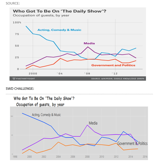
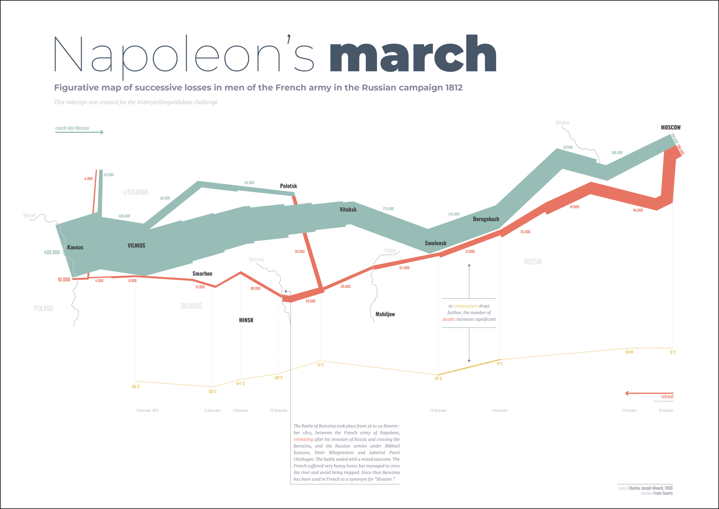
Popular sources of inspiration were Charles Joseph Minard (including RJ’s internal migration patterns and Frans and Lisa’s view’s of Napoleon's Russian campaign), FiveThirtyEight (Seonaid used Python to recreate non-fatal gunshot injuries, Liz added context to English Premier League teams’ makeup and Hamza chose a trend of The Daily Show guests over time) and even storytelling with data! Rolando and Ash chose visuals from the book and added their own flavor with additional context. Nadieh Bremer’s work was emulated multiple times: Moyocoyani used an approach originally depicting homeless relocations to visualize NBA player distributions, Kate recreated the Baby Spike viz, adding some amusing annotations (the original was created together with Zan Armstrong) and Jonas utilized a similar view for cycling data. Jared beautifully emulated David McCandless with a visual on lifespan influences and Pris prepared a nice boxplot of Trump’s approval rating inspired by Geoffrey Skelley.
To everyone who submitted examples: THANK YOU for taking the time to create and share your work! The submissions are posted below in reverse alphabetical order by first name (+ last initial when needed; we omitted full last names in respect of those who would rather remain anonymous). If you tweeted or thought you submitted one but don't see it here, email your submission (including your graph attached as .png) to swdchallenge@storytellingwithdata.com and we'll work to include any late entries this week (just a reminder that tweeting on its own isn't enough—we unfortunately don't have time to scrape Twitter for entries, so emailing is the sure way to get your creations included).
We encourage you to scroll through the entire post to be inspired by how others in the community approached this challenge (please click “like” when you get to the bottom— this helps us assess the time spent pulling together this recap summary).
Stay tuned for next month’s challenge which launches on May 1st. Until then, happy reading and check out the archives of previous month’s challenges on our #SWDchallenge page.
Zain
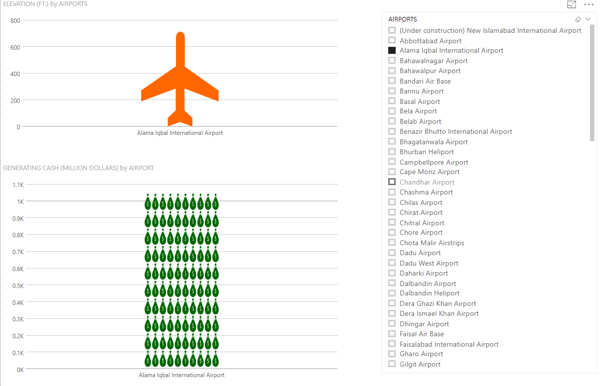
I have combined the revenue generated by airports in Pakistan as well as the elevation in feet in which their airplanes fly through the air.
William
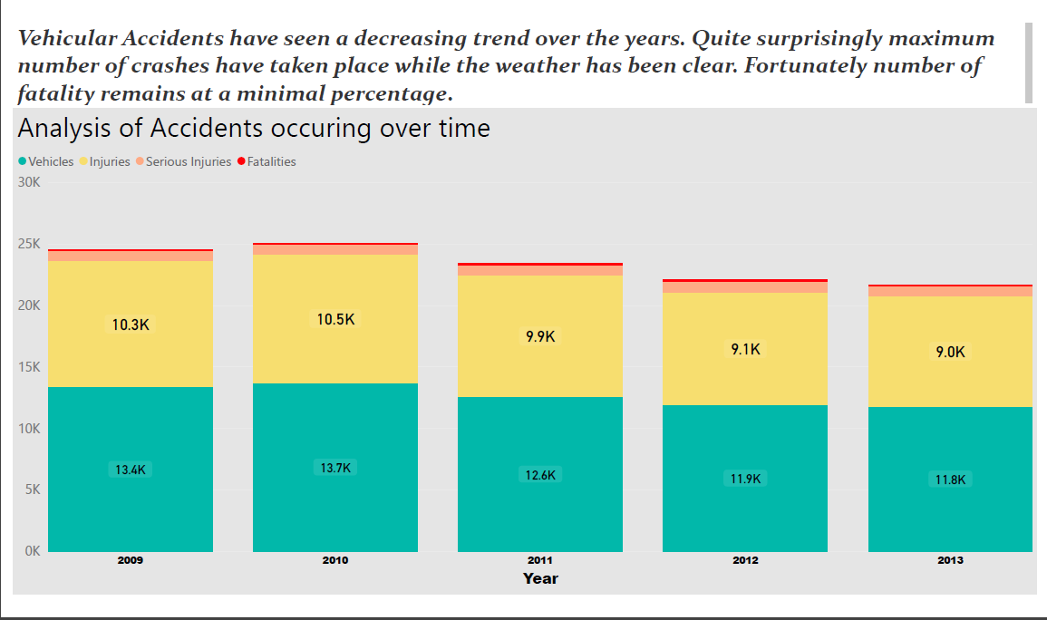
This chart is from the New Jersey page of the United Way 2018 report. I used Excel to prepare the emulated report, and learned some new techniques. Although the numbers are the same, I added color and moved the color legend above the chart for readability.
Vijaya
Talat
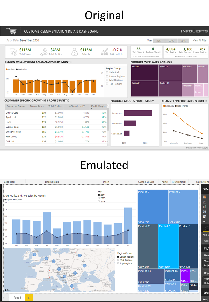
First, I tried to copy the same visualizations, and added some changes to further improve it. I inverted the charts for profit and sales. I used a line chart to represent avg yearly profit and a bar graph to represent avg yearly sale. Next, I shaded the area below the line chart, which makes it easier to grasp the profit percentage. The more the shaded area, the greater the profit. Also, the bars above the shaded area give an idea of the cost of products. Hence, the entire bar represents avg sale; shaded bar represents profit and non-shaded bar gives the estimation of the cost. Furthermore, to narrow down and refine the grain, I’ve also added a map that shows countries in a particular region. Users can further click on one of the blue circles on the map to see country-wise sales and profits. Also, to give a better idea of which product performed better, I’ve displayed the total sale price for each product.
Sualeh
Took Inspiration from: www.twooctobers.com housing visualisation.
Tools: PowerBI and Microsoft Excel
Dataset: Cricket Rankings ODI from kaggle.com
Idea: As the World Cup 2019 draws near, we wonder the ever so elusive question, what constitues as a good batsman? This is a comparative analysis of some of the top performers in cricket and their performance traits.
Sohini
Seonaid
For the "Emulate" challenge, I also chose to reproduce a recent FiveThirtyEight graph, this one looking at the uncertainty in the CDC's estimates for non-fatal gunshot injuries. The uncertainty has been increasing over the last few years, and "why?" is an outstanding question. I found the emphasis on the uncertainty in the data, (rather than the estimates themselves) interesting, and discovered that the design paralleled that emphasis in its choices of colour and line weight. I used python for my visualization, using the original data which is available from the CDC website.
Shaikh
Sandeep
I emulated a temperature anomaly graph over land ocean by NASA. I used PowerBi as a tool for dashboard.
Interactive viz | Twitter
Sabika
I have tried to emulate a global superstore dashboard using Power Bi tool.
Ryan
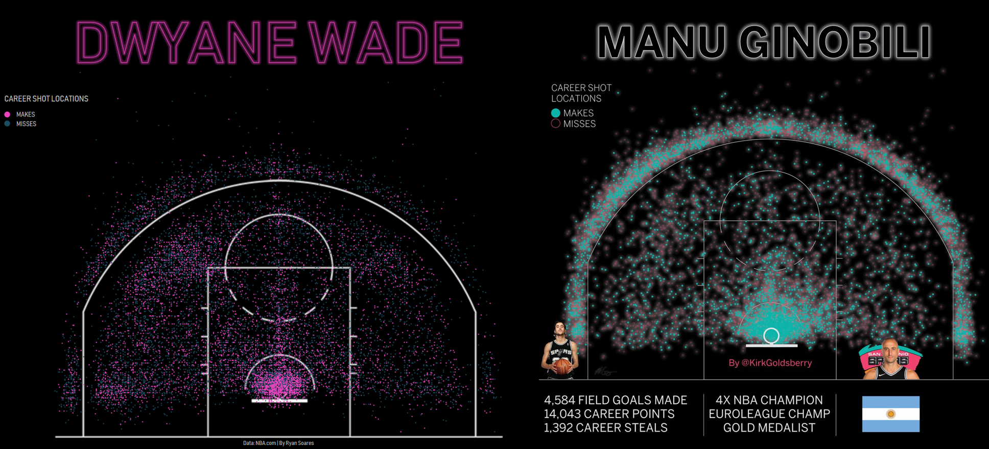
I have always loved Kirk Goldsberry's visualizations on basketball, particularly his shot charts, so I attempted to recreate his one of his designs. I chose this type of shot chart because of the neon look and because the black background makes the colors stand out well. It wasn't particularly hard to recreate in Tableau, however the finer details, such as the halo's around the marks, were more difficult to get exactly right.
Blog | Twitter | Tableau Public
Rolando
My inspiration is Cole Knaflic's chart from her book. I used Excel for recreating the DataViz. One of the key difference is the addition of a 3rd series, which is the 'Backlog' bar chart. I decided to add this so that the audience can quickly see the increase in backlog, without having them to calculate in their minds how much the backlogs where.
RJ
My favorite emulation is a piece for SIGNIFICANCE magazine that I worked on with Howard Wainer. It emulates the style of Charles Joseph Minard generally, and particularly his series on the transport of mineral fuels.
Blog | Twitter: @infowetrust
Pris
In response to the April SWD challenge, I took inspiration from Geoffrey Skelley's Trump Approval Rating chart and replicated it on Tableau Desktop using the DESI dataset used in an earlier MakeoverMonday challenge. I chose the chart because I loved how it simplified a box and whiskers chart to make it easy to understand for everyday audiences.
Penola
Tool: Tableau Public
Inspiration: Probability you will live x additional years from flowingdata.com Nathan Yau. The original visualization simulated random death events and real time histogram accumulation. Animation capability out of my reach using Tableau. What I liked about the inspiration was the whimsy & simulation.
Muhammad H
Found the original visual on PowerBI community, thought I could try it out in my own way, and so I did.
Muhammad F
I have recreated football players attributes visualization in the game FIFA 18. In the image attached, on the left is my visualization and on the right is the source. I used the Microsoft Power BI tool to achieve this task. The source data was provided by Tableau public sample data. The overall attributes were missing so I devised my own formula to calculate those statistics. This is the reason for some inconsistencies with the source image.
Moyocoyani
The plot was elaborated with python, more specifically by using the libraries of pandas, numpy and holoviews with matplotlib backend. Inkscape was used for the final edition. The dataset was not the same that the original authors used, instead I used "NBA Players by season" dataset. I decided to chose this work because I am a big fan of Nadieh Bremer's work, she's an inspiration. You can follow me at twitter @MoiYo
Mohammad
For the SWD Challenge, I worked on Houston Crime Data. The city of Houston provides high level details on crime statistics via Excel files on the police website. These statistics are stored in monthly files available via Excel or Access. The data set was used along with PowerBI as the visualization tool, in order to better understand the data.
Source | Twitter
Mishaal
I have emulated a tableau dashboard interactivity into PowerBI dashboard. Along with emulation, I've tried to improve the dashboard by adding some additional feature to enhance the effectiveness. It was a great learning process!
Michael R
For the emulate challenge, I am sharing a dashboard I created based on Adam McCann's Dynamic KPI Metric Design. I loved the simple yet effective design KPI card design, so I decided to apply it to a viz of my own with separate data. I was curious to see if Fortune Magazine's stock picks were actually effective - using Tableau + Google Sheets/Finance I created a tracker to see how each pick is performing relative to the stock price mentioned in the original article. An added bonus was the viz was selected as a Viz of the Day on Tableau Public.
Michael K
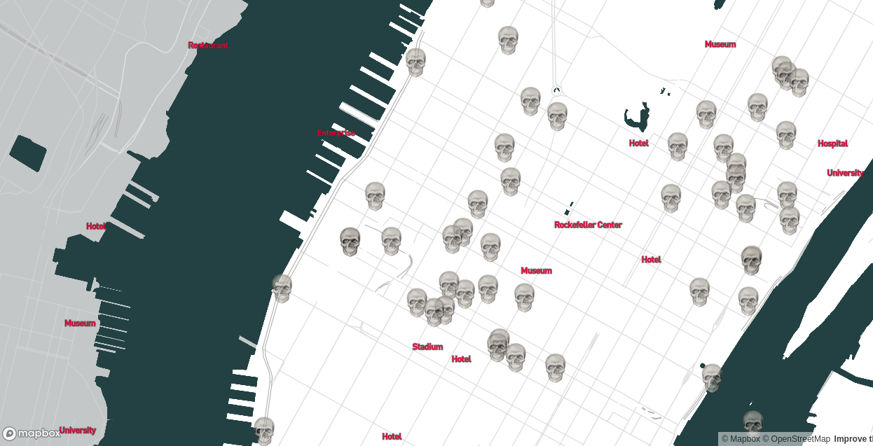
I emulated deathmapnyc by Zach Schwartz. This data tells stories, and is explorable while maintaining a sense of complexity. There's a lot to unpack and the dataset itself could be used with some other datasets that are publicly available for some interesting visualisations. I was fairly new to the technologies used, and web development in general. Most of what I learnt was about creating vector maps in Mapbox Studio, though I also learnt about handling files in Javascript and in Mapbox GL JS. Would have liked to put more functions in but ran out of time. I highlighted points of interest and removed streetnames, and used a different color scheme for NYC proper (white) and surrounds (grey). The background map is a vector map from Mapbox, and some features in the original are missing because the end up filtered out.
Maximiliano
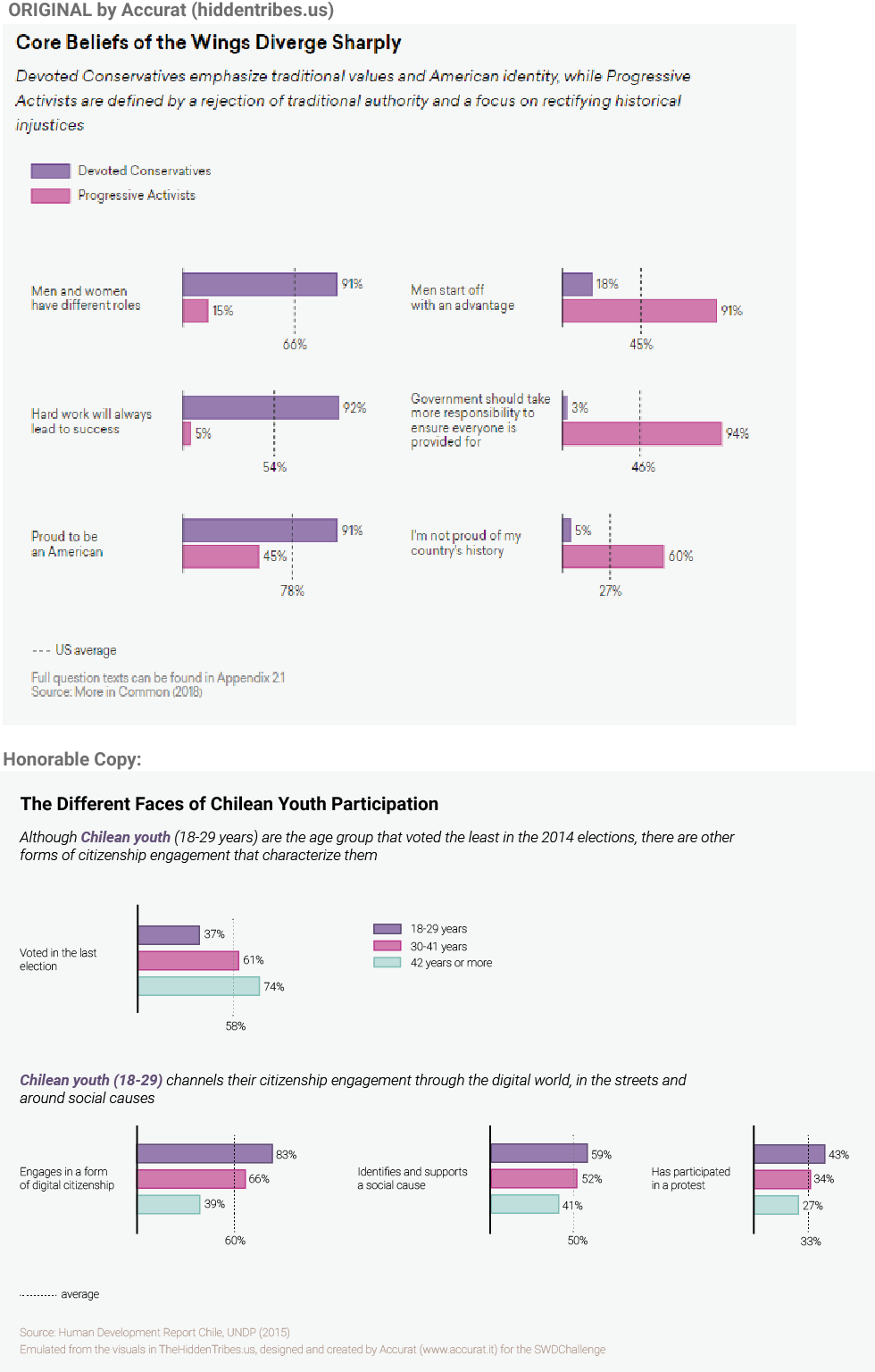
For my first SWDChallenge I remembered a visual report designed by Accurat about “The Hidden Tribes” of America. When I checked the report for the first time I really liked the economy of the visuals, the way they presented the averages and the emphasis in comparing extreme groups. So for this challenge I thought that I could emulate the style in order to present how chilean youth engages in different forms of citizenship. I think I still need to figure out my own style, to move beyond an ‘honorable copy’. However, doing this exercise, I learnt about selecting key variables to compare, the importance of short texts, and the alignment of objects. I used Illustrator to make this.
Markos
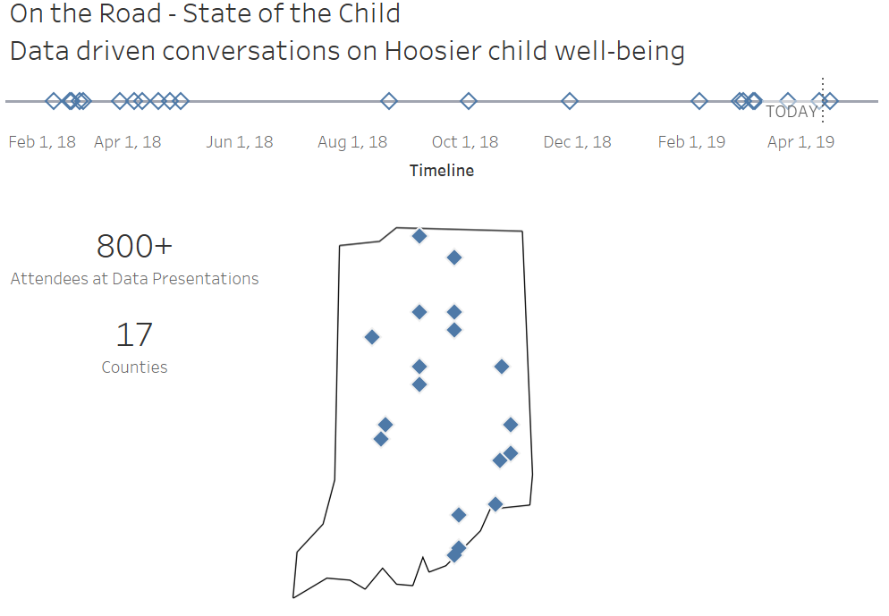
Here’s my submission for this month’s challenge: on the left the inspiration, on the right my output.
Blog
Lora
This month I worked to emulate the Mercatus Center. I really liked the clearness of their message and worked to simplify it a bit more, while still allowing for some interaction.
Interactive viz
Liz
I emulated the graph called "The English Premier League is increasingly less English" from this Fivethirtyeight article. I visually estimated this data and made the visual in Tableau. I wanted to keep Fivethirtyeight's original color scheme while getting rid of the grid lines. I also wanted to give more context around the three-foreigner restriction, so I used a call-out instead of just a label. I did this because without the surrounding article, just labeling the restriction would not add anything to the story.
Lisa
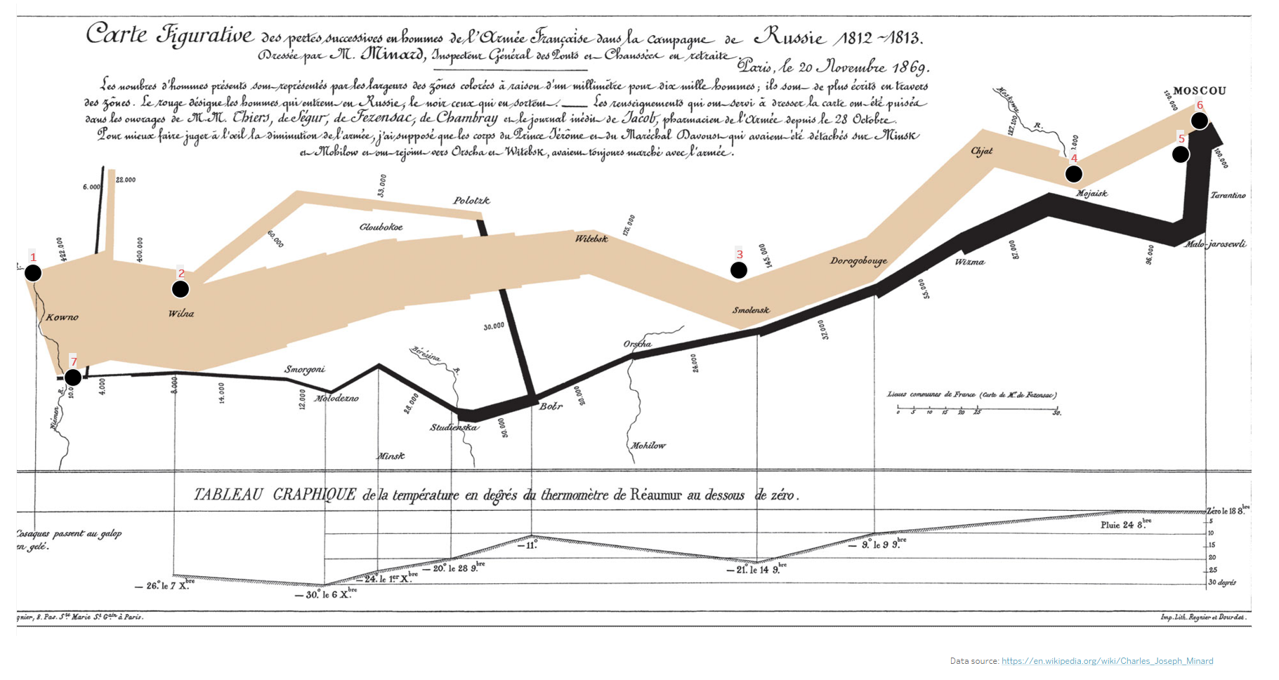
For this month’s challenge, I really wanted to emulate my favorite chart but I wasn’t sure how I could do this in a way that would bring honor to its creator, Charles Minard. I finally decided on the idea to add Viz in Tooltips as a way to understand more about the meaning of the chart. I used Minard's historical chart as a background image and mapped coordinates to the key events pictured on the chart.
Blog
Lance
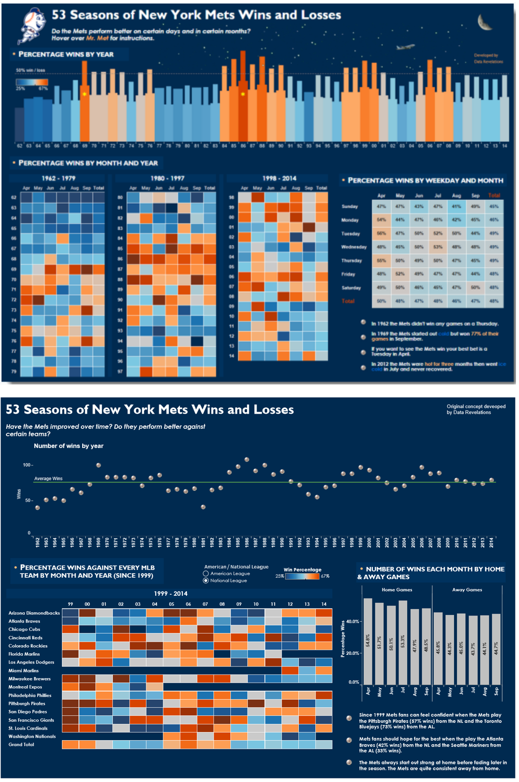
I used Tableau. The original (top) was developed by Steve Wexler (Data Revelations). Steve had a personal story behind how and why he developed his dashboard. I wasn't sure about being able to use the Mr Met logo so I just left it out. Also I struggled to find the data source Steve used so hopefully my referencing the original work is sufficient. Interested on your thoughts here. Some of my thoughts - Steve was very focused on the day of the week the Mets played (as it related to his story), I was interested in who they played as well as home and away performance as this is always an important stat for sports fans. I also thought I'd change up the skyline chart and simply swap it with some baseball icons. I played around with using a different colour background but in the end left it the same as the original.
Kate
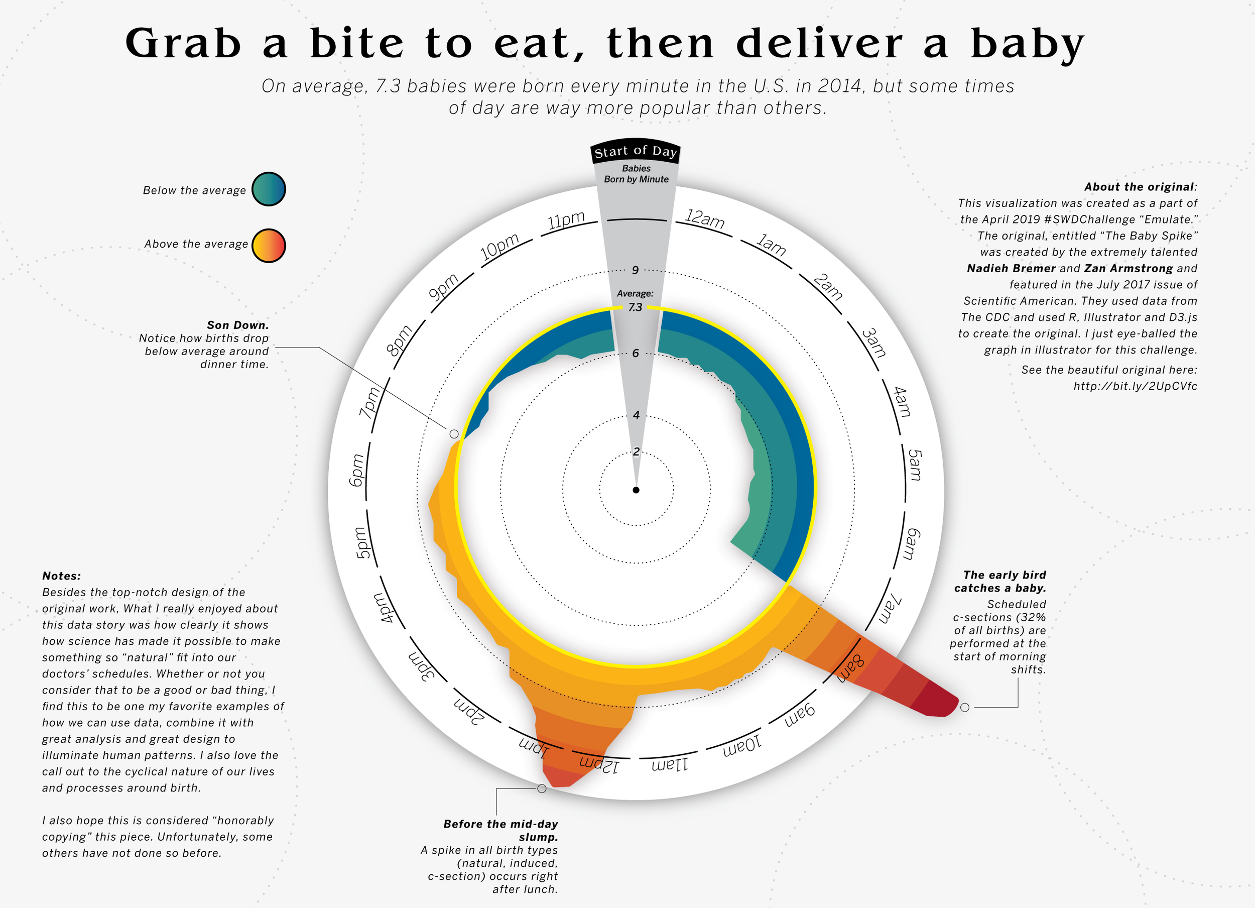
This month I emulated Nadieh Bremer and Zan Armstrong's award-winning "The Baby Spike" visualization. I've always loved this visualization not just for the stellar design, but the fascinating questions it raises about childbirth and medicalization. I love the use of the radial chart to display cyclical data. While I didn't play with any data this month (i just eyeballed this in illustrator) this challenge brought up a lot for me related to data visualization and our "human-ness" I write more about it in my blog here.
Karrie
My submission to the emulation challenged was made using Tableau. I was inspired by Andy Cotgreave's blog post on how to make art using your Strava Activity Data. Andy was inspired by Andy Kriebel's instagram post on the same subject. It's a double emulation!
Joost
For this month’s challenge I came across this blog post from Junkcharts. I think the author did a great job improving the initial visual and I like the creativity of his result. But I was confused by the random size of the parts in this visual. Then another chart came to mind which I saw recently, called a Gather Plot. I wanted to combine the way these areas are packed together in my emulation of the YouTube visual. I think it is great to see how we can combine elements from different visuals that we come across. This exercise is a good reflection on how much we can learn from "stealing like an artist".
Jonas
I'm happy to send you my entry to the April-challenge. It's based on the almost famous-now visualization by Nadieh Bremer and Zan Armstrong. I've modified the design slightly so that it transports the "cycling" topic.
Johanie
For this month #SWDChallenge, I emulated Eva Murray’s graph of #MakeoverMonday 2019W3. I was just starting at that time and I remember being really impressed by the story and the design of it. It was really a challenge to make all those annotations in R. More on my blog.
Jayleen
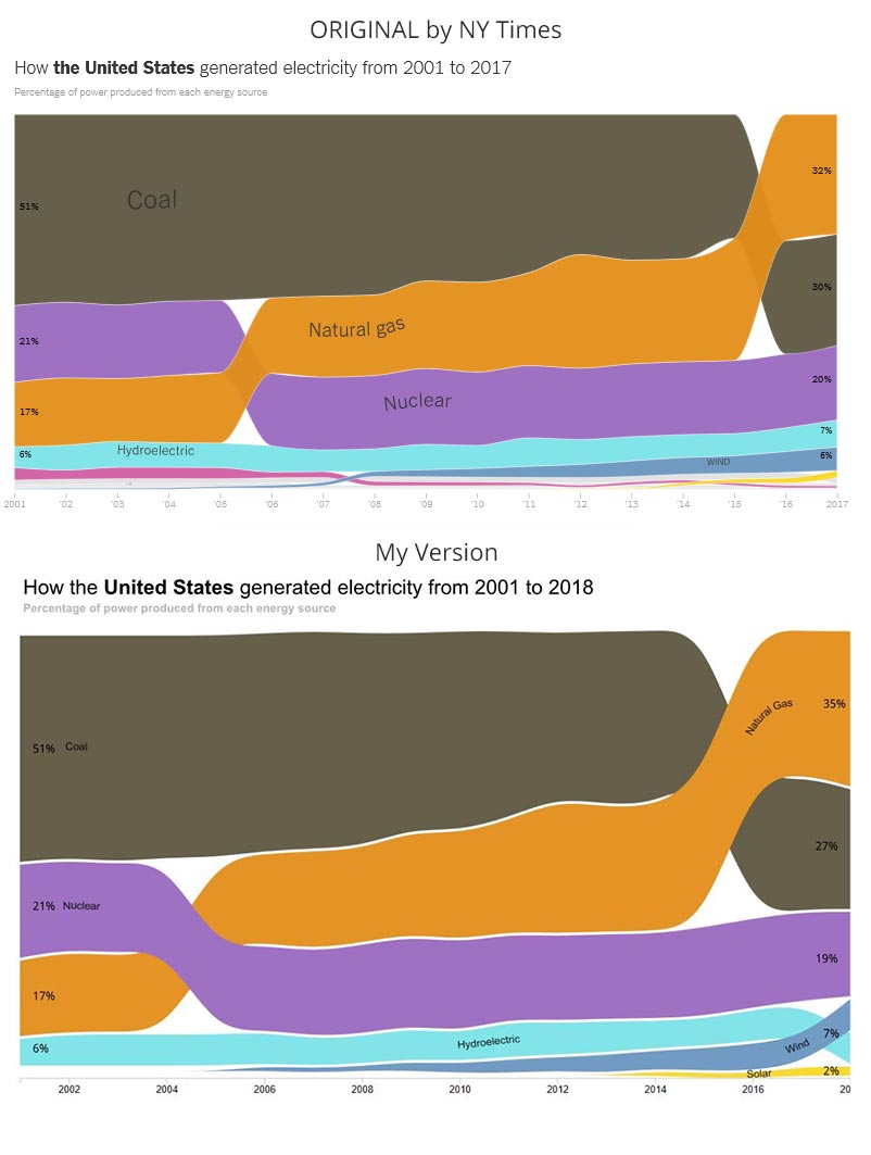
Original Graph by NYTimes (top) and my version (bottom). I did a Bump Chart & in my version included 2018 data.
Jaya
Here is my emulation inspired and my honourable copy.
Ingrid
I had a lot of fun engaging and learning new things in Tableau. I wrote about this challenge here on my blog and the dashboard is here. My dashboard was inspired by Ryan Sleeper’s "Where’s Ryan.”
Hayley
I have recreated The Economist's Big Mac index in Tableau using data provided by The Economist. I love the Economist, especially the Daily Charts and Graphic Details. I have decided that I want to share more work publicly and used the Economist's Big Mac index as inspiration for my first real Tableau Public submission. Although I started on this project months ago, it was put on the back burner until the latest Storytelling with Data (SWD) Challenge. I replicated The Economist's Big Mac index with some notable differences. I replicated all the calculations in Tableau and included the ability to use any country as the country for the base currency instead of limiting the options. I mimicked The Economist's clean style as much as possible. However, I removed axis labels and other elements that distracted from the visual. I did not include the ability to adjust the index based on GDP per person. I did not include the Index for the selected time period on the graph on the left-hand side. Instead, I focused on the index over time. I used one of Tableau's newest features, Set Actions. When a user clicks on a country, this creates a set containing one country. This country is then highlighted throughout the visual. When selecting a country, make sure not to select the country used in the base currency. I added tooltips and additional call outs to ensure that users can easily interact with the dashboard. With more time, I would love to put my own spin on the visual. I would like to include the currency symbol instead of the currency code. I would like to include a geographic visual and allow the user to filter by region. I would also like to call out the number of countries that are undervalued or overvalued.
The Economist - The Big Mac index | The Economist - The Big Mac index (GitHub Repository)
Hamza
For the #SWDchallenge, I chose a chart from an article on FiveThirtyEight. I used the data set provided on the GitHub repository of the website and Power BI to emulate the chart.
Frans
Finally one hour left to do a makeover. For the #swdchallenge I emulated a visual that I like (most). The famous visual from Minard. (perhaps some sanctuaries shouldn't be touched?). A few tweaks and a little annotation. That's all. #dataviz
Dennis
This month's #SWDChallenge was wonderful. It made me look at visualisations in a totally different way. It made me wonder what I liked about certain visuals and what I disliked about others. During the preparation of the challenge I gathered multiple visualisation I liked and wanted to emulate. Until I came across the one I eventually emulated. What I like most about the original visualisation is that it made me think. At first I thought it was a scatter plot, but looking at it again I found out it was more of a pivot/matrix. Most of the times a pivot/matrix is used to show numbers. Sometimes these numbers tell more of a story when they are formatted in a heatmap. I never thought about other ways to visualise a pivot/matrix, but this is one of those possibilities. It gave me a whole new insight. I also found out that my usual tool for visualisation (Power BI) didn't do the job making this visualisation. This inspired me to start writing a proposal with improvements for Power BI to make it an even greater product. Of course I didn't like all the elements in the original visualisation. The way the color is used, makes it look pretty but doesn't add anything to the story. I also noticed that my attention was first drawn to the two black boxes at the top, although these aren't the most important parts of the visualisation. Those two points are the main things I changed in my version of the visualisation. I still used color but this time in the way you would use it in a heatmap. I've also added the exact number in each circle as the main reason for using a pivot/matrix would be to shown exact numbers.
Declan
David
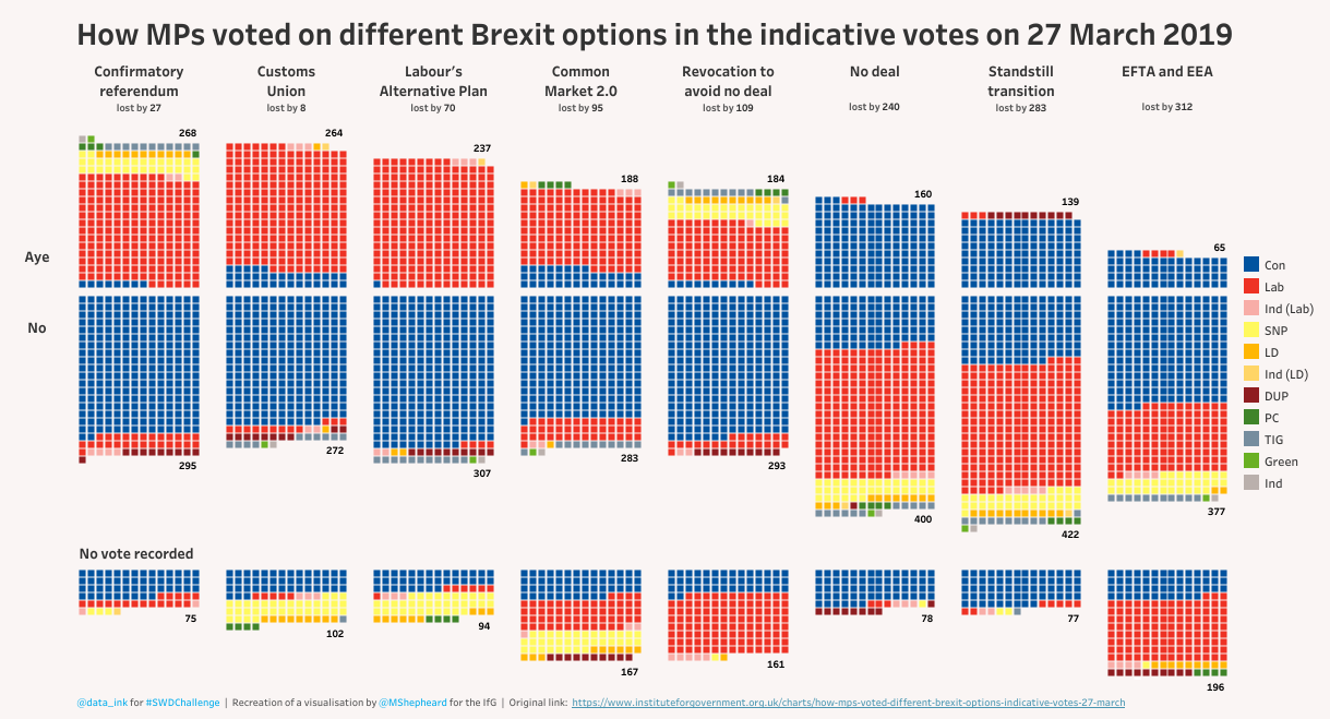
I was very impressed with the way the Institute for Government visualised the results of the recent indicative votes on Brexit and decided to emulate the visual in Tableau. The only tweaks I made were to move the titles for each option to the top of the graph and to include the overall result. My data source was different to the original and the numbers varied slightly, although this may be the result of subsequent clarifications.
Twitter | Link to original
Charles Su
I was inspired by the Tableau Community Contributor Lindsay Betzendahl and her work on Accidental Drug Deaths in Connecticut. I wanted to do a redo of a recent San Diego Crime data visualization I created. The crime viz was too busy with a spaghetti chart and didn't do a good job of telling a story. I felt that Lindsay's approach was clean, informative, and engaging. Therefore, I wanted to recreate her Drug Death view using my San Diego Crime data in Tableau. Some of the data inputs didn't lend well to yearly charts or histograms, so I swapped them out with panel charts which are one of my favorite chart types.
Charles Sa
I drew inspiration from Florence Nightingale's Coxcomb chart (also called a Nightingale's Rose) about death's from disease in the Crimean War. I made a similar chart looking at New Zealand's casualties from World War 1. This chart was absurdly difficult to make. I did my data preparation in Excel, used the stacked column graph tool in Adobe Illustrator, applied the Polar Coordinates filter in Photoshop, and finished the work in Illustrator. I think this is a great chart style for showing cyclical trends in data across a number of dimensions.
Brett
For this challenge I copied Ed Hawkens' Warming Stripes visualization. I used Excel to make both the copy and my updated version.
Ash
Arthur
For this challenge, I emulated a powerful chart which visually communicates the inequities of carbon emissions worldwide. A small percentage of the global population is responsible for a disproportionate amount of emissions and this shows how large that disparity is. From the original bitmap source chart, I created a vector based (SVG) chart using a JavaScript chart library (Blog). The original chart was dominated by text which made it less accessible and includes multiple axis that less technical viewers may be confused by. By integrating icons, simplifying labels, utilizing a category axis on x rather than a numeric scale and removing extraneous data, I hope the new chart communicates this important data to a less technical audience.
Antonio
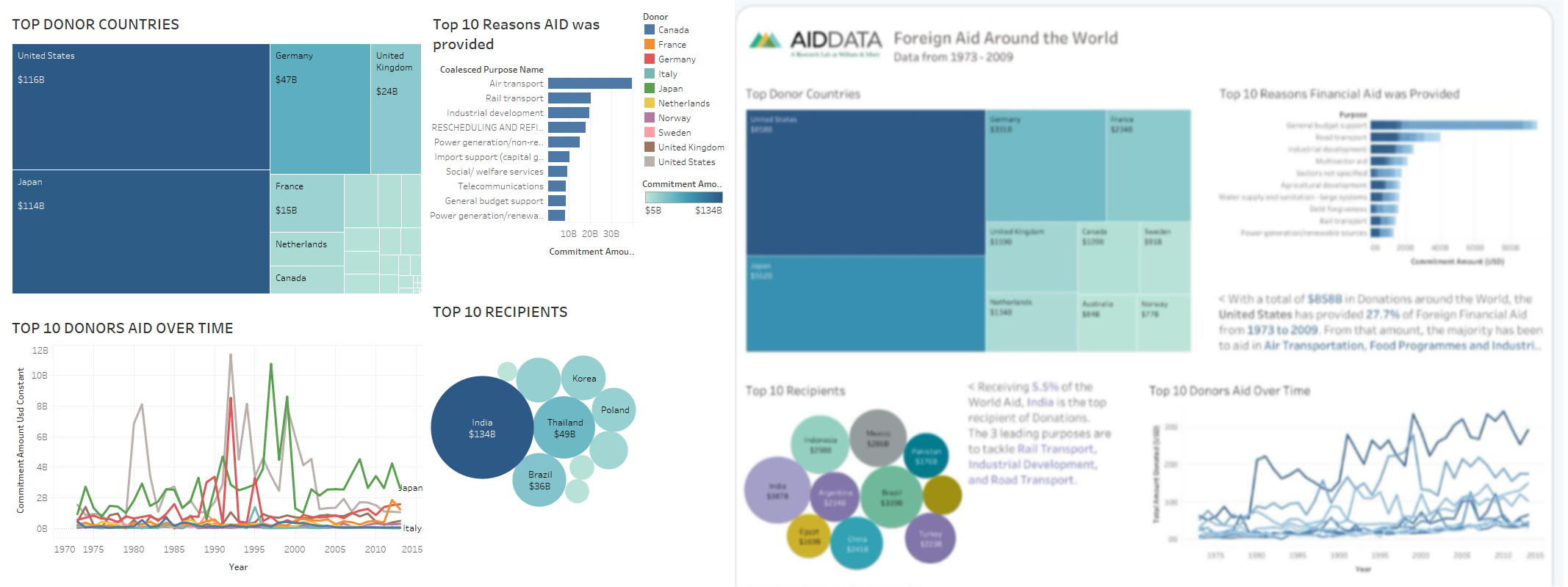
What I did was reduce the number of donor nations by creating groups by continent. In addition, the colors used reflect the logo. Twitter: @antoniousa11
Anthony
Andreia
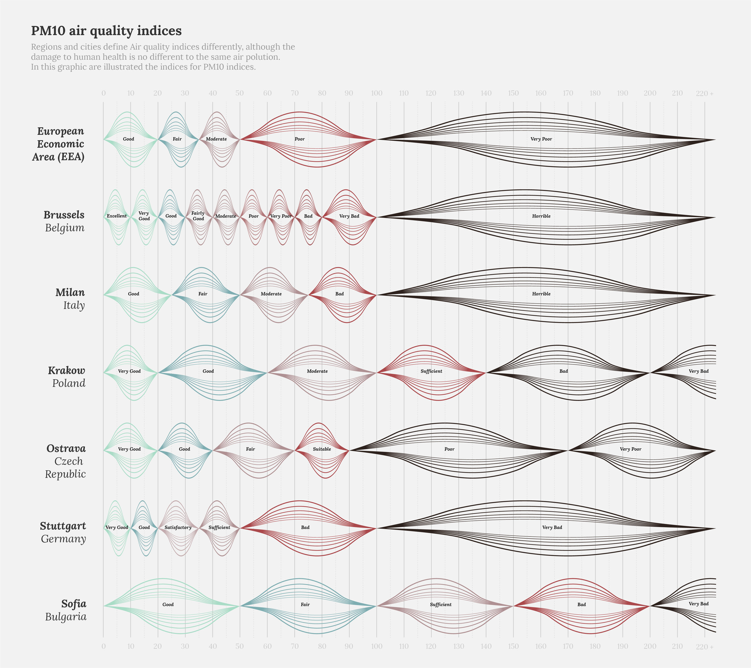
I selected a work by Federica Fragapane. I really like her work, so I thought it would be cool to imitate one of her views. The original work can be found here. I kept it pretty similar, made some visual changes and added a description and title. I did this with the Adobe Illustrator Chart Tool, created the chart, and then applied the design to the columns.
Ahmed
It's just a small dashboard that I like from "The big book of Dashboards" book. Created by Tableau and I wanted to try to copy it in Excel to generate the same interactivity.
Adam
Hot off the back of submitting an #Ironviz Europe viz, my #dataviz head was very much still engrossed with the topic 'Environment' specifically global plastics production and waste management. It therefore seemed fitting to give this months challenge 'emulate' to the striking headline chart showing the time line depicting 'global plastics production since 1950' produced by Hannah Ritchie and Max Roser for ourworldindata.org which inspired me to viz this topic for the ironviz competition. The original is powerful and clean however the full article provides plenty of context around issues and data to support this chart. For this months challenge 'emulate' i wanted to attempt to add a little to the chart in the form of annotations along with taking a few of the key takeaways from the article and adding them to this headliner as well as pointing the viewer to the full article for detail. How much plastic does the world produce?
Click ♥ if you've made it to the bottom—this helps us know that the time it takes to pull this together is worthwhile! Check out the #SWDchallenge page for more. Thanks for reading!
