you can take it with you
This month, we offered you an #SWDchallenge created by author, speaker, and technical evangelist Andy Cotgreave, and centered around the way more and more of us are consuming our information: via our mobile devices. While large-format desktop monitors likely won’t be disappearing anytime soon, we must consider mobile devices as a common form factor for all types of personal and professional communications—including charts.
More than 20 people took on the task of identifying a visualization they originally created for a desktop viewing experience, and re-factoring it to be useful on a mobile device. In doing so, they addressed several of the considerations that Andy set out in his challenge:
If the original was a dashboard, how would a user interact with a mobile version of it?
How should the limited display area of the mobile device be used?
Should the visualization scroll, or be displayed as pages, or be limited to a single screen?
Could a meaningful message be conveyed via a single static image, which could then be shared to social media channels like Instagram or Twitter?
The range of responses to this challenge impressed us all. Here are some thoughts from Andy:
The design space here is tremendously varied. Different people took a lot of different routes to solve the problem at hand. I saw examples of one or more of these techniques in every entry: simplification of the data presented; scrolling (both horizontal and vertical); animation; and forced scaling.
There were many creative approaches taken, all requiring a great deal of thoughtful revision from their originals (some of which were also shared, some we haven’t seen). Here are a few common themes that became apparent.
interactivity: consider the user
While we may want our users to be able to interact with our data, the form factor itself makes the way in which we approach this functionality different. It’s easy to be precise in pointing and clicking when the input device is a mouse or a trackpad, and when the screen is a big, high-definition monitor. But for a mobile screen, the input device is your users’ fingers, and the available real estate is far smaller; in this form factor, it’s nearly impossible for users to even see, let alone interact with, one specific data point in a scatterplot.
So for mobile devices, it’s often advisable to limit interactivity. Any remaining interactivity must be easy to see, easy to touch, and pertinent to the most likely question your audience would have when experiencing this visual. Every piece of real estate on your screen is precious: use that space for data, rather than for filters, legends, or explanations.
What techniques did our participants use to address this concern?
Bridget specifically increased the size of the elements on the screen that were meant to be interactive, while allowing the elements that displayed as a result of those interactions to be smaller and more precise. Colin and Liz employed similar techniques, also by decreasing potential overlap of interactive data points. Praveen created, in essence, a splash screen, where users first see a grid of buttons, each of which leads to a second screen filtered by that particular variable. Diana used a pinch-to-zoom mechanic to let users pick specific data points from a large field; Elizaveta used responsive design to make the charts appropriately sized and laid out for mobile devices; and Georgios used a drop-down menu.
display: what’s your first impression, and what else is there?
With such a limited space, we have to be ruthless editors of our visuals, and make hard choices about what information is truly worthy of being displayed first and foremost (or at all). We can accomplish this in a number of ways; a technique we strongly encourage at storytelling with data is to go analog: whiteboards, pen and paper, or sticky notes. Write down all the data, or all the charts, or all your interactions from your original visualization on sticky notes, and start throwing away the ones that are just “nice-to-have” until you are left with only the truly essential pieces. From there, figure out what the audience should see first, and make that the focus of the screen that first loads on mobile.
After you’ve done that, the next step is figuring out how the audience will see the rest of the remaining essential data. Dennis, Joost, Pris, and Will all felt that a vertical scrolling solution was optimal, and that is often a safe choice. Colin and Georgios used a screen-swapping solution, where clicking somewhere on the first screen loads up a second screen, with no scrolling required. The most interesting solution to me was Kate’s, which eschewed direct interaction altogether; rather, Kate repackaged the information as a standalone mobile-friendly video.
dashboards for social: does this even make sense?
“Dashboards for social” is a bit of a misnomer, actually; once we have created flat images (or animated GIFs, or even videos) that can be posted to social channels, we have now removed the interactive, exploratory element that dashboards are largely intended to provide. Instead, when we say “dashboards for social,” we’ve actually moved into the explanatory space, where we’ve identified something of interest in our dashboards, and we’re trying to convey that finding to an audience who needs to know it.
A few of our participants, like Johanie, Lance, Ligia, and Simon accomplished this by stripping their original dashboards down to a single screen, or in some cases a single chart, apiece. Elvira created two charts as static, square images, to facilitate swiping between them in an Instagram post.
Depending on the particular circumstances and requirements, distilling your story down to a tightly focused message that can be conveyed in a small area can be the perfect solution, if a challenging one to execute. Speaking of the challenge of constraints…
creativity loves constraints
Take it from Andy (who credits another Andy) himself:
The “constraint” of the small screen forces creativity. I’ve found that constraining yourself at the start begets new ideas. If you then scale out (to a desktop size, for example) your initial constraint makes the bigger version cleaner. This is an idea that Andy Kirk brought up in our last Data Viz Debate while talking about single-screen vizzes, so all credit to him.
We often find our most creative and groundbreaking solutions when we are prohibited from following our same old habits. Constraints force us to question our assumptions, demand that we abandon a reliance on “because we’ve always done it that way,” and focus our energies in a way that tends to generate work that winds up bringing us the most pride and satisfaction.
So thank you, Andy, for the specific constraints you levied upon us this month, and also to everyone who participated in the challenge (submissions below). Be on the lookout for the next #SWDchallenge, which we will announce in the first week of September.
Adam
FITBIT Daily steps
I love my FITBIT, I don't obsess over steps but keeping an eye on my general mobility during the waking day is a great indicator of whether I have been sitting staring at my computer all day or whether I have managed to move about, taking breaks or even sneaking in a cheeky lunchtime run. The standard Fitbit app doesn't quite give me the info I like to consume at a quick glance, but the data is steadily clocking up on a daily basis. All I have to do is tap into it through the great web data connector Craig Bloodworth of the Information Lab so kindly created - thanks!
This mobile viz challenge was great because it allowed me to think about the info I like to consume at a glance with ease. I wanted to design it with zero scrolling, and desired a one stop glance at a single month, be able to see the daily ebb and flow, plus added context to how my step count looks over a 12 month cycle at a higher level of aggregation (monthly overview) with weekly trends. Bish, bash, bosh. Thanks for the challenge Cole and Andy.
Bridget
SuperStore redos
The expanded version of my explanation can be found on my blog.
The short version is that I wanted to experiment with both complex and simple designs. One key source of inspiration for me is how websites convert their functions to apps (ordering pizza or food, mobile banking).
So I start from the place of what am I trying to do, what concessions need made, and how can I make this a pleasant experience. Details of this process are available from the post on my website.
Colin
Pre-attentive attributes game
Are you drowning in data and need some help to focus?
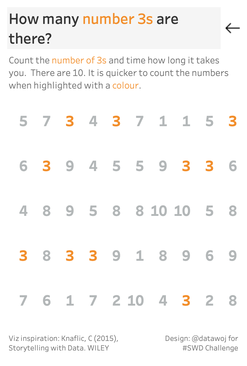
Our memories are tuned to notice visual properties such as colour, position and shape unconsciously. We can leverage these 'pre-attentive attributes' to highlight valuable insights which require action.
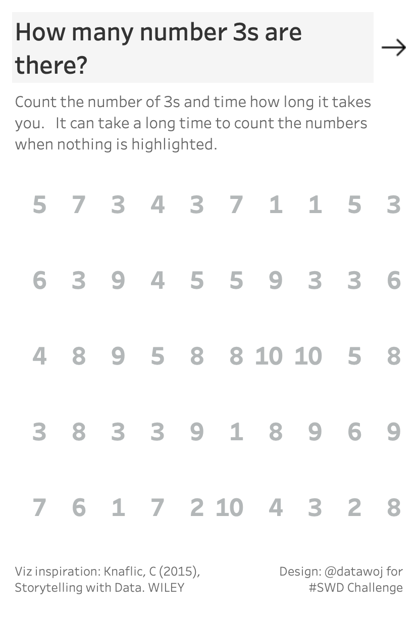
Chapter 4 of the Storytelling with Data book by Cole Knaflic covers pre-attentive attributes in more detail. I re-created my own mobile version of the 'count the numbers game' featured in the book, which demonstrates the power of pre-attentive attributes.
This challenge was great practice of designing for mobile. This included overcoming design issues such as how to minimise content for mobile, choosing the size of mobile screen for which to design, location of navigation buttons as well as practice on Tableau's device designer tool.
Dennis
Data Dump Statistics
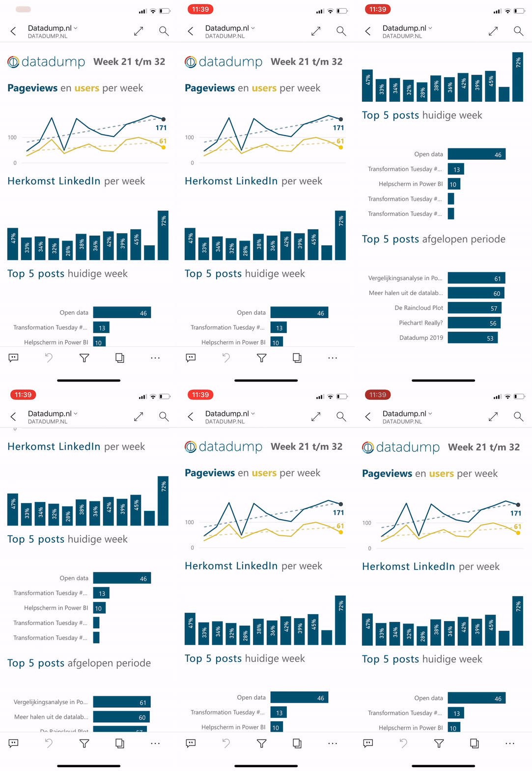
To see if our website is growing, I check the WordPress-app on a daily basis. Although it gives me some of the statistics I am looking for, this months challenge was a chance to create a mobile report for myself using Power BI.
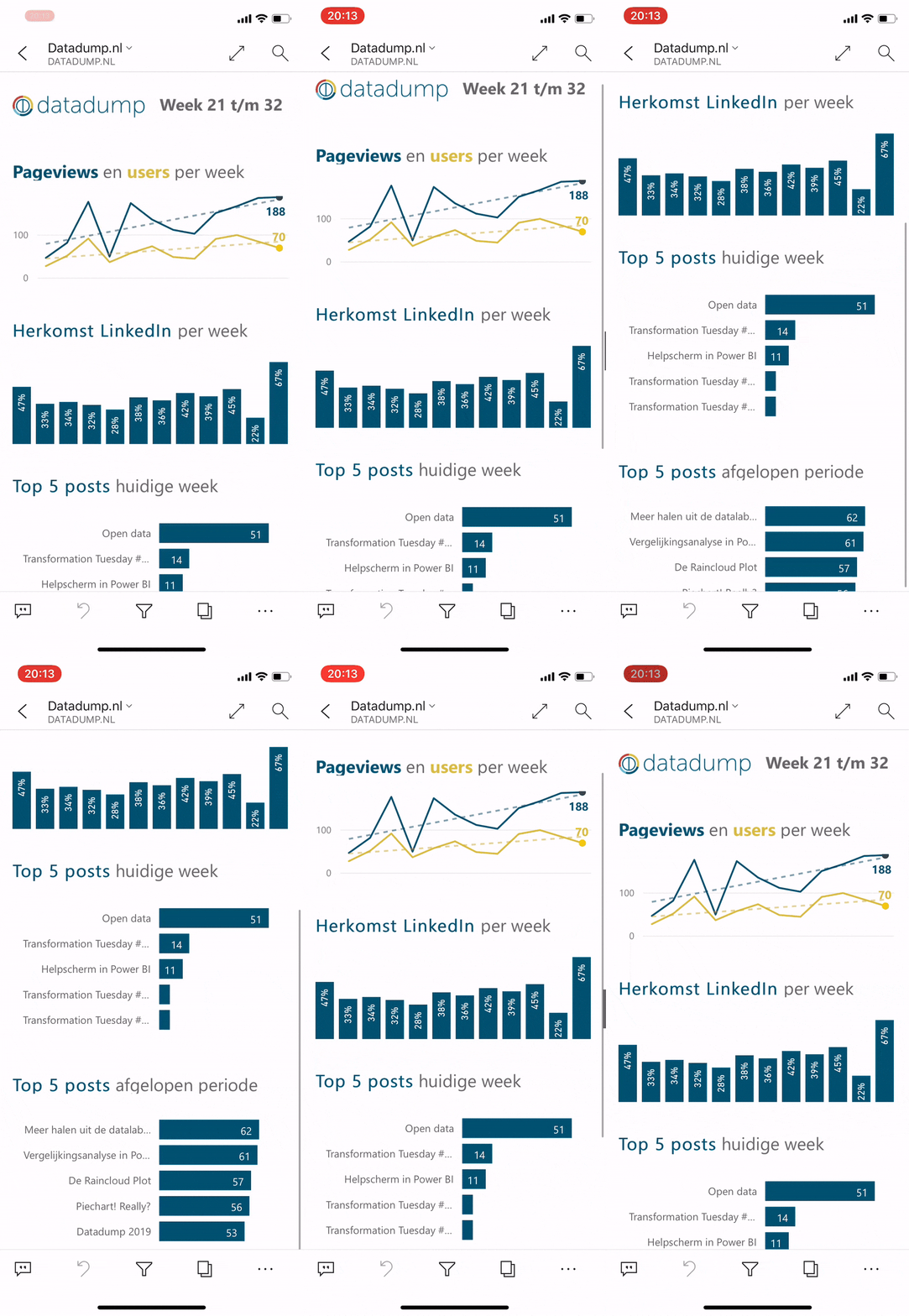
As a result, I focused on the parts that were the most important for me. This meant first seeing the amount of users and views we have per week. Because we are mainly trying to grow using social media, this is the second graph visible. As a third and last point, I want to know the success of each blog post. I posted an initial version of the mobile report, and after receiving some feedback on Twitter, I made some changes that you can see in the second version.
Making a mobile app forces you to think about the data you want to display as you don't have much screen real-estate. I like this way of thinking and learned some things about Power BI and mobile reports along the way!
Diana
Scale down - force clustering visuals
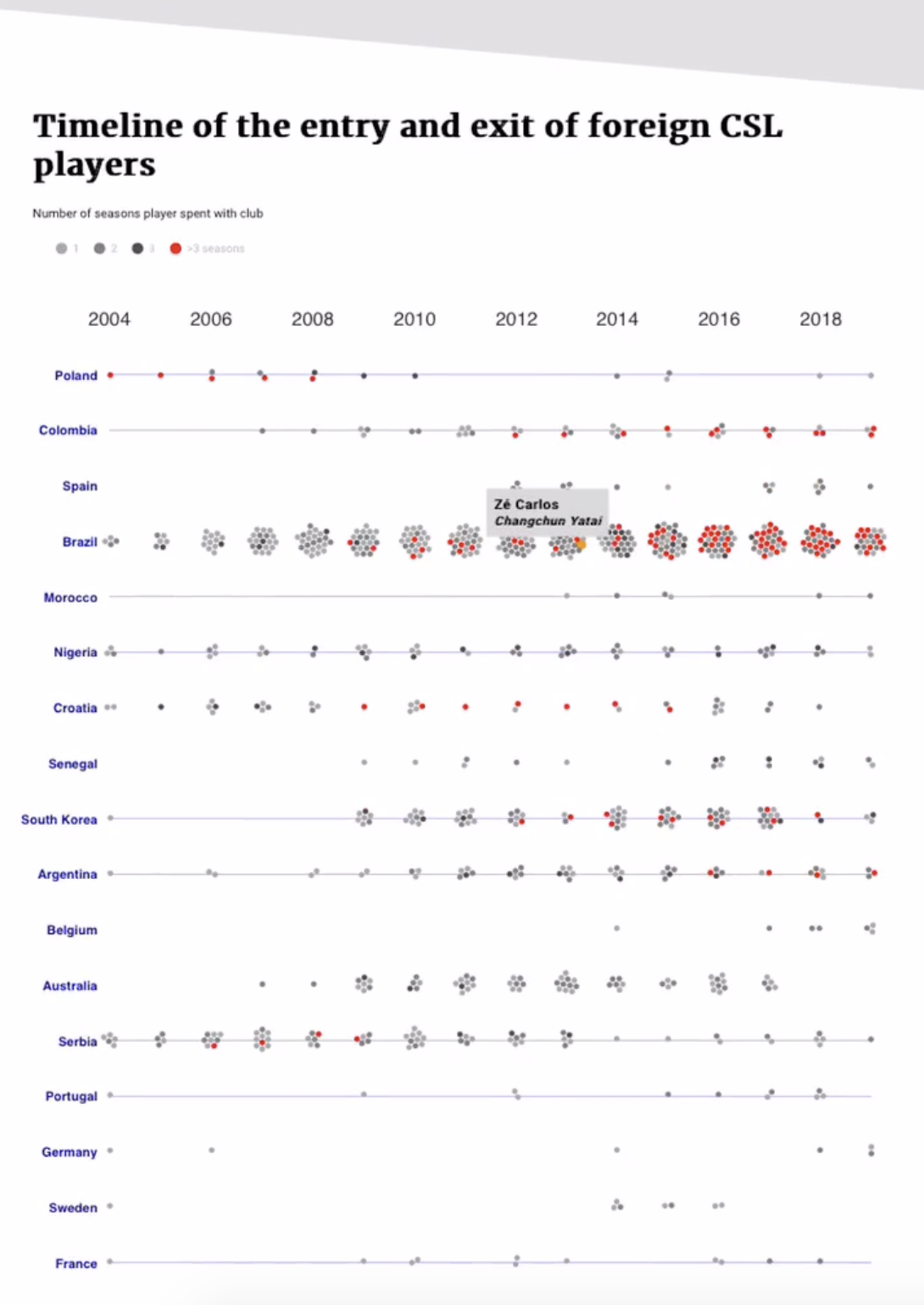
The viz i chose to redesign for mobile, while not complex in interface design, is composed of force clustering visuals (a network visualization and clustered bubble plot). I chose to simply 'scale down' the viz to make the page fit the width of the device it is on. Reader can then zoom in (by pinching) to see the details. This worked really well, all I had left to do was to fine-tune the font-size and location of textboxes with the help of CSS media queries. However, I also wanted to hide the images of soccer players for the mobile view because it was causing dots to be too closely spaced. I did this by using CSS media queries to display a different svg layer based on device.
Elizaveta
Responsive Fitness Dashboard
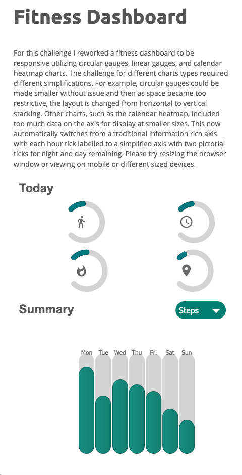
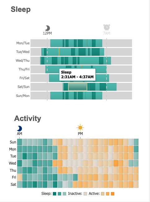
For this challenge I reworked a fitness dashboard to be responsive utilizing circular gauges, linear gauges, and calendar heatmap charts. The challenge for different charts types required different simplifications. For example, circular gauges could be made smaller without issue and then as space became too restrictive, the layout is changed from horizontal to vertical stacking. Other charts, such as the calendar heatmap, included too much data on the axis for display at smaller sizes. This now automatically switches from a traditional information rich axis with each hour tick labelled to a simplified axis with two pictorial ticks for night and day remaining. You can view the responsive dashboard directly to explore this interactivity yourself. Please try resizing the browser window or viewing on mobile or different sized devices.
Original dashboard.
Elvira
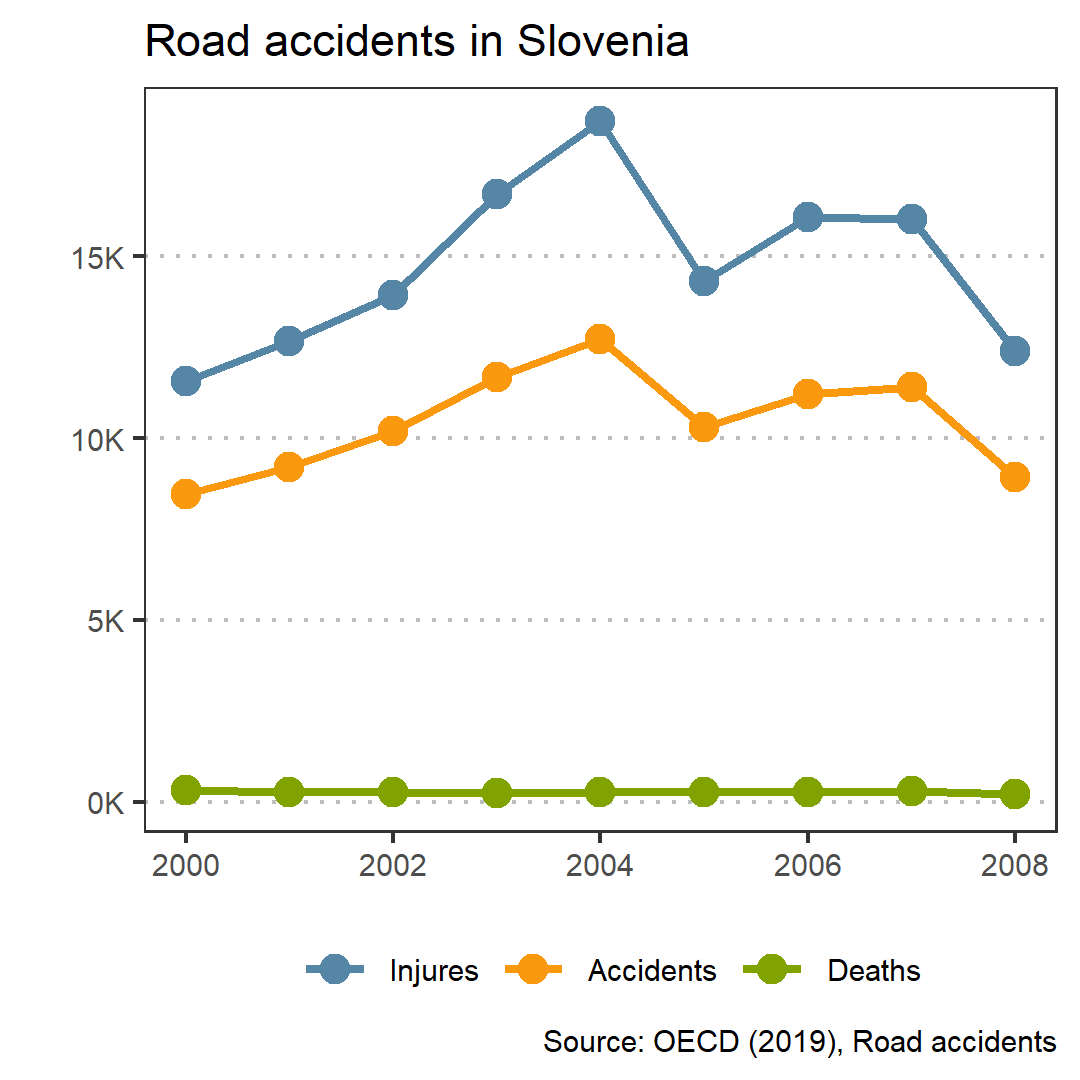
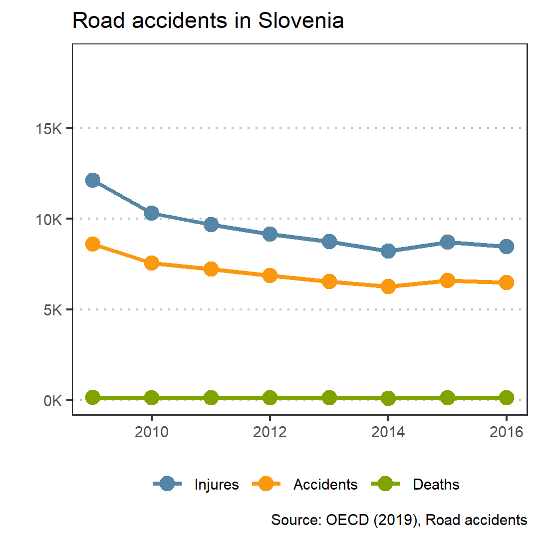
Road accidents in Slovenia
For desktop it was one plot with a vertical line in 2008, when numbers drop significantly. Now I made two slides for Instagram post: before and after 2008.
Georgios
Media Franchises
This is a redesign of a #TidyTuesday submission some weeks ago. The submission was more of a poster aesthetic and had some serious readability issues.
For the redesign I did a single screen app with Shiny in RStudio. The rings weren’t the best choice to begin with but I kept them for the sake of consistency (and because they look nice!)
Johanie
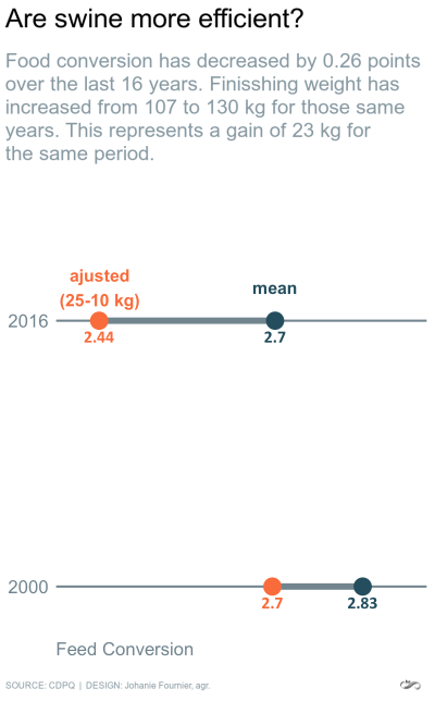
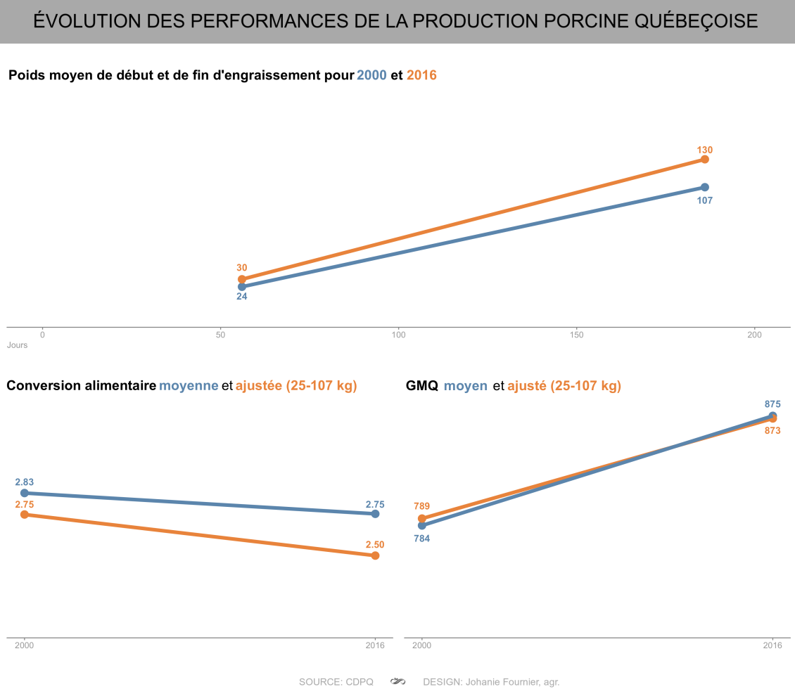
M8 | Visualize for mobile
I created the original dashboard that I used for this challenge at the beginning of 2019, and when I look at it today, there are several things I would like to improve. This challenge is therefore an excellent opportunity to do it!. First, I find that the information is redundant. In January, I wanted to show the evolution of the 3 most important growth parameters, but I believe that include all 3 graphs had a dilution effect. So, in redoing this viz, I chose to focus only on the most important parameter (the food conversion), and added annotations to support the data with the evolution of GMQ and weight. I made it mobile proof by making a single image of an appropriate size.
Joost
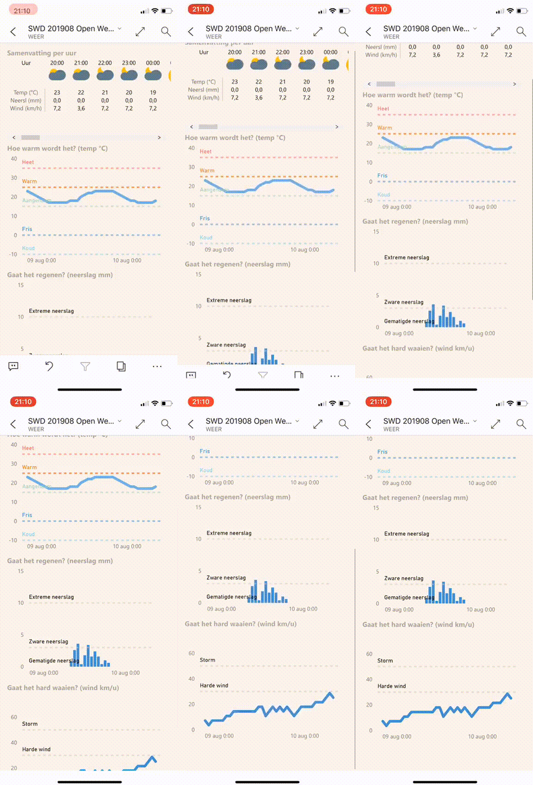
Power BI weather app
Whenever I look at some online weather dashboard to see what to expect today, I am usually in a rush, leaving for work or doing something else at the same time. I then have a hard time interpreting the different measures like temperature, wind, rain and acting accordingly: grabbing a coat, a sweater or an umbrella.
I used the #SWDChallenge for this month to create my own subjective weather app with a Power BI mobile app. This app fetches the forecast for my local town from an open API and refreshes a couple of times a day.
I hope this will make my life easier!
Nevertheless, this was a really cool and valuable learning exercise. I like how mobile dataviz apps can work and will probably use them more often in the future.
Kate
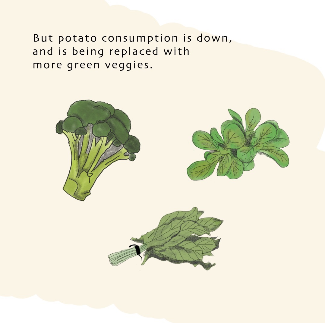
"Eat Local" with Thomas Jefferson: Mobile Version
I decided to take my July #SWD Challenge and bring it to mobile in the form of an animated video.
To make it mobile friendly, I designed it in a “square” resolution allowing it to be viewed in portrait mode without any border or scrolling in. I also made it so that everything is happening on “silent mode” aka, you do some reading. If I had a little more time, I might add some music and sound effects, but let’s face it, in these modern times, when open office spaces are “awesome,” we have to make things silent-mode friendly. Thanks for the challenge; read more and watch the full video here.
Lance
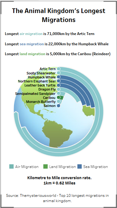
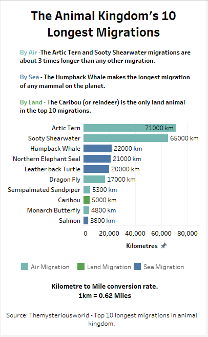
The Animal Kingdom's Longest Migrations - Mobile version
I didn't know if I would get time to do this challenge and as a result simply chose last month's entry as my chart to rework into something suitable for a mobile, again using Tableau. As it was a single chart is was easier to stick with the single image and not have to worry about scrolling. I had a first attempt sticking with the original chart design but felt the information the chart was conveying was a bit limited. Therefore I decided to change the chart type altogether and I think this fits much better as a mobile version. Not sure if this is a little bit of cheating but thought by including the first attempt it would show how I reached this final version. Again I learnt a lot and am finding the challenges very worthwhile even if finding the time is not always easy!
Ligia
Diamond price average by size
I made a single image for an Instagram post. I simplified the title and choose just one graphic that I judged the most important from my analysis published in Tableau.
Liz
Corporate Sponsorship in Baseball
I made a quick dashboard of MLB stadiums and their seating capacities for a class I teach at work, but I decided to expand on it and look at the popularity of corporate stadium names, so I added the bar chart at the bottom. I had another visualization I had to cut because it didn't fit on the mobile display, which I was trying to keep to one page (following Tufte's recommendation of putting information adjacent in space).
This was made in Tableau, and the display is for an iPhone 7 Plus, which was the largest iPhone option my version of Tableau had.
Pris
Aid in Asia Pacific
I remade my March SWDChallenge submission this month!
A few key questions to guide my design was 1) How can I make sure charts and their related commentaries can be shown within a mobile screen's length? 2) How can I keep the same design concept of my original dashboard? 3) What can I layout the information so it's clear and digestible?
I modified my line chart annotations to use a transparent, one bordered box because otherwise the annotations would have covered the chart. I also colored ADB with light blue in the text boxes more frequently throughout the mobile dashboard to give continuous visual legend prompts.
Sailal
CO2 Emissions Worldwide
Dashboard version
Mobile version.
Simon
Changing face of the English Premier League
For this month’s challenge I redesigned a dashboard from a previous months challenge. I focused on redesigning and condensing the content rather than simply removing parts of the original. The main changes were: 1) adopting a darker background with white text that can be seen more clearly on a mobile device; 2) adding some high level numbers that will stand out on a smaller screen; and 3) reducing the commentary to retain the pertinent information
Will
Billion$ in Fraud
This started out as a horizontal shape chart to show the top 10 largest accounting fraud scandals in US history. The top couple were so big the chart looked ridiculous, so I decided to make it a little more ridiculous. This scrolling vertical bar chart compares those same scandals to the life time earnings of the average American.
Click ♥ if you've made it to the bottom—this helps us know that the (non-trivial amount of) time it takes to pull this together is worthwhile! Check out the #SWDchallenge page for more. Thanks for reading!


