an expression of ignorance
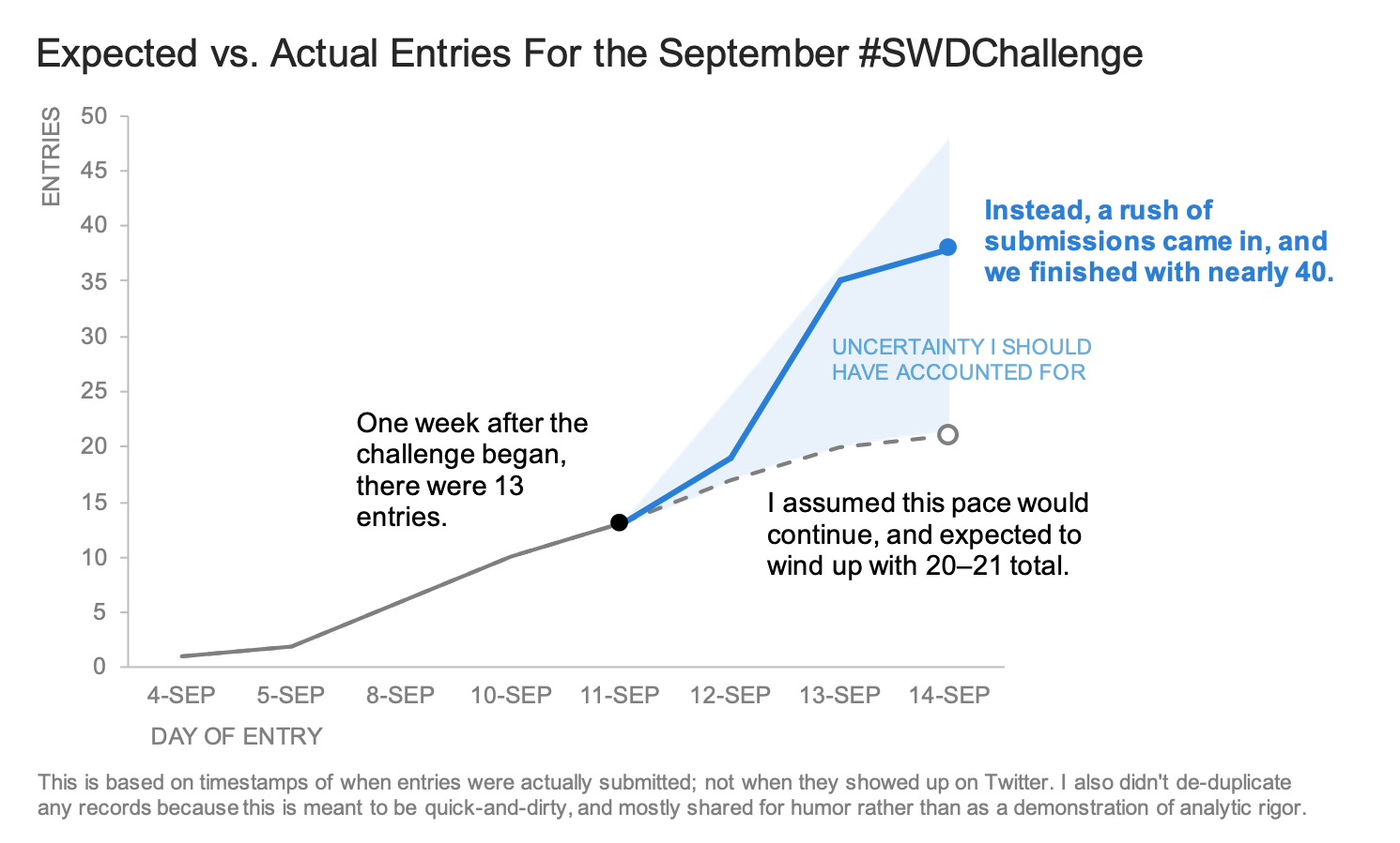
When there were only a couple of days left in our September #SWDchallenge, which solicited your takes on visualizing uncertainty, we were afraid that we might have set forth too complex a task. Even with the added incentive of having three participants receive their own copies of Alberto Cairo’s upcoming book, “How Charts Lie,” we had yet to receive more than a handful of entries.
We were prepared to write a recap all about how appropriately conveying uncertainty is one of the most daunting tasks in data visualization, and how this difficulty manifested itself (we expected, at the time) in a relatively small pool of participants. As the person responsible for writing this recap, I planned for an unusually short timeline between the close of the submission period and the completion of the monthly review.
Life, however, proved to be quite a jokester. An apt one, at that.
Because in the last 48 hours of the September #SWDchallenge, the number of submissions basically tripled.
We were surprised and thrilled by this development—not only because of the volume of submissions, but also because of their quality and variety.
We shared them with Alberto, who had this to say about the challenge and the collected submissions of our participants:
“Revealing uncertainty, I think, is one of the greatest challenges that visualization faces. Charts, graphs, maps, and other graphics are often perceived by the public as precise and accurate, even if the quantities they so neatly encode are surrounded by hidden fuzzy clouds of variation.
“I like to think of uncertainty broadly, as an expression of the difference between what we believe we know with varying degrees of confidence and what we think we don't know. In other words, uncertainty is an expression of ignorance, of both known unknowns and unknown unknowns. Some forms of this expression are quantifiable, and some aren't, and the variety of projects we've seen in this #SWDchallenge address both, either visualizing quantified fuzziness or discussing challenges with the definition and demarcation of the variables being shown. Together, the entries to the challenge constitute a good catalogue of ideas that may inspire future experimentation."
This “catalogue of ideas” included a few different strategies and techniques that several participants identified and employed, to good effect.
Use Gestalt principles to differentiate actual data from forecasted data
In our workshops, we talk about how people visually perceive the world, and certain ways that we subconsciously find order in what we see. These are commonly called “Gestalt principles” after the school of psychology that first studied and enumerated them, and they describe various ways we interpret the things we see as being related or connected. In practice, they’re extremely useful for decluttering and organizing our charts.
Taken together, we can use these principles to convey uncertainty in visualizations that involve a mix of actual data and forecasted values. Several of our participants this month used these sorts of techniques.
Enclosure: Christian, Gordan, Lance, and Lisa used a shaded area behind a line to show where actual data ended, and forecasted data began.
Closure: Angie, Cassandra, and Jami differentiated between actual values and predictions by using a solid line for the former and a dotted line for the latter.
Similarity: Adam, Charles, and Ligia employed different colors and/or intensities to distinguish between observations and predictions.
Include ranges of possible values, distributions, or confidence intervals
The use of the enclosure principle doesn’t have to be restricted only to showing where actual data stops and forecasted values begin. Using background shading in different ways can help readers understand more of the context surrounding the chart they see, and the uncertainty inherent in the data you present.
Claire’s submission, which attempts to answer the question, “When is it sweater weather in St. Louis?,” uses TWO types of shaded areas: the first (shaded in gray) shows the range between the maximum and minimum temperature for that day of the year in recorded St. Louis history; the second (shaded in color) shows the period of time when the temperature for the day of the year has, at least once, fallen in “sweater weather” range. Claire also includes the average historical daily temperature as a bold, thin line that forms the spine of the chart, and helps the reader to see more clearly not only when it’s possible that it will be a sweater-weather day, but when it’s actually likely to be one.
Claire wasn’t the only person to use shading for the purposes of providing additional context. Ash’s chart is focused on a summary statistic (represented as a bright orange line), but also includes markers and shaded areas to show the distribution of values that are the component parts of that line. Ben’s chart, being entirely based on prediction, dispenses with any measures of centrality, and displays only ranges. Georgios, Joost, Pris, Augusto, Steve, and Cedric all used intensity of color to show the likelihood of a value falling within a given range; Cedric also included a ridgeline-plot-esque view of the underlying distribution, to provide the viewer even greater insight into the data.
Marks that appear hand-drawn can suggest less certainty than crisp, digital marks
There’s something funny about things that are hand-drawn: we perceive them as being more temporary, less official, and somehow less complete than things that are generated digitally. This is, incidentally, why we are such ardent advocates of beginning all of our projects with low-tech tools like pen and paper, whiteboards, and sticky notes; it’s easy to create, reorganize, and discard ideas if we don’t put them into our computers.
So for conveying uncertainty, using hand-drawn visuals (as Layisha and Sarah) did—or using the appearance of hand-drawn visuals (as Rob and Elvira) did—can help suggest to our audience that what we are presenting to them is somehow less than definitive. (When we talk about creating the “appearance” of hand-drawn visuals, we mean using tools like a library called “xkcd”—as Elvira used—that makes charts resemble the hand drawn style of the eponymous comic; or using libraries like the “sketchy” ones Elijah Meeks has created in D3 and Semiotic that mimic analog drawings.)
Animation can heighten the tension of uncertainty
If your presentation medium allows it, then using animation could be another way to convey uncertainty. Now, for some, hearing the words “animation” and “uncertainty” might evoke memories of the New York Times’ Election Needle, which debuted in November 2016.
Why did this visualization create such a furor? Largely because we were unaccustomed to news outlets explicitly conveying uncertainty in this manner—while polling data is often presented with a “margin of error: +/-X%” footnote, the main visual is usually a solid, bold, labeled, authoritative bar chart. The footnote provides the caveat of uncertainty, but the audience’s perception is that These Numbers Are The True Numbers.
The Times’ Election Needle flipped that around, and put the uncertainty front and center. Many readers of the Times’ website were likely already anxious about the election; in looking to relieve some of this tension by seeking out information presented in a traditional authoritative style, they instead found their anxiety exacerbated by this new uncertainty-oriented display.
Tension, in the presentation of a story, is not something to be avoided. Stories devoid of tension lie flat and fail to engage. But that tension needs to be resolved. Animation can be an excellent way to generate tension and convey uncertainty, while also eventually reaching a resolution of that tension.
Alexander submitted an animated look at the performance of two different drugs intended to treat patients with plaque psoriasis. (The link to the animation is here, as Part 2 of the supplemental material for a paper hosted on an open-access scientific journal.) The animation begins at Day 0 of a treatment plan, and each frame is a step forward in time one more day of the treatment. Each dot in the scatterplot represents a patient; each patient has a different severity of plaque psoriasis. That severity is graded from 0 to 100 on the PASI (Psoriasis Area and Severity Index) scale, with 100 being the most severe. The horizontal axis shows the PASI score for a patient at the beginning of the treatment; the vertical axis shows their PASI score on whatever the current day of treatment is.
The tension of this animation comes from watching hundreds of patients, day by day, improve (or not improve, or get worse) while under two competing treatment plans. The uncertainty comes from the fact that these are human beings, and that individual people’s health statuses do not change identically, smoothly, or in a uniform direction. By following an individual mark through the animation, we can see this uneven progression in action; we can watch a patient improve slowly, or plateau, while at the same time others improve dramatically and get to a state of being 100% psoriasis-free.
A static chart could show you how many patients reached each individual PASI score, or their percentage improvement on the PASI scale, after X number of days, but the animation draws the viewer in, generates engagement and tension as they watch patients’ individual journeys towards better health, and see those journeys resolve at the end of the animation.
Thanks to everyone who participated in the challenge (submissions below). A special congratulations to Crystal, Kate, and Rob, who will be receiving their own copies of “How Charts Lie” (which is scheduled for release in the U.S. on October 15, 2019).
Be on the lookout for the next #SWDchallenge, which we will announce in the first week of October.
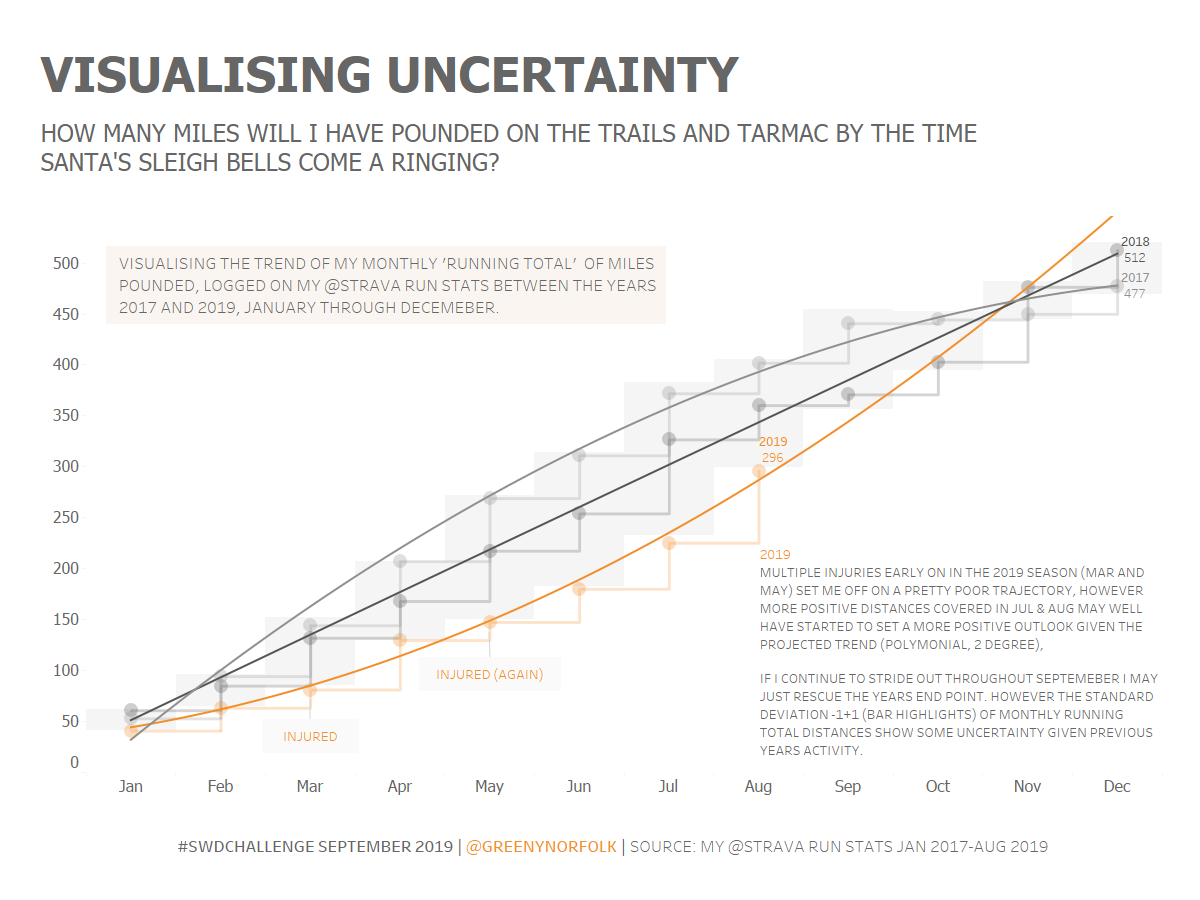
Adam | Visualizing Uncertainty (STRAVA RUN stats)
How many miles will I have pounded on the trails and tarmac, before the sleigh bells come a-ringing?
Well, up until the last few months, I had been plagued with injury this year, so I really haven't put the miles in compared to previous years. However I'm now back and trying to get fit with some goals in sight for some winter races.
So with this in mind I wanted to take a look at presenting some trends to visualize where I might end up by the end of the year, along with plotting standard deviations across the months to help me better visualize this unknown.
Alexander | Visualizing how patient with psoriasis improve over time
This is the product my team and myself worked on over a long period of time. The chart was inspired by Hans Rosling’s animations and shows each patient severity measured by the PASI as a dot. the horizontal axis is the baseline measurement and the vertical axis, the measurement over time.
To make this stand-alone, there are a couple of slides at the start of the animation. The actual animation starts at second 36.
The animated scatterplot shows that are differing degrees of uncertainty in terms of what a patient can expect from treatment.
It combines this uncertainty with the speed and the amount of improvement to be expected.
As commonly PASI rates of at least 50%, 75%, 90% or 100% improvement are published, these rates are shown in addition using colour and the additional bar charts.
As the data is collected at specific time windows, interpolation is used for the times between the different time points.
Lovisa Berggren is the responsible statistician in this publication and we were working together on this visualization.
Angie | World urban population (2050-2035)
I used UN data on historical and forecasted world urban population by various city sizes, and built the chart in Excel and Powerpoint. To show the forecasted data (post-2015), I used the classic dotting for the total population line chart, and layered a semi-transparent dotted pattern shape over the area chart.
Ash | NHL Attendance: 2000 to 2018
This takes a look at NHL Attendance per game from 2000 to 2018. The average has increased, but each team's average attendance per game can show the variance. The Tableau workbook is here.
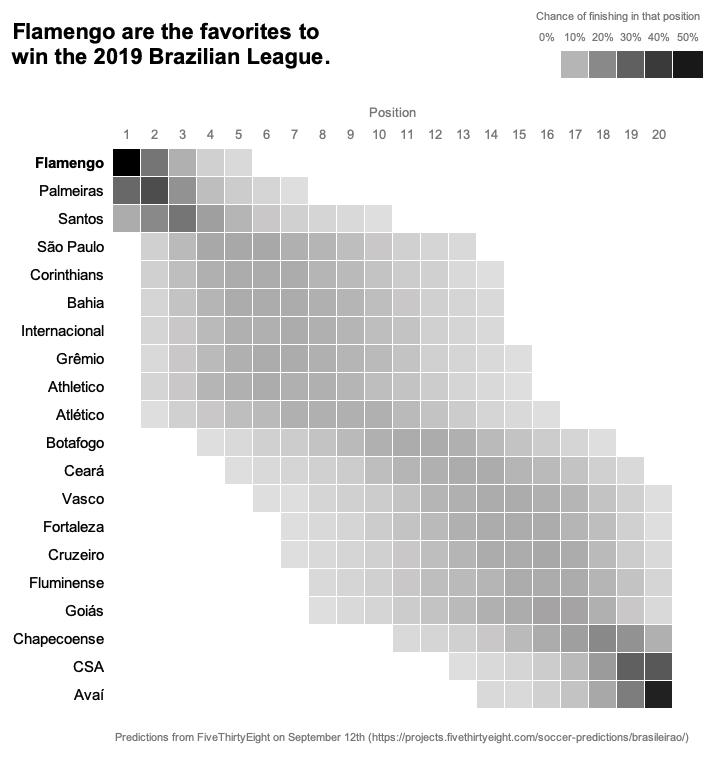
Augusto | 2019 Brazilian Championship prediction
This is my first time participating the #SWDchallenge. I chose to present the information of the club soccer predictions made by FiveThirtyEight in a different way.
Ben | School Reports
It is our duty as educators to let parents and carers know how well their children are doing in their classes. In the UK in addition to parent-teacher meetings we send parents a school report which typically includes comments and assessment scores. The trouble with scores is that they are inherently uncertain (in assessments it's called the standard error of measurement - SEM). Students and parents often find it difficult to understand the significance of their children's scores. That's why we've produced the visualization. The feedback from parents and carers has been very positive, and led to very productive conversations between parents and teachers.
I have written about our reports here.
A technical note - we produced the individualized charts using Google Sheets with some scripts. The data in this chart is for a fictitious student.
Cassandra | Music Streaming Industry Forecast
Visualization on the music streaming industry, showing market forecasts for 2017-2023. Colour was used to show the discrepancy in certainty between historical data (darker) and estimated figures (lighter). Uncertain data on the line graphs was shown with dashed lines. Trends based on the projections were shown in a light grey colour, with reduced line thickness.
Cedric | Daily Temperatures in Berlin, Germany
The data is freely available from the DWD (Deutscher Wetterdienst) here. The plot was fully made with ggplot2 and extension packages (tidybayes, extrafont, patchwork, cowplot) without any post-processing.
Charles | Wind Power in the US
I have revisited a dashboard I had created as part of a MakeoverMonday Challenge earlier this year. The angle I took was to compare the different states' investments in this energy type, weighted by their population.
For this challenge's purposes, I have added confidence intervals to the trend shown in the scatter plot at the bottom left, and added an ECDF to have a better idea of the distribution of the total power by state.
I would have loved to have more time to start this challenge from scratch, since uncertainty is a subject very dear to me, but at least it gave me a chance to revisit my previous work and try to make the data's uncertainty more apparent!
Christian | Deaths of Despair
A simple but somber dataviz using the data released this past week by the social capital project looking at historical 'deaths of despair' in the U.S. dating back to 1900. Years 2018–2023 are modeled and forecasted by me.
Claire | When will it be sweater weather in St. Louis?
The other day, in scorching heat, a friend who just moved to town asked me when she could expect sweater weather to begin. Trying to make predictions about the weather is always tricky, but I did my best to give her an answer! For this viz, I tried to think about which information would be most useful to highlight (temperature averages and ranges, probabilities based on historical time series), as well as what parameters I could reasonably use in order to give her an answer. Although "wait another month or two" wasn't the answer she was hoping for, it seems likely that sweater weather won't be coming to St. Louis any time soon.
Connor | Modern Design versus Comic-style
Note, these were part of a physical book that I printed for an experiment, so they should be viewed in two-page pdf format.
These are two visualizations I created for part of my master's thesis studying communication of policy, including uncertainty. I was interested in comparing various forms of communication against each other: these are the two forms that are visual-based (I also developed two text-based forms). The main difference between these two is story structure of the comic vs. non-story in the modern design.
You may recognize some of the graphics and principles I used in my work, SWD and DataStories both contributed to my research and gave me a lot to think about! So thanks for your good work and maybe slow down a bit so the rest of us can catch up!
Crystal | Effect Size uncertainty
My colleagues and I are currently analyzing the effects of ISS and OSS referrals on student outcomes and I’ve been wanting to visualize this. For this #SWDChallenge, visualizing uncertainty, I used example data and tried out the jtools package in R to visualize estimate distributions.
Ela | Churn types with flow
I decided to use the Sankey diagram to represent the potential churn flow; that is why it is in grey. We know how many customers resigned but we do not know what other telco operator they chose instead of our company. The right part represents uncertainty. We only know how many operators were available. Did they choose one, two, which one? Is our information about competitors range correct? We can only guess.
Elvira | Productive hours with uncertainty
I imported data from Rescue Time about my behaviour at work. The plot shows productive hours dynamics during last week. I used amazing xkcd library for styling :)
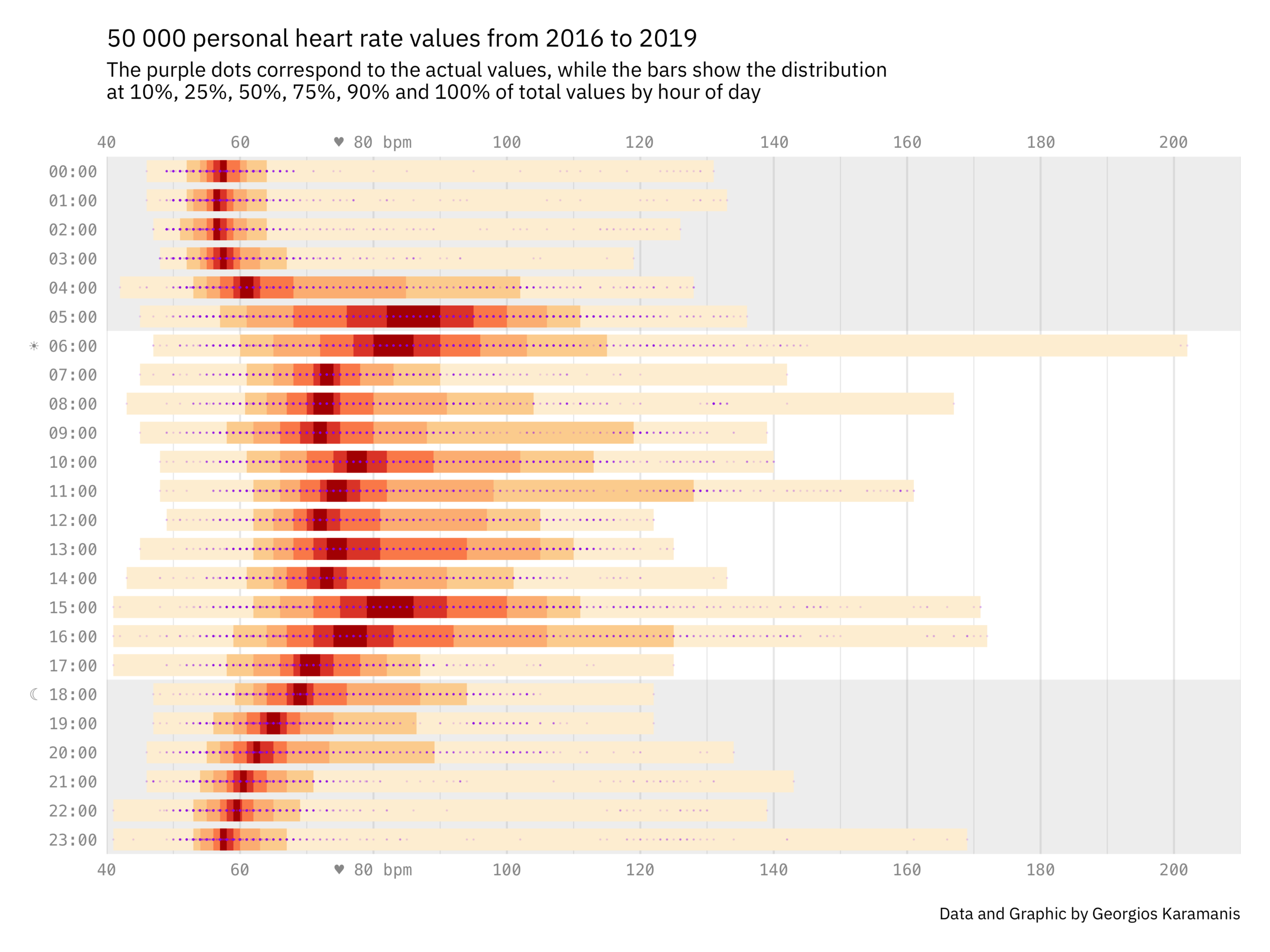
Georgios | 50,000 personal heart rate values from 2016 to 2019
Inspired by two tweets (this one and this one) and one reddit post, I attempted to visualise the distribution of my heart rate as measured by my phone and watch the last years.
Gianni | The demographic projection of the Italian population from 2020 to 2065
This is the demographic projection of the Italian population from 2020 to 2065 with the relative 90% bound of confidence interval. I used the gray bars to represent the interval in which the population estimate is expected to be contained and I consciously put the data source at 45 million to emphasize the data that, with current trends, takes on worrying connotations. The source is ISTAT The Italian National Institute of Statistics, data in millions.
If current trends are confirmed, the Italian population will be 54.1 million in 2065, about 6 million less than today. However, given that it is a very long period, an estimate interval has been created that can range from 46.4 million to 62.0 million
Gordan | Forecasting ranges
Forecasted values with confidence intervals. Used Power BI for design.
Jami | Arizona Population Projections
I wanted to be able to depict the range that population is expected to grow in Arizona plus be able to show that this growth is largely due to one large metro area: Phoenix. For those not familiar with Arizona, the Phoenix metro area (a combination of two large counties: Maricopa and Pinal), makes up about 13% of the state's land area but accounts for 67% of the population.
I used Excel to make the chart, then cleaned it up in Adobe Illustrator.
I think a map may be in order for my next data viz!
JB | Pollutant level in France data experience
Johanie | M9 - visualize uncertainty
I choose to visualize the variation in 6 different methods of evapotranspiration measurements this month. More details on my blog.
Joost | Visualizing uncertainty
I have had to deal with visualizing data with a fair amount of uncertainty to it. I then struggled with the way I wanted to present the data. I was often unsatisfied with the result, because my visual didn’t really represent reality in the best way. This #SWDChallenge was a good opportunity to address this issue.
Below you see the session duration of a webshop. That is, the duration in minutes that visitors/customers stay on the website. Here you see that the spread of the data is small. This is around 15 minutes in 2016 and in 2017. That means that every customer spends around 15 minutes on the website. But in 2018, the spread (and thus the uncertainty) of this measurement is increasing. That may be caused by the new webshop design that was published in January 2018.
This was made with Power BI. For more details, check out the blog.
Kate | You Are What You Absorb
If you've ever been concerned about your weight, you might have come across the phrase "you are what you eat" which is just another way of saying your diet has an impact on your physical appearance. If you've dug a little deeper, you might of been introduced the concept of "calories" and may have even come across another saying, "calories in calories out" which refers to the idea that in order to lose or gain weight you need to consume less calories than you expend.
Next thing you know, you find yourself looking at the federally required food nutrition label on a packaged food item at the store, calculating the amount of calories you ate that day, maybe you even used an app to keep track- making sure you don't eat more than your daily "allowance, and if you do, you push a little harder in your workout that day- one of the known ways to "burn calories." But how can you be sure that your calculations are correct? What about the food label? Is that even correct? And are all calories “equal?" Does your body respond to the calories in a vanilla milkshake as it does to a kale salad? Let's explore some of this uncertainty around counting calories in this infographic.
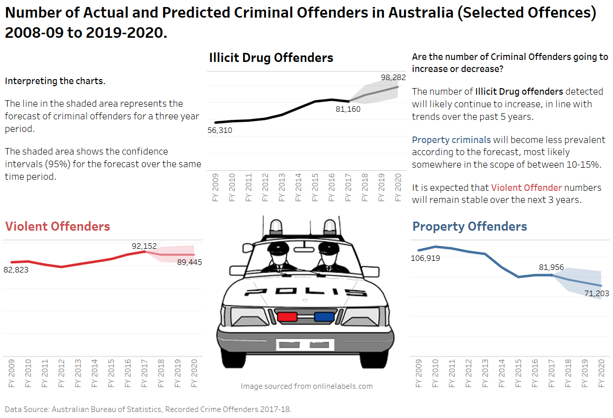
Lance | Actual & Predicted Criminal Offenders in Australia
Yet another good challenge. To be honest wasn't sure if I'd get something done for this one. Although 'time' was not so much an issue on this occasion, it was more that the creative juices really weren't flowing for me, so I am interested to see other entries and hopefully get some ideas for the future. I tried a number of different options using more colour but the forecasts seemed to get lost defeating the purpose of the challenge. I used Tableau. Looking forward to the next challenge!
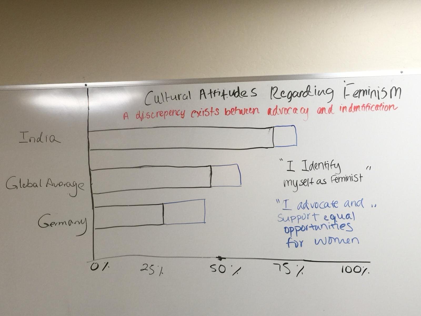
Layisha | Cultural Attitudes Regarding Feminism
A discrepancy exists between advocacy and identification
Ligia | Inflation Rate of Brazil
The inflation rate is the most important metric for a country. Its calculate has based on the average price growth of a set of goods and services over a given period. The higher this metric, the lower the purchasing power of the population. In countries with financial instability, such as Brazil, a lot of uncertainty surrounds the population.
Lisa | Is Venice Sinking?
Records on the sea levels in Venice only go back to 1871. Fortunately, some recently discovered archaeological clues give us a bit of insight into what may have happened before 1871. In the absence of early records, I chose to visualize the cumulative rising of the sea levels from 1350 to the present. I then used Tableau's forecasting feature in an area chart to show the continuing rising sea levels from now until 2100, if global warming continues at its current pace. The forecast area of the chart is visualized using a lighter shade of blue. The content of the tooltips identifies this section of the area chart as an estimate for the forecast indicator. I emphasized this point by using an annotation to clearly communicate the meaning of the forecast section and to drive home the main point that Venice is sinking.
Mohammed | Job Automation in England
The future of the job market is very unclear and makes a lot of people uneasy, My visualization is meant to shed light on the uncertainty in that area.
Paul | President Trump's Approval Rating
Here is the link to my visualization. When I first read about this month's #SWDchallenge I immediately thought of the uncertainty and variability that comes with presidential election data. While I wasn't able to find a good election dataset to viz, I found something similar in FiveThirtyEight's President Trump Approval Data.
They had originally done a great job visualizing this data using line charts with confidence bars around them. I took a different approach and used bars to visualize the presidential approval and disapproval ratings each month. At the ends of each bar, there are three different lines showing the high, low, and estimated approval and disapproval ratings for each month. The font I used kind of makes it look like a newspaper infographic which I thought was appropriate for the topic.
Links to the dataset and original FiveThirtyEight viz are here.
Pris | 48 Hours To Go Viral
The biggest obstacle was choosing a data set. We don't often think about how to visualise uncertainty, so when told to focus on it, I was stuck on what data set to use. In the end, inspired by Nathan Yau’s post: Visualizing the Uncertainty in Data, I went for YouTube daily trending data and focused on visualising the distribution of the number of days in which videos took before becoming Trending in the US. I used sizing and shading as my indicators of data distribution, and use the full range of distribution. I also specified that the data set I used only used 6 months of upload data. A reference line showing averages was added in video category comparison.
Rob | Geographic Uncertainty in Spatial Treemaps
The degree in which a spatial treemap is displaced from its correct geographic location is not always clear.
The lines in the middle map join the actual geographical locations of 32,000 neighbourhoods in England (the map on the left), to the treemap nodes on the far right. Colour represents a region, and the longer the line, the farther the displacement.
Sarah | What happens when you add the word "feminist?"
Our data is extracted from an IPSOS Public Affair global survey on Feminist and Gender Equality around the World. In this survey, respondents were asked to give their opinion on the following statements - "I advocate and support equal opportunities for women" and "I define myself as a feminist, someone who advocates and supports equal opportunities for women". Although these statements are very similar, as illustrated by our submission, answers to these questions varied a lot! With our submission, we tried to account for the uncertainty inherent in data on social values and norms, as definitional issues, stigma and preconceptions can greatly influence respondents, especially so when it comes to topics as controversial as feminism.
Simon | The population forecasts for England over the next 20 years
Looking at the population forecasts for England I wanted to see how each age might change over time. I used a reference band to show the forecasting area and plotted each age group separately and within a specific age category. The calculation I used was a running sum on the difference year on year to bring where the population is predicted to continue rising, flatten off or decrease.
Steven | Showing uncertainty in survey results
This submission is fully explained in this blog post about showing uncertainty.
Taylor | Visualizing uncertainty with gganimate
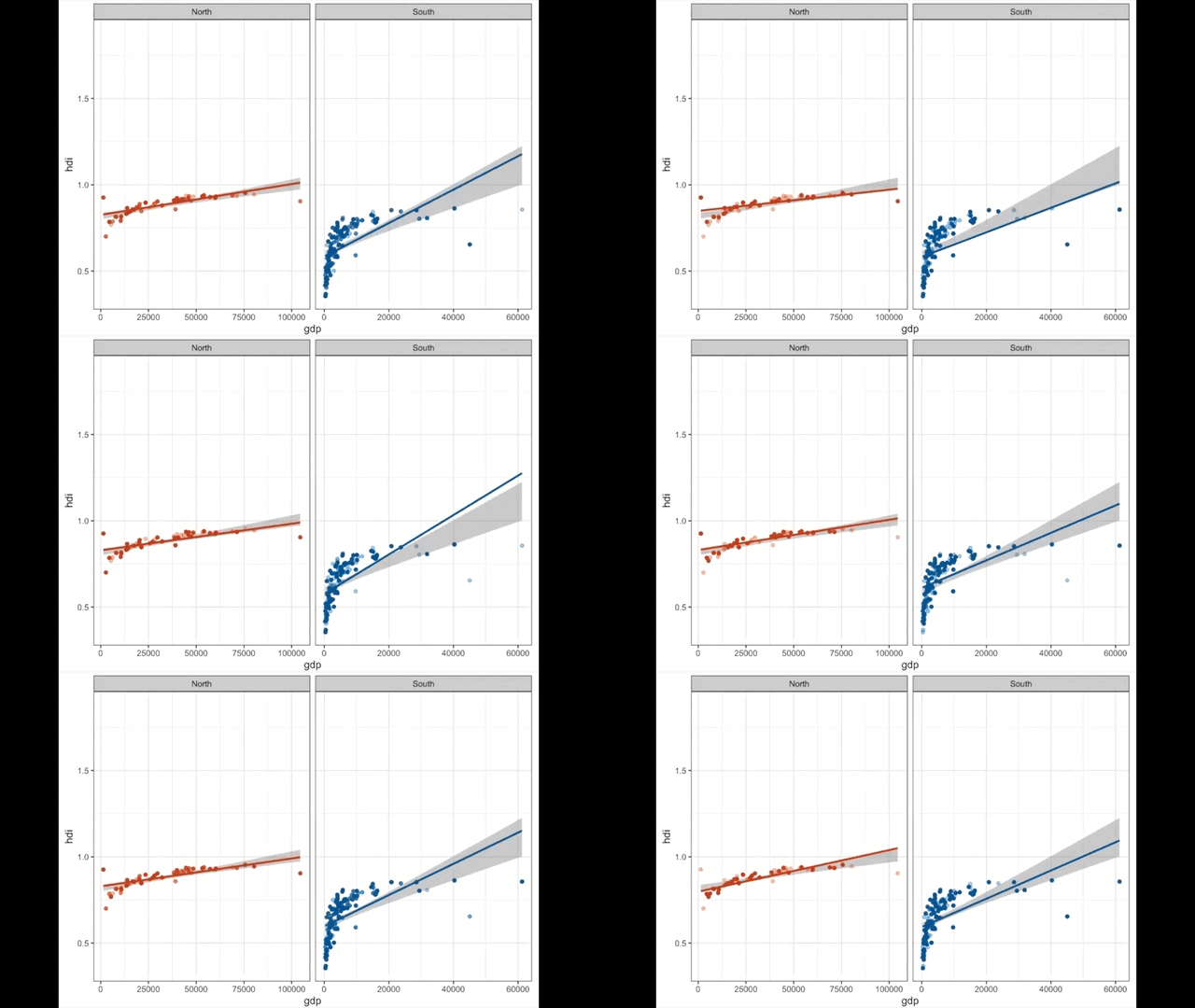
I have been playing around with interactive and animated data visualizations in R, so I used this #SWDchallenge to learn about animating OLS bootstraps with ggplot2 and gganimate. For fun I decided to try out the theme ggpomological, but had little manipulation ability within that theme for these dynamic charts. This visualization is not at a point where I am completely happy with it, but I learned a lot along the way. Thanks for a great #SWDchallenge this month! Please see here for the original version of my submission, published on my RPubs account.
Vijaya Shree | Visualizing Uncertainties - Food Preferences Survey 2019
Yes! To err is human and it includes the data generated by them. Especially, the data collected via survey tends to have a lot of uncertainty due to the participants’ typing errors, unwillingness to share the information and so on. This visualization helps to understand the uncertainties in one such survey - The food preference survey 2019. The Gender and Nationality of the participants have dirty data as shown in the viz.
