not so scary after all
Last month we had Halloween on the brain, so we challenged you to tackle a chart-related fear by creating a “xenograph”—an unfamiliar chart. The xenographics challenge was one of my favorites to explore—so many novel and intriguing visuals. As I browsed all of the entries, I was a little surprised at just how much variety there was (horizon charts, radial charts, Marimekko’s, maps, scatterpies, chord diagrams, stream graphs, tornado plots, and more). It’s a good reminder that what seems scary to one person may be commonplace for someone else.
Despite the assortment of submissions last month, there were some common themes. Let’s take a look at a couple of them.
Going with the flow
The most popular spooky or intimidating chart was the Sankey diagram. In the spirit of making the unfamiliar, familiar, let’s further explore Sankey diagrams.
These are charts used to show the change in compositional breakdowns. In most cases, this consists of parallel 100% stacked bar charts with connecting lines that vary in width to show compositional flow or change (that’s a mouthful). I understand why Ashley, Pris, Chris, Ryan, and Monica chose Sankeys last month; these charts look pretty slick but can be highly complex to understand. For specific examples, browse their creations below. Or click each image to explore within the community.


Making the complex accessible with specific design decisions
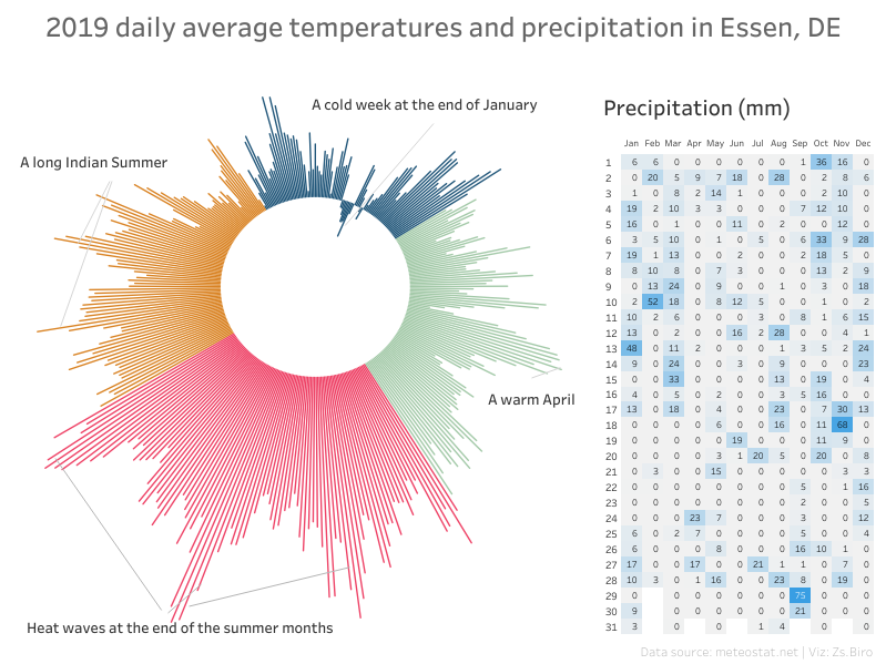
Sankeys weren’t the only complicated charts last month. David created a diverging Marimekko chart. Marc chose a MapTrix, Zsuzsanna experimented with a radial bar chart, and Rob built Flow Trees. Many of these chart types were new to me, yet they were still straightforward to consume. That’s a testament to subtle design decisions that many of you made. I have a theory that because we asked you to experiment with novel—or even downright strange—approaches last month, extra effort went into making those charts as clear as possible. Let’s explore some of the little design decisions that transformed these unique views (click the image to view in the community).
David’s diverging Marimekko: The annotations and legend highlight the insights and help an unfamiliar reader understand how to process the chart. I also like the double vertical axes; my eyes scan down, to the right, following the shape of the bars, and I get the full impact of the percentage of non-recycled waste with the nearby axis.
Marc’s MapTrix: Taking inspiration from a flow visualization research paper, Marc recreated the MapTrix but made a minor yet impactful decision to use curved lines instead of straight ones. This subtle change does an excellent job of embodying the underlying flow data, and as an added bonus, looks pretty slick!
Zsuzsanna’s radial bars: Color usage is key in this view. For the radial chart, color is used to aggregate what would be a large number of bars into spring, summer, fall, and winter. The warm and cool colors also match the seasonal temperatures—a thoughtful touch. In the heatmap, the 2-color scheme (blue and gray) highlights the extreme precipitation.
Rob’s Flow Trees (also known as Origin Destination maps): It may not be visible in the thumbnail view, but there are subtle gray lines that separate the countries. This gives the map a structured and organized feel without being overwhelming. It also helps encourage the reader to examine each country individually.
All of these callouts are reminiscent of Andy Kirk’s series: little of visualisation of design, where Andy brings attention to some of the smallest design decisions that either make or break a visual. This challenge has taught me that attention to detail is critical when designing a graph, but even more so when working with a xenograph.
Last month was a ton of fun, and I want to give a special thanks to all of those that pushed themselves to explore something new! I strongly encourage those reading to pop over to the community and continue browsing the 40 xenograph submissions. Pay close attention to what makes some of these scary and novel approaches work, and what might be an ideal scenario in which to use them.
If you are looking to continue down the novel path this month, our latest challenge is all about showing and telling the story of change. If you’re like me, Sankey diagrams are fresh on my mind!


