words are data, too
One topic that participants in our workshops frequently bring up is the challenge of working with qualitative data, in contrast to quantitative data. When we imagine a visual representation of data, most often that data is composed of numbers: percentages; counts; averages; times; and so on. This kind of data is comparatively easy to work with. It scales nicely; we know how to aggregate or disaggregate it; we can find outliers, or ranges; we can forecast future trends.
Not all of us get to work with numbers 100% of the time, however.
In some fields of work, or on certain projects, collecting and/or analyzing text is essential to finding insights that will drive positive change. Numbers can tell us, for instance, how many members of our community are engaging with a new public service initiative; but the numbers themselves won’t tell us why they are or aren’t engaging, or how the public feels about the initiative—interviews, surveys, or forms would help us to collect that data, which would necessarily require us to analyze text.
I’m sure I’m not alone in having been tasked, at least once, to analyze social media engagement in a way that goes beyond, “How many people used our hashtag?” It is comparatively trivial to count things—likes, tweets, clicks—but significantly more difficult to parse through the actual text that people are providing on social media, and make a meaningful visualization from insights derived from it. Sentiment analysis is one approach, sure; but ultimately, that analysis—a numerical abstraction of an algorithmic attempt to categorize text—results in, at best, a single insight, from an incredibly rich and nuanced collection of information.
Let’s talk briefly about a few of the specific questions surrounding qualitative data that we’ve discussed in some of our recent workshops.
How can I get people to believe in qualitative data as much as they believe in quantitative data?
Numbers have a funny quality in people’s minds. Something about assigning a numeric value to anything—how good a movie is, how well you can hit a baseball, how ready for college you are—makes it seem like an official, unmistakeable, objective measurement. Meanwhile, any kind of textual, verbal description of that same thing sounds like it’s just an opinion.
If I said, “I talked to a bunch of people about this restaurant, and most of them had good things to say about it,” you might think, “OK, great, but that’s just their opinion.” If I pulled up Yelp and said, “This restaurant has a 4.3 rating,” suddenly the fact that the rating is quantitative instead of qualitative makes it seem more official—even though that rating is based on people subjectively translating their opinions into an arbitrary numeric scale that is different in the minds of everyone who participates in the rating system.
Data is data. Numbers are not any more inherently “true” or “official” than qualitative data. The idea that there is any such thing as purely objective data is itself a fallacy, let alone the idea that only quantitative data could be inherently objective.
Data doesn’t arrive spontaneously. It is measured and collected, either by people or by machines that automate what people have programmed them to do. People make choices all along that data collection chain about what to record, how often to record it, what to exclude, how to aggregate that data, how to normalize it, how much of it to share, and so on.
All of this is true whether the data in question is quantitative or qualitative. I could argue that qualitative data is more difficult to manipulate than quantitative data, because it is harder to aggregate or filter. Ultimately, the idea that numbers are believable, while words are not, is a misconception.
Can I use word clouds to show my qualitative data?
We don’t generally say that you “can’t” do any particular thing (with some exceptions). Word clouds, by and large, are not an especially robust tool for visual analysis. The algorithms that produce word clouds are a little black-box-like, in that you can’t be sure exactly why your words are the size that they are.
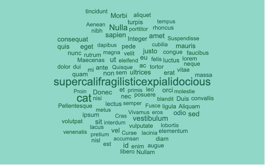
Let’s say you used a word cloud to answer the question, “What words appear most often in a corpus (a set) of 1000 documents?” Maybe the two words that appear the most by far—and in fact, are tied for first place with 300 appearances each—are “cat” and “supercalifragilisticexpialidocious.” No other word appears more than 20 times.
What would that word cloud look like? Would “cat” and “supercalifragilisticexpialidocious” have the same font size? If so, that’s misleading, because “cat” would be only a fraction of the visual size of “supercalifragilisticexpialidocious.” So “cat” would have to be a much BIGGER font size, to make the area of the two words appear similar. But wouldn’t that imply that “cat” was a more common word?
We’re between a rock and a hard place here. Either we ask people to compare two words by their areas, or we’re displaying data in a way that’s actually misleading. And this is the absolute simplest case possible for word cloud analysis.
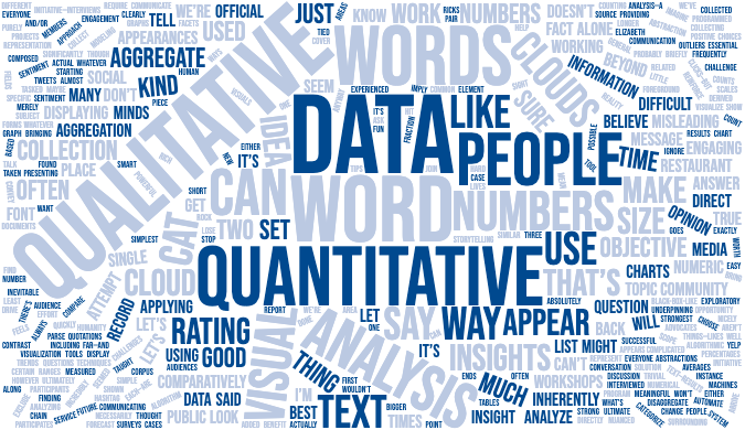
Word clouds can be used as a fun visual element (like, the back cover of a report, maybe), or as a very general starting point for your own exploratory analysis; but word clouds are probably not the best solution for communicating insight. The word cloud at the top of this article, for instance, is actually a word cloud of this article. Does it do a good job of conveying the main points of the post? Is it informative? Probably not; but I included it not as an informative data visualization, but rather as merely an eye-catching decoration…and in that role, it performs admirably.
While we’re on the subject: think about what a word cloud is actually doing: it’s applying quantitative analysis to our qualitative data. It’s merely counting the appearances of each word and displaying the words themselves as abstractions of the data. This is no longer qualitative analysis of your qualitative data set; it’s an attempt to use quantitative tools to visualize data, and that data just doesn’t want to be shown that way.
What’s a good way to use qualitative data in a visual communication?
When it‘s time to convey insights from a qualitative data set clearly, and quickly, to an audience, you might not use charts or graphs at all. We are strong advocates for using simple text, or using single numbers in text, if that’s the strongest or most direct way to communicate your message.
“Everyone we interviewed thought applying for the program seemed too complicated to be worth their time and effort.”
In most cases, though, it is almost inevitable that some kind of aggregation will have to be done on that qualitative data. It could mean sentiment analysis, topic modeling, or any number of other techniques beyond the scope of this discussion. Whatever that aggregation ends up being, and whatever visual display you choose to use, there’s always the opportunity to pair that chart or graph with a related piece of qualitative information, as Elizabeth Ricks taught us in “three tips for storytelling with quantitative data.”
This has the added benefit of bringing humanity back into the foreground. Often, as we look at tables and charts, we lose sight of the reality underpinning these visuals, that the numbers represent facets of human lives. Including direct quotations, taken directly from the source of our data collection, can reinforce that idea and make the ultimate message more powerful.
What challenges have you experienced in working with qualitative data, and what ways have you found to be successful in presenting insights from that data to your audiences? Join the conversation in our community and let us know!


