what is a dot plot?
This article is part of our back-to-basics blog series, what is…?, where we break down common topics and questions posed to us. We’ve covered much of the content in previous posts, so this series allows us to bring together many disparate resources, creating a single source for your learning. We believe it’s important to take an occasional pulse on foundational knowledge, regardless of where you are in your learning journey. The success of many visualizations is dependent on a solid understanding of basic concepts. So whether you’re learning this for the first time, reading to reinforce core principles, or looking for resources to share with others—like our expanding chart guide—please join us as we revisit and embrace the basics.
The term “dot plot” can be used for any graph that is encoding data in a dot or small circle. There are a few common types that I’ll focus on here. If you’ve ever asked yourself—What is a dot plot? How do I interpret a dot plot? When should I use a dot plot? or What are pros and cons of dot plots?—you’ll find the answers in this post. I’ll also share some tips on creating them and where to find examples that will inform and inspire.
What are common types of dot plots?
There are three common variations of the dot plot:
The first, I’d refer to as a traditional dot plot (labeled simply “dot plot” above). This graph has been used going pretty far back in time. They were originally hand drawn and are used to show the distribution of data. This can be useful if you want to see the your data to get a sense of the shape or identify outliers. It looks similar to a histogram (which encodes a distribution of data in bars rather than as dots). However in this type of dot plot, because each dot represents an individual data point, the dots don’t necessarily have to be uniformly spaced along the horizontal axis. They tend to work best for small data sets (when you have more data, something that aggregates the individual points, like a histogram or box plot, may better suit).
Today, the more common type of dot plot I encounter (in a business setting, at least) is the one developed by William S. Cleveland, sometimes referred to as the Cleveland dot plot. This graph encodes quantitative data across categories. One way to think of it is as an alternative to a bar chart. Check out the following example to see what I mean.
You don’t have to actually go through this progression to create a dot plot. Rather, this example is simply meant to illustrate how this type of dot plot works, by transitioning to it from something familiar.
The third view above doesn’t have to be the final one. You can perhaps imagine additional formatting changes we could apply. For example, we could label the individual values within each dot, eliminating the need for the x-axis. We might add light gridlines or lines from each category on the left to its respective dot to lend greater structure to the graph (this latter variation with lines from axis to dot is often referred to as a lollipop chart).
I’ve illustrated with a horizontal version in this case, but you can also rotate (imagine the dots replacing a vertical bar chart in similar manner to what I’ve illustrated above). Which orientation you choose will depend on the data itself, the length of category names, and other elements. Like bar charts, it can be a worthwhile endeavor to consider both layouts (vertical and horizontal) to determine which makes more sense or feels more intuitive in the given situation and data (if in doubt, ask others for feedback).
An additional common variation is the connected dot plot. It functions the same way as the Cleveland dot plot, but graphs two (or sometimes more) data series. Let’s use the same example as previously, only now I’ll add a second data series.
The connected dot plot encodes the absolute values (via positions of the dots), but puts emphasis on the difference or change between the data series due to the visual connection between the dots.
What are some pros and cons of dot plots?
Compared to the more common bar chart, dots in a plot use less ink, which means there is more space to add annotations, or simply have a lighter feeling graph. For the Cleveland and connected dot plots, an additional freedom that is sometimes useful is that the axis does not have to begin at zero (like it does with a bar chart or traditional dot plot, which encode data by length or height; with the other dot plot variations, we focus more on relative position in space than distance from the axis).
That said, dot plots aren’t as common as bars. In some instances, that may be a plus (bored with bars? try a dot plot!). However, they may be met by unfamiliar audiences with resistance or confusion, so assess whether it makes sense to use one given the specific situation and take careful steps to label and explain.
Where can I see example dot plots?
Let’s look at some more here! The connected dot plot is the most nuanced and has a few interesting and varied use cases, so let’s take a look at some examples of these. Through them, you’ll see a number of different design choices illustrated as well.
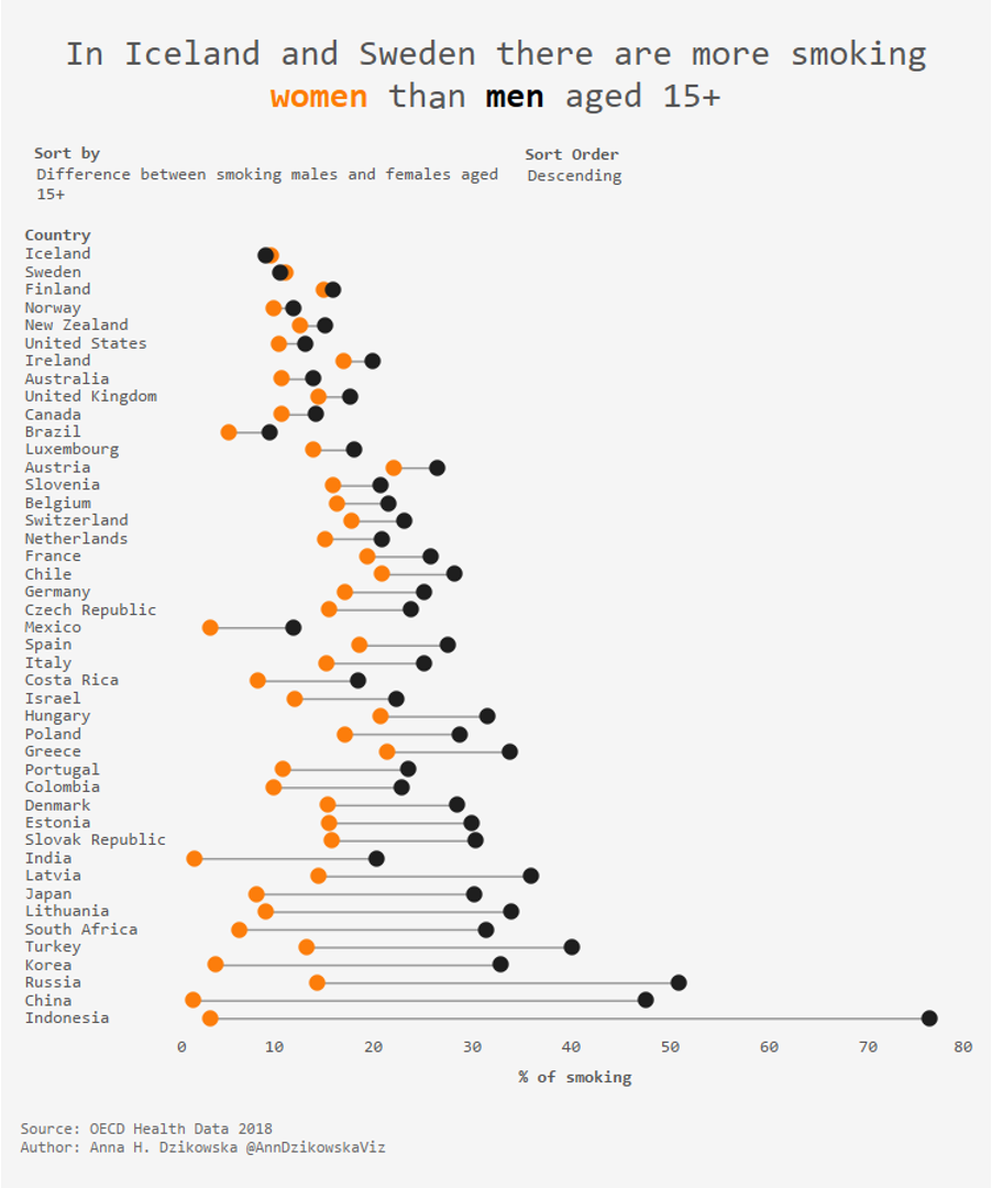
The connected dot plot can sometimes be useful to show group comparison (a slopegraph is another alternative). For example, the following visual (created by Anna Dzikowska) shows the percent of women compared to the percent of men who smoke by country.
How you sort the data is one consideration when designing a dot plot (as it is for many types of graphs). In the preceding example, countries are arranged by the difference—with cases where a greater proportion of women smoke than men at the top, to the greatest gap between proportion of women and men at the bottom.
This highlights a challenge that sometimes arises, which is when the series flip flop, changing position relative to each other, that doesn’t necessarily stand out. For example, Iceland and Sweden in the previous example are the only two cases where the orange dots are above the black dots; in all other cases the black dots are higher. But it takes some thinking and processing to recognize that (or at least it did for me, even though it was called out in the title!). Because of this, it can sometimes be useful to apply additional formatting to make this difference clear.
For example, in the following connected dot plot (created by Louise Shorten), color is used to help visually differentiate directionality within the dot plot. This example also illustrates another potential use case for a connected dot plot: time comparison. The following shows the price change of MacDonald’s Big Mac between two points in time.
Take note of the various design choices made in the preceding example when it comes to title, explanation of how to read the graph, intentional data markers, the way the data is ordered, and sparing and consistent use of color (to name a few). I mentioned this previously, but this sort of careful design can help this less common and sometimes unfamiliar graph be more easily embraced and understood.
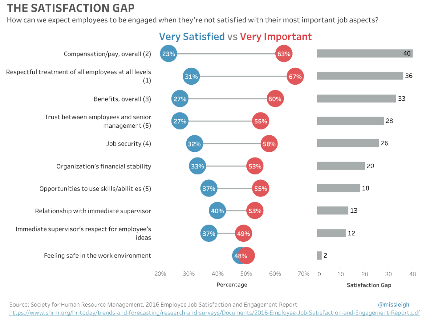
The time comparison is perhaps a relatively rarer use case for a dot plot (and restrictive, since it only typically works for two points in time). On the other end of the spectrum, a common place I see connected dot plots used in a business setting is to communicate survey data. Take the following example, for instance (created by Leigh Fonseca). It visualizes the “satisfaction gap”—the difference between the proportion of employees who say a given factor of their job is very important compared to those expressing high satisfaction.
Dot plots for survey data are also sometimes used to simply report results across survey items or categories (using a Cleveland dot plot) or for comparing survey data between groups (with a connected dot plot).
The previous examples were all drawn from our August 2018 SWD challenge, “plots with dots.” Check out the full recap for many more examples of dot plots.
How do I make a dot plot?
Now that we’ve explored common types of dot plots and looked at a number of examples, you may be wondering, “How do I actually make one of these graphs?” Some tools have built-in functionality for creating dot plots. Even in those that don’t, however, often a little outside-the-box thinking will make creating one possible.
For example, in Excel (and I have to imagine this would work in most tools) you can use a scatterplot to create a Cleveland dot plot. Depending on whether you’re after vertical or horizontal orientation, you put your data values as either the y or x values (respectively) and then input values for the other that you’ll use to separate your categories (for example, in the horizontal Cleveland dot plot I showed in my explanation early on in this post, the x-values in the scatterplot are my data values and the y-values are 1, 2, 3, 4, and 5, which are simply to space out the categories). For vertical orientation, using a line graph would also work, where you add data markers for your dots and format the line that connects them to be invisible.
Creating the connected dot plot in a tool where built in functionality doesn’t exist is a little tricker, but still possible. This will typically be a combination of either a scatterplot or line graphs (with points emphasized and line hidden, as described above) for the dots and a stacked bar chart (with the proportion ahead of the first dot unfilled) for the connection. Check out the following step-by-step guide to learn how to create a Cleveland and connected dot plot in Excel.
I hope you’ve enjoyed this tour of dot plots. Be sure to check out the other posts in our what is…? chart series, too. You’ll find them all (more coming!) in our chart guide.


