what is an area graph?
This article is part of our back-to-basics blog series called what is…?, where we’ll break down some common topics and questions posed to us. We’ve covered much of the content in previous posts, so this series allows us to bring together many disparate resources, creating a single source for your learning. We believe it’s important to take an occasional pulse on foundational knowledge, regardless of where you are in your learning journey. The success of many visualizations is dependent on a solid understanding of basic concepts. So whether you’re learning this for the first time, reading to reinforce core principles, or looking for resources to share with others—like our new comprehensive chart guide—please join us as we revisit and embrace the basics.
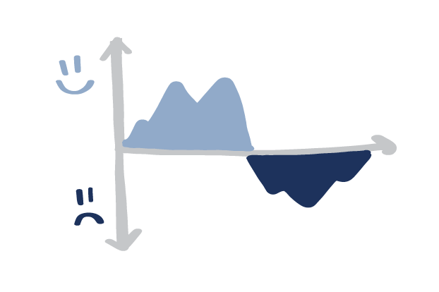
An area graph is a specialized form of the line graph, where instead of simply connecting our data points with a continuous line, we also fill in the region below that line with a solid color. This might seem to be a minor cosmetic change, but it has a significant effect on how we perceive the data in the chart.
Area graphs can be effective for:
Showing the rise and fall of various data series over time
Conveying total amounts over time as well as some sub-categorical breakdowns (but only to a point)
Emphasizing a part-to-whole relationship over time when one part is very large, or changes from being very large to very small
Showing change over time in individual panels of a small multiple chart
Area graphs are not the ideal choice for:
Data sets on scales that do not have a meaningful relationship to zero
Showing several volatile data sets over time
Showing fine differences in values
In this post, we’ll talk about how an area graph works, and some of the challenges to keep in mind when you are considering creating one.
How does an area graph work?
Area graphs are the same as a regular line graph, with two exceptions:
The space between the x-axis and each line in the graph is filled with some color (possibly of varying hue or opacity, depending on the designer’s preference).
The x-axis MUST BE ZERO.
Here’s a line graph of music sales over time in the U.S., broken down by format:
Remember that when we look at line graphs, we focus on how the values on the vertical axis change, up or down, as we progress from left-to-right along our horizontal axis, and we compare the lines to each other more than their height from the x-axis. By their nature, line graphs are better at showing the change of values over time than an exact quantity at each measured point.
Our perception changes, though, when a chart creator adds a fill of color between the line and the baseline, transforming our line graph into an area graph.
Instead of seeing lines, we see each data series as a polygon, as a shape; and we judge each data series less by how it changes over time, and more by what we perceive the overall area of the colored region to be.
An area graph transforms the purpose of the line graph from simply showing relative change over time to additionally showing volume or quantity as well.
For that reason, we can’t use scales on area graphs that don’t have a meaningful relationship to zero. Also, just like with bar charts, we must use a zero baseline.
When are area graphs useful?
Area graphs are tempting to use in lieu of line graphs. They are colorful, eye-catching, and are uncommon enough that the novelty factor tends to draw attention. As we discussed earlier, however, line graphs and area graphs are not interchangeable, due to how viewers perceive the different presentations of data. We rarely (but not never!) find ideal use cases for the area graph. Still, here are a few cases for which the area graph might be a reasonable option.
Showing several series, across several different time periods, if there is significant variation among series and change over time
Sometimes, it’s important to show how quantities have changed over time across multiple related data series. Bar charts are good at showing a quantity at one point in time, but multiple series across multiple points in time are challenging to show as bars. The chart gets crowded and cluttered very quickly.
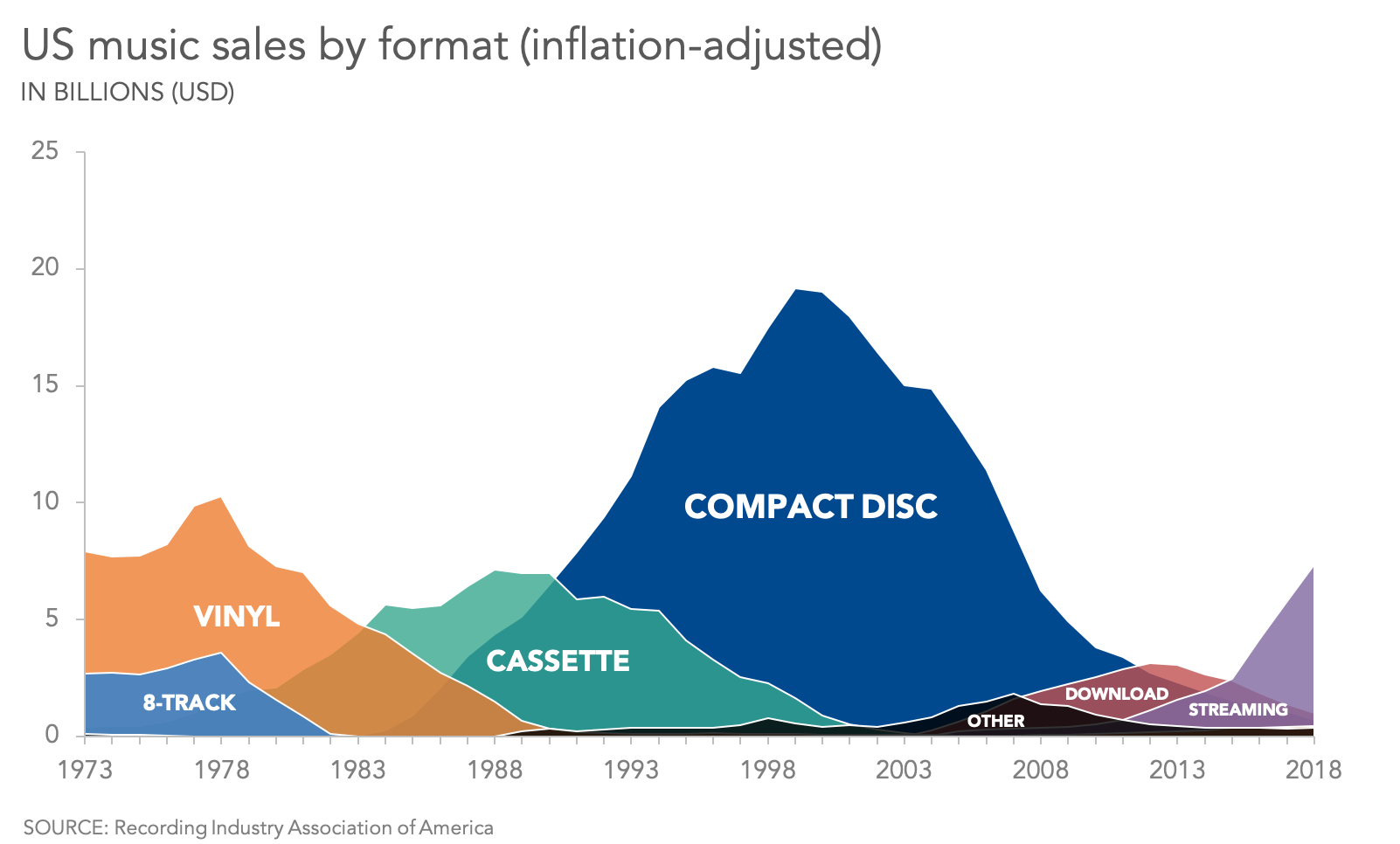
The area graph attempts to give a sense of quantity over all points of time, by creating irregular polygons of filled color. Where the data series overlap, however, it can be challenging for the audience to read that two (or more) fills are occupying the same space.
Continuing with the same example we have been using, which shows inflation-adjusted sales of music by format over time, we attempt to mitigate this challenge with a small change to the opacity of our “fill” colors, as shown below.
With purely opaque fills, we wouldn’t know, for instance, how many Cassettes were sold before 1983, or how many CDs were sold before 1990. (It’s still hard to see how many Cassettes were sold before 1979, because three series are overlapping, and it’s the “Cassette” data series that is pushed farthest to the back. This type of graph also requires a designer to make thoughtful choices about data series order.)
Showing several (or dozens) of series changing over time in a small multiple chart
Area graphs can be useful in a small multiple chart (also called a panel chart or a trellis chart). When you have multiple data series, instead of overlapping them all on one graph, you can display each of them as a small, single graph in a regularly-ordered series of similar charts. An area chart can help viewers compare quantity and change-over-time across those panels.
Showing the difference between two series, or between a series and 100%
They can also be useful if you are trying to show the gap between two (and only two) series, or between a series and 100%; and that gap is more important than the absolute value between the lines. Shading the region between the lines can emphasize that gap.
What are some challenges of area graphs?
This particular chart type combines qualities of such controversial visualizations as bubble charts (comparing by area), stacked bar charts (comparing subcategories across categories), and scatterplots (allowing some data to be hidden behind other data), while encouraging the use of color as a categorical differentiator instead of a tool for focusing attention. As such, it’s only natural that area graphs have a few drawbacks.
In most cases, some of your information will be hidden
Because your data series occupy the same space in your graph, they will inevitably overlap. The BEST case scenario is that your data series never cross over one another, so that the chart looks like a mountain range where all peaks are visible. More likely, at least once in your chart you’ll see data series cross over one another, and then you will inevitably have hidden data.
Viewers can’t always be sure what each series is using as a baseline value
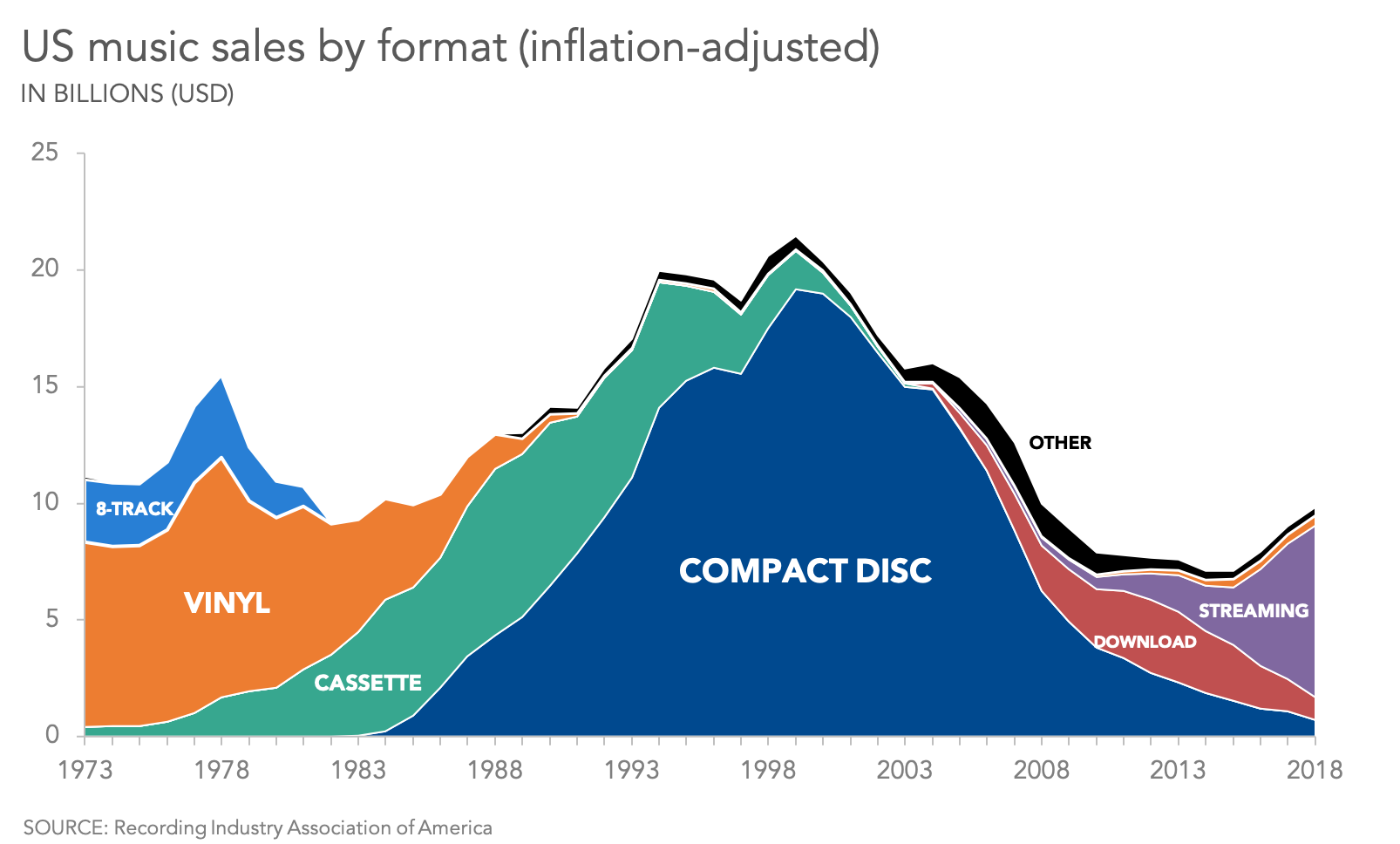
Much like a stacked bar chart, the stacked area graph comprises subcategories that add up to a total value for each value on the x-axis. Instead of each data series going down to zero, they are stacked up on top of each other.
Question: In this chart, in 1973, how many billions of dollars of 8-tracks were sold? More than $10 billion, or about $3 billion? We can’t be sure, because we don’t know if the chart we’re looking at stacks all of the data series on top of each other (so that the baseline for the “8-tracks” series is the top of the “vinyl” series), or if each series uses a common baseline of zero (so that the “8-track” series is mostly hidden behind “vinyl” and “cassette”).
If each series DOES use a common baseline, then having semi-transparent fill colors will make that fact clear. On the other hand, a stacked area chart will never be able to convince you with 100% confidence that it is, in fact, a stacked area chart, because there’s always the chance that it’s just a regular area chart with opaque fill colors.
Sometimes you will see a variant of the stacked area graph called a streamgraph. In this version, instead of the lines stacking up in one direction, they grow up and down symmetrically.
With a streamgraph, there’s less chance of it being mistaken for a pure area graph, but the cost of this is pretty high: you lose the ability to see fine detail, to include a labeled y-axis, to make easy comparisons across years.... Using a chart like this might get some attention and encourage a viewer to engage with the data, but any real insight will likely require additional charts, labels, and annotations.
Judging areas is hard
People have difficulty judging relative areas, whether it’s how much bigger one circle is versus another, how slices of pie charts compare, or the sizes of squares and rectangles that don’t have common baselines. In an area graph, we have an even tougher job: comparing regions of partially obscured irregular shapes. As you might imagine, this is nearly impossible to do accurately.
For instance, it is very difficult to make visual comparisons across years for any data series that is not the one using the zero baseline. (On a streamgraph, this applies to EVERY series.) Is it obvious that 8-Tracks had more total sales than Downloads or Streaming? Is it easy to see that VInyl and Cassette sales are within 1% of each other? Not without the data labels. The continuous and irregular nature of the boundaries for each region in a stacked area graph make those comparisons even more difficult.
More ink, more overlap, more clutter competing for attention
Finally, by their very nature, area graphs require a lot more “ink” to convey not a lot more information. An area graph with even a single data series is far more cluttered than a line graph; the more series we add, the more cluttered and hard to read it becomes. Focusing an audience’s attention on one element of an area graph is even more challenging.
Are you ready to tackle an area graph for yourself? The April 2020 #SWDChallenge is your chance! Create and share your own version of an area graph in the SWD community.
Or, continue your journey through our full what is…? chart series, by browsing other common visuals like bars and lines, or explore our comprehensive chart guide page for additional chart types.


