what is data visualization?
This article is part of our back-to-basics blog series called what is…?, where we break down some common topics and questions posed to us. We’ve covered much of the content in previous posts, so this series allows us to bring together many disparate resources, creating a single source for your learning. We believe it’s important to take an occasional pulse on foundational knowledge, regardless of where you are in your learning journey. The success of many visualizations is dependent on a solid understanding of basic concepts. So whether you’re learning this for the first time, reading to reinforce core principles, or looking for resources to share with others—like our new comprehensive chart guide—please join us as we revisit and embrace the basics.
Today, we explore a fundamental question: What is data visualization? Before I share my thoughts on this topic, I want to comment on how enlightening it’s been to write this back-to-basics series. I’ll admit that when I started drafting the first edition, what is a bar chart?, I was hesitant and mildly skeptical—my colleagues, too.
It wasn’t obvious what could be said about bars that didn’t already exist on our blog. However, in the process of creating a single comprehensive resource, the team identified new topics, learned some things, and uncovered opportunities to improve navigation on the blog. That’s why we are excited to announce a new page where you can quickly find the entire what is...? chart series: bars, lines, areas, pies, scatterplots, plus more to come. This is only the beginning; we’ll continue to identify ways to connect you with our resources—both new and old—so you can further your learning.
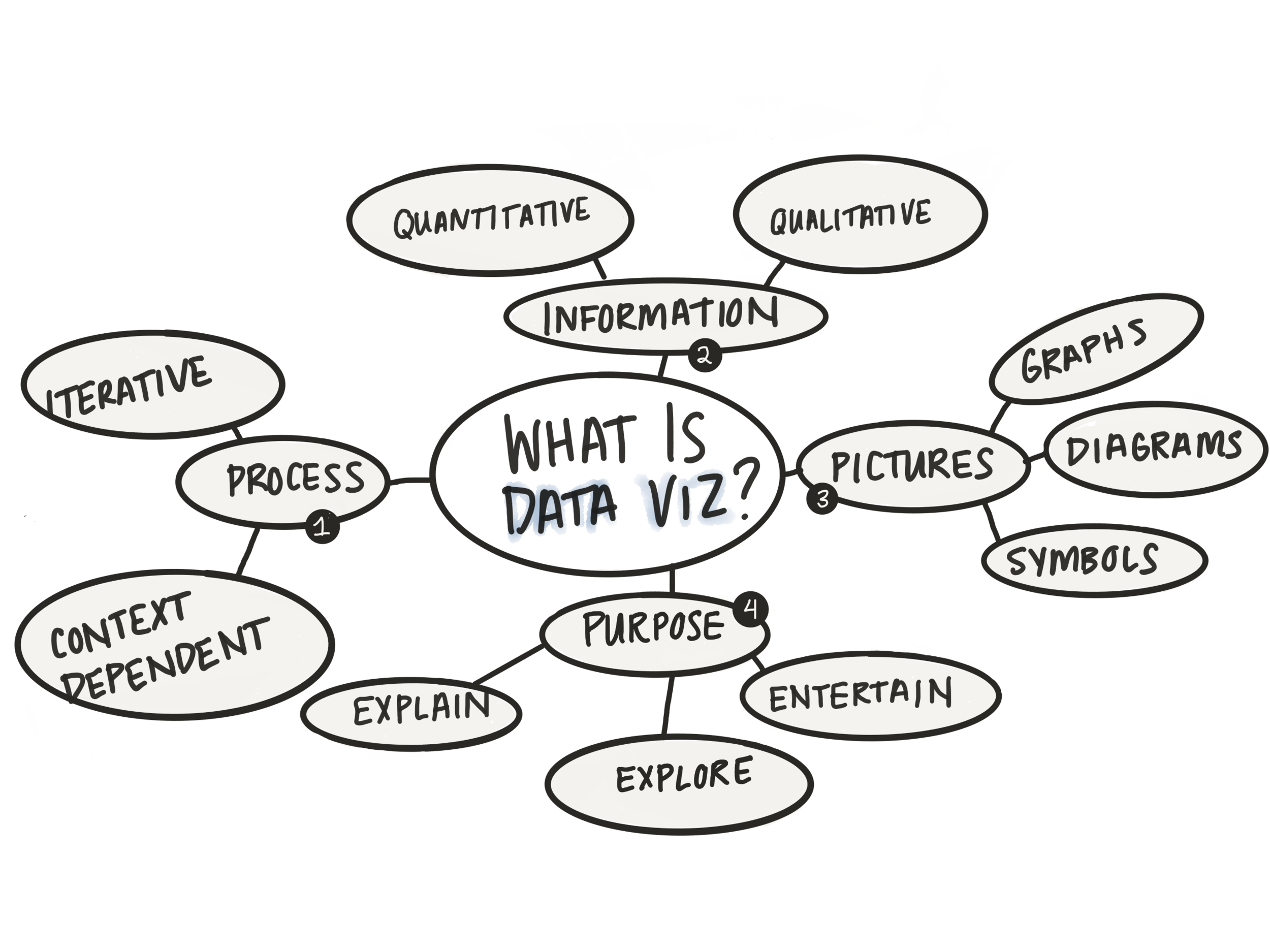
Back to the primary focus of this post. What is data visualization? It’s a simple question—and one I hoped I could rattle off—yet I struggled to craft a broad definition. At SWD, we primarily focus on creating effective business communications that drive action. However, I wanted a more inclusive definition for other use-cases, so I created a mind map to gather and organize my thoughts (an edited and simplified version is at the top of this post). In my map, I branched data visualization into four components, which served as the basis for my definition and helped me to articulate my response.
Data visualization is the process of turning information into pictures for a specific purpose. Let’s explore each of these pieces further.
PROCESS. This is the area where my understanding has evolved most. Reflecting on my days as an analyst, I used to consider graphs and dashboards, the final outputs, as data visualization. Jer Thorp says in an HBR article, “The word visualization encapsulates a process. And it’s really that process that’s the essential part, not the thing that results.” Once I expanded my view, I began allocating more time to transform my numbers into graphs. I thought about the context: who is this graph for, what’s the data literacy of my audience, how am I presenting the information, and most importantly, I asked for feedback and iterated. My shift in perspective (from a tangible outcome to a more abstract all-encompassing process), allowed me to grow and craft more effective communications.
INFORMATION. In this broad view, information is considered a synonym for data. I intentionally chose to use the word information because data is often associated with numbers (quantitative data). This isn’t the only case, as information can also be non-numeric or qualitative—like text and even images themselves. It’s important to have a good understanding of the underlying data type since this will often drive the kind of picture used to represent the information.
PICTURES. I alluded to this already, but data visualization is frequently thought of in terms of specific charts: lines, pies, bars. This is because, during the data visualization process, we often turn numbers into graphs to communicate the values quickly. Graphs aren’t the only types of pictures. For non-numeric data, you might create various qualitative diagrams like flowcharts, scannable text, timelines, etc. My mind map, a collection of related phrases, supports this broadened scope of images. Ha!
PURPOSE. This component can be a bit controversial. Many leverage data visualization in business settings, so their primary purpose is to facilitate understanding. This can be done when you are exploring your data or when you communicate and explain your data to others. Another purpose—perhaps less common—may be to simply entertain. This specific application has led to much debate, especially for those that crave a deeper understanding of the data. But, pictures are enjoyable to look at, so sometimes a viz is created for beauty and engagement, and that’s valid, too. It all depends on both your audience and the underlying goal. If you have additional thoughts on this, be sure the lend them in the related community conversation.
There you have it, my broad definition of the data viz umbrella. For more data viz interpretations and examples, be sure to check out the community gallery or listen to this podcast episode, where Cole parlays the original question into the who, why, when, and how of data visualization.
If you want to further your understanding or hone your data viz skills, here are a few ways to do that:
Explore our chart guide, where we cover the basics of commonly used chart types: bar charts, line charts, area charts, pie charts, and scatterplots.
Read about our process and learn the art of data storytelling with our two books.
Practice applying your knowledge through targeted exercises and monthly challenges in the SWD community.
