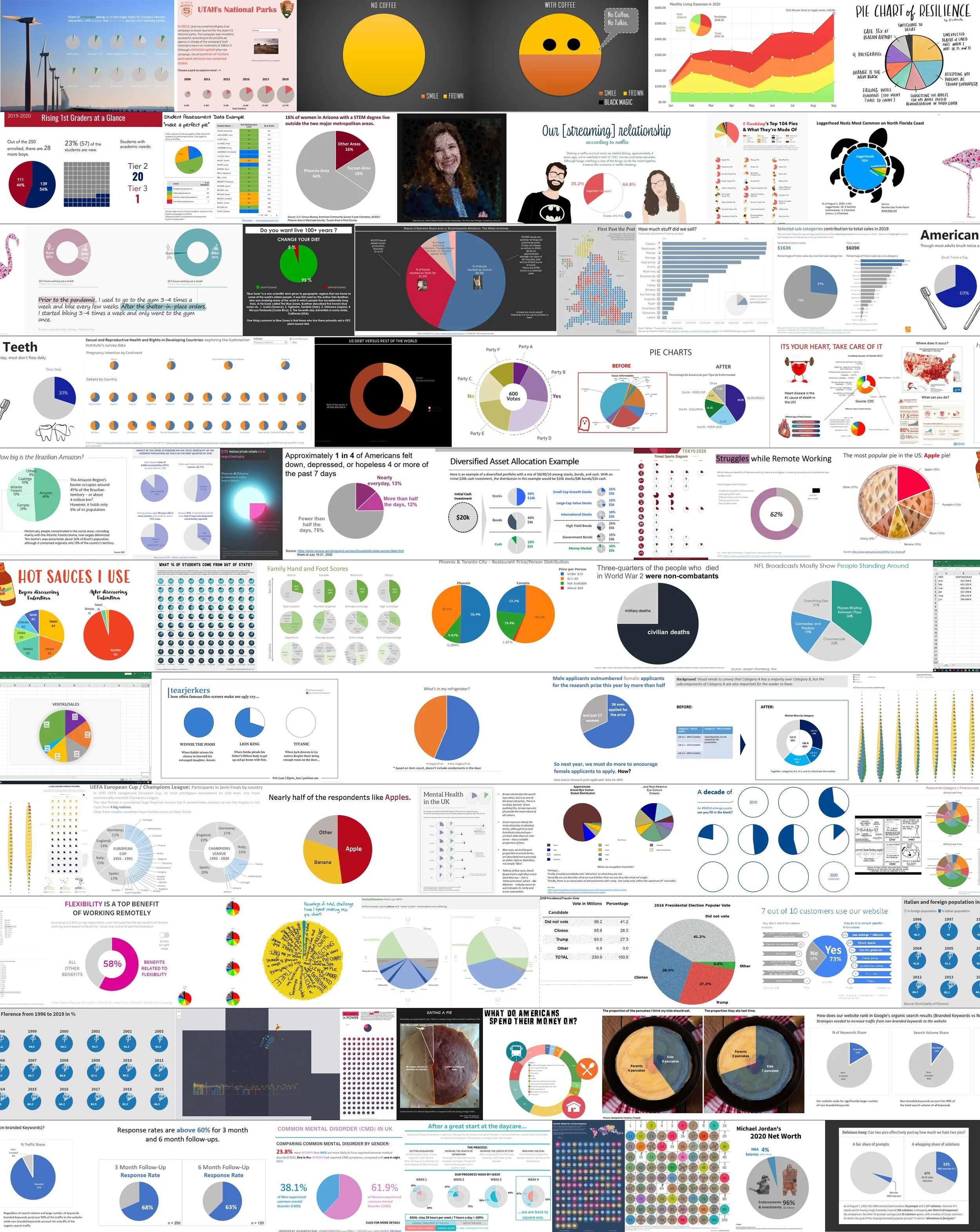
a plethora of pies
Last month’s pie chart challenge may have surprised some people. After all, pies are not something we frequently share at storytelling with data. On the surface, we kept the challenge light—even adding a contest to win a pie of the edible variety (more on the winners in a moment). But behind it all, there was a deeper lesson.
Communicating with data is a blend of many fields: information science, data analytics, design, and communication—to name a few. It’s a beautiful medley of both art and science. This means there aren’t many rigid rules about selecting a chart type. Take pie charts, for instance: many people despise pies, some going so far as to say that they are never effective and ban their use. This challenge was intended to show that things are rarely that simple. We are happy to say that many people proved pies could be a good choice with over seventy submissions. This reinforces the point that there is no good or bad chart type—every chart has an ideal use case, including the controversial pie.
Let’s take a look at some common pie chart applications from the challenge and respective examples.
Communicating part-to-whole comparisons
Pie charts are arguably one of the best ways to convey a part-to-whole relationship, especially when one segment is much larger (or smaller) than another. Plenty of community members demonstrated this application last month. Laura showed how large the Brazilian Amazon is in relation to other smaller territories. Adrian illustrated her relationship with hot sauce and how she primarily reaches for Valentina hot sauce when in need of some heat. Joseph revealed how little of Michael Jordan’s net worth comes from his NBA salary (surprised me!). Pies can be an excellent choice for these high-level insights.
Removing the inner circle to make a donut
Donut variations—a pie with the inner circle removed—can be controversial for the same reasons as the pie chart. Generally speaking, pies and donuts are comparable, so the decision about when to use a pie verse a donut often comes down to aesthetics and space constraints. Some prefer donuts because of the extra space in the middle that can be used for additional labels and statistics. Both Brent and Kolyu illustrated this: Brent used the inner circle to add context in his voting party donut, and Kolyu used the space to house the graph title. Melissa took a slight twist on the donut by creating concentric circles, yet using color sparingly to draw attention to the outer ring (the donut). If you are interested in learning more about donuts, stay tuned for a more in-depth explanation as part of our what is…? chart guide series.
Using not one but many pies
As if a pie and a donut aren’t controversial enough, let’s add several pies to a single view—go big or go home, right? At first thought, this may seem like a bad idea given the limitations of a pie, but with some thoughtful arranging and colors, this can be an effective way to showcase multiple dimensions. Agata created over 170 pie charts to show the gender disparity in political parliaments across countries. Rodrigo arranged pies in a tabular view, allowing readers to see timing breakdowns within an individual sport as well as compare them across sports. Robert deviated from the grid layout, instead opting to nest hundreds of pies within a map. Despite the limitations of a single pie chart, if you are thoughtful about the structure, multiple pie charts can reveal powerful comparisons.
Making us all laugh with relatable topics
Every month we see a range of topics, but this month, in particular, I found myself laughing and smiling more. Perhaps it’s because pies can be great for showing simple insights that many opted to display qualitative data this month. Luca made a pie chart from a half-eaten pie, showing how critical it is to devour baked goods before your family beats you to it. Lance demonstrated how he also missed out on some food this month with his pie chart pancakes. Chew had a bit of fun creating emojis that illustrate the power of coffee over one’s mood. And for a chart that we can all relate to, check out Jennifer’s pie about picking a topic for the challenge—that is sometimes the hardest part!
There were so many submissions this month—seventy-two to be exact—that it’s impossible to call out each one. Big kudos to everyone who joined in the pie-themed fun and also congrats to the three lucky actual pie winners: Ken had the most datapoints with his flamingo-pie art, Ryan solved Cole’s pie mystery, and Megan was selected at random (her submission is another great part-to-whole application). Other noteworthy pies to explore: Amy’s self-portrait, Maria’s Netflix streaming pies, and Sergio’s pie chart makeover. Be sure to browse all submissions in the community and give datapoints to any that catch your eye.
The pie chart challenge is long over, but if you are looking for a new challenge, you still have a day or so to build a table this September or stay tuned for the October challenge. (For a sneak peek of the direction we’re heading, check out Xenographics.)
