hamilton homes makeover
Combine home sales data with the opportunity to improve an underwhelming graph, and what do you get? You get 57 entries into this month’s #SWDChallenge. Starting from a seemingly simple line graph (shown below), we asked our community to try their hand at strengthening the message and the call to action implied by three years of housing market data in Hamilton County.
We created and discussed one possible re-imagining of this graph ourselves, which we broadcast live (and a recording of which is available in our SWD community). But as we always say: when it comes to communicating with data, there is never any single “right” solution. People can find any number of paths to a clear, effective, persuasive, and memorable visual. Moreover, “success” in communication will always depend on your audience, your goals, your insights, and your expectations.
Let’s explore some of the approaches folks took this month; and as we do so, consider how you might apply similar techniques to the communications you build in different situations.
1. Apply the power pairing of color and words to make the message stand out.
Austin applied color and words to make his key message stand out.
You can spend a long time learning and practicing all of the elements of the full storytelling with data process for communicating effectively—reading our books, taking our workshops, honing your skills in our community, and so on—but the quickest way to effect a significant improvement in how your visual creations are received is to use the power pairing of color and words intentionally and specifically.
In this challenge, a number of our participants kept the same basic chart type as the original example: a line graph. However, as Austin did in the example above, they applied color and words to their maximum effect:
COLOR Rather than using color for decoration or to distinguish between categories of data, many of our contributors’ makeovers used color sparingly. They also limited their palette to one or two key hues, to signal what’s important. When it comes to focusing attention, color is one of the strongest tools we have at our disposal—when paired with meaningful words, it can make the overall message of our visuals unmistakable.
WORDS Was there a key takeaway from this communication? Then write it big and bold at the top of the visualization. Were there key data points worth calling out? Then annotate those points with words, as close to the actual points as possible. A picture might tell 1,000 words, but your graph will always need a few dozen ACTUAL words so that your audience knows exactly what they’re meant to learn, and act on, after seeing your communication.
2. Acknowledge uncertainty, and communicate it clearly.
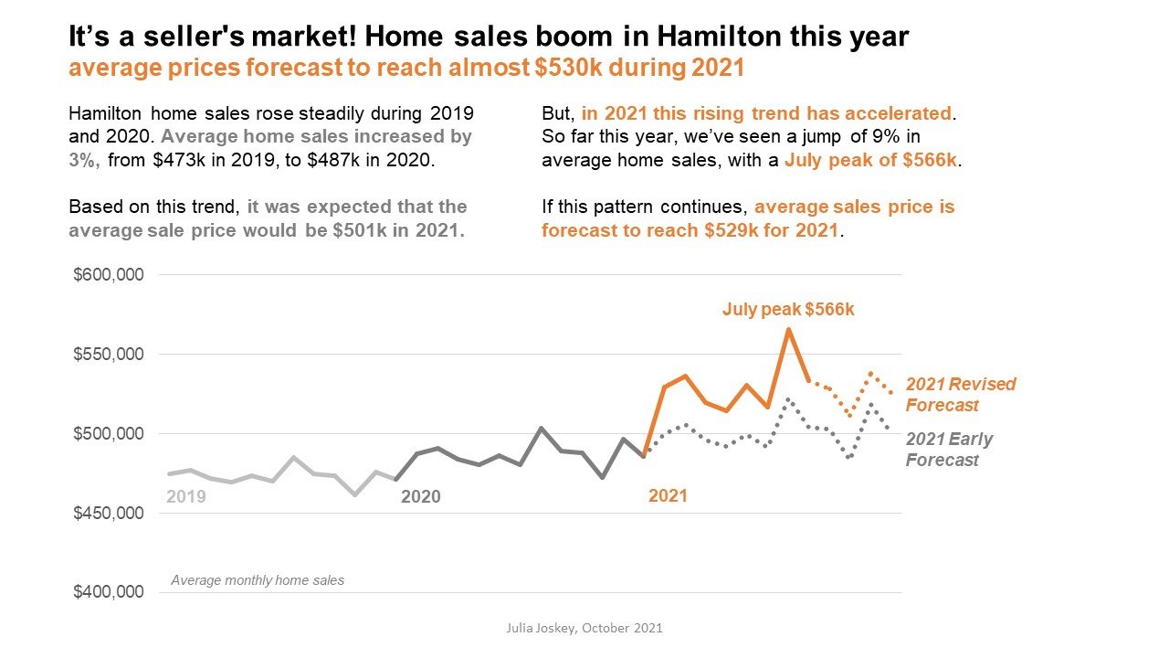
Julia communicated the uncertainty of her forecasts by showing them as dotted lines.
A prior #SWDChallenge was dedicated to the theme of visualizing uncertainty, and many participants this month found an opportunity—or a responsibility—to apply these principles to the provided example.
Given that the current year’s data was incomplete, some folks took on the task of projecting future home values (even through the following year, in some cases), but ensuring that those projections were visually distinct from historical data. Many used shaded regions and dotted lines (as Julia did in the example above) to show ranges of possible outcomes, and also used text to explain the rationale behind those projections.
3. Center the audience, and consider the problems that this data can help them solve.
Josephine considered the graph from an audience’s perspective, and re-created it to focus on answering questions that home buyers and sellers would want to be able to answer.
Rather than approaching this makeover from the position of, “What do I want to say about this data,” some participants (like Josephine) put themselves in the shoes of a consumer of this data, and so built their re-visualized work around answering the question, “What question could this data answer for a seller or a buyer?”
The challenge prompted participants simply to critique the original visual and make changes to strengthen the final product. Many of our contributors intuitively or intentionally decided to consider the audience’s needs, and just that simple step itself can make any visualization better, because it provides a better and more meaningful framework for all of our subsequent design decisions.
4. Try something new.
Jill created several visually distinct versions of this graph, ranging from simple charts to this visual metaphor of a key.
In the spirit of experimentation, we did see a few people modify the original chart type, and some people discard it entirely! From smoothing the curves at each data point, to adding a second bar graph, to building a full dashboard, to adding Nigel Holmes-esque style mashups of line charts and keys (cleverly done by Jill), we saw evidence of the thoughtfulness and creativity our community brings to every challenge we issue.
We host these challenges for many reasons, and among those are to give everyone who works with data, or with visualization, a chance to play, to try new things, to explore, and to learn from one another, in a supportive and low-stakes environment. Without experimentation and practice, without new ideas and a diversity of approaches, we risk becoming stagnant in our work and uninspired in our tasks. Kudos to everyone who took a left turn on the way to their final creation this month.
Thanks to everyone who shared their work. We encourage you to check out all the submissions in the community. If you haven’t yet participated in a challenge, maybe it’s time to bite the bullet (graph) and show us the perfect use case for this specialized bar chart in the November 2021 challenge.


