storytelling with simple text
In today’s post, we’ll talk about how you can use simple text to communicate numbers. You may be familiar with the following visual of our most commonly used visuals: note that simple text is listed first. This place of honor is fully justified, since the storytelling with data team uses simple text in many of our data-driven presentations.
Illustrations by Catherine Madden
If you're unsure about what I mean when I say simple text, I’m referring to the idea that just because you have numbers doesn’t mean you need to build a graph—as in this simple text example. Sometimes words with big numbers written in bold fonts (aka BANs) are more effective, especially when communicating one or two data points.
Some people’s hesitancy with simple text is that they think it’s unrealistic: the notion that you might only share one or two numbers with an audience. It’s is a fair point; it does seem a bit silly to think that you’d only talk through a couple of specific values when presenting data—even though I’m sure there are such occasions. Rather than thinking of the ideal use-case for simple text as when you only have one or two numbers in totality, consider when it may make sense to draw attention to one or two numbers in your larger story.
Let’s illustrate this with an example.
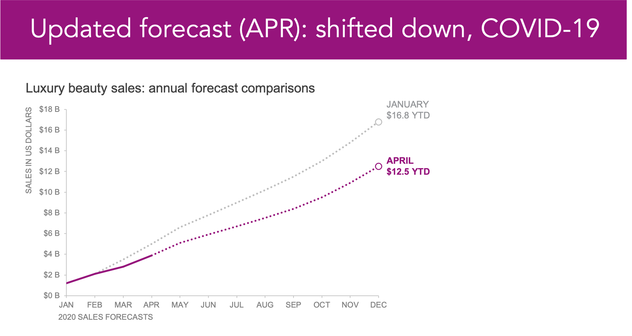
The above line chart shows annual sales forecasts for a luxury beauty brand in the US. I’ll admit that the graph might be confusing to follow since the lines overlap and share points. The main pieces to glean from this are the following:
When the forecast was run in January 2020, things were looking pretty strong—a cumulative $16.8 billion expected.
However, as we all know, 2020 interrupted many expectations and plans—data forecasts included. Once the COVID-19 lockdown set in, buying habits changed dramatically; you can see how the April YTD forecast shifted down by about $4 billion.
Surprisingly, things recovered quickly once lockdowns and restrictions eased: the October 2020 forecast illustrates how sales improved almost immediately.
Imagine I needed to present an update on sales forecasts; I could share the previous slide and explain the data as described above—building up to the exciting point that sales are recovering. I might even animate through the lines to alleviate any points of confusion.
Another approach is to lead with simple text and draw attention to the main point—the latest forecast is higher than previously thought—before jumping straight into the detailed line chart.
Because simple text works best when sharing only a couple of numbers, it’s great for summarizing data or giving a quick overview. Fortunately, starting with the big picture and then diving into the details is a great way to structure a story—and the main reason I use simple text so frequently.
I could begin my presentation with the slide below.
On this slide, I can draw attention to the latest forecast and put my audience in the right frame of mind before sharing the line chart. Putting all of these ideas together (simple text and animation), my full deck may look like the following.


You may wonder whether I need the line chart if I’m able to summarize the main point in a single slide using simple text. I’d argue that the simple text and chart pairing work together to build a more robust and effective presentation. The simple text slide aids with clarity by level-setting an audience, whereas the chart adds credibility—especially if my audience is accustomed to seeing all of the data.
Notice how in the above progression, I used a bold background for my simple text slide. In most data visualization scenarios, I advocate for using color sparingly, but I’d say simple text visualizations—if you can call them that—are the exception.
Bright and colorful is a good thing.
The bright magenta slide looks slick, but it’s also unexpected for a data-driven slide. Imagine seeing the above slide in your next Zoom meeting or projected on a screen—it’ll get your attention. This is a great way to make sure your audience is tuned in, especially if you plan to share important context about your analysis during this initial slide. I should mention that I’ve shared variations of the above colorful slide multiple times during workshops. It’s common for attendees to pull out their phones and snap a picture at this time, complementing the design.
If you’re looking for additional storytelling examples, check out our premium video library in the community. We share a sample data story in nearly all of our videos (typically towards the end of the recording). Can you spot more simple text examples? Or, if you want to practice applying this lead-with-simple-text technique, we have several related storytelling exercises in the community.


