learning about unit charts
Last month we challenged you to tackle unit charts. The results were diverse with submissions including waffle charts, all sorts of icons, hexagons, timelines, and more. Many of you commented that this was your first time creating a unit chart, which is not surprising because unit charts aren’t frequently used in the data visualization world. Still, they can be a powerful tool to help your audience engage with your data under the right circumstances.
Let’s take a look at some learnings from this challenge.
Include a legend
The symbols in a unit chart often encode a quantity. It could be one unit, ten units, or half a million even. For that reason, the legend is critical information for your audience to understand your visual properly. It’s like including a scale in a map—it needs to be there for the map to be effective. At a minimum, your audience should be clear on what each symbol represents. Below are a few creative ways members chose to share this information.
Many opted for a technique similar to Jamie and added a separate legend above the data. While some may argue that a legend is clutter, I think it’s warranted in a unit chart because it draws attention to critical information needed to interpret the visual.
Instead of a legend at the top, Yuki added labels directly next to the data, which allows the audience to quickly count and confirm each symbol represents a single person. This technique works well in a nested waffle chart.
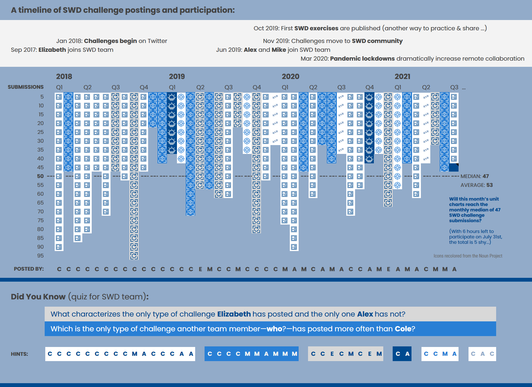
Josephine opted to use an axis instead of a legend. She aligned the axis labels and symbols perfectly to help the reader understand that each icon represents five #SWDchallenges. Her submission is a fun tour through the years of the SWD challenge.
Think carefully about partial symbols
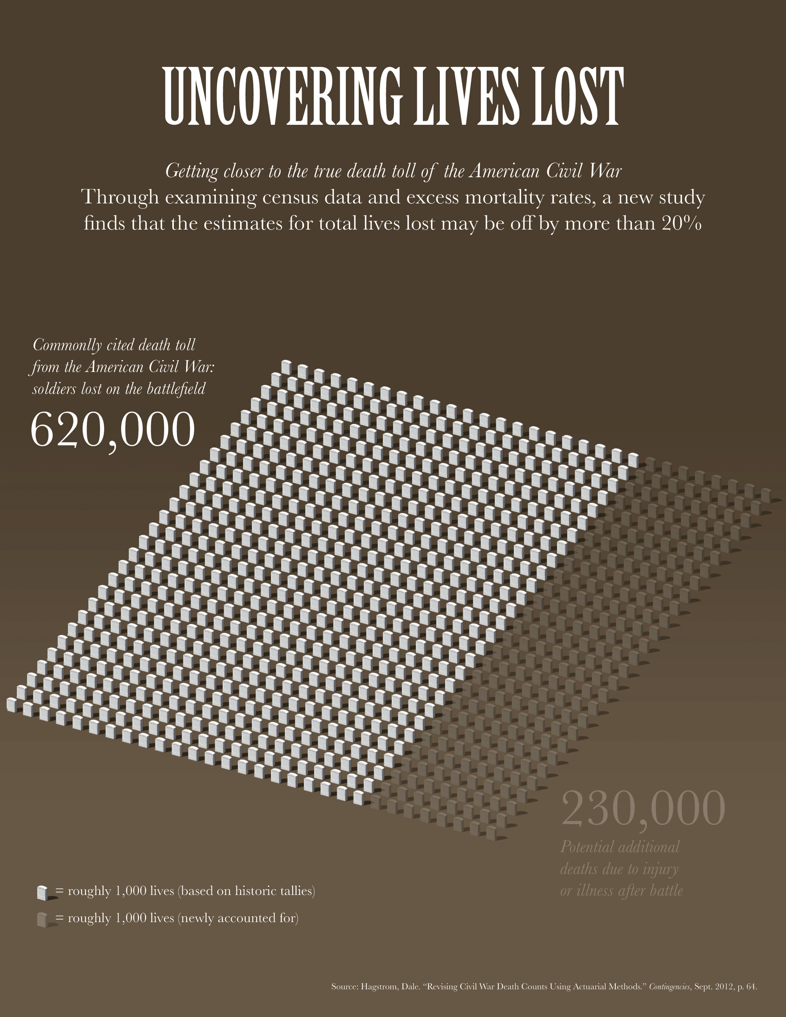
Building off of the previous comment, if your symbol represents a quantity greater than one, then you’ll likely encounter challenges where your data isn’t a multiple of the scale you’ve chosen. There’s no right or wrong way to solve this. The immediate solution we often see is partially filled symbols. The challenge with this is two-fold: when we only show a portion of a symbol, we ask our audiences to assess the area of a symbol (we aren’t good at this), and sometimes a partial symbol doesn’t make sense. How can you only have a fifth of a person? Or, better yet, is a fifth of an icon even recognizable? For this reason, I tend to avoid partial symbols altogether, as Jen did.
Jen opted to round her data, so she could neatly display all of the symbols instead of having to deal with partial versions. This is a great strategy: taking a step back and asking what level of precision will suffice? I commend Jen on this decision in light of the topic she is visualizing: lives lost. Here, we should take care to implement a level of respect in our designs—a partial tombstone wouldn’t be appropriate.
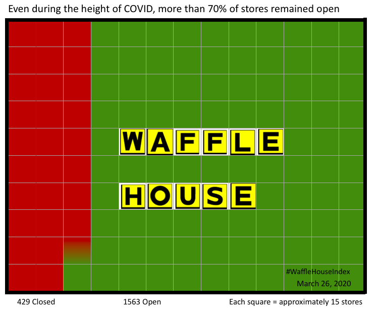
Jacob opted to use a gradient in one of the symbols. In this case, it works because he added a direct label below the chart. This takes all of the guesswork out of determining how much of the symbol represents closed versus open locations.
Make sure your icons and symbols are legible
This final learning is more a warning after flipping through all of the submissions this month. Our tools will often take our symbols and force them to fit in our graphs. This can be problematic for really detailed icons and shapes. If they get too small, it’s hard to figure out what the symbol is, and then your unit chart loses some of its value. Make sure your symbols are legible. If not, can you change the scale so that you have fewer icons, and thus can make them larger? Could you use a geometric shape that will be easily recognizable even when small, like a dot or square?
I want to give a special thanks to all of those that shared their unit chart creations. I also want to give kudos to Katy (gender differences at the Oscars), Simon (Great Britain at the Summer Olympics), Ashley (historic landmarks of Minneapolis), Pablo (a timeline of Steve Jobs), and Jill (adorable pictures of her new puppy) who shared more standout submissions.
To continue practicing and honing your data communication skills, check out the latest challenge which prompts you to turn your dashboard into data-driven story.


