an alternative to error bars

So many data visualization and design-related questions are context-dependent. For example, if someone asks if one chart type is better or worse than another, the answer is, “It depends.” Who's the audience? What's the data? How's it being shared? It’s impossible to say one way or another in every case. We all crave simple, binary solutions, but unfortunately, real life is messy like that.
During a client workshop, someone asked me if I was a fan of error bars and whether they should use them in their presentations. As I readied my standard “it depends” response, I realized that for once, it didn’t depend. I couldn't think of a single time when error bars would be the ideal solution for communicating data. (For clarity, if they had asked whether they should articulate the margin of error around their data, my answer would have certainly been it depends. I just wouldn't use error bars to do so.)
Before I discuss why I'm not a fan of error bars and an alternative solution, let's explore what they are.
What are error bars?
The purpose of error bars is to convey the precision of the data in a graph. Most commonly employed in technical communications, they are lines that extend from a data point to represent a related statistical measurement, like a standard deviation or a confidence interval. Error bars can be added to any quantitative graph: dots, bars, lines, and scatterplots, to name a few. In all cases, they usually appear by default as black lines with a flat cap at the end.
Let's consider an example from a client that uses error bars. (I modified the details to protect confidentiality.) This client captures various health metrics for patients in their studies. The example below shows the average white blood cell count (WBC) for a particular cohort. The blue line depicts the average WBC over time, and the black, capped lines are the error bars, which represent the range of recorded WBC values for all 33 patients in the cohort.

An alternate way to visualize margin of error
When designing a graph for communication purposes, you should aim to make it simple and intuitive to process. This involves removing distracting elements. Error bars, no matter how you format them, are attention-grabbing.
I can't help but focus on the error bars in the WBC line graph. There are so many lines cutting across the average trend. One option could be to modify the added lines so they don't compete for attention with the main series on the graph. I can make them gray so they contrast less against the white background. I can remove the caps at the ends, too.

This is an improvement, but a limited one from a design perspective. There are still more than 40 lines dissecting a small chart, and I’m feeling the eyestrain as I try to read the trend. Rather than showing so many individual gray lines, we could combine them into a single area or shaded region around the blue data series.

Notice how much simpler this feels. We can still see the variance around the average, but the primary focus is on the WBC line. If I wanted to label a few values or add reference lines, I could now do so without overwhelming the chart.

In almost all cases, when communicating uncertainty around my data, I opt for an error region over multiple error bars. It looks cleaner, is less to process, and feels more intuitive for an unfamiliar audience. This approach works for other charts as well. Let's consider some categorical data.
Visualing uncertainty with categorical data
An organization conducted a survey to determine employee happiness. Each question was optional. Not all employees were selected to participate in the survey, and the number of responses differed per question. To summarize the results accurately, the company used a bar chart with error bars to represent the uncertainty around each question. (Again, this is a real example that I’ve simply anonymized for confidentiality.)
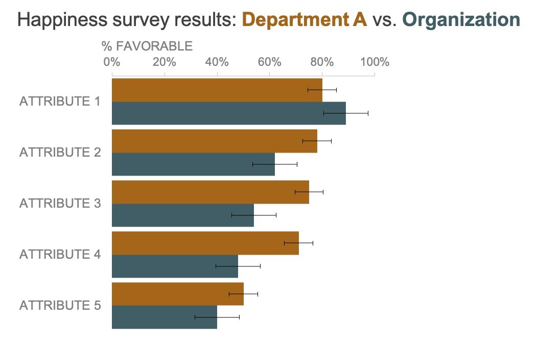
While the error bars aren’t nearly as distracting as they were in the previous example, they still draw attention away from the ends of the bars. Also, the portion that overlays the colorful bars is hard to read since there is so little contrast.
Let’s modify the chart to use a shaded region approach. First, we’ll need to use a different chart that has space to the left and right of the data values. I’ll switch from a horizontal bar chart to a dot plot.

Now that there is empty space, I can add the uncertainty in a shaded region behind each dot.
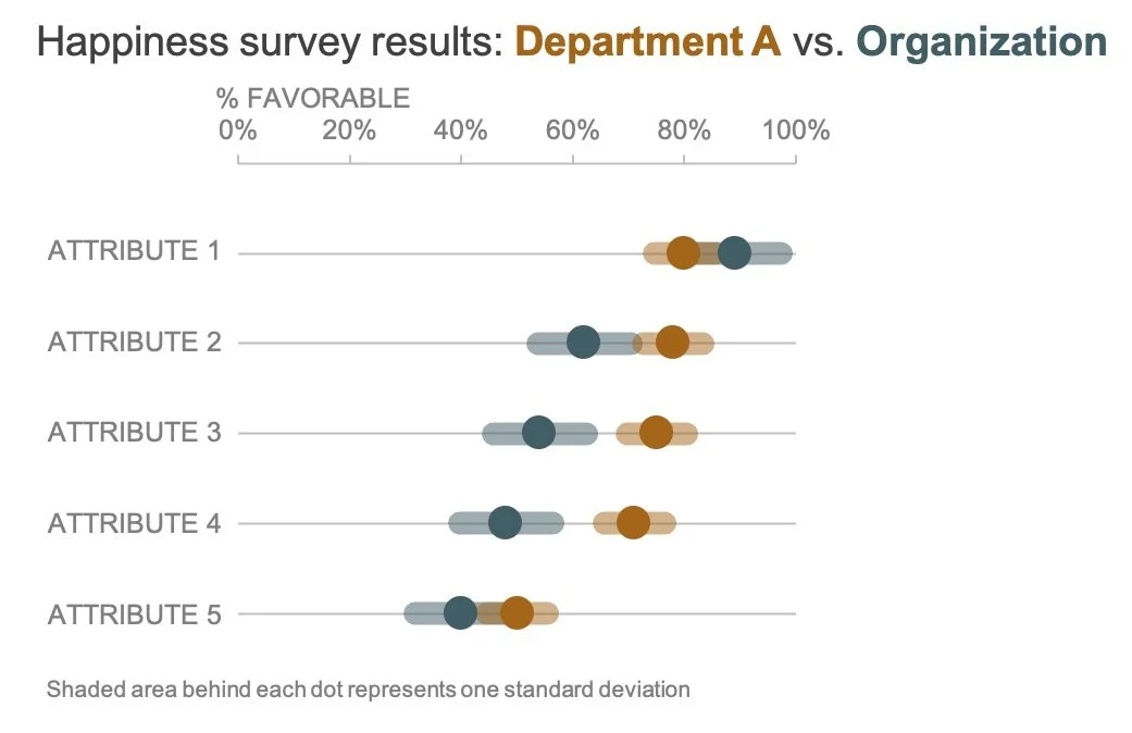
Notice how much cleaner this looks. Your attention is on the large dots for each attribute, but you have the additional detail present to help you more accurately interpret the survey results. Department A’s level of happiness does not differ from the overall organization for Attributes 1 and 5. This is shown by the overlapping error regions.
This example highlights the challenge of effectively conveying uncertainty around your data, while at the same time ensuring that the key takeaways shine through. Error bars may be familiar, easy to add, or commonly used in certain scenarios, but they often add clutter and make it harder to see the underlying story. Instead, using a shaded region or an alternative visualization can make the information clearer and more intuitive.