how do i avoid reworking my entire presentation if i have to share slides?
Through virtual and in-person workshops around the globe, we have taught tens of thousands of people how to communicate effectively with data. This series captures some of the noteworthy questions we hear during those sessions—and our answers.
Often a graph that makes sense during a live presentation loses meaning when distributed as a PowerPoint later. How can we retain context when transitioning between audiences without having to rework the entire presentation?
This is a relevant question in the time constraints we constantly are under in a real organization. We want to avoid using so-called slideuments in live presentations because it is difficult to both listen to a presenter and read text-heavy slides at the same time.
But if you’re crunched for time, there are a few time-saving strategies that will help you avoid having to create a completely separate deliverable.
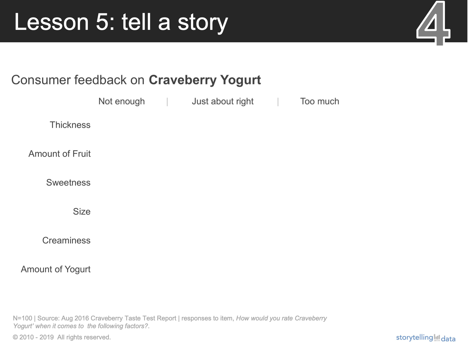
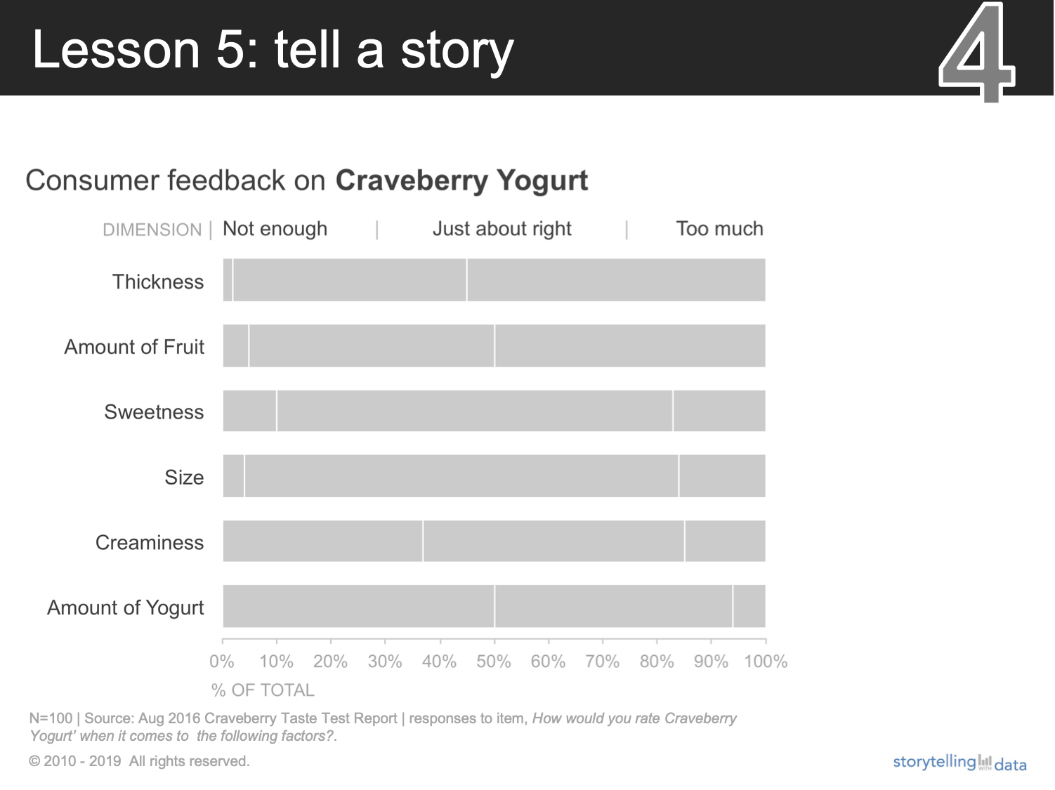
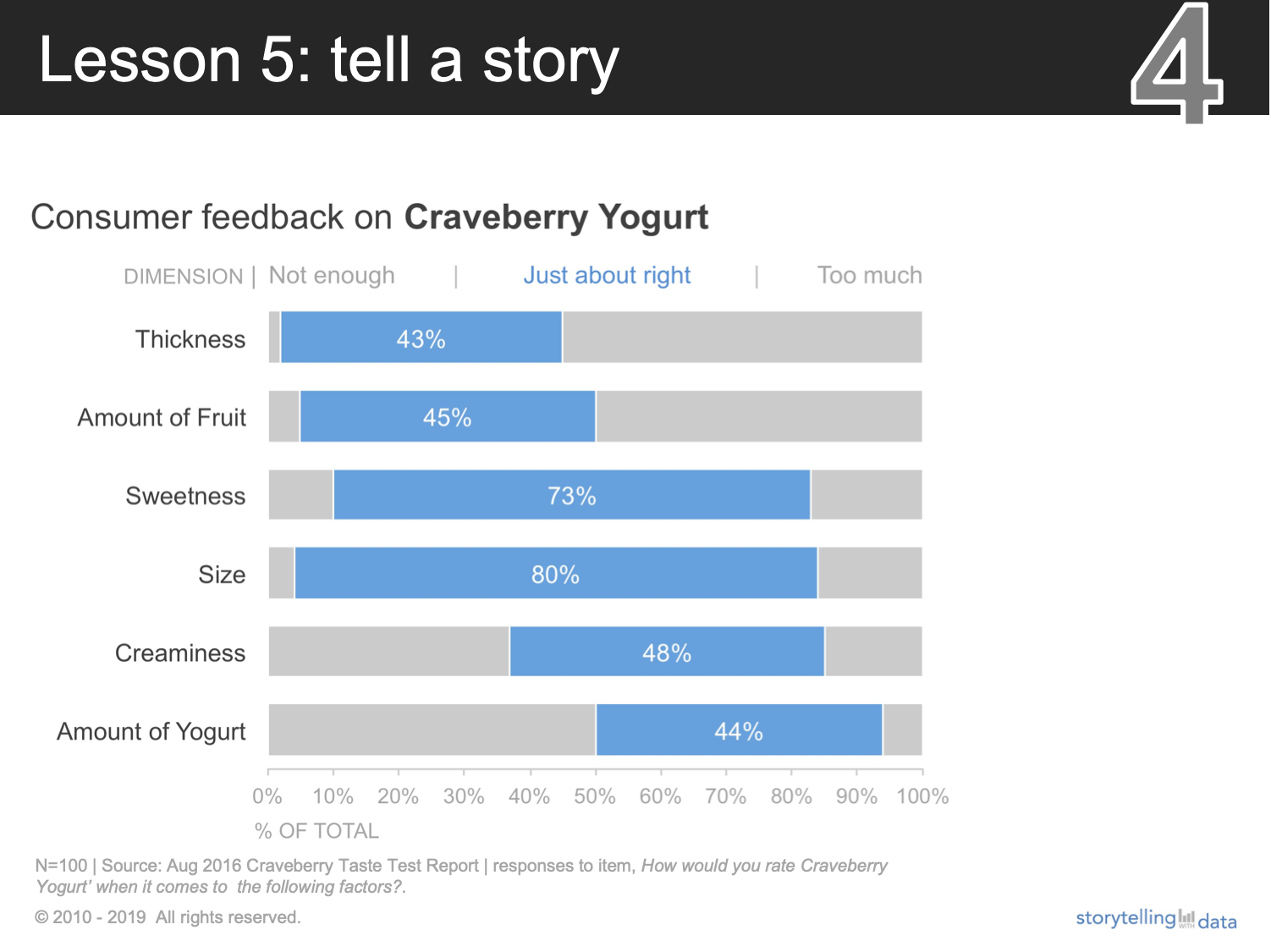
Let’s illustrate with a business example. Take a few minutes to watch Cole deliver a live data story (starting at 6:08):
This presentation was notable because:
The slides were well-designed, with effective graph choices, minimal clutter, and smart use of pre-attentive attributes to focus attention.
The visuals were paired with a strong narrative.
If you flip through the same slides on your own—would the story still be as clear? Likely not.
Back to the original question: if we must send out the entire slide deck, then let’s look at two ways we could retain Cole’s narrative without having to rework the entire presentation.
Write active slide titles. When you’re not presenting live, strong takeaway titles on your slides make it easy for the reader to understand the main point. The title bar is usually the first place your audience looks when consuming a slide deck on their own. Order your slides logically so that the reader can read just consecutive slide titles to get the overarching story you want to communicate. This is called horizontal logic.
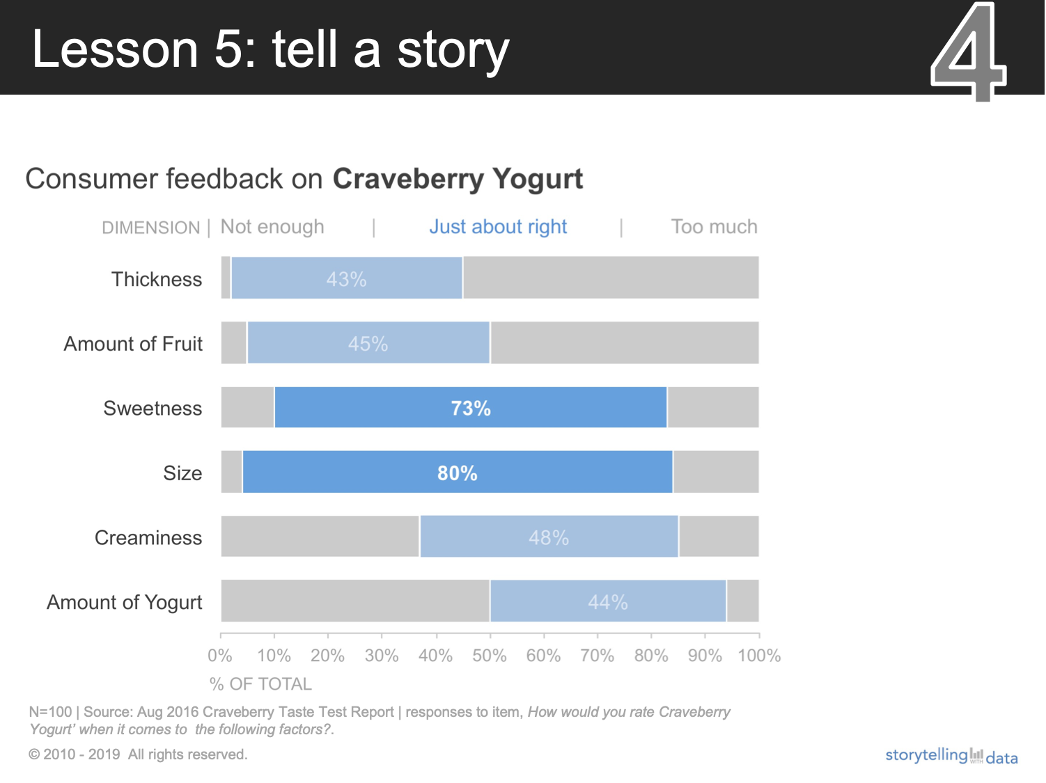
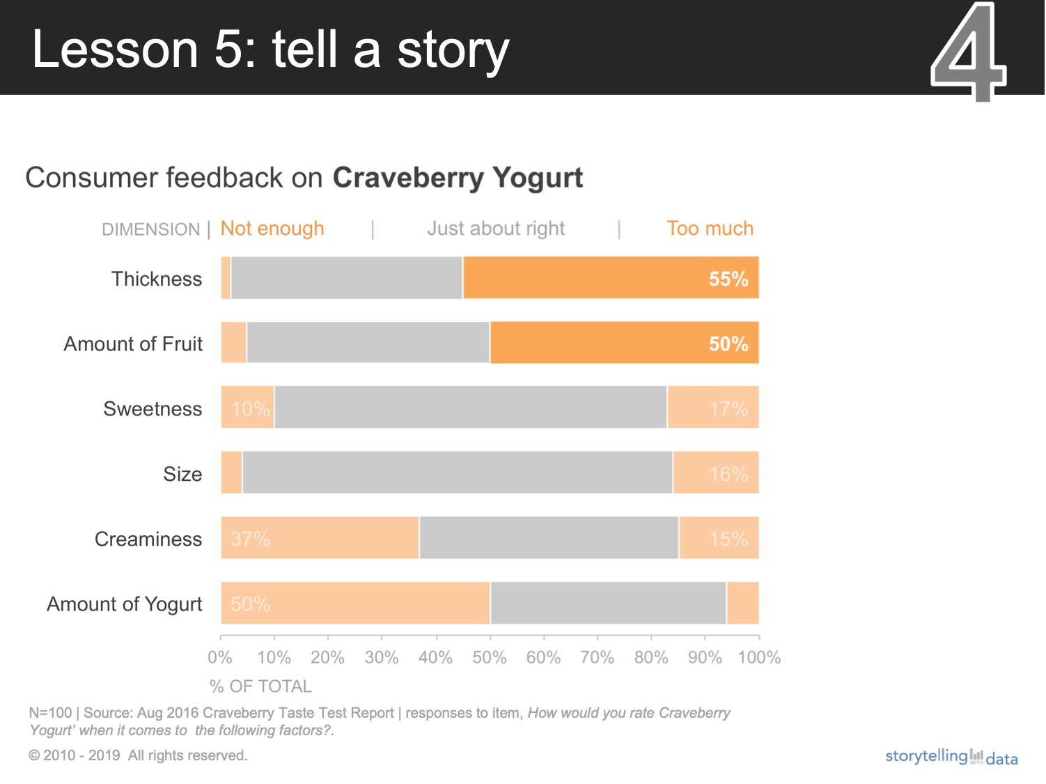
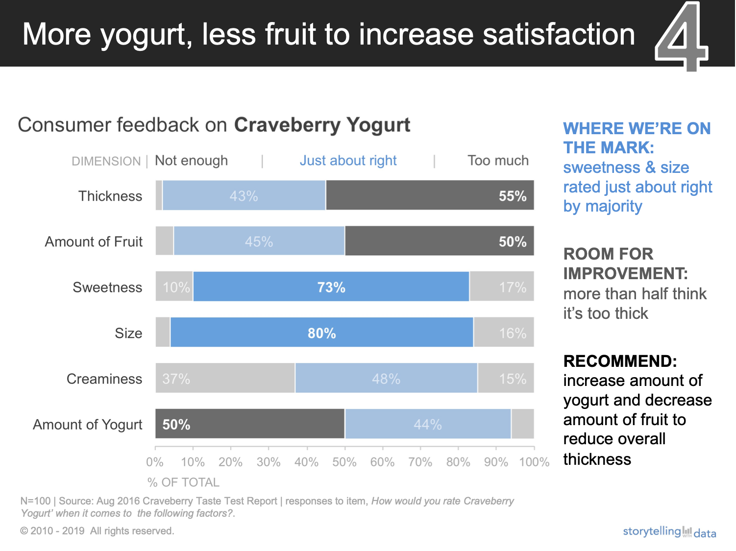
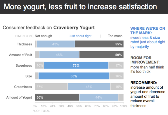
Add a fully annotated summary slide at the beginning of the deck. In this Craveberry video, Cole created this single summarized slide for the product that gets sent around after the meeting, as shown below. The audience gets the salient information without having to hear a live presenter or having to flip through the deck, because all of the information on the slide is self-reinforcing (an example of vertical logic). Adding it at the beginning means the audience could obtain the relevant details without having to flip through all the slides.
Here’s another example of adapting a live progression for written consumption.
Employing either of these two approaches goes a long way in effective data storytelling because they allow us to tailor our mode of delivery to how our audiences are consuming it.
Build your data storytelling skills in the community with these related exercises:
How would you tell the Craveberry taste test story?

