how many words is too many?
My fellow data storytellers and I have lost count of the number of times we’ve been asked questions like, “What’s the right number of slides to have in your presentation,” “How many graphs should you have on one slide,” or “What’s the right number of words to include on a single page?”
I’ve worked with many folks over the years who have quantitative backgrounds, and they tend to crave the reliability of specific numeric guidelines whenever possible. In asking questions like these, people hope, or even expect, that we’ll have prescriptive and undeniable numeric answers foro them. If you do too, then unfortunately you’re not going to like what I have to say next.
It’s time to throw another couple of dollars into the “it depends” jar, because like so many other questions in communication and data visualization, the so-called “correct” answers to these specific questions will vary depending on context.
What about the 10/20/30 Rule?
Nearly 20 years ago, the “10/20/30 Rule” for PowerPoint presentations became popular:
Use no more than 10 slides.
Speak for no longer than 20 minutes.
Only include text with a font size 30-points or larger.
This pithy, memorable, almost magic-sounding guideline has persisted ever since. After all, for self-identifying “hard skills people,” this rule provides an objective metric that can be applied to a “soft skills” task that feels inherently subjective. (As an aside, the concept of some skills being “hard” and some being “soft” is a pet peeve of mine…but that’s a topic for another day.)
Take note, though, that the 10/20/30 Rule as originally conceived came out of the world of venture capital. Those communications are taking place within a unique and specific context. Given the customs and norms associated with a pitch deck, a VC audience will expect particular structures, formats, and progressions from a presentation, for which the 10/20/30 Rule would be well-suited. But that doesn’t mean we should export these guidelines globally to all of our presentations. Committing to using 10 slides/20 minutes/30-point type in every scenario is to overly constrain yourself.
When could we safely follow the 10/20/30 guidelines?
The motivations and intentions of 10/20/30 are sound: in many cases, our aim should be to make our communications as short and as focused as possible, pairing clear imagery with words written in legible and high-contrast type. This is particularly true when your slides are meant to support your live, spoken presentation.
Take the 30-point rule, for instance. I’ve been looking at computer screens for decades, and as such my eyes aren’t what they used to be. I appreciate it when people use larger text in a slide meant for being projected on a screen. Thirty-point type? That’s fantastic, as a minimum size. If the text is sparse enough, it might even feel too small.

However, the 10/20/30 rule doesn’t limit us to ONLY 30-point type. We can bump up the text size as much as we want. Let’s go wild and use 180-point type.

Isn’t that great? It’s attention-grabbing, it’s legible, it’s dynamic, and it won’t distract my audience if I’m trying to talk while this slide is up on the screen. It supports me without competing with me.
That large, bold type looks even better when I find ways to incorporate it thoughtfully into full-bleed imagery, like in the photo below:

Imagine this slide comes up as I’m transitioning between sections of a live presentation. While I introduce the next topic in my talk—hopefully something related to beaches, San Sebastian, or landscape photography, since that’s what the image depicts—my audience gets to associate my words with a meaningfully related and aesthetically pleasing visual. The picture’s impact is greater for taking up the full slide; a smaller image cut-and-pasted into a default content window of a slide template doesn’t have nearly the same dramatic effect.
The common theme among the examples we’ve seen so far are the relatively short chunks of text we have to work with. In these situations, the 10/20/30 Rule shines.
How do we improve a slide that’s full of text?
What do we do, though, when we have more than a sentence or two’s worth of text to deal with? After all, which challenge do we find ourselves facing more often when building presentations: the case where we have too little text on one slide, or the case where we have too much? I’m guessing it’s the latter.
More often than not, the best way to deal with a slide containing too much text isn’t just to shrink the font size until everything fits. The thoughtful and elegant solution would be to edit the copy so that the total word count gets much smaller. What are the chances that every word on a slide is truly necessary, anyway? Editing takes time—and sometimes, confidence—but your audience will appreciate not having to wade through a ton of text. It’s good practice to be concise and be willing to cut words (or graphs, or images) that aren’t essential to your message or critical to include.
Sometimes, though, editing down the copy isn’t going to be a realistic option. For example:

Who would dare take the position that the right visual solution here would be to edit down the Gettysburg Address? Clearly, a different solution is called for. Even if we find ourselves working with a slide that’s somewhat less historically significant than the most famous Presidential speech ever, we still will run up against prohibitions on removing text from time to time. This may be due to compliance or regulatory reasons, or just because the person with authority prohibits it from happening.
For large blocks of text, create a visual hierarchy
When omitting even a single word is non-negotiable, sticking with the “30-point or larger” rule won’t do. Ideally, we want to create something that is more instantly scannable than the block of cramped text above. By “scannable,” we mean:
the text has been laid out so that anybody seeing the page for the first time will know what the key point is;
the secondary topics and key phrases or details are easy to find and place within the larger structure of the document; and
the document should be easy to navigate, such that skipping to and reading any particular section of the document in context should be trivial.
This visual hierarchy can be created with the thoughtful use of varying font sizes, weights, and families; color, position on the page, and other typographical choices also come into play. Look how we can take the same text of the Gettysburg Address, but instead of presenting it as a uniformly difficult to read 30-point block of words, create a scannable hierarchy:
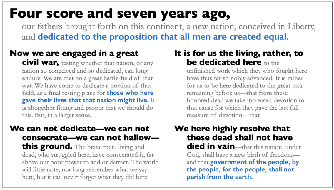
The improvement in legibility and approachability are obvious. How did we subdivide this text into a scannable hierarchy?
EMPHASIZE A PITHY, MEMORABLE PHRASE: The biggest type on the page, 40-point type, goes to the most recognizable line of the Address, “Four score and seven years ago.”
LEAD WITH THE MAIN IDEA: The lines that follow are in 28-point Garamond gray, until the key phrase “dedicated to the proposition that all men are created equal,” which are the same size but set in blue Gill Sans SemiBold.
ELEVATE SECONDARY THEMES: The topic phrases in each of the four following paragraphs of the address are written in solid black and set in 24-point Gill Sans Bold, with the paragraph text that follows in 18-point gray Garamond.
POINT OUT KEY DETAILS: Other important callout phrases are in blue Gill Sans SemiBold.
CRAFT A LAYOUT TO SUPPORT THE HIERARCHY: The introductory sentence stands alone, cutting across two columns of text; each of the four following blocks of text are roughly equal in proportion, and are aligned neatly vertically and horizontally in a 2x2 square.
While there is plenty of text on this slide that is smaller than the 10/20/30 Rule would endorse, the document itself is easily legible and scannable for anyone, regardless of their level of interest in the material. You can glance at it and immediately know it’s the Gettysburg Address from the very first line; you can grasp the narrative structure of the Address by scanning the bolded black phrases; you can get a sense of the “so what?” of the speech by connecting the three blue bold phrases; and you can dive deeper into the actual content.
Do you have a pithy phrase that will help to remember these guidelines?
Sadly, I don’t have a great slogan like “10/20/30” that can apply equally to all presentations. The reality is that the number of slides, the time we speak, and the size of our fonts all depend too much on the exact communication we’re building, and the situation in which it will take place.
Some presentations only need four slides; some need 400.
Sometimes you’ll only talk for a few minutes, and sometimes for a few hours (and if you do, PLEASE take breaks!).
And, yes, while you’ll ideally have large to very large text on your slides, sometimes you’ll need to include smaller font sizes as well, particularly if your slides will be sent around and/or read independently.
In the absence of relying on a memorable one-size-fits-all metric, let’s instead just agree that we should take as much care in designing a text-heavy slide as we would if it had graphs or images…even if they aren’t always going to be as historically significant as the Gettysburg Address.
As long as we use intentional formatting and visual structure to make that text easy to scan and understand, we’ll be more likely to connect with our audience, and therefore more likely to achieve the positive outcome we’re seeking.