I hate our brand template!
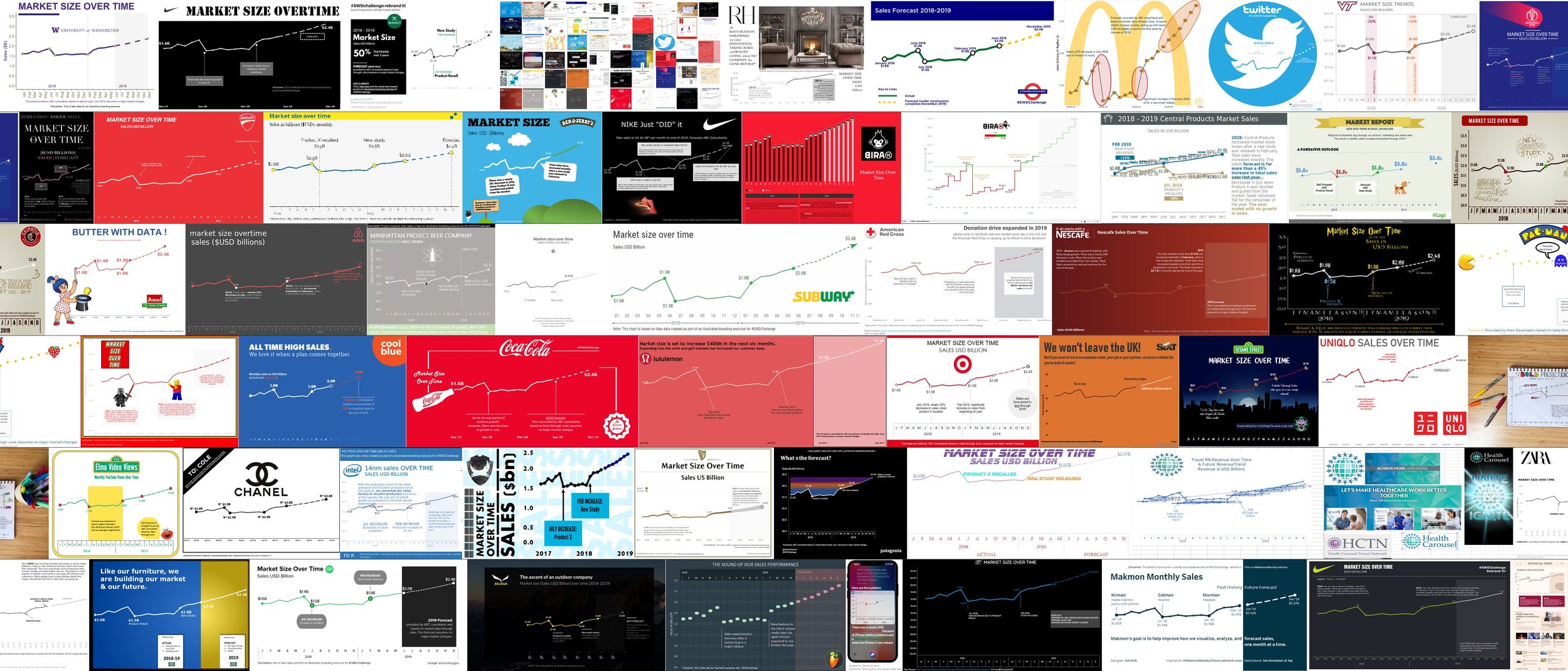
Entries from the rebrand it! SWD challenge
When making a graph or presentation, sometimes you have a choice: design freely as you create something new or follow set brand guidelines and use existing templates. On occasion, we might choose the former—a fresh style for the slide deck you’re working on, for example—only to be met with the criticism that it’s not “on brand.”
It turns out that input related to brand colors and style is among the feedback that people hate to receive. I discuss this in the latest episode of the SWD podcast—sharing thoughts on how you can reframe to appreciate and work within the constraints that brand guidelines offer, as well as ways to provide your own feedback on existing templates when that makes sense. Tune in to also hear about other graph and presentation feedback that makes people cringe and steps you can take to transform a variety of critiques from frustrating to fruitful.
Enjoy listening? Check out the SWD podcast page for more episodes.
If you don’t have set brand guidelines or otherwise have the flexibility to create something new and aren’t sure where to start, check out Chapter 5 of storytelling with you: plan, create, and deliver a stellar presentation, which steps you through the process of making a slide master, choosing colors and fonts, and more.
