my experience of the SWD challenge
Hello, this is Cole. Before we get into today’s post, I’d like to take a moment to introduce you to the person who penned it—our newest team member, Simon Rowe.
I first met Simon in 2018, when he attended a workshop I led in London where he lives. In Simon’s own words, this experience ignited his passion for data visualization (or data visualisation, as you’ll see it written from him!): “I’ve never attended a workshop before, or since, that has driven me to immediately take action and throw myself into something so earnestly.” What Simon threw himself into was the monthly SWD challenge (you’ll hear more about his experience in the forthcoming post), the Tableau community, and more recently, Sports Viz Sunday. Simon used these extracurricular activities to hone skills that he subsequently brought into the workplace.
Simon’s career up to this point has been in financial services. He has coached his team to create effective graphs and concise communications, consulted with stakeholders to gain acceptance and adoption, and presented insights to leadership that bring business performance to life in an engaging way. Now, he brings this experience to us—and to you. We’ve always had a global audience and it excites me to now have a global team as well, which will help us continue to reach and inspire people in new ways.
Please join me in welcoming Simon to the storytelling with data team!
In early 2018, I attended a storytelling with data public workshop, and was captivated by it. Cole brought an obvious passion to her delivery of simple, but practical and applicable, lessons in communicating effectively with data. Immediately, I was hooked, and I wanted to get more actively involved in the world of data visualisation.
The #SWDchallenge: an opportunity to put lessons into practice
Among the many resources provided at the workshop was a reference to the monthly storytelling with data challenge (#SWDchallenge). This caught my attention, and I decided to participate—for a few reasons.
I wanted to increase my proficiency in Tableau. My organisation had begun to use it more frequently and I saw the challenge as an ideal way to gain extra knowledge of the tool.
At the beginning of my career in analytics, my focus was on producing outputs for stakeholders. As I progressed in the department, my focus switched from delivery to supervising the delivery of others. Maintaining my technical knowledge, and therefore credibility with my team and stakeholders, was another reason for taking part.
Finally, it was a natural way to continue the momentum from the workshop. This initiative gave me an immediate platform to put into practice the lessons I’d learned. So many times, I’ve left a workshop inspired…only to very quickly forget the content for lack of an opportunity to embed it.
I submitted my first entry in March 2018; I’d used colour sparingly and incorporated it directly into the narrative, rather than using a separate legend (as I would have done previously). I was very proud when I received encouraging feedback from Cole related to my design choices.
Cole provided direct feedback on Simon's first SWD challenge entry.
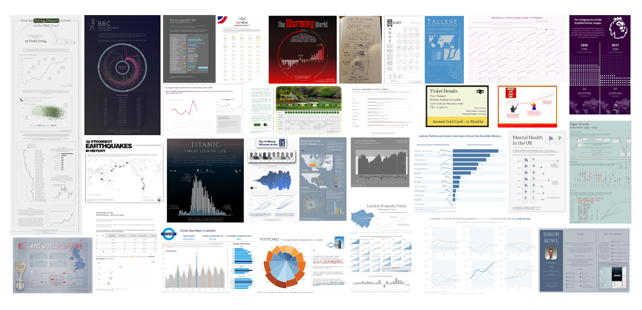
Thus inspired, I began to participate more frequently: in fact, I responded to the SWD challenge in 31 consecutive months between May 2019 and November 2021, and have submitted 38 entries overall.
The wide range of topics facilitates multi-dimensional growth
The variety of topics is a facet of the challenge that I relish. One month the ask might be to create a simple table; the following month, participants might be tasked to create an animated visual or to include a map of some kind. This diversity demanded different approaches to the challenge, whether that be with the visuals themselves or with sourcing and exploring different data sets. One month in particular that stands out from this perspective was the challenge to make a pie chart. Finding a use case where pies worked well was an interesting question to solve, and finding a data set that could be used was an intriguing challenge.
Aside from those months in which I learned a new graph—a stream graph to face my xenographobia or a coxcomb chart both leap into my mind here as being extremely fun to complete—the biggest learnings came from those that I had to re-visit and improve. The best example of this was going Back to Bars. I enjoyed this as it presented me with the opportunity to review my first submission and make improvements to it. I received helpful critiques as well from fellow SWD community members Klaudia Stano and Graeme Gourlay showing continual feedback and iteration is a critical part of the process.
Having this variety allowed me to develop in a very natural way. (Additionally, I appreciated that they weren’t overly complicated or too onerous from a time perspective to complete. This is especially important when balancing many differing priorities as we all do.) Technically, my skills were continually tested; but I also began to think far more about design, and how I would lay out my visuals to give them more breathing space and be more accessible to the audience.
Over time, the amount of positive feedback I received increased, both from the SWD community and from Twitter. It was incredibly touching to receive ‘inspired by Simon’ comments from those posting their own work. Of course, the wider audience I was reaching meant putting a little extra pressure on myself to ensure my entries were as good as they could be. In short, I’d raised my own personal standards.
My personal Top 5 submissions, in no particular order
Because they were very different from what I would normally do, I enjoyed Diagram it, in which we had to identify a process or concept of interest that was suited to a diagram and Think like a designer, which challenged participants to find an object or source of information used in daily life and improve the functionality.
Taking a different approach to my CV helped me shake the dust of my existing version and bring it up to date.
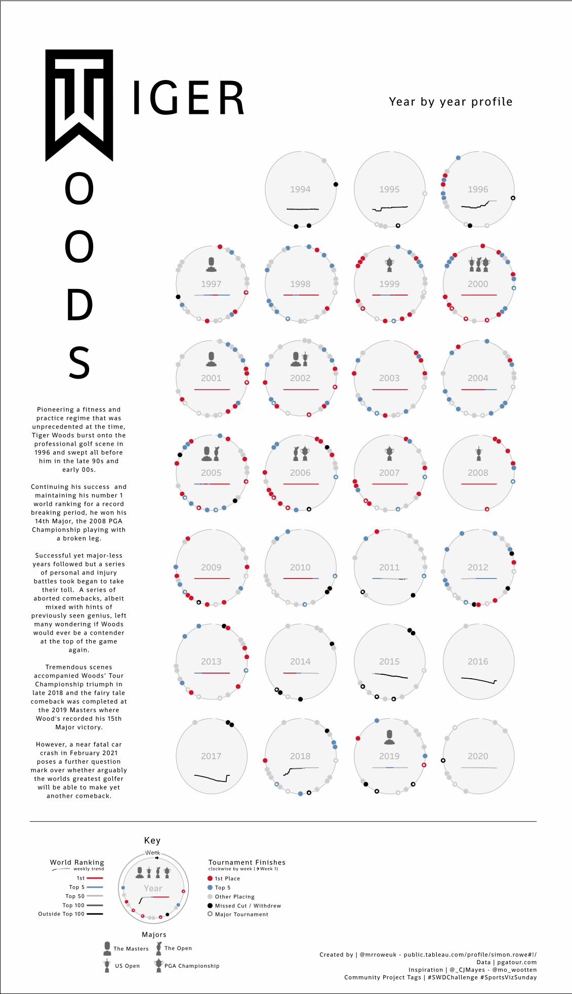
From a perspective of personal success, I have two clear winners. Explain change, where I completely redesigned a waterfall chart telling the story of Titanic into an animated version and How We’ve Grown in which I re-visited a very early visualisation on Tiger Woods.
Both astounded me with the reaction they received from the data visualisation community. These are both topics I’m passionate about and vizzing about a subject of personal significance can often lead to an increased level of quality.
What would I do differently?
Throughout my participation in SWD challenges, I was continually motivated by the variety of valuable lessons I was able to gain and the quality feedback I received. Here are just a few of the things I’ve incorporated into my approach, as a result of these monthly endeavours:
Have a specific audience in mind. Design that attempts to cater to everyone actually caters to no one. Having an audience in mind that might be particularly curious about the visual, and thinking about the journey that the audience might go on when viewing the design, is crucially important.
Have a key takeaway. Often my outputs lacked a clear call out or even a thought-provoking question that I hoped to answer in the design. Without this, an audience is left to explore the design for themselves and retrieve their own insights, which can make it hard going for them. Even a piece without a clear call to action should still have something the audience can take away with them.
Give the design space to breathe by using more whitespace. One of the biggest standouts from my earlier work is the lack of space that I gave to my designs. Building in bigger margins and giving the elements more breathing room would have had an immediate positive impact. It’s something I’m far more mindful of in my current work.
Seek feedback, early and often. I certainly didn’t do enough of this myself, especially during the initial thought and design phases. In my experience, people in dataviz-related communities are fantastic at providing feedback, but often only after a publication has been presented as a finished product. It’s very easy then to graciously accept the feedback, but not make any retrospective changes. I would certainly advocate reaching out for feedback at the early stages in the process. That way, changes and ideas can be discussed without having to invest huge amounts of time beforehand.
Set limits on how much time you want to commit. This was a struggle for me at times and I often questioned my motivations for taking part in a challenge. I’ve now set myself a target of one high quality design a month, whether it’s for the SWD challenge, another group visualization initiative, or an independent project.
I hold the storytelling with data challenges very close to my heart. Without them, I wouldn’t be where I am today. As someone with 38 entries completed, I’d encourage anyone who is considering taking part for the first time to give it a go. Do seek feedback from the SWD community, as well as your friends and colleagues, and be receptive to what comes back. Spend more time on the challenges from which you will gain the most, and don’t worry about missing a month if there are other priorities to focus on at that particular time.
And now, I’m off to start entry #39: transforming a cluttered graph into a clean and focused visual. I hope you’ll join me, and I look forward to seeing what you create!


